How to prevent an absolutely positioned element to affect the scrollbar?
Asked Answered
L

10

34

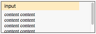
Consider an autosuggest input sitting in a container with some content and a vertical scrollbar:

enter image description here

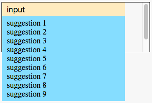
When autosuggest suggestions are shown, they should appear on top of the content without affecting container's scrollbar.

I expect to get:

enter image description here

Note that the scrollbar is exactly the same as above.

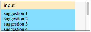
But, I get the following:

enter image description here

Note that the scrollbar is affected, and suggestions are cut.

Why absolutely positioned suggestions affect container's scrollbar?

How would you fix that?

Playground here

Notes:

  • When scrolling the container, the input and suggestions should move together.
  • You are allowed to modify the HTML, but the input and the suggestions list should stay inside .autosuggest (consider .autosuggest as a third party component whose HTML cannot be changed, but you can change its CSS).
  • You can use flexbox, if it helps.
  • I'm looking for CSS only solution. No Javascript please.

.container {
  height: 100px;
  width: 300px;
  margin-top: 50px;
  overflow-y: auto;
  border: 1px solid black;
}
.autosuggest {
  position: relative;
  width: 250px;
}
.input {
  font-size: 16px;
  width: 230px;
  padding: 5px 10px;
  border: 0;
  background-color: #FFEBBF;
}
.suggestions {
  list-style-type: none;
  margin: 0;
  padding: 5px 10px;
  width: 230px;
  background-color: #85DDFF;
  position: absolute;
}
.content {
  width: 120px;
  padding: 5px 10px;
}
<div class="container">
  <div class="autosuggest">
    <input class="input" type="text" value="input">
  </div>
  <div class="content">
    content content content content content content content content content content
  </div>
</div>
<div class="container">
  <div class="autosuggest">
    <input class="input" type="text" value="input">
    <ul class="suggestions">
      <li>suggestion 1</li>
      <li>suggestion 2</li>
      <li>suggestion 3</li>
      <li>suggestion 4</li>
      <li>suggestion 5</li>
      <li>suggestion 6</li>
      <li>suggestion 7</li>
      <li>suggestion 8</li>
      <li>suggestion 9</li>
    </ul>
  </div>
  <div class="content">
    content content content content content content content content content content
  </div>
</div>
Litigant answered 26/1, 2016 at 5:50 Comment(5)
what are expected results? Container overflow-y is set to auto and has fixed height. The auto suggestions can't leave that container as is. remove overlow and scroll disappearsHelmsman
@Helmsman I updated the question with the expected behaviour.Litigant
Can you also update your question with the code? Screenshots are nice, but you should know by now that you need to include the code in the question.Cytochrome
@Cytochrome I added a code snippet to the question.Litigant
May I ask what the purpose of having the suggestions scroll with the input is? ... Can't be to scroll down to see the content, as the suggestions already partially hide that.Foliose
A
8

This seems a bit of a janky approach and has a small caveat, but it's pure CSS/ no HTML structure modifications.

Essentially, I make the .container the main parent instead of trying to work from a lower level (.autosuggest). Step by step:

  • Move position: relative up to .container
  • Make the .autosuggest positioned absolutely (top / left default to 0px).
    • Give it a higher z-index so it's always on top
  • make .content positioned absolutely all four sides 0px so it's same size as .container
  • Move the overflow scrollbar to the .content div
  • (here's the caveat) Set the top padding of .content to the height of .input + the actually desired padding. Otherwise the .content is behind the input element.

And you end up with this:

    .container {
      height: 100px;
      width: 300px;
      margin-top: 50px;
      border: 1px solid black;
      position: relative;
    }
    .autosuggest {
      width: 250px;
      position: absolute;
      z-index: 50;
    }
    .input {
      font-size: 16px;
      width: 230px;
      padding: 5px 10px;
      border: 0;
      background-color: #FFEBBF;
    }
    .autosuggest .input:focus ~ .suggestions{
      display: block;
    }
    .suggestions {
      display: none;
      list-style-type: none;
      margin: 0;
      padding: 5px 10px;
      width: 230px;
      background-color: #85DDFF;
    }
    .content {
      overflow-y: auto;
      position: absolute;
      top: 0;
      left: 0;
      right: 0;
      bottom: 0;
      padding: 28px 10px 5px;
    }
<div class="container">
  <div class="autosuggest">
    <input class="input" type="text" value="input">
    <ul class="suggestions">
      <li>suggestion 1</li>
      <li>suggestion 2</li>
      <li>suggestion 3</li>
      <li>suggestion 4</li>
      <li>suggestion 5</li>
      <li>suggestion 6</li>
      <li>suggestion 7</li>
      <li>suggestion 8</li>
      <li>suggestion 9</li>
    </ul>
  </div>
  <div class="content">
    content content<br >content content content content content<br ><br ><br ><br ><br ><br >content content content
  </div>
</div>

I also added some showing/ hiding for the autosuggest box, because it looks nice.

.autosuggest .input:focus ~ .suggestions{
  display: block;
}
.suggestions {
  display: none;
}

Working jsFiddle.

Tested FF 43, Chrome 47


When scrolling the container, the input and suggestions should move together.

This will most likely require JavaScript. By definition, setting the suggestions to absolute position removes them from the rest of the flow of content. You could set a height on the .suggestions div and scroll it separately, but that scrolling can't (to my knowledge) be tied to the .content scroll if it's positioned absolutely (again, using CSS alone).

Something like:

$('.content').on('scroll', function () {
  $('.autosuggest .suggestions').scrollTop($(this).scrollTop());
});

Why absolutely positioned suggestions affect container's scrollbar?

Technically speaking, absolutely positioned elements do not affect the parent's height. However, they're still viewed as content of the element - content that overflows (at least in this case).

The overflow property specifies whether to clip content, render scrollbars or just display content when it overflows its block level container. (from MDN)

Since .container has overflow set to scroll, it shows a scroll bar because one of it's children overflows the bounding box. If you change overflow to hidden it'll hide all extending content and set to visible you'll see the .autosuggest extend past the .container, but so does .content (since it's also content that extends the bounding box).

You see a scrollbar because the .suggest content visually extends beyond the .container block, even though it's positioned absolutely.

Antimalarial answered 2/2, 2016 at 5:31 Comment(0)
F
12
  • When autosuggest suggestions are shown, they should appear on top of the content without affecting container's scrollbar.
  • When scrolling the container, the input and suggestions should move together.

This can't be done with CSS only.

To have suggestions appear on top of the container's content, non clipped, it has to have position: absolute and none of its parents (autosuggest and container) can be position: relative.

The down side is that suggestions will not move on scroll.

For suggestions to move with scroll, one of its parents (autosuggest or container) needs to be position: relative.

The down side with that is, and as the container's is not overflow: visible, it will be clipped


As already suggested, and assumed the input has to be within the autosuggest element, changing the position: relative on the autosuggest to position: absolute, so the input stays with suggestions on scroll, will likely be the best, though setting z-index on each container will be needed to avoid odd overlapping.

But if the provider of the third party component,... :) ..., could be talked into a version where the input could be placed outside the autosuggest element, one could get some more control, using CSS only, of both the suggestions and the content and their layouts, based on if input has focus or not,...

... where this sample maybe could be a good start (click on input to show suggestions).

.container {
  background-color: white;
  width: 300px;
  min-height: 100px;
  margin-top: 50px;
  border: 1px solid black;
  overflow: auto;
  position: relative;
}
.autosuggest {
  position: relative;
  width: 250px;
  z-index: 1;
}
.input {
  font-size: 16px;
  width: 245px;
  padding: 5px 10px;
  border: 0;
  background-color: #FFEBBF;
  position: relative;
  z-index: 1;
}
.suggestions {
  list-style-type: none;
  margin: 0;
  padding: 5px 10px;
  width: 245px;
  background-color: #85DDFF;
  display: none;
}
.content {
  position: absolute;
  left: 0;
  top: 0;
  right: 0;
  bottom: 0;
  padding: 35px 10px 5px 10px;
  overflow: auto;
  z-index: 0;
}
input:focus ~ .autosuggest .suggestions {
  display: block;
}
<div class="container">
  <input class="input" type="text" value="input">
  <div class="autosuggest">
    <ul class="suggestions">
      <li>suggestion 1</li>
      <li>suggestion 2</li>
      <li>suggestion 3</li>
      <li>suggestion 4</li>
      <li>suggestion 5</li>
      <li>suggestion 6</li>
      <li>suggestion 7</li>
      <li>suggestion 8</li>
      <li>suggestion 9</li>
    </ul>
  </div>
  <div class="content">
    content content content content content content content content content content
    content content content content content content content content content content
    content content content content content content content content content content
    content content content content content content content content content content
    content content content content content content content content content content
    content content content content content content content content content content
  </div>
</div>

<div class="container">
  <input class="input" type="text" value="input">
  <div class="autosuggest">
    <ul class="suggestions">
      <li>suggestion 1</li>
      <li>suggestion 2</li>
      <li>suggestion 3</li>
      <li>suggestion 4</li>
      <li>suggestion 5</li>
    </ul>
  </div>
  <div class="content">
    content content content content content content content content content content
    content content content content content content content content content content
    content content content content content content content content content content
  </div>
</div>
Foliose answered 30/1, 2016 at 20:16 Comment(1)
nice explanation.worked for me !!!Fog
A
8

This seems a bit of a janky approach and has a small caveat, but it's pure CSS/ no HTML structure modifications.

Essentially, I make the .container the main parent instead of trying to work from a lower level (.autosuggest). Step by step:

  • Move position: relative up to .container
  • Make the .autosuggest positioned absolutely (top / left default to 0px).
    • Give it a higher z-index so it's always on top
  • make .content positioned absolutely all four sides 0px so it's same size as .container
  • Move the overflow scrollbar to the .content div
  • (here's the caveat) Set the top padding of .content to the height of .input + the actually desired padding. Otherwise the .content is behind the input element.

And you end up with this:

    .container {
      height: 100px;
      width: 300px;
      margin-top: 50px;
      border: 1px solid black;
      position: relative;
    }
    .autosuggest {
      width: 250px;
      position: absolute;
      z-index: 50;
    }
    .input {
      font-size: 16px;
      width: 230px;
      padding: 5px 10px;
      border: 0;
      background-color: #FFEBBF;
    }
    .autosuggest .input:focus ~ .suggestions{
      display: block;
    }
    .suggestions {
      display: none;
      list-style-type: none;
      margin: 0;
      padding: 5px 10px;
      width: 230px;
      background-color: #85DDFF;
    }
    .content {
      overflow-y: auto;
      position: absolute;
      top: 0;
      left: 0;
      right: 0;
      bottom: 0;
      padding: 28px 10px 5px;
    }
<div class="container">
  <div class="autosuggest">
    <input class="input" type="text" value="input">
    <ul class="suggestions">
      <li>suggestion 1</li>
      <li>suggestion 2</li>
      <li>suggestion 3</li>
      <li>suggestion 4</li>
      <li>suggestion 5</li>
      <li>suggestion 6</li>
      <li>suggestion 7</li>
      <li>suggestion 8</li>
      <li>suggestion 9</li>
    </ul>
  </div>
  <div class="content">
    content content<br >content content content content content<br ><br ><br ><br ><br ><br >content content content
  </div>
</div>

I also added some showing/ hiding for the autosuggest box, because it looks nice.

.autosuggest .input:focus ~ .suggestions{
  display: block;
}
.suggestions {
  display: none;
}

Working jsFiddle.

Tested FF 43, Chrome 47


When scrolling the container, the input and suggestions should move together.

This will most likely require JavaScript. By definition, setting the suggestions to absolute position removes them from the rest of the flow of content. You could set a height on the .suggestions div and scroll it separately, but that scrolling can't (to my knowledge) be tied to the .content scroll if it's positioned absolutely (again, using CSS alone).

Something like:

$('.content').on('scroll', function () {
  $('.autosuggest .suggestions').scrollTop($(this).scrollTop());
});

Why absolutely positioned suggestions affect container's scrollbar?

Technically speaking, absolutely positioned elements do not affect the parent's height. However, they're still viewed as content of the element - content that overflows (at least in this case).

The overflow property specifies whether to clip content, render scrollbars or just display content when it overflows its block level container. (from MDN)

Since .container has overflow set to scroll, it shows a scroll bar because one of it's children overflows the bounding box. If you change overflow to hidden it'll hide all extending content and set to visible you'll see the .autosuggest extend past the .container, but so does .content (since it's also content that extends the bounding box).

You see a scrollbar because the .suggest content visually extends beyond the .container block, even though it's positioned absolutely.

Antimalarial answered 2/2, 2016 at 5:31 Comment(0)
W
5

All you have to do is add z-index properties to .autosuggest and .suggestions here is a code example from codepen

http://codepen.io/HTMLNoob/pen/EPEXKN

.autosuggest {
  z-index: -10;
  width: 250px;
}
.suggestions {
  list-style-type: none;
  margin: 0;
  padding: 5px 10px;
  width: 230px;
  background-color: #85DDFF;
  position: absolute;
  z-index: 10;
}

UPDATE:

I believe this is what you are looking for

http://jsbin.com/fegibaboyo/1/edit?html,css,output

Note: Hover over the input with suggestions.

UPDATE2:

http://jsbin.com/mojopuboku/edit?html,css,output

Here is the new answer.

I have tested this answer throughout most browsers(Firefox, Chrome, Opera) and all of which perform the same results.(I'm not sure about Safari, because I am unable to install Safari on my Windows XP)

Windhoek answered 26/1, 2016 at 6:31 Comment(26)
Attempting to post the link should have resulted in an error. What does it tell you?Cytochrome
"You must provide code with any link....." I do so and it litteraly posts the code not the linkWindhoek
Are you sure you've included the code? I'm not seeing anything but the link (in a code block).Cytochrome
Links to codepen.io must be accompanied by code. Please indent all code by 4 spaces using the code toolbar button or the CTRL+K keyboard shortcut. For more editing help, click the [?] toolbar icon.Windhoek
When it says "code", it means the code in the pen. Not the code for the link. Let me help you.Cytochrome
Yes, so users don't have to click the link to pen in order to see the code.Cytochrome
@Windhoek The issue with your solution is that suggestions are detached from the input once you start scrolling the container.Litigant
Ok I will try to fix this accordingly. Also do you mind if javascript is included? I'm afraid there is no pure CSS solution to this.Windhoek
@Windhoek I'm looking for a CSS only solution here.Litigant
Misha, so what exactly do you want? I see that you want the suggestions visible outside the overflowed div. But you also want the suggestions to stay attached?Windhoek
jsbin.com/rekeyawuto/edit?html,css,output @Misha Moroshko Is this what your looking for?Windhoek
@Windhoek The question title explicitly mentions a scrollbar. In your solution the container doesn't seem to have a scrollbar. You are right, suggestions should always be attached to the input, but their appearance should not affect container's scrollbar position.Litigant
@MishaMoroshko I have updated the question to fix this problemWindhoek
@Windhoek Sorry, I still can't see a scrollbar.Litigant
@Windhoek I added more content to see the scrollbar, but the problem is that the input doesn't move when you scroll (see the first Note in the question).Litigant
Ok, I will fix this @MishaMoroshkoWindhoek
@MishaMoroshko I believe I have fixed the problem :) I have updated my questionWindhoek
@Windhoek Nope. Suggestions don't move as you scroll, and their existence affect the scrollbar. Please read the question carefully again.Litigant
@MishaMoroshko, here is a link following your notes to the letter. jsbin.com/xuquyenaci/edit?html,css,output.Windhoek
@Windhoek The first note explicitly says that when scrolling the container, the input should move. In your solution the input doesn't move.Litigant
@MishaMoroshko what browser are you using? In mine the input perfectly moves with the containerWindhoek
@Windhoek Chrome, you?Litigant
@MishaMoroshko Mozilla Firefox. I also mean to press the link I made inside of the commentsWindhoek
@Windhoek I just tried you last demo with Firefox and it doesn't work as the OP expect.Foliose
@LGSon The input moves WITH the content as you scroll. Is there something that I'm missing? Here is the link to clarify jsbin.com/xuquyenaci/edit?html,css,outputWindhoek
@Windhoek You missed the note in the question saying the input and suggestions should move together.Foliose
D
2
.autosuggest {
  position: fixed; /* add position:fixed */
}

.suggestions {
 /* remove position:absolute */
}
Derisive answered 29/1, 2016 at 11:9 Comment(0)
P
1

Why not just pull the ul and li elements out of the div container and then move suggestions up by setting a negative top position?

http://jsbin.com/ficalu/edit?html,css,output

Update: Change .autosuggest to position: absolute

http://jsbin.com/gezimi/edit?html,css,output

Polished answered 26/1, 2016 at 6:49 Comment(4)
I should probably be more specific and say that .autosuggest is a third party component, so you can't move .suggestions outside of .autosuggest.Litigant
Got it. How about changing .autosuggest to position: absolute jsbin.com/gezimi/edit?html,css,outputPolished
Please check the link again. I assume you pasted the wrong link, or updated the Bin after that. It doesn't seem to solve the problem.Litigant
Here is an attempt to use position: absolute for .autosuggest: jsbin.com/yalokodajo/1/edit?html,css,output But it doesn't work since now scrolling the container leaves the input always at the top (it should move like in the original link in the question).Litigant
D
1

Easy, remove

position: relative

from class .autosuggest and add to class .container

Dun answered 26/1, 2016 at 11:27 Comment(4)
.container { height: 100px; width: 300px; margin-top: 50px; border: 1px solid black; position: relative; } .autosuggest { width: 300px; overflow-y: scroll; height: 100px; } .input { font-size: 16px; width: 230px; padding: 5px 10px; border: 0; background-color: #FFEBBF; } .suggestions { list-style-type: none; margin: 0; padding: 5px 10px; width: 230px; background-color: #85DDFF; position: absolute; } .content { width: 120px; padding: 5px 10px; }Dun
Your JSbin doesn't work as expected (it doesn't have a scrollbar at all, and content seems to be outside of the container).Litigant
From what your question I thought this was what you wanted to result to be - not sure I'm understanding the question right then?Dun
Class .suggestions could have a max-height added and an overflow-y but this would add a scroll bar to the .suggestions UL. You cannot have a scroll bar on it's parent that effects the child's overflow position, the scroll has to be on the content your overflowing else the whole panel will just move rather than scroll.Dun
H
1

Add this to your CSS:

.input:focus + .suggestions {
  position: fixed;
  display: block;
}

And add display: none; to .suggestions in your CSS.

Fiddle here.

Hoarsen answered 31/1, 2016 at 11:33 Comment(2)
When you scroll, suggestions don't move in your fiddle.Litigant
Do you want them to be scrolled too?Hoarsen
J
1

How about this:

  • move autosuggest outside container
  • give the content same margin as height of input (if you're using LESS/SASS you should be able to compute that)
  • drop the autosuggest down to occupy margin space

My changes in the CSS have a comment next to them. Note that this was only tested in Chrome. You can also probably optimize the HTML a little bit, like removing the container in the example, but you probably have multiple elements in there.

the HTML:

  <div class="autosuggest">
    <input class="input" type="text" value="input">
    <ul class="suggestions">
      <li>suggestion 1</li>
      <li>suggestion 2</li>
      <li>suggestion 3</li>
      <li>suggestion 4</li>
      <li>suggestion 5</li>
      <li>suggestion 6</li>
      <li>suggestion 7</li>
      <li>suggestion 8</li>
      <li>suggestion 9</li>
    </ul>
  </div>

  <div class="container">
    <div class="content">
      content content content content content content content content content content
    </div>
  </div>
the CSS:

.container {
  height: 100px;
  width: 300px;
  overflow-y: auto;
  border: 1px solid black;
}
.autosuggest {
  position: relative;
  top:29px; /* height of input */
  left:1px; /* width of container border */
  width: 250px;
}
.input {
  font-size: 16px;
  width: 230px;
  padding: 5px 10px;
  border: 0;
  background-color: #FFEBBF;
}
.suggestions {
  list-style-type: none;
  margin: 0;
  padding: 5px 10px;
  width: 230px;
  background-color: #85DDFF;
  position: absolute;
}
.content {
  width: 120px;
  margin-top: 29px; /* height of input */
  padding: 5px 10px;
}
Jacie answered 2/2, 2016 at 5:26 Comment(3)
Your solution doesn't satisfy "When scrolling the container, the input and suggestions should move together."Litigant
ah, I misread that part, let me have a think about an alternate solutionJacie
yeah so had a think. I reckon you can't satisfy all your requirements without JS. If you want to keep it pure CSS, you'll have to compromise. Consider either not scrolling the input+suggestions (as per my answer) or hiding suggestions on scroll/defocus (as per HTML noobs answer)Jacie
C
0

Javascript solution

I know it was asked that no Javascript was used for the solution, but since none of the proposed solutions worked for me, I had no other choice but to resort to a very sub-optimal Javascript solution that works, nonetheless.

The reasons why none of the proposed above solutions worked for me:

  1. I was developing a web component that basically only contains the input and suggestions sections specified in the original question.
  2. I could not assume anything about where the web component may be used (inside another element with scroll: auto, inside a pop-up with or without scroll, ...).

Therefore, I could not play around with the CSS properties or HTML structure of anything outside of the input, the suggestions container, and the container to the previous 2, which would equate to the web component, in my case.

I also could not apply position: absolute to the container (because of reason #2), as some solutions suggest.

This all goes to say that I am just leaving this here for those who cannot accept any of the other solutions for one reason or another, and have no choice but to resort to Javascript. I'm hoping this will help them.

const header = document.querySelector('.child-header');
const content = document.querySelector('.child-content');

const open = (el) => {
  if (!content.hasAttribute('open')) {
    content.toggleAttribute('open');
  }
}

const close = (el) => {
  if (content.hasAttribute('open')) {
    content.toggleAttribute('open');
  }
}

window.addEventListener('click', (e) => {
  let element = e.target;
  let notInsideContent = true;
  while (element && notInsideContent) {
    notInsideContent = !element.classList.contains('child-content');
    element = element.parentElement;
  }

  if (notInsideContent) {
    close(content);
  }
});

const repositionContent = () => {
  const headerStyle = header.getBoundingClientRect();
  content.style.left = `${headerStyle.x}px`;
  const contentTop = headerStyle.y + headerStyle.height;
  content.style.top = `${contentTop}px`;
  content.style.width = `${headerStyle.width}px`;

  // Make sure height takes into account bottom of page scroll
  const windowBottom = window.innerHeight;
  const contentMaxHeight = contentTop + content.scrollHeight;
  if (contentMaxHeight > windowBottom) {
    content.style.maxHeight = `${
      content.scrollHeight -
      (contentMaxHeight - windowBottom)
    }px`;
  } else {
    content.style.maxHeight = '';
  }
};

header.addEventListener('click', (e) => {
  e.stopPropagation();
  open(content);
  repositionContent();
});

// Listen to ANY scroll event on the document
document.addEventListener('scroll', e => {
  if (!content.hasAttribute('open')) {
    return;
  }

  // TODO Check scroll provoked position change for content element

  // Check scroll origin element doesn't come from within
  const path = e.composedPath();
  let element = path.pop();
  let notInsideContentElement = true;
  while (element && notInsideContentElement) {
    notInsideContentElement = (element !== content);
    element = path.pop();
  }

  if (notInsideContentElement) {
    repositionContent();
  }
}, true);
.scrollable {
  overflow: auto;
  border: 1px solid black;
}

.child-header {
  border: 1px solid red;
  box-sizing: border-box;
  cursor: pointer;
}

.child-content[open] {
  display: block;
}

.child-content {
  display: none;
  border: 1px solid blue;
  box-sizing: border-box;
  background: blue;
  color: white;
  position: fixed;
  overflow-y: auto;
}
<div class="scrollable">
  <div>Element</div>
  <div>Element</div>
  <div>Element</div>
  <div>Element</div>
  <div>Element</div>
  <div>Element</div>
  <div>Element</div>
  <div>Element</div>
  <div>Element</div>
  <div>Element</div>
  <div>Element</div>
  <div class="parent">
    <div class="child-header">
      Click me for suggestions
    </div>
    <div class="child-content">
      <div>Suggestion</div>
      <div>Suggestion</div>
      <div>Suggestion</div>
      <div>Suggestion</div>
      <div>Suggestion</div>
      <div>Suggestion</div>
      <div>Suggestion</div>
      <div>Suggestion</div>
      <div>Suggestion</div>
      <div>Suggestion</div>
      <div>Suggestion</div>
      <div>Suggestion</div>
      <div>Suggestion</div>
      <div>Suggestion</div>
      <div>Suggestion</div>
      <div>Suggestion</div>
      <div>Suggestion</div>
      <div>Suggestion</div>
    </div>
  </div>
  <div>Element</div>
  <div>Element</div>
  <div>Element</div>
  <div>Element</div>
  <div>Element</div>
  <div>Element</div>
  <div>Element</div>
  <div>Element</div>
  <div>Element</div>
  <div>Element</div>
  <div>Element</div>
  <div>Element</div>
</div>
Confluence answered 14/5, 2020 at 18:54 Comment(0)
B
-2

you can make it in "css only" style ONLY if suggestion 1,2,3 elements will be not child of "input" element.

for example:

<input>
 content
 content
</input>

suggestion1
suggestion2
suggestion3

or as working example thar suggest htmlnoob url in some upper mess

other fix, can work only in old browsers, like ie5.

Bathulda answered 31/1, 2016 at 17:2 Comment(1)
Sorry, I don't understand your proposal. You can clearly see in the question that content is not input's child.Litigant

© 2022 - 2024 — McMap. All rights reserved.