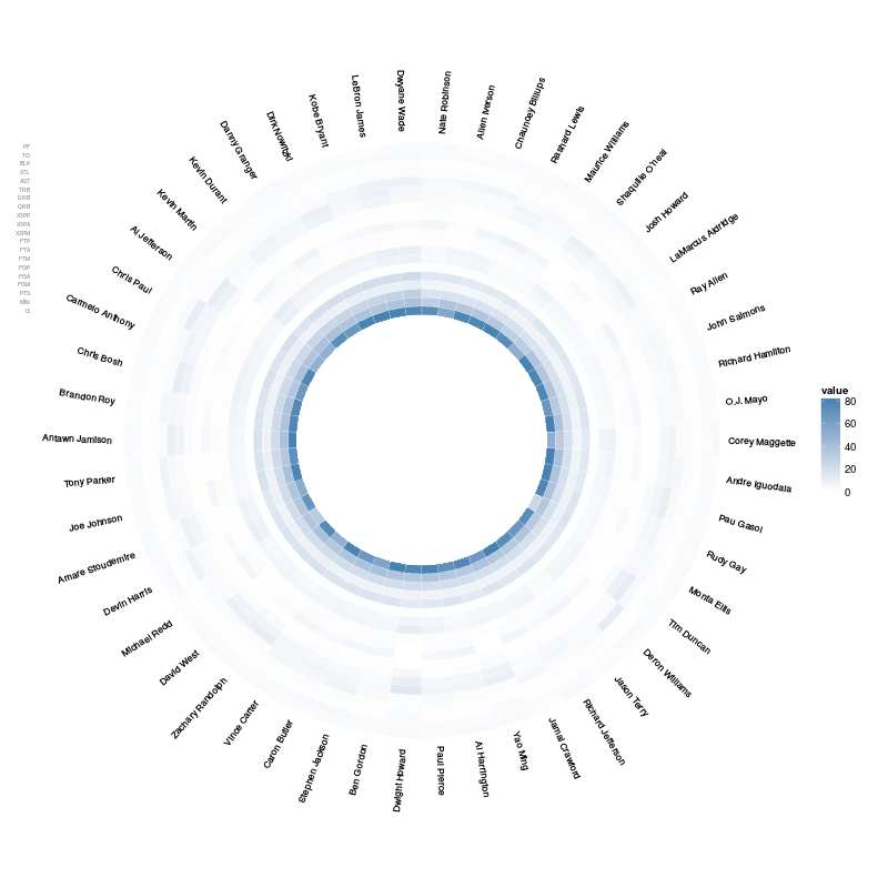
Circular Heatmap that looks like a donut
Asked Answered
C

2

34

I'm trying to create circular heatmap with ggplot2 so I can use a larger number of labels around the circumference of a circle. I'd like to have it look more like a donut with an empty hole in the middle but at the same time not losing any rows (they would need to be compressed).

Code for what I have is below.

library(reshape)
library(ggplot2)

nba <- read.csv("http://datasets.flowingdata.com/ppg2008.csv")

nba$Name <- with(nba, reorder(Name, PTS))
nba.m <- melt(nba)
nba.m <- ddply(nba.m, .(variable), transform, value = scale(value))


p = ggplot(nba.m, aes(Name,variable)) + geom_tile(aes(fill = value), colour = "white") +           scale_fill_gradient(low = "white", high = "steelblue") 
p<-p+opts(
panel.background=theme_blank(),
axis.title.x=theme_blank(),
axis.title.y=theme_blank(),
panel.grid.major=theme_blank(),
panel.grid.minor=theme_blank(),  
axis.text.x=theme_blank(),
axis.ticks=theme_blank()
)


p = p + coord_polar() 
plot(p) 
Cavefish answered 14/12, 2012 at 22:51 Comment(0)
C
49

Here is a solution accomplished by (1) converting factor to numeric and adding an offset, (2) manually specifying y-limits and (3) manually setting y-axis breaks and labels:

library(reshape)
library(ggplot2)
# Using ggplot2 0.9.2.1

nba <- read.csv("http://datasets.flowingdata.com/ppg2008.csv")
nba$Name <- with(nba, reorder(Name, PTS))
nba.m <- melt(nba)
nba.m <- ddply(nba.m, .(variable), transform, value = scale(value))

# Convert the factor levels to numeric + quanity to determine size of hole.
nba.m$var2 = as.numeric(nba.m$variable) + 15

# Labels and breaks need to be added with scale_y_discrete.
y_labels = levels(nba.m$variable)
y_breaks = seq_along(y_labels) + 15

p2 = ggplot(nba.m, aes(x=Name, y=var2, fill=value)) +
     geom_tile(colour="white") +
     scale_fill_gradient(low = "white", high = "steelblue") +
     ylim(c(0, max(nba.m$var2) + 0.5)) +
     scale_y_discrete(breaks=y_breaks, labels=y_labels) +
     coord_polar(theta="x") +
     theme(panel.background=element_blank(),
           axis.title=element_blank(),
           panel.grid=element_blank(),
           axis.text.x=element_blank(),
           axis.ticks=element_blank(),
           axis.text.y=element_text(size=5))


ggsave(filename="plot_2.png", plot=p2, height=7, width=7)

enter image description here

Charente answered 15/12, 2012 at 2:46 Comment(2)
This is amazing. How do we add labels to the x axis too?Declamation
How about the case that we have rows with different lengths?Womanhater
B
3

Addressing @FedericoGiorgi's comment, not the original question. Thanks @bdemarest your solution is incredibly useful!

Hack together a data frame to display labels, arrange them nicely:

nba.labs <- subset(nba.m, variable==levels(nba.m$variable)[nlevels(nba.m$variable)])
nba.labs <- nba.labs[order(nba.labs$Name),]
nba.labs$ang <- seq(from=(360/nrow(nba.labs))/1.5, to=(1.5*(360/nrow(nba.labs)))-360, length.out=nrow(nba.labs))+80
nba.labs$hjust <- 0
nba.labs$hjust[which(nba.labs$ang < -90)] <- 1
nba.labs$ang[which(nba.labs$ang < -90)] <- (180+nba.labs$ang)[which(nba.labs$ang < -90)]

Add a geom_text for labels:

p2 = ggplot(nba.m, aes(x=Name, y=var2, fill=value)) +
     geom_tile(colour="white") +
     geom_text(data=nba.labs, aes(x=Name, y=var2+1.5,
        label=Name, angle=ang, hjust=hjust), size=3) +
     scale_fill_gradient(low = "white", high = "steelblue") +
     ylim(c(0, max(nba.m$var2) + 1.5)) +
     scale_y_discrete(breaks=y_breaks, labels=y_labels) +
     coord_polar(theta="x") +
     theme(panel.background=element_blank(),
           axis.title=element_blank(),
           panel.grid=element_blank(),
           axis.text.x=element_blank(),
           axis.ticks=element_blank(),
           axis.text.y=element_text(size=5))
print(p2)

enter image description here

Bohun answered 11/4, 2016 at 16:49 Comment(0)

© 2022 - 2024 — McMap. All rights reserved.