How to combine scatter and line plots using Plotly Express
Asked Answered
N

4

34

Plotly Express has an intuitive way to provide pre-formatted plotly plots with minimal lines of code; sort of how Seaborn does it for matplotlib.

It is possible to add traces of plots on Plotly to get a scatter plot on an existing line plot. However, I couldn't find such a functionality in Plotly Express.

Is it possible to combine a scatter and line graph in Plotly Express?

Ned answered 3/12, 2020 at 11:9 Comment(0)
S
74

You can use:

fig3 = go.Figure(data=fig1.data + fig2.data)

Where fig1 and fig2 are built using px.line() and px.scatter(), respectively. And fig3 is, as you can see, built using plotly.graph_objects.

Some details:

One approach that I use alot is building two figures fig1 and fig2 using plotly.express and then combine them using their data attributes together with a go.Figure / plotly.graph_objects object like this:

import plotly.express as px
import plotly.graph_objects as go
df = px.data.iris()

fig1 = px.line(df, x="sepal_width", y="sepal_length")
fig1.update_traces(line=dict(color = 'rgba(50,50,50,0.2)'))

fig2 = px.scatter(df, x="sepal_width", y="sepal_length", color="species")

fig3 = go.Figure(data=fig1.data + fig2.data)
fig3.show()

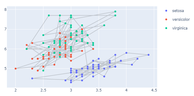
Plot:

enter image description here

Spencer answered 3/12, 2020 at 21:17 Comment(1)
If I have multiple figures like fig3 how can I use add_trace with them?Verso
K
6

EDIT: fixed typo.

This works great and is even more useful with flipSTAR's clarification regarding adding a global layout to the combined fig. However, sometimes a global layout doesn't cover everything. For example, in my case (a stacked bar and two single scatter plot lines), my global layout caused me to lose my scatter plot legends. Fortunately, you can add additional arguments to the combined fig by targeting the specific figures. e.g., given a hypothetical:

fig1 = px.bar(...)
fig2 = px.line(...)
fig3 = px.line(...)
all_fig = go.Figure(data=fig1.data + fig2.data + fig3.data, layout = fig1.layout)

Which is a bar chart and two scatter plots each with a single line, you can add the legends for each line with:

all_fig['data'][1]['showlegend']=True
all_fig['data'][1]['name']='Line 1 Name'
all_fig['data'][1]['hovertemplate']='Line 1 Name<br>x=%{x}<br>y=%{y}<extra></extra>'
all_fig['data'][2]['showlegend']=True
all_fig['data'][2]['name']='Line 2 Name'
all_fig['data'][2]['hovertemplate']='Line 2 Name<br>x=%{x}<br>y=%{y}<extra></extra>'

(the bar is all_fig['data'][0]).

For some reason, the name won't show up on hover unless you explicitly add it to 'hovertemplate.'

Kibler answered 20/5, 2022 at 21:16 Comment(0)
D
1

If you want to scale the apporach

fig3 = go.Figure(data=fig1.data + fig2.data)

as stated in the other answer, here are some hints.

fig1.data and fig2.data are common tuples that hold all the info needed for a plot and the + just concatenates them.

# this will hold all figures until they are combined
all_figures = []

# data_collection: dictionary with Pandas dataframes
 
for df_label in data_collection:

    df = data_collection[df_label]
    fig = px.line(df, x='Date', y=['Value'])
    all_figures.append(fig)

import operator
import functools

# now you can concatenate all the data tuples
# by using the programmatic add operator 
fig3 = go.Figure(data=functools.reduce(operator.add, [_.data for _ in all_figures]))
fig3.show()
Denton answered 9/11, 2021 at 6:27 Comment(2)
Or you can append fig.data and then go.Figure(data=sum(all_figures, ())). Or go.Figure(data=sum((fig.data for fig in figures), ())) if you need to iterate twice. ^^Span
I used the same layout for all figures, but this got lost by combining just the data. Here is the way to also add the "global" layout: fig3 = go.Figure(data = sum(fig.data for fig in fig_all), layout = fig_all[0].layout)Tenner
G
0

Here is a similar answer to @vestland which also results in exactly the same plot. But here I just use .add_traces() to combine the plotly express plots instead of using the go.Figure().

import plotly.express as px
df = px.data.iris()

fig1 = px.line(df, x="sepal_width", y="sepal_length", color_discrete_sequence = ['rgba(50,50,50,0.2)'])
fig2 = px.scatter(df, x="sepal_width", y="sepal_length", color="species").add_traces(fig1.data)
fig2.show()

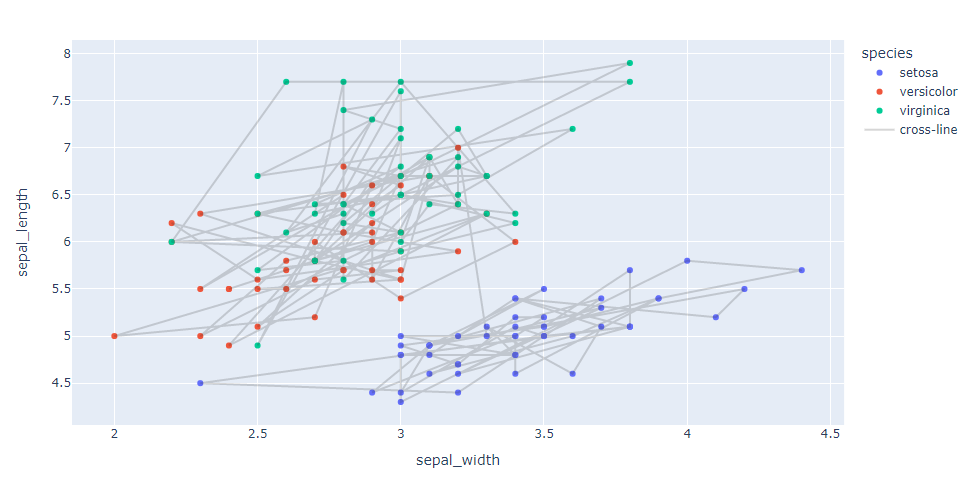
It will carry over the legend from fig1 if it has one. In the case above a legend wasn't created for fig1 so specify a color column to create a legend.

import plotly.express as px
df = px.data.iris()
df['legend'] = 'cross-line'

fig1 = px.line(df, x="sepal_width", y="sepal_length", color='legend', color_discrete_sequence  = ['rgba(50,50,50,0.2)'])
fig2 = px.scatter(df, x="sepal_width", y="sepal_length", color="species").add_trace(fig1.data[0])
fig2.show()

enter image description here

Gradus answered 4/5, 2023 at 11:52 Comment(0)

© 2022 - 2024 — McMap. All rights reserved.