How is TabItem used when placed in the layout XML?
Asked Answered
T

3

36

The TabLayout documentation gives an example of nesting TabItem directly inside TabLayout like so:

<android.support.design.widget.TabLayout
     android:layout_height="wrap_content"
     android:layout_width="match_parent">

    <android.support.design.widget.TabItem
         android:text="@string/tab_text"/>

    <android.support.design.widget.TabItem
         android:icon="@drawable/ic_android"/>

</android.support.design.widget.TabLayout>

But it gives no example of how this could be used in practice, and the documentation for TabItem says:

This view is not actually added to TabLayout, it is just a dummy which allows setting of a tab items's text, icon and custom layout.

So what is TabItem for? After extensive Googling, I cannot find a single example of anyone defining TabItems in XML. Is there any way to set up a tabbed activity using TabItem in the resource file as shown above?

Thew answered 26/6, 2016 at 3:29 Comment(0)
C
42

This appears to be a relatively recent addition to the design library, apparently added in version 23.2.0, though it's not mentioned in the revision history. It's functionality is pretty basic, and the only attributes it seems to use are the three given in its docs: text, icon, and layout.

From testing, it seems it's basically an XML shortcut for creating a new Tab, and setting its text, icon, and custom View, as one would usually do in code. When it says "This view is not actually added to TabLayout", I believe it's meant to suggest that it's not a View in the regular sense, in that you can't set any kind of standard layout attribute on it, like layout_width or background. It simply serves to cause the TabLayout to create a new Tab for each TabItem, and call setText(), setIcon(), and setCustomView() accordingly.

For example, to add a Tab in code, we would usually do something like this:

TabLayout tabLayout = (TabLayout) findViewById(R.id.tab_layout);

// Add Tab
TabLayout.Tab tab = tabLayout.newTab();

tab.setCustomView(R.layout.tab);
tab.setText("Tab 1");
tab.setIcon(R.drawable.ic_launcher);

tabLayout.addTab(tab);

Whereas now we can replace everything after the comment above by adding a TabItem in the layout.

<android.support.design.widget.TabLayout
    android:id="@+id/tab_layout"
    android:layout_width="match_parent"
    android:layout_height="wrap_content">

    <android.support.design.widget.TabItem
        android:layout="@layout/tab"
        android:text="Tab 1"
        android:icon="@drawable/ic_launcher" />

</android.support.design.widget.TabLayout>

Do note that the same requirements for the custom View layout still apply. That is, the TextView for the text must have the system Resource ID @android:id/text1, and the ImageView for the icon must have the ID @android:id/icon. As an example, the R.layout.tab from above:

<LinearLayout xmlns:android="http://schemas.android.com/apk/res/android"
    android:layout_width="wrap_content"
    android:layout_height="wrap_content"
    android:gravity="center_vertical">

    <ImageView android:id="@android:id/icon"
        android:layout_width="wrap_content"
        android:layout_height="wrap_content" />

    <TextView android:id="@android:id/text1"
        android:layout_width="wrap_content"
        android:layout_height="wrap_content" />

</LinearLayout>
Contort answered 26/6, 2016 at 5:11 Comment(13)
In TabItem your example, you define the layout attribute in addition setting text and icon. Are you saying that Android knows to apply the text attribute ("Tab 1") into your custom layout's TextView ("@android:id/text1")?Thew
Yep, exactly. That's why the TextView and the ImageView need to have those specific IDs. That's just how it works in code, too, if you've ever set custom Views on Tabs.Contort
Thanks! If this were to be set up with a ViewPager, would you just pass your TabLayout object into the adapter so that it can inform the ViewPager about the existing tabs? Any way to integrate them without having the ViewPager auto-populate the TabLayout as is usually done?Thew
Hmm, with a ViewPager I'm thinking you're gonna have to handle the setup yourself, since, I believe, the TabLayout can't use a custom View when self-populating its Tabs, and the texts get pulled from the PagerAdapter automatically. There might be some palatable way to do this, but I'll have to think on it for a bit.Contort
Is there an alternative to a ViewPager? What practical application does TabItem have?Thew
You don't have to use TabLayout with a ViewPager. It's just a specialized View that shows tabs. With its OnTabSelectedListener interface, you can hook it up to whatever you want, really. TabItem might be handy if, e.g., you just need a simple interface with only a couple of predetermined states, and you don't wanna mess with setting up a ViewPager and a PagerAdapter. Personally, I probably wouldn't ever use them with a ViewPager, since overriding the default auto-populate behavior would end up taking more code than what would be saved by using TabItems.Contort
When you say you can hook it up to whatever you want, what do you have in mind? Is there a practical alternative to ViewPager?Thew
I pretty much mean whatever you want. It's basically a glorified RadioGroup. If you want to use it to swap out Views, you could use it to control a ViewFlipper or ViewSwitcher, but those don't have swipe built in. Or you could do basic View manipulation, with ViewGroup#addView() and removeView(). Or you could perform your own FragmentTransactions, but, again, no swipe unless you implement it.Contort
@MikeM. How do you set a background that changes according to the state of the tab. Is it possible ?? I couldn't figure out a way.Parley
@SagarDevanga Old comment question, but here is an answer: The goal of TabItem as part of the support design library is to achieve the proposed material design guidelines. Following those, an active tab is marked by a colored underline (matching the text/icon highlight). It can be adjusted as app:tabIndicatorColor on TabLayout. It is also automatically animated when switching tabs by swipe. I would suggest sticking to the guidelines. Otherwise, try to create a custom view as shown by @MikeM. with a selector as background.Deadhead
this is the only post I could find that mentions TabItem and uses the android:layout parameter. Where could I find a larger example of the layout xml file ?Disturbance
@SomeoneSomewhere I'm not sure what you mean, or why you'd need a "larger example". It doesn't really get much more complicated than what is shown in my answer. Note that the layout attribute is for the tabs themselves, not the pages.Contort
thanks for the fast response, I was so disappointed when I found out the layout attribute is only for the tabs. (By "larger" I meant the rest of the layout beyond the tab)Disturbance
D
3

Quick addition to @Mikes very helpful answer:

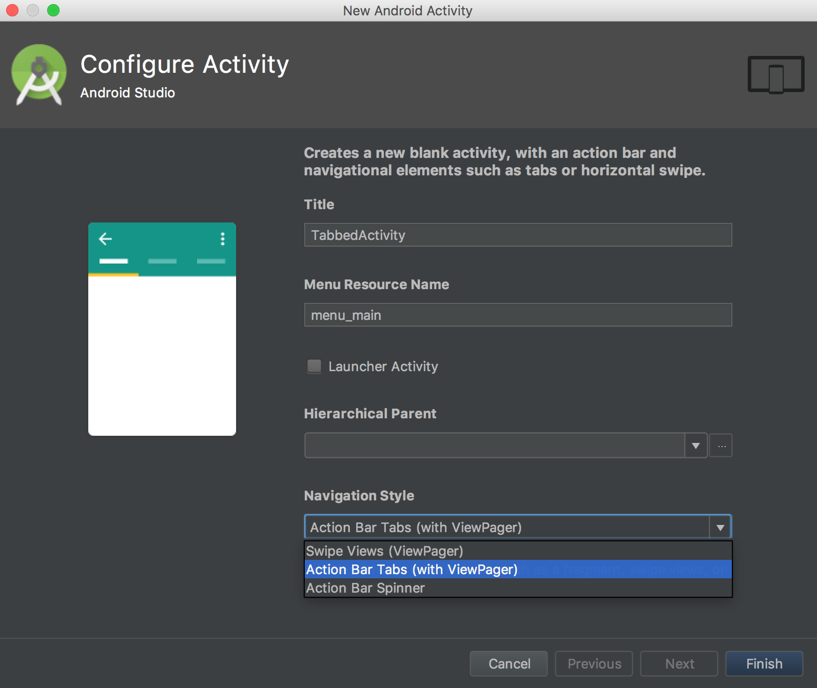
Android Studio now has a Template on how to use a TabLayout with TabItem setup in an XML layout. Create all needed files with "New > Activity > Tabbed Activity" and choose "Action Bar Tabs(with ViewPager)" as shown in the screenshot:

Configure Tabbed Activity Template in Android Studio

If you want to adjust the look of the TabItem without a custom view: use white vector assets as tab android:icon and tint them with a selector (providing different colors based on android:state_selected)

The color of the line under the currently selected tab is set as app:tabIndicatorColor on tag TabLayout.

It took me a while to get it to work, so the complete steps turned into such a long answer that I don't want to copy them here. You can find my more detailed answer with full code at:

https://mcmap.net/q/428046/-android-how-to-change-android-fillcolor-with-selector-in-one-vector-drawable-xml

Deadhead answered 2/4, 2018 at 0:33 Comment(1)
It seems that you can't select "Navigation Style" anymore. The current template doesn't contain "TabItem". I've been searching for hours how to use it because I hoped I could just put my fragments into the TabItems and do it without any adapter... :/Mutinous
A
0

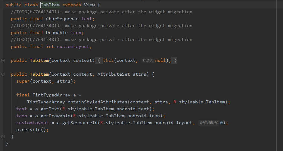
enter image description here

please see com.google.android.material.tabs.TabItem class it accepts icon text from attributes, but seems like you will need to add Tags on runtime.

Autrey answered 6/10, 2020 at 8:26 Comment(0)

© 2022 - 2024 — McMap. All rights reserved.