How to achieve a "mini" select style using Bootstrap (or straight CSS)?
Asked Answered
O

6

36

I'm using Bootstrap's btn-mini class for "mini" buttons and am looking for something analogous to create a "mini" select element, where the select button (i.e. the part you click to show the list of options, not the list of options itself) is the same size and style as a mini button.

When I apply the btn-mini class to a select element, the font style of the select button is the same size as a mini button, but the size of the select button itself is unchanged from the default size.

Is there a different Bootstrap class I should use? Or another way to do it?

P.S. I'm working on OS X Chrome, but naturally hope there is a cross-browser compatible solution.

Overarm answered 27/8, 2012 at 20:30 Comment(6)
if you want to shrink a select menu, you need only adjust the font-size, and perhaps add a bit of padding to make it more legibleMartinmartina
@Martinmartina -- that doesn't seem to be enough. The Bootstrap CSS class btn-mini includes a font-size adjustment. When applied to a select, the class makes the font size smaller, but without shrinking the box size down.Overarm
that's because .btn-mini also includes rules for line-height and padding. .btn-mini wasn't designed to be used with select elements. You're better off making your own class. See this demo to see what I'm talking about: jsfiddle.net/jackwanders/NQPBWMartinmartina
Copy the css and HTML into your question, and I'm sure someone will be along briefly with the answer.Stickybeak
@Martinmartina -- hmmm, the select box shrinks to the size of the font in the fiddle, but not with Bootstrap. Seems like Bootstrap is fixing the height of selects regardless of the font size...Overarm
Ok, got it. Bootstrap's CSS indeed sets both the height and line-height of selects in various places. So explicitly setting both to what I want works.Overarm
B
33

HTML

<select class="btn btn-mini">
    <!-- options -->
</select>
<span class="caret"></span>

CSS

select.btn-mini {
    height: auto;
    line-height: 14px;
}

/* this is optional (see below) */
select.btn {
    -webkit-appearance: button;
       -moz-appearance: button;
            appearance: button;
    padding-right: 16px;
}

select.btn-mini + .caret {
    margin-left: -20px;
    margin-top: 9px;
}

The last 2 rules are optional, it will make <select> look like <button>, I've also added a caret to it. See this fiddle.

Berberine answered 28/8, 2012 at 12:50 Comment(4)
That's nice! Changing the appearance to a button, together with the application of the new select.btn-mini rule is what makes it look consistent. Now, for the caret, any tips on how to do that?Overarm
This is awesome and should be included as part of the default Bootstrap. Thank you!Ivett
Just checked this on Firefox (20-something) on a MacBook Pro. What I see in the JS Fiddle is a select with two drop-down triangles (caret). Nice concept, though, just seems a bit odd. Must be my machine.Mexican
@Mexican Looks like -moz-appearance has no effect on Firefox 20 (and probably earlier). Non-standard properties are evil after all. I will think how to modify this answer.Berberine
D
62

Just in case any Bootstrap 3 users come across this old question, here's the BS3 way:

<select class="form-control input-lg"></select>
<select class="form-control"></select>
<select class="form-control input-sm"></select>

<input class="form-control input-lg">
<input class="form-control">
<input class="form-control input-sm">

There is no input-xs, though, so you'd have to make that yourself if you wanted smaller.

.input-xs, select.input-xs {
  height: 20px;
  line-height: 20px;
}
Drought answered 19/12, 2013 at 21:57 Comment(1)
Doesnt work if select size > 1 for this case what it should do is reduce the text size and padding.Maratha
B
33

HTML

<select class="btn btn-mini">
    <!-- options -->
</select>
<span class="caret"></span>

CSS

select.btn-mini {
    height: auto;
    line-height: 14px;
}

/* this is optional (see below) */
select.btn {
    -webkit-appearance: button;
       -moz-appearance: button;
            appearance: button;
    padding-right: 16px;
}

select.btn-mini + .caret {
    margin-left: -20px;
    margin-top: 9px;
}

The last 2 rules are optional, it will make <select> look like <button>, I've also added a caret to it. See this fiddle.

Berberine answered 28/8, 2012 at 12:50 Comment(4)
That's nice! Changing the appearance to a button, together with the application of the new select.btn-mini rule is what makes it look consistent. Now, for the caret, any tips on how to do that?Overarm
This is awesome and should be included as part of the default Bootstrap. Thank you!Ivett
Just checked this on Firefox (20-something) on a MacBook Pro. What I see in the JS Fiddle is a select with two drop-down triangles (caret). Nice concept, though, just seems a bit odd. Must be my machine.Mexican
@Mexican Looks like -moz-appearance has no effect on Firefox 20 (and probably earlier). Non-standard properties are evil after all. I will think how to modify this answer.Berberine
P
12

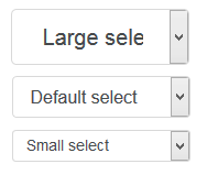
For Bootstrap 4, to set height we can use form-control-sm class with form-control.

<select class="form-control form-control-lg">
  <option>Large select</option>
</select>
<select class="form-control">
  <option>Default select</option>
</select>
<select class="form-control form-control-sm">
  <option>Small select</option>
</select>

enter image description here

And to set width of these we have to use grid column classes like .col-sm-*, .col-md-*, .col-lg-*, etc.

So put the select code in:

<div class="row">
  <div class="col-md-3">
    ... select tag code ...
  </div>
</div>

and it will look like this:

enter image description here

You can call the last one a "mini" select element.

Parrakeet answered 17/8, 2017 at 12:47 Comment(1)
ok, tested it: <select class="custom-select custom-select-sm"> does work as well. Awesome!Constructionist
O
2

This is not a final answer, but I wanted to share what I've gotten so far for anyone else curious about doing this.

As suggested by jackwanders, I've gone ahead and created a custom CSS class:

.select-mini {
  font-size: 11px;
  height: 20px;
  width: 100px;
}

This font-size and height rules more or less get the select box to be the same size as a mini button, but the text isn't quite aligned in the same way (it's slightly shifted up). Note you need to use height not line-height to override a height rule for select elements that Bootstrap sets elsewhere. (The width rule is just to change the widget and can be whatever you want.)

My CSS-fu isn't good enough to quickly make the mini select look fully consistent with the mini buttons, and from what I can see select's behave oddly when it comes to CSS anyhow, but hopefully this will be helpful as a start to others. Meanwhile, still open to better answers!

Overarm answered 28/8, 2012 at 12:42 Comment(0)
F
0

Based on btn-xs class I've prepared this:

.input-xs{
    height: 20px;
    line-height: 1.5;
    font-size: 12px;
    padding: 1px 5px;
    border-radius: 3px;
}

Note that width is not limited!

Please check this fiddle to see it in action.

Footle answered 3/3, 2017 at 11:28 Comment(0)
S
0

Pavlo answer is better. But when mouse cursor is over caret click doenst` work. Just one thing must be added into caret class to fix it:

select.btn-mini + .caret {
    margin-left: -14px;
    margin-top: 19px;
	pointer-events: none;
}
Spark answered 25/2, 2018 at 13:20 Comment(0)

© 2022 - 2024 — McMap. All rights reserved.