Padding-bottom/top in flexbox layout
Asked Answered
N

3

79

I have a flexbox layout containing two items. One of them uses padding-bottom :

#flexBox {
  border: 1px solid red;
  width: 50%;
  margin: 0 auto;
  padding: 1em;
  display: flex;
  flex-direction: column;
}
#text {
  border: 1px solid green;
  padding: .5em;
}
#padding {
  margin: 1em 0;
  border: 1px solid blue;
  padding-bottom: 56.25%; /* intrinsic aspect ratio */
  height: 0;
}
<div id='flexBox'>
  <div id='padding'></div>
  <div id='text'>Some text</div>
</div>

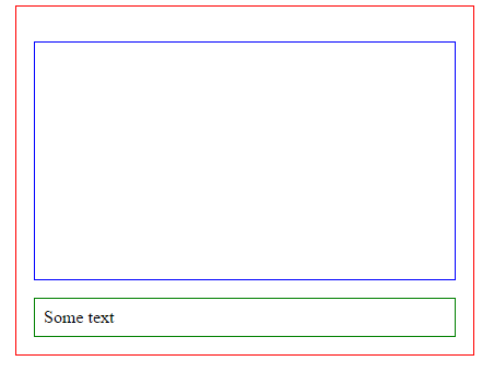
The blue element maintains its aspect ratio according to its width when the page is resized. This works with Chrome and IE and looks like :

padding-bottom in chrome and IE on flexbox layout

However, in Firefox and Edge, I get the following (it's ignoring the padding on the blue box, which is what maintains the aspect ratio):

padding-bottom in Firefox on flexbox layout

I'm too new to flexbox to really understand if this should or shouldn't work. The whole point of flexbox is to resize things, but I'm not sure why it is ignoring the intrinsic padding, and putting absolute sizes on the blue element.

I guess ultimately I'm not even sure if Firefox or Chrome is doing the correct thing! Can any Firefox flexbox experts help?

Noncontributory answered 18/5, 2014 at 2:22 Comment(1)
The above explanations were very helpful. For further context and explanation, I recommend Smashing Magazine's "Making Embedded Content Work In A Responsive iFrame" (smashingmagazine.com/2014/02/…). This article gave clear, concise context for why this padding and div wrapper solution works.Laurencelaurene
I
106

Update September 2020

Firefox and edge have implemented the behaviour from the specs and margin + padding for flex elements are both calculated according to the width of the containing block.
Just like block elements.

Update February 2018

Firefox and edge have agreed to change their behaviour on top, bottom margin and padding for flex (and grid) items :

[...] e.g. left/right/top/bottom percentages all resolve against their containing block’s width in horizontal writing modes. [source]

This is not yet implemented (tested on FF 58.0.2).

Update April 2016

(still valid in may 2017)

The specs have been updated to:

Percentage margins and paddings on flex items can be resolved against either:

  • their own axis (left/right percentages resolve against width, top/bottom resolve against height), or,
  • the inline axis (left/right/top/bottom percentages all resolve against width)

source: CSS Flexible Box Layout Module Level 1

This means that chrome IE FF and Edge (even if they don't have the same behaviour) follow the specs recommendation.

Specs also say:

Authors should avoid using percentages in paddings or margins on flex items entirely, as they will get different behavior in different browsers. [source]


Workaround

You can wrap the first child of the flex container in an other element and put the padding-bottom on the second child :

#flexBox {
  border: 1px solid red;
  width: 50%;
  margin: 0 auto;
  padding: 1em;
  display: flex;
  flex-direction: column;
}
#text {
  border: 1px solid green;
  padding: .5em;
}
#padding {
  margin: 1em 0;
  border: 1px solid blue;
}
#padding > div {
  padding-bottom: 56.25%; /* intrinsic aspect ratio */
}
<div id='flexBox'>
  <div id='padding'><div></div></div>
  <div id='text'>Some text</div>
</div>

I tested this in modern browsers (IE, chrome, FF and Edge) and they all have the same behaviour. As the configuration of the 2nd child is the "same as usual", I suppose that older browsers (that also support flexbox layout module) will render the same layout.


Previous answer

According to the specs, Firefox has the right behaviour

Explanation

Unlike block items which calculate their % margin/padding according to the containers width, on flex items:

Percentage margins and paddings on flex items are always resolved against their respective dimensions; unlike blocks, they do not always resolve against the inline dimension of their containing block.

source dev.w3.org

This means that padding-bottom/top and margin-bottom/top are calculated according to the height of the container and not the width like in non-flexbox layouts.

As you have not specified any height on the parent flex item, the bottom padding of the child is supposed to be 0px.

Here is a fiddle with a fixed height on the parent that shows that padding bottom is calculated according to the height of the display:flex; container.

Intramundane answered 20/5, 2014 at 7:58 Comment(9)
@Intramundane Hi I'm new to flex as well and just noticed this. Just to clarify, does Chrome / IE have the incorrect behaviour? This makes using percents with Padding and Margin completely useless with flex if this is the case!Laster
@Chowza that is exacltly what this answer explains. There are workarounds though as my answer and OrganicPanda's answer explain.Intramundane
@Intramundane thanks I was just getting clarification. However OrganicPanda's answer isn't good enough for me because I can't be making pseudo elements every time I want to use a padding or margin with Flex.Laster
For more information about this bug on Firefox, it's being dealt with here and apparently classified as INVALID, however it seems that the CSS spec has been updated to allow the behaviour many of us were looking for. We just need to make sure to ask questions now ;)Exuberate
@Exuberate thx for pointing out the specs change. I'll update this answer accordingly. Still I don't know wether this can be considered as a "bug on firefox" as FF still follows the specs.Intramundane
The current CSSWG draft states: "left/right/top/bottom percentages all resolve against their containing block’s width"Quintonquintuple
In this issue Edge & FF have agreed (around jan 2018) to go with the width/Blink behavior, and are going to implement it. +1Quintonquintuple
Apologies for necroing an old thread, but I wanted to note that the last part about flex items is no longer the case per the latest version of the specs.Ilana
@AleksandrH I have added an update to the answer. As both FF and edge have implemented the same behaviour. I will leave this answer here for reference.Intramundane
N
37

The accepted answer is correct but I improved on the solution by using a pseudo-element instead of adding a new element in to the HTML.

Example: http://jsfiddle.net/4q5c4ept/

HTML:

<div id='mainFlexbox'>
  <div id='videoPlaceholder'>
    <iframe id='catsVideo' src="//www.youtube.com/embed/tntOCGkgt98?showinfo=0" frameborder="0" allowfullscreen></iframe>
  </div>
  <div id='pnlText'>That's cool! This text is underneath the video in the HTML but above the video because of 'column-reverse' flex-direction.    </div>
</div>

CSS:

#mainFlexbox {
  border: 1px solid red;
  width: 50%;
  margin: 0 auto;
  padding: 1em;
  display: flex;
  flex-direction: column-reverse;
}
#pnlText {
  border: 1px solid green;
  padding: .5em;
}
#videoPlaceholder {
  position: relative;
  margin: 1em 0;
  border: 1px solid blue;
}
#videoPlaceholder::after {
  content: '';
  display: block;
  /* intrinsic aspect ratio */
  padding-bottom: 56.25%;
  height: 0;
}
#catsVideo {
  position: absolute;
  top: 0;
  left: 0;
  width: 100%;
  height: 100%;
}
Nook answered 21/1, 2015 at 20:42 Comment(2)
That's a very clever and non-destructive workaround. In my opinion it is also more advantageous over the previous suggestion.Exuberate
Perfect solution! Life saver.Estranged
Q
-3

I used vh instead of % worked perfectly in Safari, Firefox & Edge

Quadri answered 20/3, 2016 at 20:28 Comment(1)
vh is a viewport unit and not relative to the element or its parent. It will work in a situation where your element should be sized relative to the viewport, but not in general (and not in regards to this question).Inland

© 2022 - 2024 — McMap. All rights reserved.