Voronoi diagram in Manhattan metric
Asked Answered
T

2

6

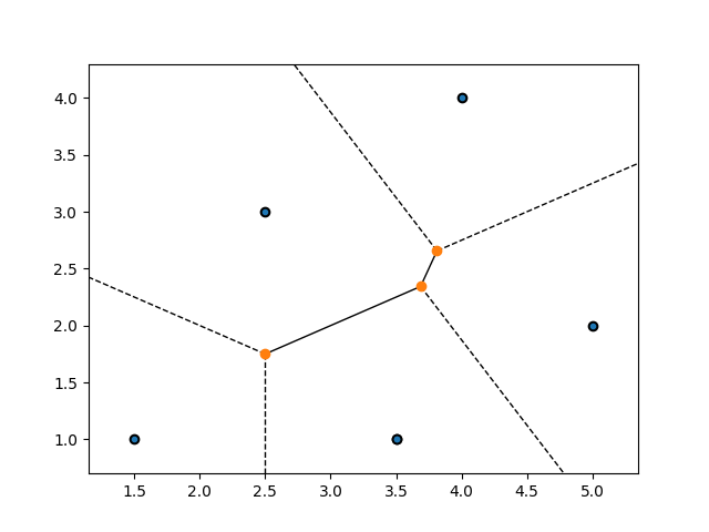
I am using scipy.spatial for visualizations of Voronoi diagrams. However, the distance metric that is used here is Euclidean (L2). I am looking for a way of Manhattan (L1) metric on my Voronoi diagram. Is there an easy (more or less) way of doing that?

import numpy as np
import matplotlib.pyplot as plt

points = np.array([[1.5, 1.], [3.5, 1.], [5., 2.], [2.5, 3.], [3.5, 1.], [4., 4.]])
    
from scipy.spatial import Voronoi, voronoi_plot_2d
vor = Voronoi(points)

fig = plt.figure()
ax = fig.add_subplot('111')
ax.plot(points[:, 0], points[:, 1], 'o', color='k')
ax.set_xlim([-1, 9])
ax.set_ylim([-1, 9])
voronoi_plot_2d(vor, ax)

Basically I'd like to get something similar but in L1 metric.

enter image description here

I have found the scipy.spatial.distance.cityblock that can handle the metric of interest but not entirely sure how can I implement it so that it works?

Tigress answered 12/6, 2021 at 15:30 Comment(3)
There is this python implementation of the Manhattan Voronoi: github.com/bobbysoon/TaxiVoronoi . I didn't check if/how it works, but maybe it'll help you. (I found it through this SO answer: stackoverflow.com/a/31623208)Enterotomy
Yeah I wasn't able to get that to work.Tigress
@Tigress wondering if the solution below worked for you?Polychasium
U
6

I created a github repo containing a Python package called voronoiz that includes the functions voronoi_l1 (for computing the polygons of an L1 Voronoi diagram) and voronoi_grid (for computing an image of the Voronoi diagram for any distance metric supported by scipy.spatial.cdist).

The implementations use brute-force, O(n²) algorithms, so it probably won't work well if you use it with millions of points, but for a small to moderate number of points, you can use it to make nice plots.

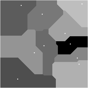
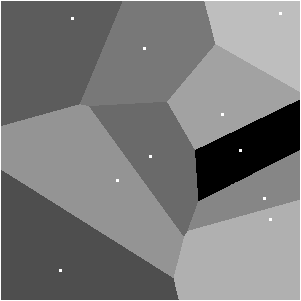
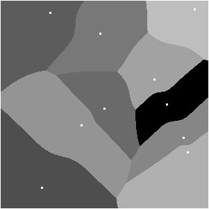
For example, these animations of a Voronoi diagram for a set of 10 points, one of which moves around in a circle, are made with voronoi_grid combined with write_apng from the numpngw library:

L1 metric:

city block metric animation

Minkowksi metric, p=2 (i.e. standard Euclidean metric):

minkowksi p=2 metric animation

Minkowski metric, p=4:

minkowski p=4 metric animation

Here's the script that generates the animations:

import numpy as np
from voronoiz import voronoi_grid
from numpngw import write_apng


xmin = 0
xmax = 5
ymin = 0
ymax = 5

points = np.array([[0.00, 0.00],
                   [1.00, 4.51],
                   [1.20, 0.30],
                   [2.50, 2.60],
                   [2.40, 0.80],
                   [4.40, 3.30],
                   [1.95, 3.00],
                   [3.71, 1.90],
                   [4.50, 3.66],
                   [4.67, 0.21]])

gridsize = 299

for kwargs in [dict(metric='cityblock'),
               dict(metric='minkowski', p=2),
               dict(metric='minkowski', p=4)]:
    imgs = []
    for theta in np.linspace(0, 2*np.pi, 250, endpoint=False):
        # points[0] will travel about a circle.
        points[0] = 2.5 + 1.5*np.array([np.cos(theta), np.sin(theta)])
        img = voronoi_grid(points, xmin, xmax, ymin, ymax,
                           gridsize=(gridsize, gridsize),
                           **kwargs)
        img = (160//(len(points)+1)*img + 64).astype(np.uint8)
        img[img == 64] = 0
        for x, y in points:
            i = int(gridsize*(x - xmin)/(xmax - xmin))
            j = int(gridsize*(y - ymin)/(ymax - ymin))
            img[j-1:j+2, i-1:i+2] = 255
        img = np.pad(img, pad_width=1, mode='constant', constant_values=255)
        imgs.append(img)

    tag = '_'.join(f"{key}_{value}" for key, value in kwargs.items())
    write_apng(f'animation_{tag}.png', imgs, delay=100)
Umpteen answered 20/10, 2021 at 17:3 Comment(1)
Sweet! I believe it works.Tigress
P
2

If visualisation and computation of areas are your only requirements you can use this pip library called mcvoronoi we did a while back. This is based on monte-carlo sampling. I added an option to change the distance metric for this answer. The updated version (with distance metric option) is not published on pip yet, but you can use the github master branch. The usage is shown below:

  • Clone the repository in your current directory
  • Run python example.py

The example.py consists of this basic line:

lat_lon_area, mean_percentage_error = voronoi_area(points,voronoi_plot_enabled=True, NUM_COLORS=5, metric='manhattan')

The images are saved as shown below:

You can of course make them super crisp by increasing the number of points in sampling. An error plot showing the error in area calculation is generated as well. image

You might want to use more colors but if you have a sufficiently large number of regions, slightly more than 4 colors are usually enough.

Polychasium answered 24/6, 2021 at 14:25 Comment(0)

© 2022 - 2024 — McMap. All rights reserved.