The issue you're experiencing is probably because your spectra are not zero-centered; their RMS value looks to be about 100 in whichever units you're plotting, instead of 0. The reason this is an issue is because numpy.correlate works by "sliding" imag_data over temp_data to get their dot product at each possible offset between the two series. (See the wikipedia on cross-correlation to understand the operation itself.) When using mode='same' to produce an output that is the same length as your first input (temp_data), NumPy has to "pad" a bunch of dummy values--zeroes--to the ends of imag_data in order to be able to calculate the dot products of all the shifted versions of the imag_data. When we have any non-zero offset between the spectra, some of the values in temp_data are being multiplied by those dummy zero-padding values instead of the values in image_data. If the values in the spectra were centered around zero (RMS=0), then this zero-padding would not impact our expectation of the dot product, but because these spectra have RMS values around 100 units, that dot product (our correlation) is largest when we lay the two spectra on top of one another with no offset.
Notice that your cross-correlation result looks like a triangular pulse, which is what you might expect from the cross-correlation of two square pulses (c.f. Convolution of a Rectangular "Pulse" With Itself. That's because your spectra, once padded, look like a step function from zero up to a pulse of slightly noisy values around 100. You can try convolving with mode='full' to see the entire response of the two spectra you're correlating, or, notice that with mode='valid' that you should only get one value in return, since your two spectra are the exact same length, so there is only one offset (zero!) where you can entirely line them up.
To sidestep this issue, you can try either subtracting away the RMS value of the spectra so that they are zero-centered, or manually padding the beginning and end of imag_data with (len(temp_data)/2-1) dummy values equal to np.sqrt(np.mean(imag_data**2))
Edit:
In response to your questions in the comments, I thought I'd include a graphic to make the point I'm trying to describe a little clearer.
Say we have two vectors of values, not entirely unlike your spectra, each with some large non-zero mean.
# Generate two noisy, but correlated series
t = np.linspace(0,250,250) # time domain from 0 to 250 steps
# signal_model = narrow_peak + gaussian_noise + constant
f = 10*np.exp(-((t-90)**2)/8) + np.random.randn(250) + 40
g = 10*np.exp(-((t-180)**2)/8) + np.random.randn(250) + 40
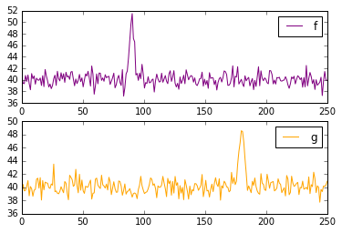
![Fake signals]()
f has a spike around t=90, and g has a spike around t=180. So we expect the correlation of g and f to have a spike around a lag of 90 timesteps (in the case of spectra, frequency bins instead of timesteps.)
But in order to get an output that is the same shape as our inputs, as in np.correlate(g,f,mode='same'), we have to "pad" f on either side with half its length in dummy values: np.correlate pads with zeroes. If we don't pad f (as in np.correlate(g,f,mode='valid')), we will only get one value in return (the correlation with zero offset), because f and g are the same length, and there is no room to shift one of the signals relative to the other.
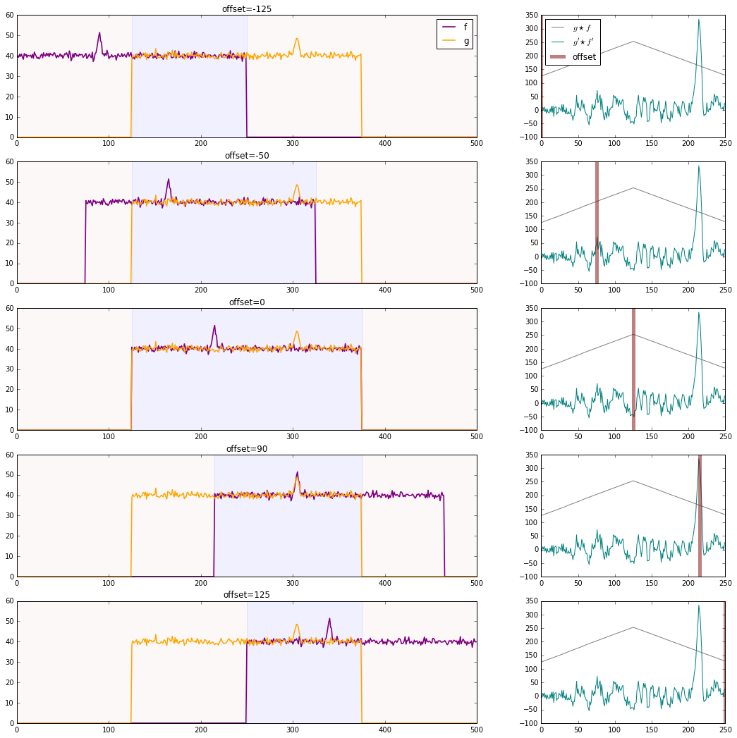
When you calculate the correlation of g and f after that padding, you find that it peaks when the non-zero portion of signals aligns completely, that is, when there is no offset between the original f and g. This is because the RMS value of the signals is so much higher than zero--the size of the overlap of f and g depends much more strongly on the number of elements overlapping at this high RMS level than on the relatively small fluctuations each function has around it. We can remove this large contribution to the correlation by subtracting the RMS level from each series. In the graph below, the gray line on the right shows the cross-correlation the two series before zero-centering, and the teal line shows the cross-correlation after. The gray line is, like your first attempt, triangular with the overlap of the two non-zero signals. The teal line better reflects the correlation between the fluctuation of the two signals, as we desired.
![Cross-Correlations]()
xcorr = np.correlate(g,f,'same')
xcorr_rms = np.correlate(g-40,f-40,'same')
fig, axes = plt.subplots(5,2,figsize=(18,18),gridspec_kw={'width_ratios':[5,2]})
for n, axis in enumerate(axes):
    offset = (0,75,125,215,250)[n]
    fp = np.pad(f,[offset,250-offset],mode='constant',constant_values=0.)
    gp = np.pad(g,[125,125],mode='constant',constant_values=0.)

    axis[0].plot(fp,color='purple',lw=1.65)
    axis[0].plot(gp,color='orange',lw=lw)
    axis[0].axvspan(max(125,offset),min(375,offset+250),color='blue',alpha=0.06)
    axis[0].axvspan(0,max(125,offset),color='brown',alpha=0.03)
    axis[0].axvspan(min(375,offset+250),500,color='brown',alpha=0.03)
    if n==0:
        axis[0].legend(['f','g'])
    axis[0].set_title('offset={}'.format(offset-125))


    axis[1].plot(xcorr/(40*40),color='gray')
    axis[1].plot(xcorr_rms,color='teal')
    axis[1].axvline(offset,-100,350,color='maroon',lw=5,alpha=0.5)
    if n == 0:
        axis[1].legend(["$g \star f$","$g' \star f'$","offset"],loc='upper left')

plt.show()


