backdrop-filter not working for nested elements in Chrome
Asked Answered
C

3

39

I have a div.outer and inside a div.inner, both with position: absolute; and backdrop-filter: blur(8px);.

https://jsbin.com/nihakiqocu/1/edit?html,css,output

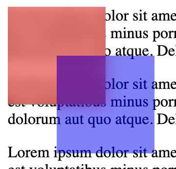
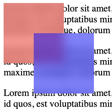
Safari (left) gives the desired result – both divs blur what's behind them.

Chrome (right), however, only applies the blur of div.outer:

SafariChrome

I have a solution: adding another div inside div.outer and moving backdrop-filter: blur(8px); to that new div.

However, I would appreciate a solution that doesn't require changing the DOM from the first jsbin. Also, does anybody know what is causing this – is it a Chrome bug?

https://jsbin.com/rasudijame/1/edit?html,css,output

PS: it works on iOS's Chrome, but not on Android's Chrome and also not on Mac OS's Chrome

Chur answered 2/4, 2020 at 17:54 Comment(7)
backdrop-filter has poor support: caniuse.Durant
Have you tried using the -webkit- prefix?Durant
Also, it works fine on iOS safari, chrome and Firefox.Durant
I am using both -webkit- and the normal version. Oddly, it works on iOS's Chrome, but not on Android's Chrome and also not on Mac OS's Chrome (all current versions, which should support backdrop-filter, according to caniuse)Chur
@TonaldDrump iOS chrome is Safari under the hood, that's why it works there.Landlocked
It's a tracked bug on Chrome, see: bugs.chromium.org/p/chromium/issues/detail?id=993971Landlocked
According to this chrome issue bugs.chromium.org/p/chromium/issues/detail?id=993644 (labelled as WontFix), Chrome behavior is apparently compliant with W3C spec. Safari (and Firefox as well for the matter) are deviating by overpassing this limitation. Tested on latest build for Chrome, Safari and Firefox (May 9 2023), and Chrome is the only one keeping this behavior.Weeden
F
42

Place the backdrop filter on css pseudo element. This allows nested backdrop filters. Also you can use z-index: -1; to position your backdrop behind your elemets

div {
  height: 100px;
  width: 100px;
}
.wrapper {
  position: absolute;
}
.outer, .inner {
  position: relative;
}
.outer::before {
  content: '';
  position: absolute;
  width: 100%;
  height: 100%;
  -webkit-backdrop-filter: blur(8px);
  backdrop-filter: blur(8px);
}
.outer {
  background: rgba(255, 0, 0, .5);
}
.inner::before {
  content: '';
  position: absolute;
  width: 100%;
  height: 100%;
  -webkit-backdrop-filter: blur(8px);
  backdrop-filter: blur(8px);
  
}
.inner {
  background: rgba(0, 0, 255, .5);
  top: 50px;
  left: 50px;
}
main {
  position: relative;
}
<main>
  <div class="wrapper">
    <div class="outer">
      <div class="inner"></div>
    </div>
  </div>

  <p>Lorem ipsum dolor sit amet, consectetur adipisicing elit. Accusamus in id quos, est voluptatibus minus porro sunt totam quod commodi odit maxime similique, dolorum aut quo atque. Deleniti, voluptas animi.</p>
  <p>Lorem ipsum dolor sit amet, consectetur adipisicing elit. Accusamus in id quos, est voluptatibus minus porro sunt totam quod commodi odit maxime similique, dolorum aut quo atque. Deleniti, voluptas animi.</p>
  <p>Lorem ipsum dolor sit amet, consectetur adipisicing elit. Accusamus in id quos, est voluptatibus minus porro sunt totam quod commodi odit maxime similique, dolorum aut quo atque. Deleniti, voluptas animi.</p>
  <p>Lorem ipsum dolor sit amet, consectetur adipisicing elit. Accusamus in id quos, est voluptatibus minus porro sunt totam quod commodi odit maxime similique, dolorum aut quo atque. Deleniti, voluptas animi.</p>
  <p>Lorem ipsum dolor sit amet, consectetur adipisicing elit. Accusamus in id quos, est voluptatibus minus porro sunt totam quod commodi odit maxime similique, dolorum aut quo atque. Deleniti, voluptas animi.</p>
</main>

And here is codepen

Forsook answered 9/11, 2020 at 15:26 Comment(12)
If this doesn't work for anyone, I found the solution for me was reducing (or removing) the z-index of an element lower in the stack. No idea why but a glass layer (z 1000) didn't work with an earlier sibling (z 100), but reducing the sibling to z 10 fixed it.Embay
@MikeStopContinues can you explain please? I bumped into this issue!Eiland
Can you apply this to bootstrap dropdown menu? It is working in safari but not in chrome.Eiland
@Eiland It's been a long time since I tackled this issue, but I can say this: I now use two fixed headers, one for the filter effect, and one for the content. This seems to work for me. Something like: <header><div class="glass"/><nav /></header>. Make the header position: fixed, make the children position: absolute, and you should have no problem making everything work.Embay
@MikeStopContinues I fixed it .. all good :) Your answers helped man. Thank you.Eiland
I encountered similar issue on Chrome. Discovered that one of the parent elements has -webkit-animation-fill-mode: both. Without it it worked as supposed. Maybe this can help someone.Underworld
I had this issue and it took very long to fix. In my case there were two culprits: opacity and drop-shadow. Setting opacity breaks the blur effect so you should (just like in this answer) use rgba(r, g, b, *opacity here*). Second one is drop-shadow. If the element I wanted to blur also had drop-shadow it adds shadow but blur disappears. I hope this helps.Crowe
@MikeStopContinues thanks! That was my issue as well - I had a parent with a blurred backdrop, but an absolutely positioned child then could not have its own backdrop-filter effects.Titillate
took me some time to get my head around this. but now i only apply the psuedo styles to the parent element. its child elements can have normal backdrop-filterSnooty
@alpersunter's comment was all I needed. Move opacity from the opacity property into the background property's rgba value.Tamaru
mine did not work unless I applied the styles to both ::before AND ::after. I have no idea why.Mahone
For anyone reading this, elaborating on the answer by KawaLo, and combining this with the Tailwind CSS, one can just use @apply backdrop-filter-[your-value] instead of the last two lines of the custom ::beforeJudaica
W
16

This answer completes the one from @Michał (which worked for me). Short answer: Chrome voluntarily prevents nested backdrop filters from stacking.

Why Chrome behaves this way

A very similar issue has been reported on chromium bugs tracker. Quoting an answer to this bug report:

The backdrop-filter will filter everything behind it, up to the "Backdrop Root", which is formed by several triggers. One of those triggers is another backdrop-filter element.

So basically, when you add backdrop-filter to an element, it becomes the new backdrop root: nested backdrop filters will NOT apply to any of its ancestors, because they cannot "see" above the root.

<elem1>
  <!-- Here, backdrop filter will apply to elem1, -->
  <!-- as it is an ancestor of elem2 -->
  <elem2 style="backdrop-filter: ...">
    <!-- Here, backdrop filter will apply to elem2, -->
    <!-- but not elem1, as elem2 is now the new Backdrop root -->
    <elem3 style="backdrop-filter: ...">
    </elem3>
  </elem2>
</elem1>

Chrome actually follows a W3C recommendation (or so it seems). If you have the motivation, you can read the full reason why this behavior exist at this W3C draft.

Why the accepted answer works

The :before is a pseudo element, which means it has no child. Thus, even if it becomes a backdrop root, it will not block nested filters from applying to its ancestors.

Why it works on other browsers

As of May 2023, I was able to test this behavior on Chrome, Safari and Firefox. Only Chrome seems to follow this W3C draft, as elements were correctly blurred on Safari and Firefox. However, Safari and Firefox are deviating from spec according to the bug report answers.

Summary

If you want an element with a backdrop filter to allow nested backdrops (for example, a transparent nav-bar with a drop menu that both have a blur/transparent effect), you should apply the filter to a pseudo element, as @Michał suggested:

/* replace */
.parent {
  backdrop-filter: /*...*/;
}

/* with */
.parent::before {
    content: '';
    position: absolute;
    width: 100%;
    height: 100%;
    top: 0;
    left: 0;
    backdrop-filter: /*...*/;
    z-index: -1;
}

Note: you only need to to this if the parent container has nested elements with a backdrop filter set, not on "leaves" elements.

Weeden answered 9/5, 2023 at 8:7 Comment(1)
Thanks for this amazing explanation ! Real shame that this will never get fixed on Chromium browsers thoughDressy
I
6

Tailwind specific solution

The explanation is covered by above answers, but if anyone wants a quick copy-paste workaround for tailwind, here you go:

@layer utilities {
  /*
    Chromium browsers don't render nested backdrop filters.
    As a workaround, add 'before:' to the outer filter, along with 'before:backdrop-hack':

      <div class="before:backdrop-blur-md before:backdrop-hack>
        <div class="backdrop-blur-md"></div>
      </div>

    See https://stackoverflow.com/a/76207141.
  */
  .backdrop-hack {
    @apply absolute inset-0 -z-10;
  }
}

If applying a background color, you'll probably also want to prefix that in your markup with before:.

Irradiation answered 18/8, 2023 at 17:48 Comment(0)

© 2022 - 2024 — McMap. All rights reserved.