How to make a sticky footer in react?
Asked Answered
R

13

39

I've made a sticky footer higher-level component that wraps other components inside itself:

Footer.js

//this is a higher-order component that wraps other components placing them in footer

var style = {
    backgroundColor: "#F8F8F8",
    borderTop: "1px solid #E7E7E7",
    textAlign: "center",
    padding: "20px",
    position: "fixed",
    left: "0",
    bottom: "0",
    height: "60px",
    width: "100%",
};

const Footer = React.createClass({
    render: function() {
        return (
            <div style={style}>
                {this.props.children}
            </div>
        );
    }
});

export default Footer;

Usage:

<Footer><Button>test</Button></Footer>

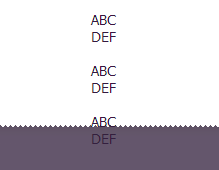
But it is hiding the contents of the page:

hiding contents footer

This looks like a common problem, so I searched a bit and found this issue, where is FlexBox is recommended for the sticky footer. But at this demo the footer is at the very bottom of the page, while I need the footer to be always displayed on the page and the content being scrolled inside the above area (like in SO chat). In addition to that, there is an advice to change all the other components with custom stylesheet rules. Is it possible to achieve what I need using styling only the footer component so the code will remain modular?

Renshaw answered 9/11, 2016 at 20:8 Comment(0)
C
69

Here's an idea (sandbox example link).

Include a phantom div in your footer component that represents the footer's position that other dom elements will respect (i.e. affecting page flow by not being position: 'fixed';).

var style = {
    backgroundColor: "#F8F8F8",
    borderTop: "1px solid #E7E7E7",
    textAlign: "center",
    padding: "20px",
    position: "fixed",
    left: "0",
    bottom: "0",
    height: "60px",
    width: "100%",
}

var phantom = {
  display: 'block',
  padding: '20px',
  height: '60px',
  width: '100%',
}

function Footer({ children }) {
    return (
        <div>
            <div style={phantom} />
            <div style={style}>
                { children }
            </div>
        </div>
    )
}

export default Footer
Chromate answered 12/11, 2016 at 22:46 Comment(1)
This works even in 2020, but it does not solve the problem for if your content above the footer is small. The footer will not stick to the bottom if you have say only 50px of header + body.Kimberleykimberli
L
23

Much easier idea (following the trend), i imported both bootstrap and reactstrap, used the bootstrap fixed bottom class and workaround with that like this.

class AppFooter extends Component{
render() {
    return(
        <div className="fixed-bottom">  
            <Navbar color="dark" dark>
                <Container>
                    <NavbarBrand>Footer</NavbarBrand>
                </Container>
            </Navbar>
        </div>
    )
}
Loring answered 29/11, 2018 at 21:43 Comment(2)
Works perfectly in IE 11, Chrome 74, and Edge 14. Using create-react-app version 3.0.1, React v16.8.6, reactstrap v8.0.0, and bootstrap v4.3.1Recountal
another way is to put height: 100vh on a container class and make your footer below that containerLoring
L
10

There is a much simpler way. I am creating a portfolio site with React, and some of my pages are not very long, so in some devices, like kindle fire hd for example, the footer would not stick to the bottom. And of course to set this up in the traditional fashion with would not work, because the would be wrapped in there. And we don't want that. So this is what I did:

In App.js:

import React, { Component } from 'react';
import {Header} from './components/Header';
import {Main} from './components/Main';
import {Footer} from './components/Footer';

class App extends Component {
    render() {
        return (
            <div className="App Site">
                <div className="Site-content">
                    <div className="App-header">
                        <Header />
                    </div>
                    <div className="main">
                        <Main />
                    </div>
                </div>
                <Footer />
            </div>
        );
    }
}

export default App;

And then in _sticky-footer.css (I use POSTCSS):

:root {
    --space: 1.5em 0;
    --space: 2em 0;
}

.Site {
    display: flex;
    flex-direction: column;
    min-height: 100vh;
}

.Site-content {
    flex: 1 0 auto;
    padding: var(--space) var(--space) 0;
    width: 100%;
}

.Site-content:after {
    content: '\00a0';
    display: block;
    margin-top: var(--space);
    height: 0;
    visibility: hidden;
}

The original solution for this was created by Philip Walton: https://philipwalton.github.io/solved-by-flexbox/demos/sticky-footer/

Louannlouanna answered 4/10, 2017 at 1:14 Comment(0)
P
3

You can fix this by adding margin-bottom: 60px; to the body of your website. With the 60px being the height of your footer.

Parament answered 9/11, 2016 at 20:40 Comment(3)
Many thanks, but that won't help with React, unfortunately.Renshaw
no, it does work. It is exactly how I solved the problem. You can see it here - frazerk.net/resume.htmlParton
@FrazerKirkman what you have is not what OP is asking. OP needs sticky div container, yours is at the bottom/non-sticky.Larrup
P
3

.App will be the main component you load to your Root.

Assume that the footer is the last child of .App in the document flow

.App {
  height: 100vh;
  display: flex;
  flex-direction: column;
}

footer {
  margin-top: auto;
}
Pruter answered 27/6, 2019 at 5:26 Comment(0)
G
3
.footer{
width: 100%;
position: fixed;
bottom: 0;
}

This should do the trick! Cheers! (:

Glary answered 21/12, 2020 at 10:23 Comment(0)
L
1

I found that if you wrap your 'footer' component in a standard html

<footer>

tag, it pretty much sorts out all of the positioning for you

Luncheonette answered 27/6, 2020 at 12:50 Comment(0)
L
0

I wanted to share this solution that worked. I cribbed this from https://react.semantic-ui.com/modules/sticky. Scroll to the bottom of this page and inspect the text 'This is the bottom' to see where I stole it. Its a site built on react so it should work for your situation.

Here it is:

{
  padding-top: 50vh;
}

Conceptually, this solution is creating negative space like jacoballenwood's phantom div to push the footer down to the bottom and stick it there. Just add it to your css style class for the footer and adjust the value to taste.

Layby answered 28/6, 2018 at 0:8 Comment(0)
S
0

Very late answer, but someone can find this useful. You can, instead of phantom style, set Toolbar. I have build some standard layout for the components, where {children} is component from the parent component - App.js. This is example:

import React from "react";
import { Route } from "react-router-dom";
import { makeStyles } from "@material-ui/core/styles";
import AppBar from "@material-ui/core/AppBar";
import CssBaseline from "@material-ui/core/CssBaseline";
import Toolbar from "@material-ui/core/Toolbar";

import Header from "../components/header";
import Footer from "../components/footer";
import SideBar from "../components/sidebar";

const useStyles = makeStyles((theme) => ({
  root: {
    display: "flex",
  },
  appBar: {
    zIndex: theme.zIndex.drawer + 1,
  },
  content: {
    flexGrow: 5,
    padding: theme.spacing(3),
  },
}));

const StandardLayout = ({ children }) => {
  const classes = useStyles();

  return (
    <div className={classes.root}>
      <CssBaseline />
      <AppBar position="fixed" className={classes.appBar}>
        <Route path="/" component={Header} />
      </AppBar>
      <SideBar />
      <main className={classes.content}>
        <Toolbar />
        <br />
        {children}
        <Toolbar/>
      </main>
      <AppBar className={classes.appBar}>        
        <Route path="/" component={Footer} />
      </AppBar>
    </div>
  );
};
export default StandardLayout;
Sonometer answered 4/8, 2020 at 7:10 Comment(0)
A
0

Its rule for me

<footer style={{position:"fixed",bottom:"0"}}>
Adjudge answered 4/2, 2022 at 9:41 Comment(0)
M
0

just make style for the root element

#root{
  min-height: 100vh;
  display: flex;
  flex-direction: column;}

for footer element

.footer{
  margin-top:auto;
}
Martellato answered 25/7, 2023 at 13:44 Comment(0)
A
0

Using react-bootstrap, you can copy paste this directly:

import Container from 'react-bootstrap/Container';
import Nav from 'react-bootstrap/Nav';
import Navbar from 'react-bootstrap/Navbar';
import { Component } from 'react';

export default class MyFooter extends Component {
    render() {
        return (
            <div className="fixed-bottom">
                <Navbar color="dark" dark>
                    <Container>
                        <Navbar.Brand>Footer</Navbar.Brand>
                        <Nav className="me-auto">
                            <Nav.Link href="#">First</Nav.Link>
                            <Nav.Link href="#">Second</Nav.Link>
                        </Nav>
                    </Container>
                </Navbar>
            </div>
        )
    }
}

Anything extra needed can be customized in css. It looks like plenty of code because of the imports but it makes it easier to copy and see what was used.

Automobile answered 5/2 at 0:14 Comment(0)
C
-1

Try this html code:

/public/index.html

<html lang="en" class="h-100">

<body class="h-100">

  <div id="root" class="d-flex flex-column h-100"></div>
    ...

/src/App.js

<main role='main' className='flex-shrink-0'>

You can follow this template:

react-bootstrap-sticky-footer/public/index.html

react-bootstrap-sticky-footer/src/App.js

Cupcake answered 29/7, 2022 at 16:9 Comment(0)

© 2022 - 2024 — McMap. All rights reserved.