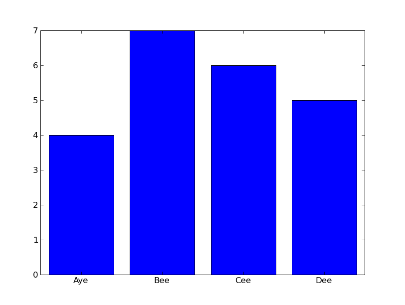
I am trying to create bar graphs of letter frequency in Python. I thought the best way to accomplish this would be matplotlib, but I have been unable to decipher the documentation. Is it possible to label the bars of a matplotlib.pyplot.hist plot with one letter per bar, instead of a numerical axis? I think it must be, but I have not used matplotlib before.
This is the sort of graph I'm after, rendered as text:
|
|    *
|    *  *
| *  *  *
+----------
  A  B  C


x = xrange(4)andy = [4,7,6,5]. – Forage