WPF: Aligning the base line of a Label and its TextBox
Asked Answered
C

6

41

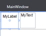
Let's say I have a simple TextBox next to a Label:

<StackPanel>
    <StackPanel Orientation="Horizontal">
        <Label Margin="3">MyLabel</Label>
        <TextBox Margin="3" Width="100">MyText</TextBox>
    </StackPanel>
    ...
</StackPanel>

This yields the following result:

result

As you can see, the base lines of MyLabel and MyText are not aligned, which looks ugly. Of course, I could start playing around with the margins until they match up, but since this is such a common requirement I'm sure that WPF provides a much easier and more elegant solution, which I just haven't found yet...

Coit answered 14/6, 2010 at 17:5 Comment(0)
H
44

This behaviour is, I think, caused by the fact that the TextBox defaults to a vertical alignment of Stretch, which causes it to fill the available space and have the extra couple of pixels under the text. If you use this instead:

<StackPanel>
    <StackPanel Orientation="Horizontal">
        <Label >MyLabel</Label>
        <TextBox VerticalAlignment="Center" Width="100">MyText</TextBox>
    </StackPanel>
</StackPanel>

... you should see a cleaner result.

Hurlburt answered 14/6, 2010 at 17:20 Comment(0)
P
25

What do you think?

alt text

<StackPanel Orientation="Horizontal">
        <Label Margin="3" VerticalContentAlignment="Center">MyLabel</Label>
        <TextBox Margin="3" VerticalContentAlignment="Center" Width="100">MyText</TextBox>
 </StackPanel>
Pennsylvania answered 14/6, 2010 at 17:19 Comment(1)
+1, looks nice, thanks. I've accepted Dan's answer as correct, though, since his solution keeps the TextBox's box at it's "natural" height instead of stretching it.Coit
K
5

I achieved that look in Kaxaml with:

<StackPanel Orientation="Horizontal">
  <Label Margin="3" VerticalAlignment="Center">MyLabel</Label>
  <TextBox Margin="3" Width="100" VerticalAlignment="Center">MyText</TextBox>
</StackPanel>
Kleeman answered 14/6, 2010 at 17:21 Comment(0)
T
4

I know that this is an old answer, but for here's an example for those who seek another way, where you don't need to rely on a fixed textbox width:

Instead of StackPanel, use a DockPanel and .Dock.

This proves to be very handy when used inside a Grid.

<DockPanel Grid.Column="2" Grid.Row="2">
     <Label Content="SomeTitle:" DockPanel.Dock="Left"></Label>
     <TextBox x:Name="SomeValueTextBox" VerticalAlignment="Center" DockPanel.Dock="Right"></TextBox>
</DockPanel>

Result

Tilefish answered 31/1, 2018 at 14:31 Comment(0)
S
1

This question is not as trivial as it looks and the accepted answers lacks details. If you try custom heights with the controls, you will see issues.

First, this is the correct implementation as answered by User7116.

<StackPanel Orientation="Horizontal">
  <Label Margin="3" VerticalAlignment="Center">MyLabel</Label>
  <TextBox Margin="3" Width="100" VerticalAlignment="Center">MyText</TextBox>
</StackPanel> 

The tricky part is that there two level of vertical alignments here so understand how the alignments works.

When we specify alignment for a control, we are telling it how to position itself in the parent container (See documentation). So when we specify VerticalAlignment="Center"> to the TextBox we are telling it that this TextBox should appear vertically centered in parent stackpanel.

Now the actual text inside that TextBox could also use vertical alignment within that TextBox! This is the 2nd level and actually quite tricky and is answered here.

If you experiment with setting the Label's height above to say 50 as well, you will see they will not align again. This is because Label is now taking larger area and its text inside that area is not vertical aligned so it doesn't look aligned again.

enter image description here

The code for above is:

    <StackPanel Orientation="Horizontal" VerticalAlignment="Center">
        <Label Margin="3" VerticalAlignment="Center" Height="50">MyLabel</Label>
         <TextBox Margin="3" VerticalAlignment="Center" Width="50" Height="50">MyText</TextBox>
    </StackPanel>

Luckily when control height is default (like label control), it's just tall enough to contain the text so the inside alignment doesn't matter. But it comes into play if someone is setting custom heights for these controls and its better to understand how this works.

Shawannashawl answered 17/6, 2020 at 21:18 Comment(0)
G
0

Here is how you can do this:

     <StackPanel Orientation="Horizontal" HorizontalAlignment="Center" Margin="2">
      <Label FontSize="20" Margin="3" FontWeight="Bold">Username :</Label>
      <TextBox Width="200" Margin="3" Height="40" Name="txtUsername" />
  </StackPanel>
  <StackPanel Orientation="Horizontal" HorizontalAlignment="Center" Margin="2">
      <Label FontSize="20" Margin="3" FontWeight="Bold">Password :</Label>
      <TextBox Width="200" Margin="3" Height="40" Name="txtPasswrod" />
  </StackPanel>
Gestate answered 24/1 at 10:43 Comment(0)

© 2022 - 2024 — McMap. All rights reserved.