How to create android spinner without down triangle on the right side of the widget
Asked Answered
M

8

42

I have a screen where the user has many items to input so screen space is at a premium.

I want the look of the widget on the screen (before the user presses it) to be similar to an EditText or the left portion of the Spinner widget (without the normal down triangle) on the right side of the Spinner. Then when the user presses the widget, he/she will get the normal Spinner selection dialog.

Is there some Spinner style attribute I can change to accomplish this?

I have not been able to see code like this.

Thanks

Minardi answered 30/10, 2010 at 10:56 Comment(0)
S
40

One thing you can do is take Spinner's source code from android code base, together with related layouts and resources, and use them to create your own custom widget (probably you will only need to remove the arrow from the layout and tweak the code a little depending on your needs).

EDIT: You're right, following that post it was actually really simple :) You have to do two things. First, create a styles.xml file under res/values, open it and add the following:

<?xml version="1.0" encoding="utf-8"?>
<resources>
    <style parent="@android:style/Widget.Spinner" name="SpinnerAsEditText">
        <item name="android:background">@android:drawable/edit_text</item>
    </style>
</resources>

Next, in your layout, add the Spinner like this:

<Spinner style="@style/SpinnerAsEditText" anyOtherAttributeYouNeed="..."></Spinner>

That's it, now the spinner will look like a plain EditText, without that unuseful and annoying down arrow.

Swamper answered 30/10, 2010 at 16:23 Comment(3)
I was hoping for an easier way. I did find this post (groups.google.com/group/android-developers/browse_thread/thread/…), but I am still attempting to fully understand it. I get the impression that they are stating that all that is needed is to create a style which eliminates the down arrow and then apply that style. Will have to experiment.Minardi
My spinner is in menu it is itemWampler
If you prefer a runtime solution: categorySpinner.background = ContextCompat.getDrawable(this, R.drawable.abc_edit_text_material)Every
B
67

This is quite an old question, but I think still relevant, so here's my answer:

Simplest Method

lencinhaus answer is correct. It works, but it can be done in an even simpler way: Just add another background to it. The example below uses the standard Button background for a more homogeneous look-and-feel:

<Spinner
    android:id="@+id/my_spinner"
    android:layout_width="wrap_content"
    android:layout_height="wrap_content"
    android:prompt="@string/my_prompt" 
    android:background="@android:drawable/btn_default"
    />       

The syle used in the other answer does not more than applying a background to the widget. That can be done directly to the widget, saving the need for a new xml file. Of course, if you are going to apply a style to the spinner anyways, there's nothing wrong with that approach.

Why?

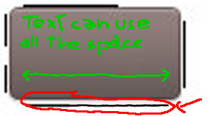
The key to understand how it works lies in the description of the 9-patch PNGs. The lines at the right and at the bottom are used for padding, i.e., to keep some space from being used by its content. In this case, the text inside. The standard Spinner background uses an image with an arrow at the right that is outside of the usable text area. See figure 1 below for an illustration:

Figure 1. Original Spinner bacground 9-patch PNG http://tinypic.com/images/404.gif
Figure 1. Original Spinner bacground 9-patch PNG.

Just removing the arrow is not enough since the padding remains there. You need to use a new 9-patch image with a decreased padding (see figure 2 for an example based on fig. 1) or use one of the precompiled 9-patch images without so much padding, such as the ones for EditText (@android:drawable/edit_text) or Button (@android:drawable/btn_default).

Figure 2. Modified Spinner bacground 9-patch PNG with reduced padding
Figure 2. Modified Spinner bacground 9-patch PNG with reduced padding.

Understanding this will allow you to create your own backgrounds for the Spinner (and, in fact, for any widget).

A better explanation of the 9-patch files can be found here

It's very easy to create the files with the draw9patch executable from the SDK (read about it here), but nothing prevents you to use Photoshop or Gimp instead. Remember, 9-patch PNGs are just plain PNGs! The only caveat is to make sure that you draw only to the outer lines of pixels and that the rest of the pixels are completely transparent. Antialiasing close to the border might yield unexpected results.

Behr answered 8/5, 2011 at 14:33 Comment(3)
if i could give you more points than one, i would, thanks for your help!Diann
I wish to upvote this answer multiple times. Thank you so much for the simplest solution!Dichloride
FYI, the "Figure 1" image is broken nowMarja
S
40

One thing you can do is take Spinner's source code from android code base, together with related layouts and resources, and use them to create your own custom widget (probably you will only need to remove the arrow from the layout and tweak the code a little depending on your needs).

EDIT: You're right, following that post it was actually really simple :) You have to do two things. First, create a styles.xml file under res/values, open it and add the following:

<?xml version="1.0" encoding="utf-8"?>
<resources>
    <style parent="@android:style/Widget.Spinner" name="SpinnerAsEditText">
        <item name="android:background">@android:drawable/edit_text</item>
    </style>
</resources>

Next, in your layout, add the Spinner like this:

<Spinner style="@style/SpinnerAsEditText" anyOtherAttributeYouNeed="..."></Spinner>

That's it, now the spinner will look like a plain EditText, without that unuseful and annoying down arrow.

Swamper answered 30/10, 2010 at 16:23 Comment(3)
I was hoping for an easier way. I did find this post (groups.google.com/group/android-developers/browse_thread/thread/…), but I am still attempting to fully understand it. I get the impression that they are stating that all that is needed is to create a style which eliminates the down arrow and then apply that style. Will have to experiment.Minardi
My spinner is in menu it is itemWampler
If you prefer a runtime solution: categorySpinner.background = ContextCompat.getDrawable(this, R.drawable.abc_edit_text_material)Every
V
15

I just arrived to this question, because my spinner was not showing the triangle indicator, now I understand why: I was setting the background to "white":

android:background="#FFFFFFFF"

This removes the triangle indicator (the spinner background image and padding stated by Aleadam).

For my problem, I solve it adding a parent LinearLayout just to set the background to "white".

Vaginectomy answered 22/8, 2013 at 6:46 Comment(0)
R
7

Give it a background, the arrow will disappear.

android:background="@drawable/bg"
Recitative answered 17/2, 2016 at 21:20 Comment(2)
what an answer - so ezCatbird
not working and copying the above answers not interesting at allTaco
B
3

I was having the same issue and changed the style to:

style="@style/Widget.AppCompat.Light.DropDownItem.Spinner"

and it worked.

How odd, Its located in DropDownItem.

While the one that have the bottom triangle is named the normal.

Cheers!

Burthen answered 12/6, 2014 at 17:43 Comment(1)
Didn't worked for me <Spinner android:id="@+id/planets_spinner" android:layout_width="match_parent" android:layout_height="wrap_content" style="@style/Widget.AppCompat.Light.DropDownItem.Spinner"/>Receptive
H
2

On related issue of space taken when you actually click on spinner, I found by accident that you can remove those big selection indicators at right. You get a basic list separated by lines but you can click on an item and it still works.

Set up a spinner like this to get the selection indicators:

    Spinner s1 = (Spinner) findViewById(R.id.spinner1);
    ArrayAdapter<CharSequence> adapter1 = ArrayAdapter.createFromResource(
            this, R.array.petals, android.R.layout.simple_spinner_item);
    adapter1.setDropDownViewResource(android.R.layout.simple_spinner_dropdown_item);
    s1.setAdapter(adapter1);

For no indicators just leave out the setDropDownViewResource line.

Heavyfooted answered 1/11, 2011 at 14:32 Comment(0)
D
1

why don't you go for a dialog with list. According to your requirement, create an edittext field, add setOnFocusChangeListener and then show a dialog with list items in onFocusChange() method. For dialog with list items

new AlertDialog.Builder(this)
                .setTitle("<Title>")
                .setItems(R.array.<ItemsArrayName>, new DialogInterface.OnClickListener(){
     @Override
public void onClick(DialogInterface dialog, int which) {
// TODO Auto-generated method stub  
}}).show();
Daigle answered 2/2, 2011 at 3:44 Comment(0)
M
-1

No answer was helpful for me, so here is a really simple one-line solution that worked.

  //some spinner initialisation stuff->
mySpinner.setAdapter(adapter);

  //some spinner initialisation stuff->
mySpinner.getBackground().setColorFilter(Color.TRANSPARENT, PorterDuff.Mode.CLEAR);

I can't tell for sure if it will work with just a default spinner layout, but it worked well with my custom that I created for other needs.

Maddiemadding answered 5/1, 2018 at 22:16 Comment(0)

© 2022 - 2024 — McMap. All rights reserved.