Limit text length to n lines using CSS
Asked Answered
I

21

977

Is it possible to limit a text length to "n" lines using CSS (or cut it when overflows vertically).

text-overflow: ellipsis; only works for 1 line text.

original text:

Ultrices natoque mus mattis, aliquam, cras in pellentesque
tincidunt elit purus lectus, vel ut aliquet, elementum nunc
nunc rhoncus placerat urna! Sit est sed! Ut penatibus turpis
mus tincidunt! Dapibus sed aenean, magna sagittis, lorem velit

wanted output (2 lines):

Ultrices natoque mus mattis, aliquam, cras in pellentesque
tincidunt elit purus lectus, vel ut aliquet, elementum...

Impetrate answered 13/10, 2010 at 10:32 Comment(6)
Just a note: text-overflow ellipsis isn't supported on Firefox, see bugzilla.mozilla.org/show_bug.cgi?id=312156Gallegos
doesn't work on IE10. It works on 11.Bridgid
@GauravShah Thank you. It works on IE10 as well. Most of the solutions here are not cross browser.Bridgid
Related: https://mcmap.net/q/37909/-css-ellipsis-on-second-lineScandura
@GauravShah 's link doesn't work anymore. (and it's not foundable on the main web archives) Here is the closest alternative that's I've found (it says it's based on aforementioned link) github.com/ericdrowell/Pure-CSS-Multiline-EllipsisKbp
check out this question which talks about animating thisIncoherence
S
1460

There's a way to do it using unofficial line-clamp syntax, and starting with Firefox 68 it works in all major browsers.

body {
   margin: 20px;
}

.text {
   overflow: hidden;
   display: -webkit-box;
   -webkit-line-clamp: 2; /* number of lines to show */
           line-clamp: 2; 
   -webkit-box-orient: vertical;
}
<div class="text">
Lorem ipsum dolor sit amet, consectetur adipiscing elit. Aliquam consectetur venenatis blandit. Praesent vehicula, libero non pretium vulputate, lacus arcu facilisis lectus, sed feugiat tellus nulla eu dolor. Nulla porta bibendum lectus quis euismod. Aliquam volutpat ultricies porttitor. Cras risus nisi, accumsan vel cursus ut, sollicitudin vitae dolor. Fusce scelerisque eleifend lectus in bibendum. Suspendisse lacinia egestas felis a volutpat.
</div>

Unless you care about IE users, there is no need to do line-height and max-height fallbacks.

Saxtuba answered 13/10, 2010 at 10:32 Comment(14)
for example, with certain font-size to line-height, you can see part of the next line also with text-align:justify, the ellipsis is not at the end of the last line, but overlaps the text at the position, it would be, if the text was aligned to leftPrevail
here's the fiddle: jsfiddle.net/csYjC/1122 while I was preparing it, I found out, that part of last line is only visible when there is paddingPrevail
Well, nobody said this non-standard webkit-only black magic is going to work perfectly all the time. You can use padding on some other, perhaps parent, container. Wripping text in <p> tag makes perfect sense: jsfiddle.net/csYjC/1129Saxtuba
that's OK, I understand it's experimental and that's why I wanted to warn everyone, that there are some issues your workaround works great for the showing line, and there is only the problem with 'justify' nowPrevail
Note that, as of this comment, -webkit-line-clamp does not respect visibility: hidden. This cost me a few hours debugging. Here's a supporting bug report: bugs.webkit.org/show_bug.cgi?id=45399.Batavia
@EugeneXa, I saw your jsFiddle work as expected. Can you explain how it can be that I copy your css, but I cannot see the '...'? it work nice but like as I wrote 'text-overflow:clip'.Swagerty
If you're having issues with -webkit-box-orient: vertical; being hidden when compiling scss try this /* autoprefixer: ignore next */ -webkit-box-orient: vertical;Burnard
Seems like it's working even without text-overflow: ellipsis; (tested on FF and Chrome on mac). Another thing. I wonder, if display: flex replaced display: -webkit-box I wonder why isn't working with display: flex?Fossick
Good Idea for show limited line it is also working with html tag like <h1> hello</h1>.Dissemble
I took the liberty of creating a basic demo using the HTML and CSS from this answer but expanded it to show examples in <table>s and <p>s. See CodePen demo hereFinable
This is great! Note for TailwindCSS users—you can benefit from using the Tailwind plugin to manage multiple line-clamps from tailwind.config. It's based on the same CSS. tailwindcss.com/docs/plugins#line-clampThorazine
still shows some cut off text below the last line for mePu
How to hide the "ellipsis" in this?Micaelamicah
What if I want to add a transition? tried with the transition: all 4s; and seems like not workingEth
G
190

What you can do is the following:

.max-lines {
  display: block;/* or inline-block */
  text-overflow: ellipsis;
  word-wrap: break-word;
  overflow: hidden;
  max-height: 3.6em;
  line-height: 1.8em;
}
<p class="max-lines">Lorem ipsum dolor sit amet, consectetur adipiscing elit. Nunc vitae leo dapibus, accumsan lorem eleifend, pharetra quam. Quisque vestibulum commodo justo, eleifend mollis enim blandit eu. Aenean hendrerit nisl et elit maximus finibus. Suspendisse scelerisque consectetur nisl mollis scelerisque.</p>

where max-height: = line-height: × <number-of-lines> in em.

Graffito answered 13/10, 2010 at 10:32 Comment(6)
Is working like text-overflow: clip, as its not showing (...)Natatorium
Seems to be the best possible solution for me also, but as @Natatorium noted does not end with ellipsis. Continues to function like clip.Hannah
I believe you'll have to add the attributes display: -webkit-box; -webkit-line-clamp: 2; -webkit-box-orient: vertical; to make the ellipsis appear. But this will only work in Chrome. For solution that work on Firefox as well, look here: https://mcmap.net/q/37911/-why-webkit-line-clamping-does-not-work-in-firefox And here is a helpful tutorial on the subject: css-tricks.com/line-clampinArrivederci
Too bad the ellipsis is not working with your solution...Aubade
Adding white-space property will make the ellipsis appear see: #7993567, however it can only work with 1 line of text.Retake
No ellipsis appear in firefoxUnskillful
C
47

Working Cross-browser Solution

This problem has been plaguing us all for years.

To help in all cases, I have laid out the CSS only approach, and a jQuery approach in case the css caveats are a problem.

Here's a CSS only solution I came up with that works in all circumstances, with a few minor caveats.

The basics are simple, it hides the overflow of the span, and sets the max height based on the line height as suggested by Eugene Xa.

Then there is a pseudo class after the containing div that places the ellipsis nicely.

Caveats

This solution will always place the ellipsis, regardless if there is need for it.

If the last line ends with an ending sentence, you will end up with four dots....

You will need to be happy with justified text alignment.

The ellipsis will be to the right of the text, which can look sloppy.

Code + Snippet

jsfiddle

.text {
  position: relative;
  font-size: 14px;
  color: black;
  width: 250px; /* Could be anything you like. */
}

.text-concat {
  position: relative;
  display: inline-block;
  word-wrap: break-word;
  overflow: hidden;
  max-height: 3.6em; /* (Number of lines you want visible) * (line-height) */
  line-height: 1.2em;
  text-align:justify;
}

.text.ellipsis::after {
  content: "...";
  position: absolute;
  right: -12px; 
  bottom: 4px;
}

/* Right and bottom for the psudo class are px based on various factors, font-size etc... Tweak for your own needs. */
<div class="text ellipsis">
  <span class="text-concat">
Lorem ipsum dolor sit amet, nibh eleifend cu his, porro fugit mandamus no mea. Sit tale facete voluptatum ea, ad sumo altera scripta per, eius ullum feugait id duo. At nominavi pericula persecuti ius, sea at sonet tincidunt, cu posse facilisis eos. Aliquid philosophia contentiones id eos, per cu atqui option disputationi, no vis nobis vidisse. Eu has mentitum conclusionemque, primis deterruisset est in.

Virtute feugait ei vim. Commune honestatis accommodare pri ex. Ut est civibus accusam, pro principes conceptam ei, et duo case veniam. Partiendo concludaturque at duo. Ei eirmod verear consequuntur pri. Esse malis facilisis ex vix, cu hinc suavitate scriptorem pri.
  </span>
</div>

jQuery Approach

In my opinion this is the best solution, but not everyone can use JS. Basically, the jQuery will check any .text element, and if there are more chars than the preset max var, it will cut the rest off and add an ellipsis.

There are no caveats to this approach, however this code example is meant only to demonstrate the basic idea - I wouldn't use this in production without improving on it for a two reasons:

1) It will rewrite the inner html of .text elems. whether needed or not. 2) It does no test to check that the inner html has no nested elems - so you are relying a lot on the author to use the .text correctly.

Edited

Thanks for the catch @markzzz

Code & Snippet

jsfiddle

setTimeout(function()
{
	var max = 200;
  var tot, str;
  $('.text').each(function() {
  	str = String($(this).html());
  	tot = str.length;
    str = (tot <= max)
    	? str
      : str.substring(0,(max + 1))+"...";
    $(this).html(str);
  });
},500); // Delayed for example only.
.text {
  position: relative;
  font-size: 14px;
  color: black;
  font-family: sans-serif;
  width: 250px; /* Could be anything you like. */
}
<script src="https://ajax.googleapis.com/ajax/libs/jquery/2.1.1/jquery.min.js"></script>
<p class="text">
Old men tend to forget what thought was like in their youth; they forget the quickness of the mental jump, the daring of the youthful intuition, the agility of the fresh insight. They become accustomed to the more plodding varieties of reason, and because this is more than made up by the accumulation of experience, old men think themselves wiser than the young.
</p>

<p class="text">
Old men tend to forget what thought was like in their youth;
</p>
 <!-- Working Cross-browser Solution

This is a jQuery approach to limiting a body of text to n words, and end with an ellipsis -->
Clarkson answered 13/10, 2010 at 10:32 Comment(4)
Your css solution is not so good, becouse what about case that text is not overflow? it is also show "..."...Swagerty
But also the jQuery version adds dots if the text is shorter: jsfiddle.net/o82opadm/35Doddering
@Doddering - thanks for that, no idea how I missed it :-) I revised it now, but it's not something I would use in production without a bit more work. But at least the basic idea is laid out.Clarkson
I found that the CSS-only solution seems to work well, but only if you use only pixel measurements. EMs and percentages got me into trouble. And I added the ellipsis as an <a> styled to position:absolute in the bottom right for those who want to click the link and read more. In my case I knew the text would always overflow, so jQuery was not necessary. Thanks for the useful CSS solution!Helicopter
H
40

The following CSS class restricts text to two lines, and inserts an ellipsis to indicate overflowing text.

.two-line-ellipsis {
  overflow: hidden;
  width: 100%;
  display: -webkit-box;
  -webkit-line-clamp: 2;
  -webkit-box-orient: vertical;
}
<div class="two-line-ellipsis">Lorem ipsum dolor sit amet, consectetur adipiscing elit. Donec in ex sit amet diam efficitur pellentesque. Mauris posuere scelerisque libero, nec pretium mauris molestie non. Nulla aliquam sollicitudin egestas. Fusce aliquet elit vitae mi volutpat vehicula.
  Vestibulum vel sapien enim. Nulla eu volutpat ex, ac faucibus urna. Etiam mattis rutrum ullamcorper. Ut sagittis, erat sit amet vulputate commodo, nisl lacus aliquet magna, vel condimentum ante felis rutrum nibh. Suspendisse ut lorem rutrum, molestie
  velit eget, hendrerit lorem. Vivamus rutrum nunc elit, nec lacinia risus viverra ut.</div>
Halfassed answered 13/10, 2010 at 10:32 Comment(0)
J
35

As far as I can see, this would be possible only using height: (some em value); overflow: hidden and even then it wouldn't have the fancy ... at the end.

If that is not an option, I think it's impossible without some server side pre-processing (difficult because text flow is impossible to predict reliably) or jQuery (possible but probably complicated).

Jonell answered 13/10, 2010 at 10:32 Comment(2)
This seems to work for any font-size .mytext { overflow:hidden; line-height: 1.2em; max-height: 2.4em; }Impetrate
@Pedro yeah. You might be able to run through each .mytext using jQuery, find out whether it has more content than is visible, and add a ... manually. That way, you are compatible to clients with no JS, and clients with JS can have the decoration. Maybe worth a separate question for a jQuery Guru to answer; might be possible to do relatively easilyDenice
D
17

2024 UPDATE: Shorter Approach

This is according to Tailwind CSS 3.4+ wherein you can use the utility line-clamp-* but below is the css version.

div {
  width: 200px;
}

p {
  overflow: hidden;
  display: -webkit-box;
  -webkit-box-orient: vertical;
  -webkit-line-clamp: 2;
}
<div>
  <p>
    Lorem ipsum dolor sit amet, consectetur adipiscing elit, sed do eiusmod tempor incididunt ut labore
  </p>
<div>

Browser-safe approach with fallbacks:

div {
  width: 200px;
}

p {
  display: block; /* Fallback for non-webkit */
  display: -webkit-box;
  height: 2.6em; /* Fallback for non-webkit, line-height * 2 */
  line-height: 1.3em;
  -webkit-line-clamp: 2; /* if you change this, make sure to change the fallback line-height and height */
  -webkit-box-orient: vertical;
  overflow: hidden;
  text-overflow: ellipsis;
}
<div>
  <p>
    Lorem ipsum dolor sit amet, consectetur adipiscing elit, sed do eiusmod tempor incididunt ut labore
  </p>
<div>
Dariodariole answered 13/10, 2010 at 10:32 Comment(1)
This is really the best way, as it seems to support any number of lines.Prosperity
C
14

The solution from this thread is to use the jquery plugin dotdotdot. Not a CSS solution, but it gives you a lot of options for "read more" links, dynamic resizing etc.

Cloakroom answered 13/10, 2010 at 10:32 Comment(0)
N
13

For React users, with inline styles:

<p
    style={{
        overflow: "hidden",
        textOverflow: "ellipsis",
        display: "-webkit-box",
        lineClamp: 2,
        WebkitLineClamp: 2,
        WebkitBoxOrient: "vertical",
    }}
>
    Some Text
</p>;
Nephron answered 13/10, 2010 at 10:32 Comment(0)
R
7
.class{
   word-break: break-word;
   overflow: hidden;
   text-overflow: ellipsis;
   display: -webkit-box;
   line-height: 16px; /* fallback */
   max-height: 32px; /* fallback */
   -webkit-line-clamp: 2; /* number of lines to show */
   -webkit-box-orient: vertical;
}
Rotator answered 13/10, 2010 at 10:32 Comment(0)
M
5

I have a solution which works well but instead an ellipsis it uses a gradient. It works when you have dynamic text so you don't know if it will be long enough to need an ellipse. The advantages are that you don't have to do any JavaScript calculations and it works for variable width containers including table cells and is cross-browser. It uses a couple of extra divs, but it's very easy to implement.

Markup:

<td>
    <div class="fade-container" title="content goes here">
         content goes here
         <div class="fade">
    </div>
</td>

CSS:

.fade-container { /*two lines*/
    overflow: hidden;
    position: relative;
    line-height: 18px; 
    /* height must be a multiple of line-height for how many rows you want to show (height = line-height x rows) */
    height: 36px;
    -ms-hyphens: auto;
    -webkit-hyphens: auto;
    hyphens: auto;
    word-wrap: break-word;
}

.fade {
        position: absolute;
        top: 50%;/* only cover the last line. If this wrapped to 3 lines it would be 33% or the height of one line */
        right: 0;
        bottom: 0;
        width: 26px;
        background: linear-gradient(to right,  rgba(255,255,255,0) 0%,rgba(255,255,255,1) 100%);
}

blog post: http://salzerdesign.com/blog/?p=453

example page: http://salzerdesign.com/test/fade.html

Muster answered 13/10, 2010 at 10:32 Comment(0)
A
5

Currently you can't, but in future you will be able to use text-overflow:ellipis-lastline. Currently it's available with vendor prefix in Opera 10.60+: example

Amparoampelopsis answered 13/10, 2010 at 10:32 Comment(1)
That doesn't work for multiline strings, as it requires also to set white-scace: nowrap. See here.Dedifferentiation
T
3

As of (almost) 2023, some older css rules are no longer needed.

These show the minimum required, and work cross browser despite the prefixed syntax:

.line-clamp {
  overflow: hidden;
  display: -webkit-box;
  -webkit-box-orient: vertical;
  -webkit-line-clamp: 1;
}

.line-clamp-2 {
  overflow: hidden;
  display: -webkit-box;
  -webkit-box-orient: vertical;
  -webkit-line-clamp: 2;
}

.line-clamp-3 {
  overflow: hidden;
  display: -webkit-box;
  -webkit-box-orient: vertical;
  -webkit-line-clamp: 3;
}

Thorazine answered 13/10, 2010 at 10:32 Comment(0)
B
1

If you are running into horizontal text clipping issues, it probably has to do with the use of overflow: hidden combined with line-height. Try using this min-height solution below, that uses CSS variables with calc to dummy-proof it a little.

NOTE: This is not vertically responsive. Meaning, that it has a set height, and if the text content is less than the --lines, the container will not shrink accordingly.

--lines: 7;
--line-height: 1.5;

overflow: hidden;
display: -webkit-box;
-webkit-box-orient: vertical;

-webkit-line-clamp: var(--lines);
line-height: var(--line-height);

min-height: calc(var(--line-height) * (1em * var(--lines))); 
Blouson answered 13/10, 2010 at 10:32 Comment(0)
B
1

There was a case in which this next solution worked for me in a span where I needed to cut long emails short:

.ellipsis {
  text-overflow: ellipsis;
  overflow: hidden;
  overflow-wrap: normal;
}
Boswall answered 13/10, 2010 at 10:32 Comment(0)
L
0

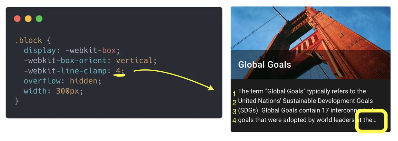
The line-clamp property limits the number of lines in the paragraph and adds an ellipsis(…) at the end.
The whole example: Github

I've got an answer here medium enter image description here

Lajuanalake answered 13/10, 2010 at 10:32 Comment(0)
L
0

If you want to focus on each letter you can do like that, I refer to this question

function truncate(source, size) {
  return source.length > size ? source.slice(0, size - 1) + "…" : source;
}

var text = truncate('Truncate text to fit in 3 lines', 14);
console.log(text);

If you want to focus on each word you can do like that + space

const truncate = (title, limit = 14) => {  // 14 IS DEFAULT ARGUMENT 
    const newTitle = [];
    if (title.length > limit) {
        title.split(' ').reduce((acc, cur) => {
            if (acc + cur.length <= limit) {
                newTitle.push(cur);
            }
            return acc + cur.length;
        }, 0);

        return newTitle.join(' ') + '...'
    }
    return title;
}

var text = truncate('Truncate text to fit in 3 lines', 14);
console.log(text);

If you want to focus on each word you can do like that + without space

const truncate = (title, limit = 14) => {  // 14 IS DEFAULT ARGUMENT 
    const newTitle = [];
    if (title.length > limit) {
        Array.prototype.slice.call(title).reduce((acc, cur) => {
            if (acc + cur.length <= limit) {
                newTitle.push(cur);
            }
            return acc + cur.length;
        }, 0);

        return newTitle.join('') + '...'
    }
    return title;
}

var text = truncate('Truncate text to fit in 3 lines', 14);
console.log(text);
Loach answered 13/10, 2010 at 10:32 Comment(0)
R
0

I really like line-clamp, but no support for firefox yet.. so i go with a math calc and just hide the overflow

.body-content.body-overflow-hidden h5 {
    max-height: 62px;/* font-size * line-height * lines-to-show(4 in this case) 63px if you go with jquery */
    overflow: hidden;
}
.body-content h5 {
    font-size: 14px; /* need to know this*/
    line-height:1,1; /*and this*/
}

now lets say you want to remove and add this class via jQuery with a link, you will need to have an extra pixel so the max-height it will be 63 px, this is because you need to check every time if the height greather than 62px, but in the case of 4 lines you will get a false true, so an extra pixel will fix this and it will no create any extra problems

i will paste a coffeescript for this just to be an example, uses a couple of links that are hidden by default, with classes read-more and read-less, it will remove the ones that the overflow is not need it and remove the body-overflow classes

jQuery ->

    $('.read-more').each ->
        if $(this).parent().find("h5").height() < 63
             $(this).parent().removeClass("body-overflow-hidden").find(".read-less").remove()
             $(this).remove()
        else
            $(this).show()

    $('.read-more').click (event) ->
        event.preventDefault()
        $(this).parent().removeClass("body-overflow-hidden")
        $(this).hide()
        $(this).parent().find('.read-less').show()

    $('.read-less').click (event) ->
        event.preventDefault()
        $(this).parent().addClass("body-overflow-hidden")
        $(this).hide()
        $(this).parent().find('.read-more').show()
Raama answered 13/10, 2010 at 10:32 Comment(1)
by the way, don't add line-clamp to this, it will set the height to 62px(for this case) and you will not have the jquery comprabationRaama
C
-2
.text-container {
    display: -webkit-box;
    -webkit-line-clamp: 2; /* Number of lines to show */
    -webkit-box-orient: vertical;
    overflow: hidden;
    text-overflow: ellipsis;
    /* Additional styles for the container (e.g., height, width, etc.) */
    height: 3em; /* Set the height to accommodate two lines of text */
    width: 300px; /* Set the width as needed */
}
Castellated answered 13/10, 2010 at 10:32 Comment(0)
B
-2
.word-limit{
   display: block;
   text-overflow: ellipsis;
   white-space: nowrap;
   word-wrap: break-word;
   overflow: hidden;
}
Bradleigh answered 13/10, 2010 at 10:32 Comment(1)
Please read How do I write a good answer?. While this code block may answer the OP's question, this answer would be much more useful if you explain how this code is different from the code in the question, what you've changed, why you've changed it and why that solves the problem without introducing others.Peasant
C
-4

Basic Example Code, learning to code is easy. Check Style CSS comments.

table tr {
  display: flex;
}
table tr td {
  /* start */
  display: inline-block; /* <- Prevent <tr> in a display css */
  text-overflow: ellipsis;
  white-space: nowrap;
  /* end */
  padding: 10px;
  width: 150px; /* Space size limit */
  border: 1px solid black;
  overflow: hidden;
}
<table>
  <tbody>
    <tr>
      <td>
        Lorem ipsum dolor sit amet, consectetur adipiscing elit. Nulla egestas erat ut luctus posuere. Praesent et commodo eros. Vestibulum eu nisl vel dui ultrices ultricies vel in tellus.
      </td>
      <td>
        Praesent vitae tempus nulla. Donec vel porta velit. Fusce mattis enim ex. Mauris eu malesuada ante. Aenean id aliquet leo, nec ultricies tortor. Curabitur non mollis elit. Morbi euismod ante sit amet iaculis pharetra. Mauris id ultricies urna. Cras ut
        nisi dolor. Curabitur tellus erat, condimentum ac enim non, varius tempor nisi. Donec dapibus justo odio, sed consequat eros feugiat feugiat.
      </td>
      <td>
        Pellentesque mattis consequat ipsum sed sagittis. Pellentesque consectetur vestibulum odio, aliquet auctor ex elementum sed. Suspendisse porta massa nisl, quis molestie libero auctor varius. Ut erat nibh, fringilla sed ligula ut, iaculis interdum sapien.
        Ut dictum massa mi, sit amet interdum mi bibendum nec.
      </td>
    </tr>
    <tr>
      <td>
        Sed viverra massa laoreet urna dictum, et fringilla dui molestie. Duis porta, ligula ut venenatis pretium, sapien tellus blandit felis, non lobortis orci erat sed justo. Vivamus hendrerit, quam at iaculis vehicula, nibh nisi fermentum augue, at sagittis
        nibh dui et erat.
      </td>
      <td>
        Nullam mollis nulla justo, nec tincidunt urna suscipit non. Donec malesuada dolor non dolor interdum, id ultrices neque egestas. Integer ac ante sed magna gravida dapibus sit amet eu diam. Etiam dignissim est sit amet libero dapibus, in consequat est
        aliquet.
      </td>
      <td>
        Vestibulum mollis, dui eu eleifend tincidunt, erat eros tempor nibh, non finibus quam ante nec felis. Fusce egestas, orci in volutpat imperdiet, risus velit convallis sapien, sodales lobortis risus lectus id leo. Nunc vel diam vel nunc congue finibus.
        Vestibulum turpis tortor, pharetra sed ipsum eu, tincidunt imperdiet lorem. Donec rutrum purus at tincidunt sagittis. Quisque nec hendrerit justo.
      </td>
    </tr>
  </tbody>
</table>
Chromatism answered 13/10, 2010 at 10:32 Comment(1)
The OP is looking for a multiple line solution. This only works on single lines of text.Clarkson
R
-12

I've been looking around for this, but then I realize, damn my website uses php!!! Why not use the trim function on the text input and play with the max length....

Here is a possible solution too for those using php: http://ideone.com/PsTaI

<?php
$s = "In the beginning there was a tree.";
$max_length = 10;

if (strlen($s) > $max_length)
{
   $offset = ($max_length - 3) - strlen($s);
   $s = substr($s, 0, strrpos($s, ' ', $offset)) . '...';
}

echo $s;
?>
Rectangle answered 13/10, 2010 at 10:32 Comment(1)
You cannot safely use server-side processing because you cannot know in advance how much space the text will take in the page. It depends on font size, browser text size settings, browser zoom level, etc.Majesty

© 2022 - 2024 — McMap. All rights reserved.