How to plot multiple linear regressions in the same figure
Asked Answered
I

2

9

Given the following:

import numpy as np
import pandas as pd
import seaborn as sns

np.random.seed(365)
x1 = np.random.randn(50)
y1 = np.random.randn(50) * 100
x2 = np.random.randn(50)
y2 = np.random.randn(50) * 100

df1 = pd.DataFrame({'x1':x1, 'y1': y1})
df2 = pd.DataFrame({'x2':x2, 'y2': y2})

sns.lmplot('x1', 'y1', df1, fit_reg=True, ci = None)
sns.lmplot('x2', 'y2', df2, fit_reg=True, ci = None)

This will create 2 separate plots. How can I add the data from df2 onto the SAME graph? All the seaborn examples I have found online seem to focus on how you can create adjacent graphs (say, via the 'hue' and 'col_wrap' options). Also, I prefer not to use the dataset examples where an additional column might be present as this does not have a natural meaning in the project I am working on.

If there is a mixture of matplotlib/seaborn functions that are required to achieve this, I would be grateful if someone could help illustrate.

Immutable answered 16/3, 2016 at 3:12 Comment(0)
E
12

You could use seaborn's FacetGrid class to get desired result. You would need to replace your plotting calls with these lines:

# sns.lmplot('x1', 'y1', df1, fit_reg=True, ci = None)
# sns.lmplot('x2', 'y2', df2, fit_reg=True, ci = None)
df = pd.concat([df1.rename(columns={'x1':'x','y1':'y'})
                .join(pd.Series(['df1']*len(df1), name='df')), 
                df2.rename(columns={'x2':'x','y2':'y'})
                .join(pd.Series(['df2']*len(df2), name='df'))],
               ignore_index=True)

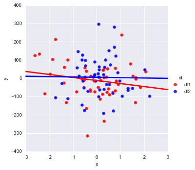
pal = dict(df1="red", df2="blue")
g = sns.FacetGrid(df, hue='df', palette=pal, size=5);
g.map(plt.scatter, "x", "y", s=50, alpha=.7, linewidth=.5, edgecolor="white")
g.map(sns.regplot, "x", "y", ci=None, robust=1)
g.add_legend();

This will yield this plot:

enter image description here

Which is if I understand correctly is what you need.

Note that you will need to pay attention to .regplot parameters and may want to change the values I have put as an example.

  • ; at the end of the line is to suppress output of the command (I use ipython notebook where it's visible).
  • Docs give some explanation on the .map() method. In essence, it does just that, maps plotting command with data. However it will work with 'low-level' plotting commands like regplot, and not lmlplot, which is actually calling regplot behind the scene.
  • Normally plt.scatter would take parameters: c='none', edgecolor='r' to make non-filled markers. But seaborn is interfering the process and enforcing color to the markers, so I don't see an easy/straigtforward way to fix this, but to manipulate ax elements after seaborn has produced the plot, which is best to be addressed as part of a different question.
Eogene answered 16/3, 2016 at 9:33 Comment(0)
S
4

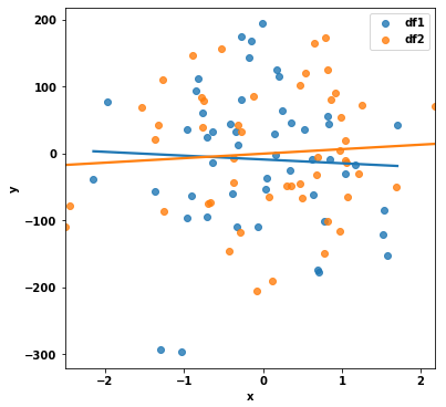
Option 1: sns.regplot

  • In this case, the easiest to implement solution is to use sns.regplot, which is an axes-level function, because this will not require combining df1 and df2.
import pandas as pd
import seaborn
import matplotlib.pyplot as plt

# create the figure and axes
fig, ax = plt.subplots(figsize=(6, 6))

# add the plots for each dataframe
sns.regplot(x='x1', y='y1', data=df1, fit_reg=True, ci=None, ax=ax, label='df1')
sns.regplot(x='x2', y='y2', data=df2, fit_reg=True, ci=None, ax=ax, label='df2')
ax.set(ylabel='y', xlabel='x')
ax.legend()
plt.show()

enter image description here


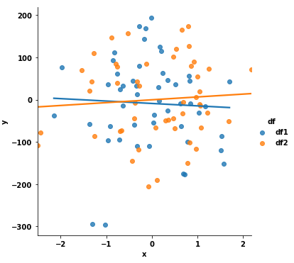
Option 2: sns.lmplot

  • As per sns.FacetGrid, it is better to use figure-level functions than to use FacetGrid directly.
  • Combine df1 and df2 into a long format, and then use sns.lmplot with the hue parameter.
  • When working with seaborn, it is almost always necessary for the data to be in a long format.
    • It's customary to use pandas.DataFrame.stack or pandas.melt to convert DataFrames from wide to long.
    • For this reason, df1 and df2 must have the columns renamed, and have an additional identifying column. This allows them to be concatenated on axis=0 (the default long format), instead of axis=1 (a wide format).
  • There are a number of ways to combine the DataFrames:
    1. The combination method in the answer from Primer is fine if combining a few DataFrames.
    2. However, a function, as shown below, is better for combining many DataFrames.
def fix_df(data: pd.DataFrame, name: str) -> pd.DataFrame:
    """rename columns and add a column"""
    # rename columns to a common name
    data.columns = ['x', 'y']
    # add an identifying value to use with hue
    data['df'] = name
    return data


# create a list of the dataframes
df_list = [df1, df2]

# update the dataframes by calling the function in a list comprehension
df_update_list = [fix_df(v, f'df{i}') for i, v in enumerate(df_list, 1)]

# combine the dataframes
df = pd.concat(df_update_list).reset_index(drop=True)

# plot the dataframe
sns.lmplot(data=df, x='x', y='y', hue='df', ci=None)

enter image description here

Notes

  • Package versions used for this answer:
    • pandas v1.2.4
    • seaborn v0.11.1
    • matplotlib v3.3.4
Sigmoid answered 9/5, 2021 at 23:33 Comment(0)

© 2022 - 2024 — McMap. All rights reserved.