Flex-box: Align last row to grid
Asked Answered
B

37

570

I have a simple flex-box layout with a container like:

.grid {
  display: flex;
  flex-flow: row wrap;
  justify-content: space-between;
}

Now I want the items in the last row to be aligned with the other. justify-content: space-between; should be used because the width and height of the grid can be adjusted.

Currently it looks like

The item in the bottom right should be in the middle

Here, I want the item in the bottom right to be in the "middle column". What is the simplest way to accomplish that? Here is a small jsfiddle that shows this behaviour.

.exposegrid {
  display: flex;
  flex-flow: row wrap;
  justify-content: space-between;
}

.exposetab {
  width: 100px;
  height: 66px;
  background-color: rgba(255, 255, 255, 0.2);
  border: 1px solid rgba(0, 0, 0, 0.4);
  border-radius: 5px;
  box-shadow: 1px 1px 2px rgba(0, 0, 0, 0.2);
  margin-bottom: 10px;
}
<div class="exposegrid">
  <div class="exposetab"></div>
  <div class="exposetab"></div>
  <div class="exposetab"></div>
  <div class="exposetab"></div>
  <div class="exposetab"></div>
  <div class="exposetab"></div>
  <div class="exposetab"></div>
  <div class="exposetab"></div>
  <div class="exposetab"></div>
  <div class="exposetab"></div>
  <div class="exposetab"></div>
  <div class="exposetab"></div>
  <div class="exposetab"></div>
  <div class="exposetab"></div>
</div>
Bagwell answered 11/9, 2013 at 14:37 Comment(7)
Duplicate: #16378472Minta
Check my solution here I think it works nice without hack, just maths: #18744664Surprint
Alternatively, use could use the newer css grid module - which doesn't have this problemTryparsamide
Targeting flex items on the last rowOp
I added a generic JS solution for cases when width of child is variable, making the number of items on row variable as well.Morehead
use align-content: flex-start; instead of justify-content: space-between; it will also distributes space evenly. more details in the answer: #18744664Peripteral
flex-start: that doesn't solve it, tired that. I still end up with the same issue on my second row on my own code as wellNarceine
C
649

Add a ::after which autofills the space. No need to pollute your HTML. Here is a codepen showing it: http://codepen.io/DanAndreasson/pen/ZQXLXj

.grid {
  display: flex;
  flex-flow: row wrap;
  justify-content: space-between;
}

.grid::after {
  content: "";
  flex: auto;
}
Conchology answered 15/1, 2016 at 17:32 Comment(31)
Would it be possible to make it work with space-around somehow?Hogwash
@Hogwash not sure how you want the end result to look likeConchology
@DanAndreasson There are two issues, it does not start from the left (like space-between), and also the space between the items of the last row is different than in previous row (simulating some fixed width items in "any-size" grid - relates to both)... codepen.io/anon/pen/gPoYZE What I wanted is to maintain the "strategy" (space-around or space-between) but start from the left like on previous lines... I wanted to know, if it is possible to generalize your amazing solution.Hogwash
I'm looking for the same thing as Tom, above. On a responsive site, using space-between, the space between elements changes for all the rows except the last. The last are all left-aligned next to each other.Wegner
This only works because the items have padding to space them and the combined percentage widths equal 100% for each set of 4. In this codepen I removed justify-content: space-between; from .grid and removed .grid:after and it works the same. Now if you tried something like this it totally breaks. Notice the widths for each set of 4 dont add up to 100%. In the OP's fiddle the widths are set in px so your solution doesn't work this situation.Klaxon
If the number of items that need the wrapping is dynamically created ( example a photo gallery with unknown number of thumbs) you can optionally load the .grid:after code after checking if ($items % numColumns > 0 ). At least this worked for me just fine.Accountancy
You could try to set the flex value to a high number e.g 1000 instead of auto.Wednesday
Trying this solution, initially, the items it was short on the last row weren't spread properly with space-between. However, when I set the flex-basis of .grid:after to the same sizing as the other items in the grid (per-breakpoint, overriding the above default/base module code), the last row spread out correctly. Seems to work on Safari, iOS, Firefox, Chrome (need to test IE) and my largest row size is 3 on my initial implementation.Romeu
You must add display: block to force IE11 apply flexbox property at pseudoelementCrossover
I wouldn't say this is a solution to the problem for the same reasons given by Jacob Alvarez, yet it's an interesting trick that might come in handy at some point. It does feel like it's the first part to a hack to make this whole thing work, though.Monthly
any way to get this to work with justify-content: center?Playboy
this is not even real flex (because of many static attributes in css)Babu
use display: gridAnhanhalt
Is it just me, or does this solution NOT WORK if your items are 33% width? codepen.io/jakobud/pen/wmEJmv It appears that the pseudo element receives a width in this case for some reason, which throws off the layout. Is this a bug? Is there a fix for this?Butterworth
Unfortunately, this doesn't work if you're using flex-grow.Ossein
I need to keep automatic space between elements created by justify-content: space-between. This works fine for me if I give the :after the same width of all grid elements as the value of flex-basis, and do not use flex-auto like this: &:after { content: ''; @include mf-tabletPortrait { flex-basis: 48%; } @include mf-tabletLandscape { flex-basis: calc(33% - 30px); } } }Peltast
For my needs this worked with the following modification: { content: "";flex: 0 0 32%;max-width: 480px;} and I changed the max-width with with media query changes so the grid was perfect at all widths.Gerigerianna
@ColinWiseman, thanks a lot! This works just like a charm for space-between haging line justification. Smooth as CSS grid but with no mess the grid produces in IE. I always unfold comments and read to the end on SO. All the time there come the gems like this one. Cheers. :)Methadone
Here's my variation to which your solution doesn't work: codepen.io/anon/pen/ZdgmeeGarlicky
@dyh333 Yes. We abandoned display: flex and went to display: grid. display: grid; gap: 20px; padding-top: 10px; grid-template-columns: repeat(auto-fill, minmax(250px, 1fr));Garlicky
This is a good solution but I don't know why it doesn't work in my case!Lex
Last row didn't have spacing, so I added: flex-basis: <your card width>; flex-grow: 0 to the ::after element. Now the space is correct on the last row.Parse
wont work with items min-width set.. last row items width will be always set to min-width whilte other rows width will be adjusted..Cageling
Working, only I had to delete flex: auto as this statement pushes other items together (their padding were lost).Dowse
this solution breaks the last line spacing. it can be solved with margin/padding, but then the flex prop will be pointless. i think this problem deserves a native solutionFrith
Adding width to the &:after element instead of flex: auto; solves the issue for me. See codepen.io/milkovsky/pen/PozZRoZDualistic
Same could be achieved with :last-child { margin-right: auto; } ignoring space-betweenDeach
This solution wasn't what I wanted, because I wanted the last row to be from the left to the right, but aligned with the items from the previous rows even when there are spaces between the items (if you use width: 23%;in the codepen example, you can see that the last item is not aligned). This is what worked for me: https://mcmap.net/q/37488/-how-to-align-left-last-row-line-in-multiple-line-flexbox-duplicateStannum
@Dualistic This is exactly what worked for me, I just set the width of the after element to be the same as other elements, and it works like a charm.Sludgy
Although this solution works on first sight, it actually messes up if you have any margins between the children (with margins you can achieve min space between them). The best solution is to "pollute the html" as mentioned in https://mcmap.net/q/37488/-how-to-align-left-last-row-line-in-multiple-line-flexbox-duplicate.Abstracted
Just have to style the ::after similarly to the actual child items, those that affect the position like: flex-basis, padding, etc.. Then it should take up same space like other childs.Conclusive
T
231

As other posters have mentioned - there's no clean way to left-align the last row with flexbox (at least as per the current spec)

However, for what it's worth: With the CSS Grid Layout Module this is surprisingly easy to produce:

Basically the relevant code boils down to this:

ul {
  display: grid; /* 1 */
  grid-template-columns: repeat(auto-fill, 100px); /* 2 */
  grid-gap: 1rem; /* 3 */
  justify-content: space-between; /* 4 */
}

1) Make the container element a grid container

2) Set the grid with auto columns of width 100px. (Note the use of auto-fill (as apposed to auto-fit - which (for a 1-row layout) collapses empty tracks to 0 - causing the items to expand to take up the remaining space. This would result in a justified 'space-between' layout when grid has only one row which in our case is not what we want. (check out this demo to see the difference between them)).

3) Set gaps/gutters for the grid rows and columns - here, since want a 'space-between' layout - the gap will actually be a minimum gap because it will grow as necessary.

4) Similar to flexbox.

ul {
  display: grid;
  grid-template-columns: repeat(auto-fill, 100px);
  grid-gap: 1rem;
  justify-content: space-between;
  
  /* boring properties */
  list-style: none;
  background: wheat;
  padding: 2rem;
  width: 80vw;
  margin: 0 auto;
}

li {
  height: 50px;
  border: 1px solid green;
}
<ul>
  <li></li>
  <li></li>
  <li></li>
  <li></li>
  <li></li>
  <li></li>
  <li></li>
</ul>

Codepen Demo (Resize to see the effect)

Tryparsamide answered 7/9, 2017 at 14:46 Comment(8)
Nice solution. Only problem is that it does not work with IE10/11.Dawnedawson
In the light of current possibilities, this should now be the accepted answer. Using :after pseudo-element may lead to unwanted results in edge cases.Authorized
@ Danield this suggestion helped me out a lot, thank you!Registrant
This should be the accepted answer. I would combine it with flexbox as a fallback, in the spirit of progressive enhancement: browsers that don't support the grid would display the flexbox version, which is close sufficiently enough for me.Aria
"there's no clean way to left-align the last row with flexbox (at least as per the current spec)" - ha check my answer, it's super simple :)Abirritate
This doesn't work in firefox. The grip gap property seems to have no effect and I have a HUGE gap.Jeffrey
Awesome, glad it was so simple with CSS grid. One thing that wasn't apparent to me when I tried with a wrapping <div> was the need to add width: 100%. I am not sure if this is always the case, but after adding that everything worked perfectly.Vicegerent
What about, when you only have a few items (so it only creates 1 row at a medium-large screen)? In your codepen, if you resize it very large, the single row is left-aligned, not centered. Is there any way to change that, and make it so, if there's a single row, it's centered?Governess
U
182

One technique would be inserting a number of extra elements (as many as the max number of elements you ever expect to have in a row) that are given zero height. Space is still divided, but superfluous rows collapse to nothing:

http://codepen.io/dalgard/pen/Dbnus

body {
  padding: 5%;
}

div {
  overflow: hidden;
  background-color: yellow;
}

ul {
  display: flex;
  flex-wrap: wrap;
  margin: 0 -4px -4px 0;
  list-style: none;
  padding: 0;
}

li {
  flex: 1 0 200px;
  height: 200px;
  border-right: 4px solid black;
  border-bottom: 4px solid black;
  background-color: deeppink;
}
li:empty {
  height: 0;
  border: none;
}

*,
:before,
:after {
  box-sizing: border-box;
}
<div>
  <ul>
    <li>a</li>
    <li>b</li>
    <li>c</li>
    <li>d</li>
    <li>e</li>
    <li>f</li>
    <li>g</li>
    <li>h</li>
    <li>i</li>
    <li>j</li>
    <li>k</li>
    <li></li>
    <li></li>
    <li></li>
    <li></li>
    <li></li>
    <li></li>
    <li></li>
    <li></li>
    <li></li>
    <li></li>
  </ul>
</div>

In the future, this may become achievable through using multiple ::after(n).

Urga answered 25/2, 2014 at 15:27 Comment(16)
Unfortunately this contaminates the markup in a non-semantic way, but it totally works. :S I wish I knew of any other way to replicate this behavior, flexbox or otherwise, that didn't require the non-semantic elements.Maurizio
Agreed, it's dirty, but it works, and is less hacky than a lot of hacks. Feck it, I'm using it, until ::after(12) gains support, or they add some additional justify options. It's a real shame as the way flexbox justify works at the moment is just plain wrong! If you were justifying a paragraph of text you'd never try to justify the last line. Should definitely have been an option, I can't believe they missed this.Politicking
Can you link where Pseudo-elements Module Level 4 introduces ::after(17)? ::after does not seem to be defined with that syntax.Handtohand
It appears this use of ::after never went beyond loose talk. There is mention of something that is close, but not quite what I wrote above, in this section: w3.org/TR/css3-content/#inserting0Urga
I came up with a CSS only solution.. the caveat being it can only ever account for two missing items, so will only work safely in a flex grid with a maximum of three items per wrapping row. Demo: codepen.io/lukejacksonn/pen/dozqVq The principle here is to use pseudo elements as the extra children and give them the same flex property as the items in the container.Towards
@Politicking Jesus. I have only started using flexbox thinking how I will get rid of all these hacks intended to align those inline-blocks inside a grid, and now it turns out that it is simply not possible! I have hit that block right away, reaching the limits which I thought I would hardly ever reach happily solving all these old unsolvable CSS problems. Not so fast, I guess. It only took 20 years to get proper vertical centering - we certainly can wait. Jesus, it seems so simple task...Popper
Guess we're waiting for CSS Grid Layout now.Urga
Fixed it with a :after on the .grid. See the answer below.Conchology
@Urga I don't think so. See my comment.Klaxon
While this might be "hack" as far as markup is concerned it certifiably works. And has the added bonus of should there be a wide view-port an not many items, they aren't spread across the space but neatly left aligned.Flyfish
Hi, did someone improve this solution without the extra HTML markup since 2014?Stonedead
But what if the content is generated dynamically and you can't anticipate the number of items?Calipee
This is not the better elegant way! The :after and some margin is much better, faster and less code!Kimberly
This could be undesirable for accessibility if it is expected that the user would focus these list items.Butterworth
This is a nice approach, but unfortunately, it also pads the first line if it contains fewer items than the line could hold. This breaks centering.Hendrick
Descent solution! Unfortunately this dosn't work well with a row-gap but that can be somewhat circumvented by using a bottom-margin on each non-empty item if you don't mind having an extra margin on the bottom row (which in some cases can be fixed by giving the bottom-margin of the entire ul the same negative margin).Keely
P
42

Without any extra markup, just adding ::after worked for me specifying the width of the column.

.grid {
  display:flex;
  justify-content:space-between;
  flex-wrap:wrap;
}
.grid::after{
  content: '';
  width: 10em // Same width of .grid__element
}
.grid__element{
  width:10em;
}

With the HTML like this:

<div class=grid">
   <div class="grid__element"></div>
   <div class="grid__element"></div>
   <div class="grid__element"></div>
</div>
Panelboard answered 13/8, 2016 at 12:54 Comment(3)
this is interesting, but not quite correct. the problem comes when you're dealing with more than two elements in the bottom row - the spacing that emerges between elements on above rows never emerges on the last; the items are hard-packed together, negating the original utility of space-between.Langrage
even better if you use flex-basis: 10em instead of width.Commandant
very underrated answer. worked for me spacing 3 elements each row.Pointillism
R
35

I know there are many answers here but.. The simplest way to do this is with a grid instead of flex and grid template columns with repeat and auto fills, where you have to set the number of pixels that you have given to each element, 100px from your snippet code.

.exposegrid {
     display: grid;
     grid-template-columns: repeat(auto-fill, 100px);
     justify-content: space-between;
}
 .exposetab {
     width: 100px;
     height: 66px;
     background-color: rgba(255, 255, 255, 0.2);
     border: 1px solid rgba(0, 0, 0, 0.4);
     border-radius: 5px;
     box-shadow: 1px 1px 2px rgba(0, 0, 0, 0.2);
     margin-bottom: 10px;
}
<div class="exposegrid">
   <div class="exposetab"></div>
   <div class="exposetab"></div>
   <div class="exposetab"></div>
   <div class="exposetab"></div>
   <div class="exposetab"></div>
   <div class="exposetab"></div>
   <div class="exposetab"></div>
   <div class="exposetab"></div>
   <div class="exposetab"></div>
   <div class="exposetab"></div>
   <div class="exposetab"></div>
   <div class="exposetab"></div>
   <div class="exposetab"></div>
   <div class="exposetab"></div>
</div>
Rabush answered 1/2, 2019 at 10:57 Comment(2)
This is the proper solution to get last row items left aligned.Inclose
I agree, proper way is to use grid. It can be achieved with flexbox but much cleaner to use grid.Goal
M
17

You can't. Flexbox is not a grid system. It does not have the language constructs to do what you're asking for, at least not if you're using justify-content: space-between. The closest you can get with Flexbox is to use the column orientation, which requires setting an explicit height:

http://cssdeck.com/labs/pvsn6t4z (note: prefixes not included)

ul {
  display: flex;
  flex-flow: column wrap;
  align-content: space-between;
  height: 4em;
}

However, it would be simpler to just use columns, which has better support and doesn't require setting a specific height:

http://cssdeck.com/labs/dwq3x6vr (note: prefixes not included)

ul {
  columns: 15em;
}
Minta answered 11/9, 2013 at 15:3 Comment(7)
There is a way; see my answer.Urga
@dalgard, your answer is a workaround, not a true solution. cimmanon's answer is correct.Tugman
@Tugman I think "technique" is a fair description of my answer. It has certainly worked as a solution for a lot of people, including the asker.Urga
@Urga It doesn't change the fact that Flexbox does not provide the language constructs to do what's being asked. Furthermore, I would argue that adding fake elements is an extremely dirty practice, right up there with using tables for layout.Minta
It's not pretty, but front end development is the art of the possible; pragmatism is a basic premise. I think the word extremely is misplaced, since extra elements are being used for styling on 99.9 % of real-world web sites (cf. Bootstrap container elements).Urga
I'm not sure I'd liken front-end purpose to an example of a CSS framework that is premised on pollution, both with elements/containers and CSS utility classes. @Tugman is absolutely right on this. True, your technique works visibly, but it's accessibility and information architecture implications are staggering.Gait
@Minta check my answer and say that "you can't", it's not hacky in any way or using any fake elements, just pure css and flexbox..Abirritate
B
14

A possible solution is to use justify-content: flex-start; on the .grid container, size restrictions on its children, and margins on the appropriate child elements -- depending on the desired number of columns.

For a 3-column grid, the basic CSS would look like this:

.grid {
    display: flex;
    flex-flow: row wrap;
    justify-content: flex-start;
}

.grid > * {
    flex: 0 0 32%;
    margin: 1% 0;
}

.grid > :nth-child(3n-1) {
    margin-left: 2%;
    margin-right: 2%;
}

It's another imperfect solution, but it works.

http://codepen.io/tuxsudo/pen/VYERQJ

Beating answered 13/3, 2015 at 15:58 Comment(0)
N
10

Also you can do this:

.exposegrid:last-child {
  margin-right: auto;
}
Nodus answered 10/3, 2021 at 13:31 Comment(2)
right... keep forgetting about the margin auto 👍Snuggery
Almost, but this removes all spacing between elements that space-between provided.Tarbox
F
9

This problem was solved for me using CSS grid,

This solution is applicable only if you're having fix number of columns i.e. no. of elements to display in a single row

-> using grid but not specifying number of rows, as number of elements increase it wraps into columns and add rows dynamically, I have specified three columns in this example

-> you don't have to give any position to your child/cells, as it will make it fix, which we don't want.

.grid-class{
  display: grid;
  grid-template-columns: repeat(3, 1fr);
  column-gap: 80px;
}
Floriaflorian answered 17/12, 2019 at 6:28 Comment(0)
A
8

If you want a grid with some space between the items and the items starting without any initial space then this simple solution works:

.grid {
    display: flex;
    flex-flow: row wrap;
    margin: 0 -5px; // remove the inital 5px space
    width: auto;
}
.grid__item {
    width: 25%;
    padding: 0 5px; // should be same as the negative margin above.
}

If you want the initial 5px space then just remove the negative margin :) Simple.

https://jsfiddle.net/b97ewrno/2/

The accepted answer, whilst good, it causes there to be no space between the elements on the second row..

Abirritate answered 19/4, 2018 at 12:16 Comment(8)
Surprised this doesn't have any more up votes. This is a beautiful approach that belongs in the Flex museum.Harve
@EduardoLaHozMiranda thanks! But why "museum"? IE11 doesn't support css grid and most sites still need to support that. + Some big timers in frontend development still claims there are different use cases for grid v.s. flexbox. But perhaps you just meant that this should be a important part of web history :DAbirritate
Lol, yeah. I was excited at the time. Just meant it was a great and minimal take on this problem.Harve
@dencey you don’t need to know that for this solution, it 25% so max 4 per row, but you can use whatever percent you wantAbirritate
@Abirritate I mean the item width is fixed(like 100px), but container width is dynamic, so items per row is dynamic.Inexplicit
@Inexplicit ok.. what is the question/problem then? I have no idea what you are after here.. jsfiddle.net/b97ewrno/2Abirritate
@Abirritate fixed item width, not percentage, referring to style in the question, desired effect is items align to the container edge on both side, and have equal space between items on each row. jsfiddle.net/n6k831LdInexplicit
@Inexplicit I don't believe that is possible with flexbox unless you use some hack like always rending x elements with js/BE etc. I'd look at CSS Grid then, hopefully you don't need to support IE11 and if u do there is probably a polyfill for it, haven't checked. I have never needed such a solution.Abirritate
T
7

Yes.! We can but with some media queries & Maximum no of columns are predefined.

Here am using 4 columns. Check my code:

.container {
  display: flex;
  display: -webkit-flex;
  display: -moz-flex;
  flex-flow: row wrap;
  -webkit-flex-flow: row wrap;
  -moz-flex-flow: row wrap;
}

.container .item {
  display: flex;
  display: -webkit-flex;
  display: -moz-flex;
  justify-content: center;
  -webkit-justify-content: center;
  -moz-justify-content: center;
  flex-basis: 25%; //max no of columns in %, 25% = 4 Columns
}

.container .item .item-child {
  width: 130px;
  height: 180px;
  background: red;
  margin: 10px;
}

@media (max-width: 360px) {
  .container .item {
    flex-basis: 100%;
  }
}

@media (min-width:360px) and (max-width: 520px) {
  .container .item {
    flex-basis: 50%;
  }
}

@media (min-width:520px) and (max-width: 680px) {
  .container .item {
    flex-basis: 33.33%;
  }
}
<div class="container">

  <div class="item">
    <div class="item-child">1</div>
  </div>
  <div class="item">
    <div class="item-child"></div>
  </div>
  <div class="item">
    <div class="item-child"></div>
  </div>
  <div class="item">
    <div class="item-child"></div>
  </div>
  <div class="item">
    <div class="item-child"></div>
  </div>
  <div class="item">
    <div class="item-child"></div>
  </div>
  <div class="item">
    <div class="item-child"></div>
  </div>
  <div class="item">
    <div class="item-child"></div>
  </div>
  <div class="item">
    <div class="item-child"></div>
  </div>
  <div class="item">
    <div class="item-child"></div>
  </div>
  <div class="item">
    <div class="item-child"></div>
  </div>
  <div class="item">
    <div class="item-child"></div>
  </div>
  <div class="item">
    <div class="item-child"></div>
  </div>
  <div class="item">
    <div class="item-child"></div>
  </div>
  <div class="item">
    <div class="item-child"></div>
  </div>
  <div class="item">
    <div class="item-child"></div>
  </div>
  <div class="item">
    <div class="item-child"></div>
  </div>
  <div class="item">
    <div class="item-child"></div>
  </div>
  <div class="item">
    <div class="item-child"></div>
  </div>
  <div class="item">
    <div class="item-child"></div>
  </div>
  <div class="item">
    <div class="item-child"></div>
  </div>
  <div class="item">
    <div class="item-child"></div>
  </div>
  <div class="item">
    <div class="item-child"></div>
  </div>

</div>

NOTE
1) No need to create child div. It may be any other tag like 'img' r whatever you want..
2) If you want more columns adjust the media queries and maximum no.of columns.

Threepence answered 7/6, 2017 at 18:45 Comment(1)
This creates only 3 in latest IEGuideboard
E
5

If you want to align the last item to the grid use the following code:

Grid container

.card-grid {
  box-sizing: border-box;
  max-height: 100%;
  display: flex;
  flex-direction: row;
  -webkit-box-orient: horizontal;
  -webkit-box-direction: normal;
  justify-content: space-between;
  align-items: stretch;
  align-content: stretch;
  -webkit-box-align: stretch;
  -webkit-box-orient: horizontal;
  -webkit-box-direction: normal;
  -ms-flex-flow: row wrap;
  flex-flow: row wrap;
}

.card-grid:after {
  content: "";
  flex: 1 1 100%;
  max-width: 32%;
}

Item in the grid

.card {
  flex: 1 1 100%;
  box-sizing: border-box;
  -webkit-box-flex: 1;
  max-width: 32%;
  display: block;
  position: relative;

}

The trick is to set the max-width of the item equal to the max-width of the .card-grid:after.

Live demo on Codepen

Extrasensory answered 21/2, 2017 at 9:32 Comment(2)
cthulu blesses you and your computerZook
This approach does not work when size of card is fixed and number of cards in each row are unknown. codepen.io/zendu/pen/WXNGvoDawnedawson
S
4

If you wish to align item in grid view with equal distance for even the last element. Make sure you card width is 100% Use the following css. This works pretty well

.container {
  /* ... snip ... */
  display: grid;
  grid-template-columns: repeat(auto-fill, 100px);
  justify-content: space-between;
  grid-gap: 20px;
}
Systemic answered 8/10, 2021 at 6:47 Comment(0)
S
3

It is possible to use "flex-start" and to add the margins manually. It requires some math-hacking but is definitely easy to do and make it easy to use with a CSS preprocessor like LESS.

See for example this LESS mixin:

.flexboxGridMixin(@columnNumber,@spacingPercent) {
  @contentPercent: 100% - @spacingPercent;
  @sideMargin: @spacingPercent/(@columnNumber*2);
  display: flex;
  flex-direction: row;
  flex-wrap: wrap;
  justify-content: flex-start;
  > * {
    box-sizing: border-box;
    width: @contentPercent/@columnNumber;
    margin-left: @sideMargin;
    margin-right: @sideMargin;
  }
}

And then it can easily be used to display a responsive grid layout:

ul {
  list-style: none;
  padding: 0;
  @spacing: 10%;
  @media only screen and (max-width: 499px) { .flexboxGridMixin(1,@spacing); }
  @media only screen and (min-width: 500px) { .flexboxGridMixin(2,@spacing); }
  @media only screen and (min-width: 700px) { .flexboxGridMixin(3,@spacing); }
  @media only screen and (min-width: 900px) { .flexboxGridMixin(4,@spacing); }
  @media only screen and (min-width: 1100px) { .flexboxGridMixin(5,@spacing); }
}

li {
  background: pink;
  height: 100px;
  margin-top: 20px;
}

Here is an example of

http://codepen.io/anon/pen/YyLqVB?editors=110

Surprint answered 27/10, 2015 at 18:9 Comment(3)
You never use @contentPercent. Did you intend to?Aggappera
width: @contentPercent/@columnNumber;Parity
WOW ! I'm really impressed by this solution. I'll try to adapt to my situationParity
A
3

This is a combination of a lot of the answers but it does exactly what I was needing -- which is, aligning the last child in a flex container to the left while maintaining the space-between behavior (in this case it's a three-column layout).

Here's the markup:

.flex-container {
  display: flex;
  justify-content: space-between;
  flex-direction: row;
}

.flex-container:after {
  content: "";
  flex-basis: 30%;
}
Aerugo answered 27/1, 2017 at 1:56 Comment(2)
To be more generic: flex-basis size must be equal to the size of the childs.Approach
I've found flex-grow: 0.9 instead of flex-basis works for any number of columns. Tested in a bunch of modern browsers - it works in them all but the padding is broken in IE (but working in Edge0Louis
C
2

Just add few fake items with same properties except for height set to 0px to the end.

Cageling answered 24/1, 2020 at 10:32 Comment(4)
Adding fake items is bad practice in every single way. You're not supposed to fill the DOM with stuff just to hack around css unless its mandatory. For many reasons, from accessibility, to flooding the codebase with weird stuff, to making the logic more complex to understand and list goes on. Don't recommend hacks unless you explicitely say it might be a bad solution or there's a special case for that.Bevin
@Bevin Well, i cant find any solution working in 100% cases and without using javascript. Using javascript makes it more complicated. Grid + column-template ? Maybe it has to work in IE11 too so no. nth-child, last-child, 'after' specifier... none of these are working in specific scenarios. Sometimes there is no other way than use ugly code or lower design requirements.Cageling
Funny, this is actually the only solution that works in practice (besides JS-hacking), and it has 0 votes. Well... not anymore! Anyway, the number of empty divs you need to add is N - 1, where N is the max number of items in a row. Note that this solutions permits the container to use space-around, space-between and space-evenly for its justify-content property. Also best to to set the empty divs to flex: 0 0 nn where nn is the same flex-basis as the real elements have.Rinee
I like this answer. Just let those fake items be hidden.Glob
M
2

I liked the simplicity in the answer from @Dan Andreasson & @Robin Métral.. however it didn't work entirely for me.

So instead of:

.grid {
display: flex;
flex-flow: row wrap;
justify-content: space-between;
}
.grid::after {
content: "";
flex: auto;
}

I used:

.grid {
display: flex;
flex-flow: row wrap;
justify-content: space-between;
}
.grid::after {
content: "";
width: calc(100%/3 - 20px); /* whatever width grid items are */
}

so far, it seems to work as intended.

Manara answered 29/8, 2022 at 22:21 Comment(0)
V
1

This version is best way for blocks with fixed width:

http://codepen.io/7iomka/pen/oxxeNE

In other cases - version of dalgard

http://codepen.io/dalgard/pen/Dbnus

body {
  padding: 5%;
}

div {
  overflow: hidden;
  background-color: yellow;
}

ul {
  display: flex;
  flex-wrap: wrap;
justify-content:center;
  margin: 0 -4px -4px 0;
  list-style: none;
  padding: 0;
}

li {
  flex: 1 0 200px;
  height: 200px;
  max-width:200px;
  min-width:200px;
  border-right: 4px solid black;
  border-bottom: 4px solid black;
  background-color: deeppink;
}
li:empty {
  height: 0;
  border: none;
}

*,
:before,
:after {
  box-sizing: border-box;
}
<div>
  <ul>
    <li>a</li>
    <li>b</li>
    <li>c</li>
    <li>d</li>
    <li>e</li>
    <li>f</li>
    <li>g</li>
    <li>h</li>
    <li>i</li>
    <li>j</li>
    <li>k</li>
    <li></li>
    <li></li>
    <li></li>
    <li></li>
    <li></li>
    <li></li>
    <li></li>
    <li></li>
    <li></li>
    <li></li>
  </ul>
</div>
Venitavenite answered 9/3, 2016 at 10:2 Comment(0)
D
1

Even though gap is coming to Flexbox I will add a solution that works.

It uses the sibling combinator to check 2 conditions.

The first condition it checks is if an element is the second to last div:nth-last-child(2)

For 4 column layouts we need to check for postions 2 & 3 Check if it is in the second row of 4 div:nth-of-type(4n+2) or third in a row div:nth-of-type(4n+3)

For 3 column layouts we only need to check position 2

div:nth-of-type(3n+2)

We can then combine like below for 4 column layouts

div:nth-last-child(2) + div:nth-of-type(4n+2)

div:nth-last-child(2) + div:nth-of-type(4n+3)

We also need to take care of one edge case, Any number that is 3n+2 & multiple of 4 will get the 35% margin-right div:nth-last-child(2) + div:nth-of-type(4n+4)

3 column layouts will be

div:nth-last-child(2) + div:nth-of-type(3n+2)

Then we need to add a margin to the above selectors. The margin-right will need to be calculated and will depend on the flex-basis.

I have added a sample with 3 and 4 columns and a media query. I have also added a small JavaScript button that adds a new div so you can check it works.

It is a little bit of CSS but it works. I also wrote about this on my site if you want a little more explanation. https://designkojo.com/css-programming-using-css-pseudo-classes-and-combinators

var number = 11;

$("#add").on("click", function() {
    number = number + 1;
    $("#main").append("<div>" + number + "</div>");
});
body {
  margin: 0;
}
main{
  display: flex;
  flex-wrap: wrap;
  align-items: flex-start;
  align-content: flex-start; /* vertical */
  justify-content: space-between;
  min-width: 300px;
  max-width: 1200px;
  margin: 20px auto;
  background-color: lightgrey;
  height: 100vh;
}
div {
  flex-basis: 30%;
  background-color: #5F3BB3;
  min-height: 20px;
  height: 50px;
  margin-bottom: 20px;
  display: flex;
  justify-content: center;
  align-items: center;
  color: #9af3ff;
  font-size: 3em;
}


div:nth-last-child(2) + div:nth-of-type(3n+2) {
  background-color: #f1b73e;
  margin-right: 35%;
}

@media screen and (min-width: 720px) {

  div {
    flex-basis: 22%;
  }

  div:nth-last-child(2) {
    background-color: greenyellow;
  }

  div:nth-of-type(4n+2) {
    background-color: deeppink;
  }

  /* Using Plus combinator is for direct sibling */
  div:nth-last-child(2) + div:nth-of-type(4n+2) {
    background-color: #f1b73e;
    margin-right: 52%;
  }

  div:nth-last-child(2) + div:nth-of-type(4n+3) {
    background-color: #f1b73e;
    margin-right: 26%;
  }

  /* Also need to set the last to 0% to override when it become (3n+2)
   * Any number that is 3n+2 & multiple of 4 will get the 35% margin-right
   * div:nth-last-child(2) + div:nth-of-type(3n+2)
   */

  div:nth-last-child(2) + div:nth-of-type(4n+4) {
    background-color: #f1b73e;
    margin-right: 0;
  }

}
<!DOCTYPE html>
<html lang="en">

<head>
  <meta charset="UTF-8">
  <meta name="viewport" content="width=device-width, initial-scale=1.0">
  <link rel="stylesheet" href="style.css">
  <title>My New Project</title>
</head>

<body>

<header>


</header>

<button id="add">Add</button>
<main id="main">

  <div>1</div>
  <div>2</div>
  <div>3</div>
  <div>4</div>
  <div>5</div>
  <div>6</div>
  <div>7</div>
  <div>8</div>
  <div>9</div>
  <div>10</div>
  <div>11</div>


</main>
<script src="https://cdnjs.cloudflare.com/ajax/libs/jquery/2.1.3/jquery.min.js"></script>
<script src="action.js"></script>
</body>
</html>
Deach answered 8/1, 2021 at 7:3 Comment(0)
B
1

the best way to do this even if you will add more items to parent is this

.parent {
display:flex;
flex-wrap: wrap;
justify-content: space-between;
}

and just add ::after this this parent

.parent::after {
content: "";
flex-basis: 30% /* give it the same width of your child or item; */
}

and you fix it now, even if you added more child or items it will not overflow

Bloodsucker answered 16/2, 2023 at 13:32 Comment(0)
C
0

Assuming:

  • You want 4 column grid layout with wrapping
  • The number of items is not necessarily a multiple of 4

Set a left margin on every item except 1st, 5th and 9th item and so on. If the left margin is 10px then each row will have 30px margin distributed among 4 items. The percentage width for item is calculated as follows:

100% / 4 - horizontal-border - horizontal-padding - left-margin * (4 - 1) / 4

This is a decent workaround for issues involving last row of flexbox.

.flex {
  display: flex;
  flex-direction: row;
  flex-wrap: wrap;
  margin: 1em 0 3em;
  background-color: peachpuff;
}

.item {
  margin-left: 10px;
  border: 1px solid;
  padding: 10px;
  width: calc(100% / 4 - 2px - 20px - 10px * (4 - 1) / 4);
  background-color: papayawhip;
}

.item:nth-child(4n + 1) {
  margin-left: 0;
}

.item:nth-child(n + 5) {
  margin-top: 10px;
}
<div class="flex">
  <div class="item">1</div>
  <div class="item">2</div>
  <div class="item">3</div>
  <div class="item">4</div>
</div>
<div class="flex">
  <div class="item">1</div>
  <div class="item">2</div>
  <div class="item">3</div>
  <div class="item">4</div>
  <div class="item">5</div>
  <div class="item">6</div>
</div>
<div class="flex">
  <div class="item">1</div>
  <div class="item">2</div>
  <div class="item">3</div>
  <div class="item">4</div>
  <div class="item">5</div>
  <div class="item">6</div>
  <div class="item">7</div>
  <div class="item">8</div>
  <div class="item">9</div>
</div>
Craddock answered 11/9, 2013 at 14:37 Comment(0)
U
0

There is a way without flexbox, although you'd need to meet the following conditions. 1) The container has padding. 2) Items are the same size and you know exactly how many you want per line.

ul {
  padding: 0 3% 0 5%;
}
li {
  display: inline-block; 
  padding: 0 2% 2% 0;
  width: 28.66%;
}

The smaller padding on the right side of the container allows for the extra padding to the right of each list item. Assuming other items in the same parent as the list object are padded with 0 5%, it will be flush with them. You can also adjust the percentages to however much margin you'd like or use calculate px values.

Of course, you can do the same without the padding on the container by using nth-child (IE 9+) to remove margin on every third box.

Unlay answered 11/12, 2014 at 1:17 Comment(0)
D
0

Using flexbox and a few media queries, I made this little work-around: http://codepen.io/una/pen/yNEGjv (its a bit hacky but works):

.container {
  display: flex;
  flex-flow: row wrap;
  justify-content: flex-start;
  max-width: 1200px;
  margin: 0 auto;
}

.item {
  background-color: gray;
  height: 300px;
  flex: 0 30%;
  margin: 10px;

  @media (max-width: 700px) {
     flex: 0 45%;
  }

  @media (max-width: 420px) {
    flex: 0 100%;
  }

  &:nth-child(3n-1) {
    margin-left: 10px;
    margin-right: 10px;
  }
}
Duyne answered 15/7, 2015 at 15:47 Comment(0)
U
0

This is pretty hacky, but it works for me. I was trying to achieve consistent spacing/margins.

.grid {
  width: 1024px;
  display: flex;
  flex-flow: row wrap;
  padding: 32px;
  background-color: #ddd;  

  &:after {
    content: "";
    flex: auto;
    margin-left:-1%;
  }

  .item {
    flex: 1 0 24.25%;
    max-width: 24.25%;
    margin-bottom: 10px;
    text-align: center;
    background-color: #bbb;

    &:nth-child(4n+2),
    &:nth-child(4n+3),
    &:nth-child(4n+4) {
      margin-left: 1%;
    }

    &:nth-child(4n+1):nth-last-child(-n+4),
      &:nth-child(4n+1):nth-last-child(-n+4) ~ .item {
        margin-bottom: 0;
    }    

  }
}

http://codepen.io/rustydev/pen/f7c8920e0beb0ba9a904da7ebd9970ae/

Uropod answered 5/5, 2016 at 23:12 Comment(0)
Z
0

Seems like no one proposed the flex-grow solution on last item. The idea is to have your last flex item to take all the place it can using flex-grow: 1.

.grid {
  display: flex;
  flex-flow: row wrap;
  justify-content: space-between;
}

.grid > *:last-child {
  flex-grow: 1;
}

Note: This solution is not perfect, especially if you have centered elements inside your flex items as it will center on the possibly huge last flex item.

Zoo answered 31/5, 2016 at 15:1 Comment(0)
C
0

Oh boy, I think I found a good solution with minimal CSS and no JS. Check it out:

img {width:100%;}
li {
  display: inline-block;
  width:8em;
  list-style:none;
}
ul {text-align: justify;}
<ul>
  <li>
    <img src="http://www.planwallpaper.com/static/images/kitty-cat.jpg" />
  </li>
  <li>
    <img src="http://www.planwallpaper.com/static/images/kitty-cat.jpg" />
  </li>
  <li>
    <img src="http://www.planwallpaper.com/static/images/kitty-cat.jpg" />
  </li>
  <li>
    <img src="http://www.planwallpaper.com/static/images/kitty-cat.jpg" />
  </li>
  <li>
    <img src="http://www.planwallpaper.com/static/images/kitty-cat.jpg" />
  </li>
  <li>
    <img src="http://www.planwallpaper.com/static/images/kitty-cat.jpg" />
  </li>
  <li>
    <img src="http://www.planwallpaper.com/static/images/kitty-cat.jpg" />
  </li>
  <li>
    <img src="http://www.planwallpaper.com/static/images/kitty-cat.jpg" />
  </li>
  <li>
    <img src="http://www.planwallpaper.com/static/images/kitty-cat.jpg" />
  </li>
  <li>
    <img src="http://www.planwallpaper.com/static/images/kitty-cat.jpg" />
  </li>
  <li>
    <img src="http://www.planwallpaper.com/static/images/kitty-cat.jpg" />
  </li>
  <li>
    <img src="http://www.planwallpaper.com/static/images/kitty-cat.jpg" />
  </li>
  <li>
    <img src="http://www.planwallpaper.com/static/images/kitty-cat.jpg" />
  </li>
  <li>
    <img src="http://www.planwallpaper.com/static/images/kitty-cat.jpg" />
  </li>
  <li></li>
  <li></li>
  <li></li>
  <li></li>
  <li></li>
  <li></li>
  <li></li>
</ul>

The key here is to remember that what we are trying to achieve is exactly what text-align: justify does!

The empty elements in the HTML are there to make the last row display perfectly without changing the appearance, but might not be needed given what you are trying to achieve. For perfect balance in every situation, you need at least x-4 empty elements, x being the number of elements to display, or n-2, n being the number of column you want to display.

Chemesh answered 21/5, 2018 at 18:17 Comment(0)
J
0

If you know the width of spaces between elements in the row and the amount of elements in a row, this would work:

Example: 3 elements in a row, 10px gap between elements

div:last-child:nth-child(3n+2) {
  flex-grow: 1
  margin-left: 10px
}
Jansenism answered 6/6, 2019 at 8:42 Comment(0)
S
0

I modified the example presented by Dan Andreasson by using a right border on elements to create a faux gutter. You can then use nth-child to remove the border on the last-child of the column grid count you need. here is a demo https://codepen.io/JacobLett/pen/mdVoroM

/* demo only */
body {
margin:0;
padding:0;
max-width:1024px;
margin:0 auto;
}
.block-list {
background: #ccc;
  border:1px solid #ccc;
}

.block-list .block-list__item {
background: #eee;
}
/* demo only */


.block-list .block-list__item {
   min-height: 100px;
   margin-bottom: 1rem;
}

@media only screen and (min-width: 900px) {
   .block-list {
      display: -webkit-box;
      display: flex;
      flex-wrap: wrap;
      -webkit-box-pack: justify;
      justify-content: space-between;
      background-color: #ffffff;
      margin: 1em auto;
   }

   .block-list:after {
      content: "";
      -webkit-box-flex: 1;
      flex: auto;
   }

   .block-list__item {
      height: 10em;
      width: 25%;
      box-sizing: border-box;
      border-right: 10px solid white;
   }

   .block-list-2 .block-list__item {
      width: 50%;
   }

   .block-list-2 .block-list__item:nth-child(2n) {
      border: none;
   }

   .block-list-3 .block-list__item {
      width: 33.3%;
   }

   .block-list-3 .block-list__item:nth-child(3n) {
      border: none;
   }

   .block-list-4 .block-list__item {
      width: 25%;
   }

   .block-list-4 .block-list__item:nth-child(4n) {
      border: none;
   }
   
   .block-list-5 .block-list__item {
      width: 20%;
   }

   .block-list-5 .block-list__item:nth-child(5n) {
      border: none;
   }
   
   .block-list-6 .block-list__item {
      width: 16.66%;
   }

   .block-list-6 .block-list__item:nth-child(6n) {
      border: none;
   }
}
<h2>2 column</h2>
<div class="block-list block-list-2">
   <div class="block-list__item">1
   </div>
   <div class="block-list__item">2
   </div>
   <div class="block-list__item">3
   </div>
   <div class="block-list__item">4
   </div>
   <div class="block-list__item">5
   </div>
   <div class="block-list__item">6
   </div>
</div>
<h2>3 column</h2>
<div class="block-list block-list-3">
   <div class="block-list__item">1
   </div>
   <div class="block-list__item">2
   </div>
   <div class="block-list__item">3
   </div>
   <div class="block-list__item">4
   </div>
   <div class="block-list__item">5
   </div>
   <div class="block-list__item">6
   </div>
</div>

<h2>4 column</h2>
<div class="block-list block-list-4">
   <div class="block-list__item">1
   </div>
   <div class="block-list__item">2
   </div>
   <div class="block-list__item">3
   </div>
   <div class="block-list__item">4
   </div>
   <div class="block-list__item">5
   </div>
   <div class="block-list__item">6
   </div>
</div>
<h2>5 column</h2>
<div class="block-list block-list-5">
   <div class="block-list__item">1
   </div>
   <div class="block-list__item">2
   </div>
   <div class="block-list__item">3
   </div>
   <div class="block-list__item">4
   </div>
   <div class="block-list__item">5
   </div>
   <div class="block-list__item">6
   </div>
</div>
<h2>6 column</h2>
<div class="block-list block-list-6">
   <div class="block-list__item">1
   </div>
   <div class="block-list__item">2
   </div>
   <div class="block-list__item">3
   </div>
   <div class="block-list__item">4
   </div>
   <div class="block-list__item">5
   </div>
   <div class="block-list__item">6
   </div>
</div>
Sachsen answered 27/10, 2020 at 9:34 Comment(0)
C
0

If the individual child items have an explicit width (eg. 32%), you can solve this by adding an :after element to the parent and giving this the same explicit width.

Comedian answered 11/11, 2020 at 15:41 Comment(0)
H
0

There are solutions here where people suggest writing exact layout css-classes, faking the last item with pseudo-element, using non-flexbox approaches etc.

One big problem is the gaps between neighbors (case - aligned buttons wrapping to multiple lines). In such a case, you don't want the items to touch each other, there is a need for gaps. I just want to add an adoptive solution that respects gaps and works with any number of items. It is based on the idea of fake last element too though, but is more universal. See snippet comments for details.

html {
  font-size: 1px;
}

.container {
  font-size: 16rem;
  display: flex;
  flex-wrap: wrap;
  justify-content: space-between;
}

.item {
  background-color: orange;
  border-radius: 10rem;
  box-sizing: border-box;
  color: white;
  margin-bottom: 10rem;
  padding: 15rem 10rem;
  text-align: center;
}
<!--
Our setup from design (example) used later in calculations:

container-width: 100%; (can be any)
max-per-row = 4;
total = 6;
desired-hor-gap = 10rem; (equal to vert. gap)

If you go dynamic (drawing html according to the coming data either in a backend template or in a frontend template), you have to calculate and then set exact properties inline.

<i> (or any real html element) is needed to set inline styles to arrange the last row properly.

"2" in <i> calc function - is 6 % 4 since calc doesn't allow for "%" operator. But in real life you will calculate these numbers in JS or some backend template anyway.

   Formulas written in elements' calc functions. Seem to be self-descriptive, but the idea is to set for the last fake item the remainder width + hypothetical gaps.
-->

<div class="container">

<div style="flex: 0 1 calc((100% - (4 - 1) * 10rem) / 4);" class="item">do stuff</div>

<i style="flex: 0 1 calc((100% - (4 - 1) * 10rem) / 4 * (4 - 2) + ( 4 - 2 - 1) * 10rem);"></i>
</div>
Harass answered 27/5, 2021 at 12:21 Comment(0)
L
0

I found an efficient solution that the justify-content can be also center / space-evenly / etc... (if you know the number of items in a single row):

HTML:

<section class="container">
    <div class="flex-item"></div>
    <div class="flex-item"></div>
    <div class="flex-item"></div>
    <div class="flex-item"></div>
    <div class="flex-item"></div>

    <p aria-hidden="true"></p>
    <p aria-hidden="true"></p>
    <p aria-hidden="true"></p>
  </section>

The number of <p> tags (it can be any other tag) is the number of items in each row minus 1. With different screen sizes you can manipulate it with media queries.

CSS:

.container {
  display: flex;
  flex-wrap: wrap;
  justify-content: center;
  gap: 20px;
}

.flex-item {
  width: 300px;
  height: 300px;
  background: #21BA45;
}

.container > p {
  width: 300px;
  height: 300px;
}
Loud answered 2/9, 2021 at 14:43 Comment(0)
L
0

My simple working but HACK solution

Still flex, support almost all situation(space-between/space-around..).

use more dummy div to take space, but hidden these div, dummy div count should greater than max div count in a line

 .flex {
  display: flex;
  flex-direction: row;
  flex-wrap: wrap;
  justify-content: space-between;
  margin: 1em 0 3em;
  background-color: peachpuff;
}

.item {
  margin: 4px;
  border: 1px solid;
  padding: 10px;
  width: 24px;
  background-color: papayawhip;
}

.dummy {
  margin-top: 0;
  margin-bottom: 0;
  padding-top: 0;
  padding-bottom: 0;
  height: 0;
  visibility: hidden;
}
<div class="flex">
  <div class="item">1</div>
  <div class="item">2</div>
  <div class="item">3</div>
  <div class="item">4</div>
  <div class="item">5</div>
  <div class="item">6</div>
  <div class="item">7</div>
  <div class="item">8</div>
  <div class="item">9</div>
  <div class="item">10</div>
  <div class="item">11</div>
  <div class="item">12</div>
  <div class="item">13</div>
  <div class="item">14</div>
  <div class="item">15</div>
  <div class="item">16</div>
  <div class="item">17</div>
  <div class="item">18</div>
  <div class="item">19</div>
  <div class="item">20</div>
  <div class="item">21</div>
  <div class="item">22</div>
  <div class="item">23</div>
  <div class="item">24</div>
  <div class="item">25</div>
  <div class="item">26</div>
  <div class="item">27</div>
  <div class="item">28</div>
  <div class="item">29</div>
  <div class="item">30</div>
  <div class="item">31</div>
  <div class="item">32</div>
  <div class="item">33</div>
  <div class="item">34</div>
  <div class="item">35</div>
  <div class="item">36</div>
  <div class="item">37</div>
  <div class="item">38</div>
  <div class="item">39</div>
  <div class="item">40</div>
  <div class="item">41</div>
  <div class="item">42</div>
  <div class="item">43</div>
  <div class="item">44</div>
  <div class="item">45</div>
  <div class="item">46</div>

  <!-- dummy-div -->
  <div class="item dummy"></div>
  <div class="item dummy"></div>
  <div class="item dummy"></div>
  <div class="item dummy"></div>
  <div class="item dummy"></div>
  <div class="item dummy"></div>
  <div class="item dummy"></div>
  <div class="item dummy"></div>
  <div class="item dummy"></div>
  <div class="item dummy"></div>
  <div class="item dummy"></div>
  <div class="item dummy"></div>
  <div class="item dummy"></div>
  <div class="item dummy"></div>
  <div class="item dummy"></div>
  <div class="item dummy"></div>
  <div class="item dummy"></div>
  <div class="item dummy"></div>
  <div class="item dummy"></div>
  <div class="item dummy"></div>
</div>

In a situation where the maximum width and height of the container are both determined, it works very well.

Lundt answered 20/10, 2023 at 6:39 Comment(0)
C
0

As of 2024, use display: grid with grid-template-columns. Super elegant.

display: grid;
gap: 16px;

// 3 in a row
grid-template-columns: repeat(3, minmax(min-content, 1fr));

// 4 in a row
grid-template-columns: repeat(4, minmax(min-content, 1fr));

// auto-fill the row accoreding to a specified width
grid-template-columns: repeat(auto-fill, 200px);

repeat() is pretty neat. It tells CSS to repeat by n times, and the width of each item. This width can be very flexible, minmax() is recommended here as it is better than manually setting flex-basis. Giving 1fr as the max-width, it basically assign each child equal ratio (33% when 3 child, 25% when 4 child, etc)


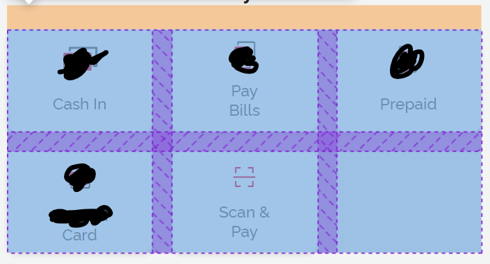
Sample 3 in a row: enter image description here

Conclusive answered 7/2 at 4:13 Comment(0)
F
-1

I made a SCSS mixin for it.

@mixin last-row-flexbox($num-columns, $width-items){

  $filled-space: $width-items * $num-columns;
  $margin: calc((100% - #{$filled-space}) / (#{$num-columns} - 1));

  $num-cols-1 : $num-columns - 1;

  &:nth-child(#{$num-columns}n+1):nth-last-child(-n+#{$num-cols-1}) ~ & {
    margin-left: $margin;
  }
  @for $i from 1 through $num-columns - 2 { 
    $index: $num-columns - $i;
    &:nth-child(#{$num-columns}n+#{$index}):last-child{
      margin-right: auto;
    }
  }
}

This is the codepen link: http://codepen.io/diana_aceves/pen/KVGNZg

You just have to set the items width in percentage and number of columns.

I hope this can help you.

Fermium answered 8/2, 2016 at 16:25 Comment(0)
J
-1

Here's another couple of scss mixins.

These mixins assume that you are not going to use js plugins like Isotope (they don't respect html markup order, thus messing up with css nth rules).

Also, you will be able to take full advantage of them especially if you're writing your responsive breakpoints in a mobile first manner. You ideally will use flexbox_grid() on the smaller breakpoint and flexbox_cell() on the following breakpoints. flexbox_cell() will take care of resetting previously setted margins no longer used on larger breakpoints.

And by the way, as long as you correctly setup your container's flex properties, you can also use only flexbox_cell() on the items, if you need to.

Here's the code:

// apply to the container (for ex. <UL> element)
@mixin flexbox_grid($columns, $gutter_width){

  display: flex;
  flex-direction:row;
  flex-wrap:wrap;
  justify-content: flex-start;

  > *{
    @include flexbox_cell($columns, $gutter_width);
  }
}

// apply to the cell (for ex. a <LI> element)
@mixin flexbox_cell($columns, $gutter_width){
  $base_width: 100 / $columns;
  $gutters: $columns - 1;
  $gutter_offset: $gutter_width * $gutters / $columns;

  flex-grow: 0;
  flex-shrink: 1;
  flex-basis: auto; // IE10 doesn't support calc() here

  box-sizing:border-box; // so you can freely apply borders/paddings to items
  width: calc( #{$base_width}% - #{$gutter_offset} );

  // remove useless margins (for cascading breakponts)
  &:nth-child(#{$columns}n){
    margin-right: 0;
  }

  // apply margin
  @for $i from 0 through ($gutters){
    @if($i != 0){
      &:nth-child(#{$columns}n+#{$i}){
        margin-right: $gutter_width;
      }
    }
  }
}

Usage:

ul{
   // just this:
   @include flexbox_grid(3,20px);
}

// and maybe in following breakpoints, 
// where the container is already setted up, 
// just change only the cells:

li{
   @include flexbox_cell(4,40px);
}

Obviously, it's up to you to eventually set container's padding/margin/width and cell's bottom margins and the like.

Hope it helps!

Jaffa answered 9/3, 2016 at 11:5 Comment(0)
E
-1

Simply Use Jquery/Javascript trick to add an empty div:

if($('.exposegrid').length%3==2){
 $(".exposegrid").append('<div class="exposetab"></div>');
}
Exceed answered 9/4, 2020 at 13:0 Comment(0)
P
-8

I was able to do it with justify-content: space-between on the container

Playboy answered 19/3, 2016 at 22:41 Comment(0)

© 2022 - 2024 — McMap. All rights reserved.