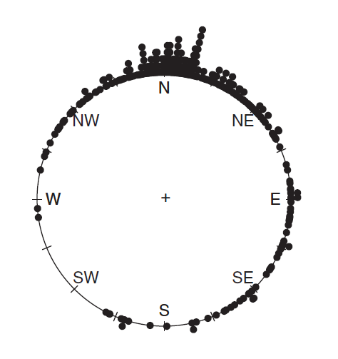
I have a dataset of wind directions and I am looking to create raw data plots as seen in the example below. I should mention that I know about rose diagrams and how to create them in Python. This is another way of looking at the data and is commonly brought up in texts about directional statistics.
The plot is similar to a polar histogram, in that raw data is collected into continuous bins. But there are stacked individual dots for each data point instead of a bar.
I have found a solution on the mathematica stackexchange, but I have no experience with that language: circular plot and circular histogram. The book I took the above image from also gives the R code for it, but I only know Python.
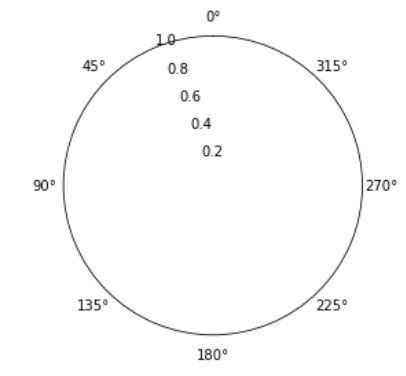
Below is the minimal code I have until now.
directions = np.random.randint(low=0, high=90, size=50)
# Setup plot
ax = plt.subplot(111, polar=True)
ax.set_theta_zero_location("N")
ax.grid(False)

plt.show()
As you can see I have not made much progress. Again, I can find code for polar bar plots and histograms, but not for this type of plot in Python. Any hints in the right directions are welcome.


clip_on=Falsewill allow to plot outside the axes. – Anticoagulant