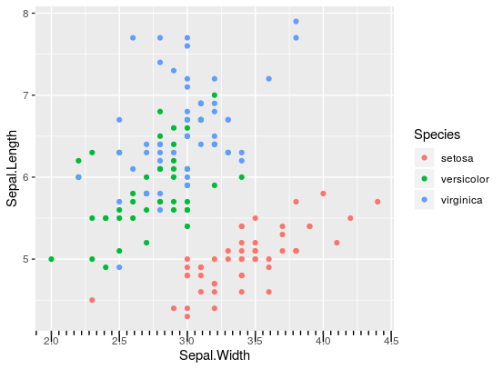
ggplot2 annotation_ticks on the outside of the plot region
Asked Answered
G

2

3

I try to find an elegant way to insert minor ticks on plots created with ggplot2. I found a function which does almost exactly what I want: https://rdrr.io/github/hrbrmstr/ggalt/src/R/annotation_ticks.r

There is only one drawback: the ticks, like in annotation_logticks, are drawn inside the plot region. I need them to be on the outside.

A solution could be to use negative values for the tick-length. When I do so, the ticks disappear. I assume, that this is due to the default clipping action of ggplot2, which supresses plotting outside the plot region (?) (see also log ticks on the outer side of axes (annotation_logticks), where the clipping is turned off which - unfortunately - leads to ticks exceeding the plot-range).

So: is there an option to modify the annotation_ticks - function in order to produce ticks outside of the plot region, only covering the range of the plot? Ideally, this functionality should by incorporated in the annotate_ticks - function (I don't want to save and then re-arrange the plot; I'd rather build my final plot in one step).

Groggery answered 21/10, 2019 at 11:27 Comment(0)
R
4

I've found a sort of satisfactory solution to adapting the annotation_ticks function. If we'd simply copy-paste the code from the link you've posted, we can make the following small adjustment near the end in the GeomTicks ggproto object:

GeomTicks <- ggproto(
  "GeomTicks", Geom,
  # ...
  # all the rest of the code
  # ...
    gTree(children = do.call("gList", ticks), cl = "ticktrimmer") # Change this line
  },
  default_aes = aes(colour = "black", size = 0.5, linetype = 1, alpha = 1)
)

Then we can write a small function that simply clips the ticks that are outside the range that gets triggered just before drawing by hijacking the S3 generic makeContent in the grid package:

library(grid)

makeContent.ticktrimmer <- function(x) {
  # Loop over segment grobs
  x$children <- lapply(x$children, function(m) {
    # convert positions to values
    x0 <- convertX(m$x0, "npc", valueOnly = T)
    x1 <- convertX(m$x1, "npc", valueOnly = T)
    y0 <- convertY(m$y0, "npc", valueOnly = T)
    y1 <- convertY(m$y1, "npc", valueOnly = T)

    # check if values are outside 0-1
    if (length(unique(x0)) == 1) {
      keep <- y0 >= 0 & y0 <= 1 & y1 >= 0 & y1 <= 1
    } else if (length(unique(y0)) == 1) {
      keep <- x0 >= 0 & x0 <= 1 & x1 >= 0 & x1 <= 1
    } else {
      keep <- TRUE
    }

    # Trim the segments
    m$x0 <- m$x0[keep]
    m$y0 <- m$y0[keep]
    m$x1 <- m$x1[keep]
    m$y1 <- m$y1[keep]
    m
  })
  x
}

And now we can plot:

g <- ggplot(iris, aes(Sepal.Width, Sepal.Length)) +
  geom_point(aes(colour = Species)) +
  annotation_ticks(long = -1 * unit(0.3, "cm"),
                   mid = -1 * unit(0.2, "cm"),
                   short = -1 * unit(0.1, "cm")) +
  coord_cartesian(clip = "off")

enter image description here

Besides the first tick on the left being slightly weirdly placed, this seems to work reasonably.

EDIT: Here is a quick refactoring of the code to work with the native minor breaks instead of calculating minor breaks de novo. The user function:

annotation_ticks <- function(sides = "b",
                             scale = "identity",
                             scaled = TRUE,
                             ticklength = unit(0.1, "cm"),
                             colour = "black",
                             size = 0.5,
                             linetype = 1,
                             alpha = 1,
                             color = NULL,
                             ticks_per_base = NULL,
                             ...) {
  if (!is.null(color)) {
    colour <- color
  }

  # check for invalid side
  if (grepl("[^btlr]", sides)) {
    stop(gsub("[btlr]", "", sides), " is not a valid side: b,t,l,r are valid")
  }

  # split sides to character vector
  sides <- strsplit(sides, "")[[1]]

  if (length(sides) != length(scale)) {
    if (length(scale) == 1) {
      scale <- rep(scale, length(sides))
    } else {
      stop("Number of scales does not match the number of sides")
    }
  }

  base <- sapply(scale, function(x) switch(x, "identity" = 10, "log10" = 10, "log" = exp(1)), USE.NAMES = FALSE)

  if (missing(ticks_per_base)) {
    ticks_per_base <- base - 1
  } else {
    if ((length(sides) != length(ticks_per_base))) {
      if (length(ticks_per_base) == 1) {
        ticks_per_base <- rep(ticks_per_base, length(sides))
      } else {
        stop("Number of ticks_per_base does not match the number of sides")
      }
    }
  }

  delog <- scale %in% "identity"

  layer(
    data = data.frame(x = NA),
    mapping = NULL,
    stat = StatIdentity,
    geom = GeomTicks,
    position = PositionIdentity,
    show.legend = FALSE,
    inherit.aes = FALSE,
    params = list(
      base = base,
      sides = sides,
      scaled = scaled,
      ticklength = ticklength,
      colour = colour,
      size = size,
      linetype = linetype,
      alpha = alpha,
      ticks_per_base = ticks_per_base,
      delog = delog,
      ...
    )
  )
}

The ggproto object:

GeomTicks <- ggproto(
  "GeomTicks", Geom,
  extra_params = "",
  handle_na = function(data, params) {
    data
  },

  draw_panel = function(data,
                        panel_scales,
                        coord,
                        base = c(10, 10),
                        sides = c("b", "l"),
                        scaled = TRUE,
                        ticklength = unit(0.1, "cm"),
                        ticks_per_base = base - 1,
                        delog = c(x = TRUE, y = TRUE)) {
    ticks <- list()

    for (s in 1:length(sides)) {
      if (grepl("[b|t]", sides[s])) {

        xticks <- panel_scales$x.minor

        # Make the grobs
        if (grepl("b", sides[s])) {
          ticks$x_b <- with(
            data,
            segmentsGrob(
              x0 = unit(xticks, "npc"),
              x1 = unit(xticks, "npc"),
              y0 = unit(0, "npc"),
              y1 = ticklength,
              gp = gpar(
                col = alpha(colour, alpha),
                lty = linetype,
                lwd = size * .pt
              )
            )
          )
        }
        if (grepl("t", sides[s])) {
          ticks$x_t <- with(
            data,
            segmentsGrob(
              x0 = unit(xticks, "npc"),
              x1 = unit(xticks, "npc"),
              y0 = unit(1, "npc"),
              y1 = unit(1, "npc") - ticklength,
              gp = gpar(
                col = alpha(colour, alpha),
                lty = linetype,
                lwd = size * .pt
              )
            )
          )
        }
      }


      if (grepl("[l|r]", sides[s])) {

        yticks <- panel_scales$y.minor

        # Make the grobs
        if (grepl("l", sides[s])) {
          ticks$y_l <- with(
            data,
            segmentsGrob(
              y0 = unit(yticks, "npc"),
              y1 = unit(yticks, "npc"),
              x0 = unit(0, "npc"),
              x1 = ticklength,
              gp = gpar(
                col = alpha(colour, alpha),
                lty = linetype, lwd = size * .pt
              )
            )
          )
        }
        if (grepl("r", sides[s])) {
          ticks$y_r <- with(
            data,
            segmentsGrob(
              y0 = unit(yticks, "npc"),
              y1 = unit(yticks, "npc"),
              x0 = unit(1, "npc"),
              x1 = unit(1, "npc") - ticklength,
              gp = gpar(
                col = alpha(colour, alpha),
                lty = linetype,
                lwd = size * .pt
              )
            )
          )
        }
      }
    }
    gTree(children = do.call("gList", ticks))
  },
  default_aes = aes(colour = "black", size = 0.5, linetype = 1, alpha = 1)
)

Plotting:

ggplot(iris, aes(Sepal.Width, Sepal.Length)) +
  geom_point(aes(colour = Species)) +
  annotation_ticks(ticklength = -1 * unit(0.1, "cm"),
                   side = "b") +
  coord_cartesian(clip = "off")

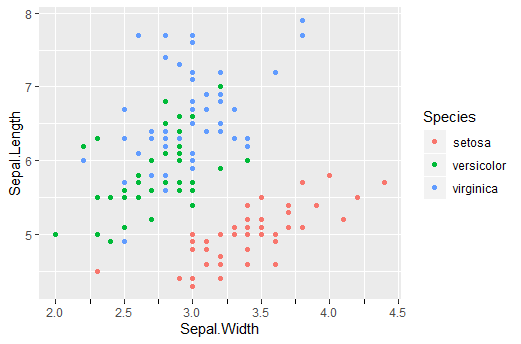
enter image description here

Ringtail answered 21/10, 2019 at 14:6 Comment(7)
Actually, this leads into a very promising direction. The strange behaviour at the beginning (and also the end, which became visible with other data) of the minor ticks is, of course, undesired. Can you see where it comes from? Perhaps it is possible to fix it...Groggery
I don't know, it's already in the function before I adapted it. Probably the best place to look is calc_ticks from the link you posted, but I'm not familiar with what that piece of code is doing. If you comment out the minpow and maxpow in this statement: ` majorTicks <- sort( unique( c( minpow, regScale[which(regScale %in% majorTicks)], maxpow, majorTicks ) ) )`, the weird ticks disappear but also the part that extends beyond the last major breaks.Ringtail
I suppose that it might be possible to write a much simpler version of calc_ticks for my purpose - it seems like the code is adapted from annotation_logticks, which requires more complex calculations for the tick-locations.Groggery
Alternatively, you could get away with having near-zero effort in calculating the breaks, by simply using the minor breaks that the scales already have calculated. See edit above.Ringtail
wow, it worked. I almost cannot believe it! Thank you, @teunbrand!Groggery
It is like a miracle: your solution worked. And it works quite well - it is possible to adjust the minor ticks via the minor_breaks argument, e.g. in scale_x_continuous. Thank you so much for the effort! I think, minor ticks should be implemented in further versions of ggplot2. However, the solution you presented is a very useful workaround as long as there is no such implementation in ggplot2Groggery
I still found a few debugging lines in the code I posted that didn't need to be there. So ggplot 3.3.0 will come with axes (position guides) that you can tweak, see this merged pull request: github.com/tidyverse/ggplot2/pull/3398. So, soon we can implement this the way it would suppose to work (via the axes instead of a geom).Ringtail
S
3

Very nice functions above.

A solution I find somewhat simpler or easier to wrap my head around is to simply specify you major axis breaks in the increments you want for both major and minor breaks - so if you want major in increments of 10, and minor in increments of 5, you should nevertheless specify your major increments in steps of 5.

Then, in the theme, you are asked to give a color for the axis text. Rather than choosing one color, you can give it a list of colors - specifying whatever color you want the major axis number to be, and then NA for the minor axis color. This will give you the text on the major mark, but nothing on the 'minor' mark. Likewise, for the grid that goes inside the plot, you can specify a list for the line sizes, so that there is still a difference in thickness for major and minor gridlines within the plot, even though you are specifying the minor gridlines as major grid lines. As an example of what you could put in theme:

panel.grid.major.x = element_line(colour = c("white"), size = c(0.33, 0.2)),
panel.grid.major.y = element_line(colour = c("white"), size = c(0.33, 0.2)),
axis.text.y = element_text(colour = c("black", NA), family = "Gill Sans"),
axis.text.x = element_text(colour = c("black", NA), family = "Gill Sans"),

I suspect you can change the size of the outer tick mark in the exact same way, though I haven't tried it.

Sartre answered 20/3, 2020 at 14:52 Comment(0)

© 2022 - 2024 — McMap. All rights reserved.