Jetpack Compose: Custom TextField design
C

5

46

In general, most components in Jetpack Compose seem to be very easy to customize.

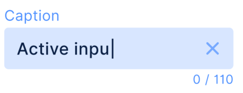
However, the same cannot be said for the TextField. For example, say that I wanted to make something like this:

Custom text input

One would think that simply wrapping the BaseTextField would work. However, it appears that there has been a bug in the BaseTextField component, and I have opened an issue. This bug will not permit the user to focus the text field after focusing-away from it once already, until the component is re-rendered.

Citing this, I attempted to customize the OutlinedTextField and TextField components, but am not able to customize them to look like the image above. Were it not for the fact that the cursor color uses the activeColor property, I could make it work.

What would be a proper work-around to create a usable text field that looks like the above?

Christoper answered 26/10, 2020 at 18:7 Comment(5)
How do you show Character Counter below TextField?Garda
@Garda Well, you’d need to wrap everything in a column so that the counter appears below the text field, and then use the text field’s state to get the ‘.length’Christoper
Thank you very much. I thought it's a native component for TextField. Still no char counter, assistive text, and error message yet i guess.Garda
How do you remove underline from TextField, i couldn't also remove that either. I'm trying to create a rounded corner TextField with no underline for TopBar search with leading icon. BasicTextField has no icon property so i'm trying to do it with TextField but if it's not working i will do it manually with BasicTextField and Image.Garda
You need to add a border that's thick enough to cover the existing lineChristoper
U
36

By this exemple you can learn a lot. With 1.0.0 you can do like this:

Custom TextField printscreen here

Column {
        var textState by remember { mutableStateOf("") }
        val maxLength = 110
        val lightBlue = Color(0xffd8e6ff)
        val blue = Color(0xff76a9ff)
        Text(
            text = "Caption",
            modifier = Modifier
                .fillMaxWidth()
                .padding(bottom = 4.dp),
            textAlign = TextAlign.Start,
            color = blue
        )
        TextField(
            modifier = Modifier.fillMaxWidth(),
            value = textState,
            colors = TextFieldDefaults.textFieldColors(
                backgroundColor = lightBlue,
                cursorColor = Color.Black,
                disabledLabelColor = lightBlue,
                focusedIndicatorColor = Color.Transparent,
                unfocusedIndicatorColor = Color.Transparent
            ),
            onValueChange = {
                if (it.length <= maxLength) textState = it
            },
            shape = RoundedCornerShape(8.dp),
            singleLine = true,
            trailingIcon = {
                if (textState.isNotEmpty()) {
                    IconButton(onClick = { textState = "" }) {
                        Icon(
                            imageVector = Icons.Outlined.Close,
                            contentDescription = null
                        )
                    }
                }
            }
        )
        Text(
            text = "${textState.length} / $maxLength",
            modifier = Modifier
                .fillMaxWidth()
                .padding(top = 4.dp),
            textAlign = TextAlign.End,
            color = blue
        )
    }
Upi answered 30/7, 2021 at 14:25 Comment(0)
M
48

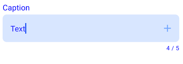
You can use the TextField:

  • removing the label with label = null
  • applying custom color with the TextFieldDefaults.textFieldColors parameter to hide the indicator.
  • adding in the onValueChange a function to fix the max number of characters as described here

Finally use a Column to add 2 Text composables to complete the external label and counter text.

Something like:

var text by remember { mutableStateOf("") }
val maxChar = 5

Column(){
    //External label
    Text(
        text = "Label",
        modifier = Modifier.fillMaxWidth(),
        textAlign = TextAlign.Start,
        color = Blue
    )

    TextField(
        value = text,
        onValueChange = {
            if (it.length <= maxChar) text = it
        },
        modifier = Modifier
            .fillMaxWidth()
            .padding(vertical = 4.dp),
        shape = RoundedCornerShape(8.dp),
        trailingIcon = {
            Icon(Icons.Filled.Add, "", tint = Blue)
        },
        colors = TextFieldDefaults.textFieldColors(
            backgroundColor = ....,
            focusedIndicatorColor =  Color.Transparent, //hide the indicator
            unfocusedIndicatorColor = .....)
    )
    //counter message
    Text(
        text = "${text.length} / $maxChar",
        textAlign = TextAlign.End,
        color = Blue,
        style = MaterialTheme.typography.caption, //use the caption text style
        modifier = Modifier.fillMaxWidth()
    )

enter image description here

Myocarditis answered 11/3, 2021 at 10:30 Comment(1)
backgroundColor is replaced by containerColor. i.e containerColor = ... not backgroundColor = ... Anyway, thanks for solutionWelt
U
36

By this exemple you can learn a lot. With 1.0.0 you can do like this:

Custom TextField printscreen here

Column {
        var textState by remember { mutableStateOf("") }
        val maxLength = 110
        val lightBlue = Color(0xffd8e6ff)
        val blue = Color(0xff76a9ff)
        Text(
            text = "Caption",
            modifier = Modifier
                .fillMaxWidth()
                .padding(bottom = 4.dp),
            textAlign = TextAlign.Start,
            color = blue
        )
        TextField(
            modifier = Modifier.fillMaxWidth(),
            value = textState,
            colors = TextFieldDefaults.textFieldColors(
                backgroundColor = lightBlue,
                cursorColor = Color.Black,
                disabledLabelColor = lightBlue,
                focusedIndicatorColor = Color.Transparent,
                unfocusedIndicatorColor = Color.Transparent
            ),
            onValueChange = {
                if (it.length <= maxLength) textState = it
            },
            shape = RoundedCornerShape(8.dp),
            singleLine = true,
            trailingIcon = {
                if (textState.isNotEmpty()) {
                    IconButton(onClick = { textState = "" }) {
                        Icon(
                            imageVector = Icons.Outlined.Close,
                            contentDescription = null
                        )
                    }
                }
            }
        )
        Text(
            text = "${textState.length} / $maxLength",
            modifier = Modifier
                .fillMaxWidth()
                .padding(top = 4.dp),
            textAlign = TextAlign.End,
            color = blue
        )
    }
Upi answered 30/7, 2021 at 14:25 Comment(0)
C
6

Well, until the issue I mentioned is resolved, the choices are:

  1. Roll back to Compose version 1.0.0-alpha04 (issue was introduced in alpha05)
  2. Add a border to a TextField or OutlinedTextField as so:
    TextField(
        value = myValue,
        onValueChange = myOnChange,
        modifier = Modifier.clip(myShape).border(5.dp, myColor)
    )
    
Christoper answered 27/10, 2020 at 16:23 Comment(1)
In newer versions, you have pass the shape to TextField itself, as it overwrites the clip parameter with the shape coming in thereWaxwork
N
4

In addition to Gabriele Mariotti's Answer
If you like to have custom color for your cursor, you can achieve it using:

Column(){
    //External label
    Text(
        ...
        ...
    )

    TextField(
        ...
        ...

        colors = TextFieldDefaults.textFieldColors(
            backgroundColor = ...,
            focusedIndicatorColor =  ..., 
            unfocusedIndicatorColor = ...,
            cursorColor = Color.Black)
    )
    //counter message
    Text(
        ...
        ...
    )
Naked answered 1/5, 2022 at 17:22 Comment(0)
F
1

For Material 3

TextField(
        value = text,
        onValueChange = {
            text = it
        },
        shape = RoundedCornerShape(8.dp),
        colors = TextFieldDefaults.colors().copy(
            focusedContainerColor = md_grey_200,
            focusedTextColor = md_black_1000,
            unfocusedTextColor = md_black_1000,
            focusedIndicatorColor = md_transparent,
            unfocusedContainerColor = md_grey_200,
            unfocusedIndicatorColor = md_transparent
        )
    )

TextFieldDefaults.colors().copy() helps keep the code minimum, only change the color you want to

Fanchette answered 11/5 at 14:18 Comment(0)

© 2022 - 2024 — McMap. All rights reserved.