Android: how to change the color of the datepicker divider?
Asked Answered
J

8

39

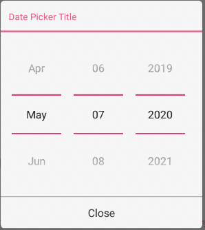
I've got a datepicker in my Android app, but now I want to change the color of the blue dividers into green (see the image below this text). There are some other discussions on Stackoverflow that talk about the same, but none of them gives an answer which leads to a solution.

So I went looking myself and found there is actually an android:datePickerStyle and there is also an android:divider. I don't know however, whether the divider is actually referring to the divider in the datepicker at all. I tried a multitude of combinations of the two, but I don't seem to get it to work. So my first question: Does the android:divider refer to the divider in the datepicker, and how could I use it to change color?

So another option is supposedly to create a fully new custom datepicker. If that enables me to just change the color of the divider I'm down for it. So I had a look at some of the tutorials on creating a custom datepicker, but none of them seem to define the color of the dividers. The dividers are simply not listed in the xml files or in the java files.

It would be great if there would be some kind of boilerplate code to recreate the datepicker as it currently displays, including the code that sets the color of the dividers. Hopefully that would enable me to copy it and simply change the color setting of the divider somewhere. So my second question: Would anybody know any boilerplate code which simply implements the datepicker as it is now (including a definition of the dividers)?

enter image description here

Jumpoff answered 22/11, 2013 at 15:36 Comment(1)
This link may help full to you just check it please #12711712Apuleius
C
101

Unfortunately, this is not a trivial task.

DatePickers use widgets NumberPicker and CalendarView internally. For instance, the image you have posted is using 3 NumberPickers. And the dividers you are talking about come from NumberPicker's attribute: selectionDivider. The problem is that this attribute is not public, and neither is numberPickerStyle, through which, this attribute is set.

I recently back-ported CalendarView and NumberPicker to API 8, mostly for fun. Since the code is readily available(look up android.widget.NumberPicker and others in android's source), all this task takes is time, and some digging through android's source-code. Examples:

  1. Easy ==> You'll have to change the private variable from View class to their accessor methods

    mLeft (protected variable in View class) ==> getLeft() (public accessor method)

  2. The most time-consuming task was restoring the Accessibility methods.

In any case, if you do decide on writing custom implementation of DatePicker, you'll have to write them for NumberPicker and CalendarView (optionally) as well.

Easier way:

Backported DatePicker is available as a library here: Android-DatePicker. As mentioned above, you'll be using backported CalendarView and NumberPicker in conjunction with this DatePicker.

What you need to change:

Use {library-numberpicker} / res / drawable-xxxx / np_numberpicker_selection_divider.9.png as a template, and change the 'bluish' color to green (I used pixlr). You can either save it with the same name, if you want to be done with the blue divider altogether, or use a different name and make changes in {library-numberpicker} / res / values / themes.xml.

The changes required in themes.xml if you choose a different name:

<style name="NPWidget.Holo.NumberPicker" parent="NPWidget.NumberPicker">
    ....
    <item name="selectionDivider">@drawable/new_nine_path_drawable_name</item>
    ....
</style>

And that's it.

Output using the libraries:

enter image description here

Edit:

Does the android:divider refer to the divider in the datepicker, and how could I use it to change color?

The attribute divider actually comes from LinearLayout. NumberPicker inherits this attribute as NumberPicker extends LinearLayout. But this divider serves a different purpose. The drawable passed to this attribute is placed between child views of LinearLayout.

The attribute android:showDividers is used to change the placement of this divider, possible values being:

  • none: No dividers shown
  • beginning: Divider is shown before the first child view
  • middle: Divider is shown after each child view, not not after the last child view
  • end: Divider is shown after the last child view

The attribute android:dividerPadding is self-explanatory.

Even though NumberPicker inherits this attribute, it does not use it. This is evident from your own research & trials: I tried a multitude of combinations of the two, but I don't seem to get it to work.

To see the divider attribute in action:

<LinearLayout xmlns:android="http://schemas.android.com/apk/res/android"
    android:layout_width="wrap_content"
    android:layout_height="wrap_content"
    android:orientation="horizontal"
    android:divider="@android:drawable/ic_media_play"
    android:showDividers="middle" >

    <TextView
        android:layout_width="wrap_content"
        android:layout_height="wrap_content"
        android:text="Hello" />

    <TextView
        android:layout_width="wrap_content"
        android:layout_height="wrap_content"
        android:text="World," />

    <TextView
        android:layout_width="wrap_content"
        android:layout_height="wrap_content"
        android:text="Again" />

</LinearLayout>

Hack-ish workaround using java reflection:

This answer here gave me the idea. I hate using refection in general, mostly for reasons listed in this answer: Link. Although I'm listing it here for completeness sake, I suggest you don't use it.

public class CDP extends android.widget.DatePicker {

    public CDP(Context context, AttributeSet attrs) {
        super(context, attrs);

        Class<?> internalRID = null;
        try {
            internalRID = Class.forName("com.android.internal.R$id");
        } catch (ClassNotFoundException e) {
            e.printStackTrace();
        }

        Field month = null;
        try {
            month = internalRID.getField("month");
        } catch (NoSuchFieldException e) {
            e.printStackTrace();
        }

        NumberPicker npMonth = null;
        try {
            npMonth = (NumberPicker) findViewById(month.getInt(null));
        } catch (IllegalArgumentException e) {
            e.printStackTrace();
        } catch (IllegalAccessException e) {
            e.printStackTrace();
        }

        Field day = null;
        try {
            day = internalRID.getField("day");
        } catch (NoSuchFieldException e) {
            e.printStackTrace();
        }

        NumberPicker npDay = null;
        try {
            npDay = (NumberPicker) findViewById(day.getInt(null));
        } catch (IllegalArgumentException e) {
            e.printStackTrace();
        } catch (IllegalAccessException e) {
            e.printStackTrace();
        }

        Field year = null;
        try {
            year = internalRID.getField("year");
        } catch (NoSuchFieldException e) {
            e.printStackTrace();
        }

        NumberPicker npYear = null;
        try {
            npYear = (NumberPicker) findViewById(year.getInt(null));
        } catch (IllegalArgumentException e) {
            e.printStackTrace();
        } catch (IllegalAccessException e) {
            e.printStackTrace();
        }

        Class<?> numberPickerClass = null;
        try {
            numberPickerClass = Class.forName("android.widget.NumberPicker");
        } catch (ClassNotFoundException e) {
            e.printStackTrace();
        }

        Field selectionDivider = null;
        try {
            selectionDivider = numberPickerClass.getDeclaredField("mSelectionDivider");
        } catch (NoSuchFieldException e) {
            e.printStackTrace();
        }

        try {
            selectionDivider.setAccessible(true);
            selectionDivider.set(npMonth, getResources().getDrawable(
                       R.drawable.np_numberpicker_selection_divider_green));
            selectionDivider.set(npDay, getResources().getDrawable(
                       R.drawable.np_numberpicker_selection_divider_green));
            selectionDivider.set(npYear, getResources().getDrawable(
                       R.drawable.np_numberpicker_selection_divider_green));
        } catch (IllegalArgumentException e) {
            e.printStackTrace();
        } catch (NotFoundException e) {
            e.printStackTrace();
        } catch (IllegalAccessException e) {
            e.printStackTrace();
        }
    }
}

What we do here:

  • Extend DatePicker
  • If you open date_picker.xml in sdk/platforms/android-xx/res/layout, you'll see that the three NumberPickers have ids month, day, year. We access android.internal.R.id to get resource ids for these NumberPickers.
  • We create three NumberPicker objects using these ids with findViewById(int) method.
  • Then, access and retrieve the Field mSelectionDivider using relection.
  • Set the field to accessible (as its declared final), set its value using Field#set(Object, Object) method. The first argument is the Object that we perform this operation on. Second argument is the Object that we want to set.

The drawable I have used can be downloaded from: here.

Carcajou answered 29/11, 2013 at 18:13 Comment(9)
Potential simplification: npMonth = (NumberPicker) findViewById(Resources.getSystem().getIdentifier("month", "id", "android"));?Shock
@Carcajou how did you manage to get the upper and bottom date text grey in color ? all text color are black in color for me using TimePickerReject
@flexdroid I didn't have to make the text color grey. From looking at the source code, NumberPicker uses the following parameter: TOP_AND_BOTTOM_FADING_EDGE_STRENGTH = 0.9f. For lack of a better word, this value is the alpha applied to specific portions of a View using overridden methods getTopFadingEdgeStrength() and getBottomFadingEdgeStrength(). And the specific portions that get this alpha applied are determined in NumberPicker#initializeFadingEdges().Carcajou
@flexdroid Since you are not seeing this effect, check net.simonvt.numberpicker.NumberPicker.java and confirm that TOP_AND_BOTTOM_FADING_EDGE_STRENGTH is indeed set to 0.9f. You can also try changing this value to something dramatic like 0.1f. In this case, the top and bottom textviews should be hardly visible.Carcajou
@Carcajou TOP_AND_BOTTOM_FADING_EDGE_STRENGTH are set to 0.9f even after changing the value also i am not able to see the effect.Reject
I found that the fading edge is visible in device like nexus 4 with kitkat 4.4, but not in samsung note 2 with 4.3 what could be wrong ?Reject
@flexdroid Could be that Samsung changed this behavior. Vendors often do such things. Not much you can do about. Perhaps you should look into the newer (and in my opinion, more intuitive) date and time pickers that are part of the stock alarm clock app on nexus 4. There's a library implementation for those.Carcajou
@Carcajou please take a look at #27545113Iconolatry
@Vikram, Please add note of setting CDP into xml file or call it As an new DatePicker.Gladiator
C
26

I think the simplest solution is probably to use styles.

Just put this in your styles.xml document

    <!-- changes the default colours for EditTexts, including non-text elements (also works with the DatePicker -->

<style name="appCompatStyle" parent="Theme.AppCompat.Light">
    <item name="colorControlNormal">@color/lightPrimaryText</item>
    <item name="colorControlActivated">@color/colorAccent</item>
    <item name="android:editTextStyle">@style/editTextStyle</item>
</style>


<!-- changes the default text colour for the EditTexts -->
<style name="editTextStyle" parent="android:style/Widget.EditText">
    <item name="android:textColor">@color/lightPrimaryText</item>
</style>

and put these attributes in your layout XML

android:theme="@style/appCompatStyle"

and customize it however you like.

Convergence answered 26/3, 2016 at 15:39 Comment(2)
On Android 4.3 and 4.4 not working, in android 5 and above - works greatFasten
This does not change the dividers' color for API 21Belfort
S
11

Setting a theme to DatePicker layout and adding colorControlNormal to it works for me.

In your layout's xml add a DatePicker applying a theme as shown below -

<DatePicker xmlns:android="http://schemas.android.com/apk/res/android"
            android:theme="@style/NumberPickerStyle"
            android:datePickerMode="spinner"
            android:calendarViewShown="false"
            android:layout_gravity="center_horizontal"
            android:layout_height="wrap_content"
            android:layout_width="wrap_content"/>

and then define the NumberPickerStyle in styles.xml specifying colorControlNormal like this -

<style name="NumberPickerStyle">
        <item name="colorControlNormal">@color/colorAccent</item>
</style>
Sandor answered 7/5, 2018 at 10:17 Comment(1)
I have exactly the same code and it's not working. It is still black. However I am not using DatePicker in a Dialog. It's just a view that I'm displaying in my dialog, I don't know if this changes anything.Mucilaginous
V
8

Change color divider in DatePickerDialog with android:datePickerMode="spinner" => Set android:theme for DatePicker

DatePicker Xml:

<DatePicker
        android:id="@+id/datePicker"
        android:layout_width="match_parent"
        android:layout_height="wrap_content"
        android:calendarViewShown="false"
        android:theme="@style/MyAppTheme.DatePicker"
        android:datePickerMode="spinner" />

MyAppTheme Xml:

<style name="MyAppTheme.DatePicker" parent="AppTheme">
    <item name="colorControlNormal"> ?colorAccent </item>
</style>

screenshot

Vert answered 7/5, 2020 at 4:18 Comment(0)
C
3

There is one library they have custmize time and date picker. In that you can change color of divider following way

    timePicker.setSelectionDivider(new ColorDrawable(0xffff0000));
    timePicker.setSelectionDividerHeight(2);

Edit Another library I have also used that is also good one in that you can customize using following way in thems.xml

<style name="NPWidget.Holo.NumberPicker" parent="NPWidget.NumberPicker">
        <item name="solidColor">@android:color/transparent</item>
        <item name="selectionDivider">@color/div_color</item>
        <item name="selectionDividerHeight">0.3dip</item>
        <item name="internalLayout">@layout/number_picker_with_selector_wheel</item>
        <item name="internalMinWidth">64dip</item>
        <item name="internalMaxHeight">140dip</item>
        <item name="virtualButtonPressedDrawable">@drawable/item_background_holo_dark</item>
    </style>
Condolent answered 21/8, 2017 at 5:32 Comment(2)
the library crashes with weird exceptionsGreco
CustomTimePicker one you can customize 100% your own way. I use it and working charmCondolent
K
0

First of all; Vikram, you did a great job thank you for your effort! One thing I was missing in net.simonvt.datepicker.DatePickerDialog was the option to set the titleDivider color which I want to match with numberPickerDividerColor. So I added this option in Vikrams implementation and am posting it here. It's a common solution related to changing AlertDialog.titleDividerColor. Maybe it will help someone.

class net.simonvt.datepicker.DatePickerDialog
private int titleDividerColor;

It's important to set the color when the dialog is shown, so I do this in onAttachedToWindow method.

@Override
public void onAttachedToWindow() {
    super.onAttachedToWindow();

    if (titleDividerColor <= 0) { return; }

    try {
        int dividerId = getContext().getResources().getIdentifier("android:id/titleDivider", null, null);
        View divider = findViewById(dividerId);
        if (divider != null) {
            divider.setBackgroundColor(getContext().getResources().getColor(titleDividerColor));
        }
    } catch (Exception e) {}
}

public void setTitleDividerColor(int titleDividerColor) {
    this.titleDividerColor = titleDividerColor;
}

public int getTitleDividerColor() {
    return titleDividerColor;
}

EDIT

I posted another solution here https://mcmap.net/q/188104/-how-can-i-change-the-color-of-alertdialog-title-and-the-color-of-the-line-under-it

Kerriekerrigan answered 18/11, 2015 at 9:8 Comment(0)
A
0

For changing just divider color in DatePickerDialog changing android:datePickerDialogTheme style in your theme is sufficient:

Theme style:

 <style name="BaseTheme" parent="Theme.AppCompat.Light.NoActionBar">
    <item name="android:datePickerDialogTheme">@style/style_date_picker_dialog</item>
</style>

Dialog style:

<style name="style_date_picker_dialog" parent="AppCompatAlertDialogStyle">
<item name="colorControlNormal">@color/colorAccent</item>
</style>
Abbevillian answered 17/8, 2016 at 13:57 Comment(1)
android:datePickerDialogTheme is for API >=21Chink
D
-5

From wrecker at Android divider color DatePicker dialog

You can use these attributes for instance:

<NumberPicker
            android:layout_width="wrap_content"
            android:layout_height="wrap_content"
            selectionDivider="@color/black" //The divider for making the selection area
            selectionDividerHeight="1px"//The height of the selection divider
            selectionDividersDistance="3dp"//The distance between the two selection dividers
            internalLayout="@layout/something"//The layout of the number picker.
            internalMaxHeight="5dp"//The max height of the NumberPicker (also check other variations)
            internalMinWidth="5dp" // The max width of the NumberPicker (also check other variations)
            virtualButtonPressedDrawable="@drawable/something"//The drawable for pressed virtual (increment/decrement) buttons.
            />
Dunfermline answered 5/12, 2013 at 11:58 Comment(0)

© 2022 - 2024 — McMap. All rights reserved.