My Today extension needs to have a dynamic height based on the contents the widget is displaying. I was able to achieve this by adding a constraint on my bottom-most element: bottom layout guide's top is less than or equal to the bottom most element's bottom, with a constant of 0, priority 999, multiplier 1.
This works exactly as expected on iPhones - the widget height fits all content plus the default bottom margin is applied before the next widget is shown.
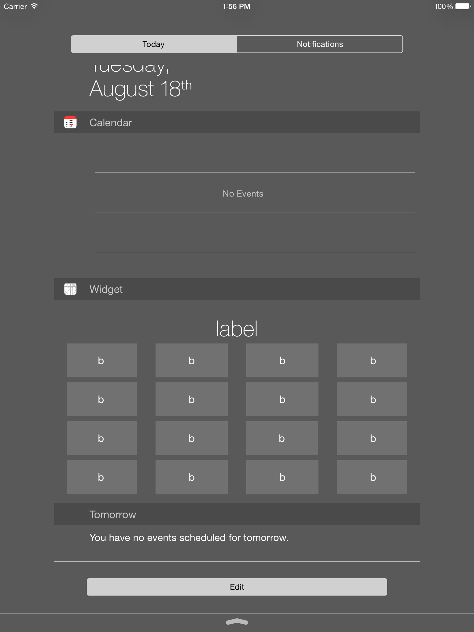
But on iPad it seems to be setting my widget's height equal to the max height Notification Center will allow a widget to be - there's a lot of space underneath my widget, it's nearly full screen.
How can I remove that extra space?
I know exactly what the problem is but am not sure how to solve it - see the "The Problem" section. First let me explain the setup:
The Setup:
I set this extension's view up in a storyboard, nothing is done programmatically. The view consists of 5 elements stacked vertically, and some others horizontally. These are the auto layout constraints for that vertical line from top to bottom - where not stated priority is 1000, multiplier 1:
UILabel: height = 35, top space to top layout guide with constant of 10
UIButton: equal height and width to a different button (whose aspect ratio is 1:1, there is no fixed width/height), top space to label 10
UIButton: equal height and width to same button, top space to above button 8
UIButton: equal height and width to same button, top space to above button 8
UIButton: equal height and width to same button, top space to above button 8, bottom space to bottom layout guide <= 0 with priority 999
The Necessary Behavior:
- I need a grid of 4x4 buttons located underneath a single full-width label
- Each button should be the exact same width and height - all perfect squares
- No extra space underneath the last row of buttons
The Result:

The Expected Result:

The Problem:
The aspect ratio constraints on all of the buttons end up indirectly imposing an 'implicit' aspect ratio constraint on the height of the widget view when it is sent systemLayoutSizeFittingSize:withHorizontalFittingPriority:verticalFittingPriority:, where it’s passed the necessary width (724) for layout at the required priority and a height of 0 (to compress the view) at the fitting level priority. This results in a tall widget view on iPad where the view is wider to begin with. But there is no actual aspect-ratio constraint that can be removed. Essentially, because I've applied aspect-ratio constraints to all the button, the height of the today extension is dependent on its width (considering all the constraints together, aspect-ratio and otherwise). Thus the height of the extension is ungainly in a wide area, manifesting itself on a wide device like the iPad. The constraints on the buttons need to be reconsidered, or somehow adjusted.
The Sample Project:
A sample project that demonstrates the issue is available from CloudApp so you can download and play with it.
What I've Tried:
I tried removing the default margin insets by overriding widgetMarginInsetsForProposedMarginInsets and returning 0 for the bottom. This did remove the default padding, therefore decreased the height a bit, but there's still a lot of extra space underneath it.
The UILabel had a constraint on it: label's leading equal to superview's leading - constant 0, priority 1000, multiplier 1. If I simply change that to the superview's leading margin, the extra bottom spacing magically disappears. I wondered if it was because the elements were becoming too large, so increasing the amount of left spacing would decrease their size, but I tried keeping it set to the regular leading and increasing the constant and that didn't resolve the issue. But this only resolves the issue for iPad in portrait. And it doesn't even fully resolve it, every time you pull down Notification Center it starts at the large height then shrinks down to the proper size. In landscape it never does shrink to the proper size.
Attempted Solutions:
- @Lefteris proposed hardcoding the size, which won't work in this case as the height is dynamic and the widget is available for many screen sizes/orientations.
- @Yuyutsu attempted to solve it, but it unfortunately doesn't meet the requirements and exhibits conflicting constraints and a modified layout.


