I have a Pandas DataFrame that has the following values in a Series
x = [2, 1, 76, 140, 286, 267, 60, 271, 5, 13, 9, 76, 77, 6, 2, 27, 22, 1, 12, 7, 19, 81, 11, 173, 13, 7, 16, 19, 23, 197, 167, 1]
I was instructed to plot two histograms in a Jupyter notebook with Python 3.6.
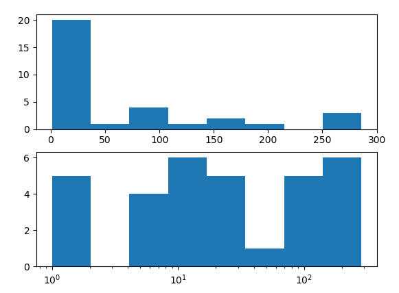
x.plot.hist(bins=8)
plt.show()
I chose 8 bins because that looked best to me. I have also been instructed to plot another histogram with the log of x.
x.plot.hist(bins=8)
plt.xscale('log')
plt.show()
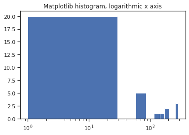
This histogram looks TERRIBLE. Am I not doing something right? I've tried fiddling around with the plot, but everything I've tried just seems to make the histogram look even worse. Example:
x.plot(kind='hist', logx=True)
I was not given any instructions other than plot the log of X as a histogram.
For the record, I have imported pandas, numpy, and matplotlib and specified that the plot should be inline.

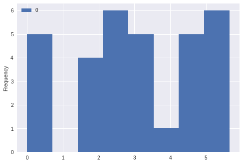
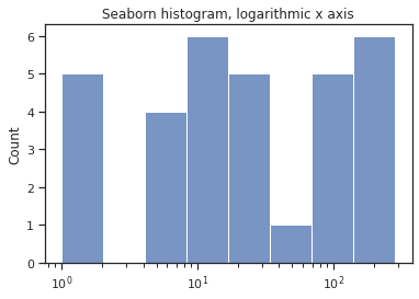
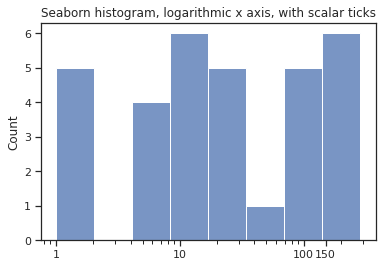
plt.hist(np.log(x)). – Velvety