Change the stroke/fill color of SF Symbol icon in SwiftUI?
Asked Answered
B

8

54

I am looking for a way to change the stroke / fill color of an SF Symbol icon in SwiftUI.

I have tried .background(Color.red) but that just changes the background of the whole icon (no change is applied to the actual icon itself) as implied. I also tried .foregroundColor(Color.red)which does nothing to the icon.

contents of content view are as follows:

var body: some View {
    Image(systemName: "person.circle").foregroundColor(.red)    
}
Boyer answered 21/6, 2019 at 19:34 Comment(7)
Image(systemName: "person.circle").foregroundColor(.red) draws a red person in a circle for me. What does it draw for you?Rooftop
for me it remains a black icon. It could just be a xcode bug... At least that's what I'm hoping.Boyer
Please post a small, self-contained test. Create a new SwiftUI project and modify the default ContentView to demonstrate the problem. Then copy the definition of ContentView into your question.Rooftop
Edited! Still black with a self contained project however.Boyer
Are you running the code, or using the preview? For me, the preview is showing the icon as black, but running it will change the color correctlyHuggins
Oh! That seems to have solved my problem. Odd it doesn't show in the preview.Boyer
Image(systemName: "person.circle").foregroundColor(.red) will work, but I want to color the custom logo like Image("clock").foregroundColor(.blue) and it doesn't work.Agateware
M
53

You can change the stroke and fill color of a sf symbol icon using foregroundColor(_ color: Color?)

The following code:

Image(systemName: "flame.fill").foregroundColor(.red)
Image(systemName: "flame").foregroundColor(.red)

Should produce this:

Filled and Stroked Flame SF Symbol Icons

Here is the complete SwiftUI View Code

struct Icon : View {
    var body: some View {
        HStack{
            Image(systemName: "flame.fill")
            .foregroundColor(.red)
            Image(systemName: "flame")
            .foregroundColor(.red)
        }
        .padding()
    }
}
Missend answered 18/7, 2019 at 16:44 Comment(4)
Perfect. foregroundColor did the trick for me. 👍 You would say accentColor would describe this functionality better but that one doesn't work.Garment
Also note that foregroundColor has no effect on Image if you use a Image(uiImage: UiImage("flame.fill"))Out
The SFSymbol .fill or .outline variants are now automatically selected depending on the containing view. e.g. in TabView on Mac. Mac and iOS tab views don't both use .fill.Hydrophilous
@Out you can get past the foregroundColor not working with a UIImage source by setting the rendering mode, e.g. Image(uiImage: UiImage("flame.fill")).renderingMode(.template).foregroundColor(Color(.red)). I still have some programatically created icons generated with PaintCode returned as UIImages.Lewin
S
32

iOS 15

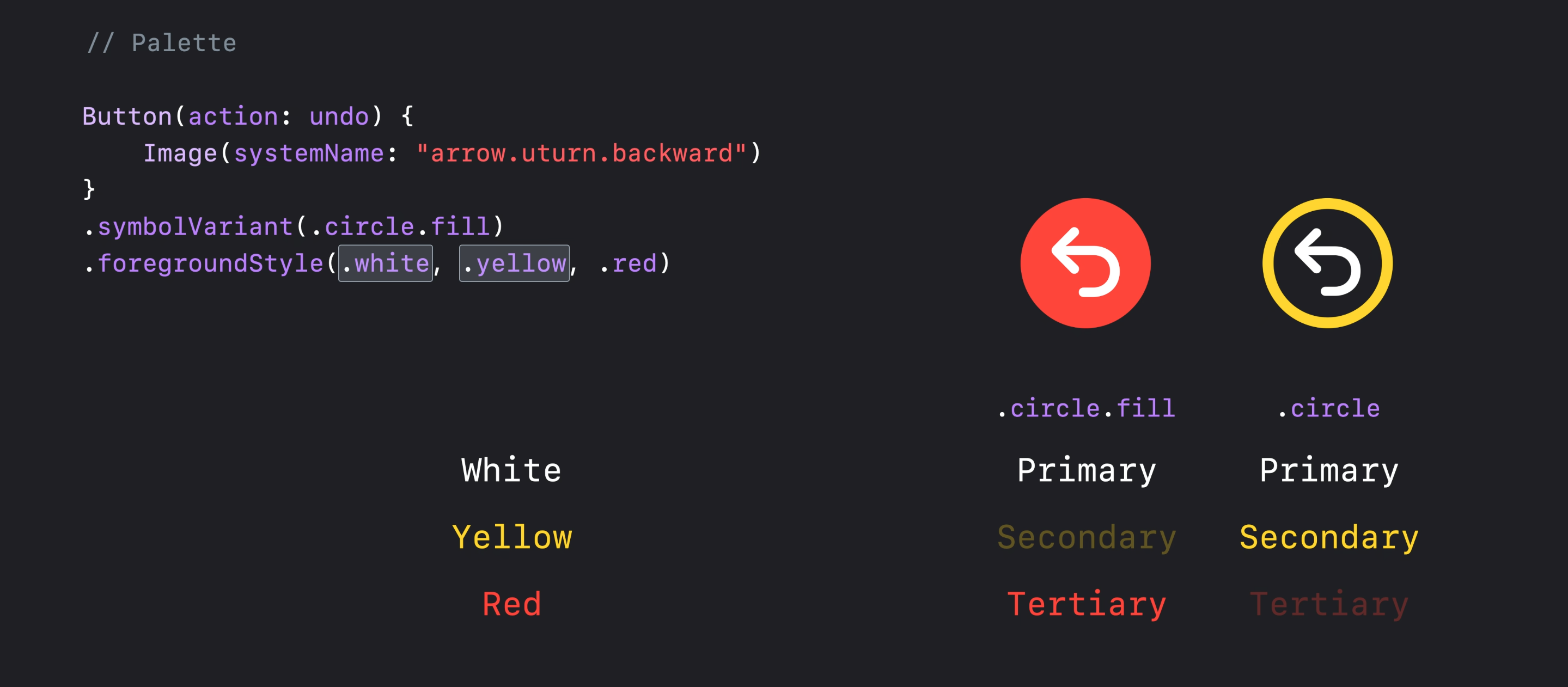
from iOS 15 and with the SFSymbols 3, you can apply different layers of colors to a single symbol with the foreground style modifier:

Image(systemName: "person.circle")
    .resizable()
    .foregroundStyle(.red, .blue)
    .frame(width: 200, height: 200, alignment: .center)

Demo 1


iOS 13 and 14

You can use a ZStack with different parts of the icon and apply different modifiers to each layer like:

/// 💡 I've used `GeometryReader ` for setting the size of elements dependent on each other

GeometryReader { proxy in 
    ZStack {
        Image(systemName: "circle")
            .resizable()
            .foregroundColor(.blue)

        Image(systemName: "person.fill")
            .resizable()
            .foregroundColor(.red)
            .frame(
                   width: proxy.size.width * 0.55,
                   height: proxy.size.width * 0.55,
                   alignment: .center
            )
    }
}.frame(width: 200, height: 200, alignment: .center)

Demo 2

Note that the old and new methods look slightly different but feel the same. (take a closer look at the roundness of the head)

Supersensual answered 22/7, 2021 at 16:26 Comment(1)
using .resizable with systemImage is not recommended as it's transformed into something other than a fontLadew
S
28

iOS 15+

In iOS 15 we can use foregroundStyle to customise SF Symbols even more:

Image(systemName: "cloud.sun.bolt")
    .foregroundStyle(.gray, .blue)

See more at this WWDC session:

enter image description here

Softball answered 16/6, 2021 at 16:32 Comment(1)
A great example of the incredible amount of typing you save in SwiftUI over UIKit!Nyctalopia
T
4

One trick I figured out that works nicely for iOS 14 is to use the fill and non fill versions together to get two colors regardless of whether 14 or 15:

ZStack {
    Image(systemName: "person.circle")
        .foregroundColor(.white)
    Image(systemName: "person.circle.fill")
        .foregroundColor(.yellow)
}
Tramline answered 7/2, 2022 at 16:5 Comment(0)
I
2

Yes there is:

var body: some View {
    Image(systemName: "person.circle").accentColor(.red)    
}
Insulin answered 29/6, 2019 at 23:35 Comment(1)
This worked in an earlier beta. I think that currently, the correct way to do it is to use .foregroundColor(.red).Insulin
M
1

SwiftUI now allows you to color parts (layers) of many of the SF Symbols. Some symbols have many layers.

This will color the symbol foreground blue:

Image(systemName: "person.circle").foregroundStyle(.blue)

If you want to color the circle differently from the person this will color the person blue and the circle gray

Image(systemName: "person.circle").foregroundStyle(.blue, .gray)
Malayan answered 16/1, 2023 at 20:58 Comment(0)
L
0

This will draw the background of the icon in red and the lines in blue:

Image(systemName: "person.circle")
    .foregroundColor(Color.red)
    .background(Color.blue)
    .frame(width: size, height: self, alignment: .center)
    .clipShape(Circle())

Without clipShape there will be blue corners in the rectangle behind the circle.

Lascivious answered 15/11, 2020 at 8:12 Comment(0)
B
-1

Just change the tint color. That did it for me.

Broomcorn answered 28/8, 2019 at 23:48 Comment(1)
tint color was the away I updated the .borderedProminent buttonStyle color.Wills

© 2022 - 2024 — McMap. All rights reserved.