I want to use the NumberPicker component-widget but Instead in the default Holo theme I need to replace the blue color with orange since that is the default color in my styling.
How can I replace the blue color and the color of the numbers,and keep all of the functionality of the component?
 thanks
Make copy of library/res/drawable-*/numberpicker_selection_divider.9.png and name then, for example, custom_np_sd.9.png.
Override default NumberPicker style via activity theme:
<style name="AppTheme" parent="@style/Holo.Theme">
  <item name="numberPickerStyle">@style/CustomNPStyle</item>
</style>
<style name="CustomNPStyle" parent="@style/Holo.NumberPicker">
  <item name="selectionDivider">@drawable/custom_np_sd</item>
</style>
And apply @style/AppTheme as activity theme.
Unfortunately, you can't style it. The styles and styling attributes for NumberPicker are not present in the public API, therefore you can't set them and change the default look. You can only select between light and dark theme.
As a solution I would suggest to use android-numberpicker library instead. The library is basically a port of NumberPicker extracted from Android source codes. But it's better than that, it also backports NumberPicker to Android 2.x. The library can be easily styled.
To style the divider adjust NPWidget.Holo.NumberPicker style and its selectionDivider and selectionDividerHeight attributes.
To style the text adjust NPWidget.Holo.EditText.NumberPickerInputText style.
android:textColorPrimary in your base theme. This can possibly affect other TextViews' text color (if one is not set explicitly). But, this behavior can be contained on the Activity level. –
Taro android:textColorPrimary, as I've already done so differently, –
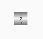
Alcaic Preview of a customized number picker:
<NumberPicker
  android:id="@+id/np"
  android:layout_width="40dp"
  android:layout_height="40dp"
  android:layout_centerHorizontal="true"
  android:background="@drawable/drawablenp"
  android:layout_centerVertical="true"/>
Create the background xml in the drawable folder named "drawablenp.xml"
<?xml version="1.0" encoding="utf-8"?>
<shape
    xmlns:android="http://schemas.android.com/apk/res/android"
    android:shape="rectangle">

    <gradient
        android:startColor="#707070"
        android:centerColor="#f8f8f8"
        android:endColor="#707070"
        android:angle="270"/>

</shape>
Make copy of library/res/drawable-*/numberpicker_selection_divider.9.png and name then, for example, custom_np_sd.9.png.
Override default NumberPicker style via activity theme:
<style name="AppTheme" parent="@style/Holo.Theme">
  <item name="numberPickerStyle">@style/CustomNPStyle</item>
</style>
<style name="CustomNPStyle" parent="@style/Holo.NumberPicker">
  <item name="selectionDivider">@drawable/custom_np_sd</item>
</style>
And apply @style/AppTheme as activity theme.
I faced this problem too. I really want to have nice NumberPicker UI. All answer in this question worked but very limited. I almost create my own RecylerView to create the NumberPicker I want. Apparently I found neat library which is very robust. Here is the link https://github.com/Carbs0126/NumberPickerView
Not trying to answer the question here. Just want to help someone with the same problem as I am.
I face this problem too, I use reflect to change the style
public class MyNumberPicker extends NumberPicker {
    public MyNumberPicker(Context context) {
        super(context);

        setNumberPickerDivider();
    }

    public MyNumberPicker(Context context, AttributeSet attrs) {
        super(context, attrs);

        setNumberPickerDivider();
    }

    public MyNumberPicker(Context context, AttributeSet attrs, int defStyleAttr) {
        super(context, attrs, defStyleAttr);

        setNumberPickerDivider();
    }

    @RequiresApi(api = Build.VERSION_CODES.LOLLIPOP)
    public MyNumberPicker(Context context, AttributeSet attrs, int defStyleAttr, int defStyleRes) {
        super(context, attrs, defStyleAttr, defStyleRes);

        setNumberPickerDivider();
    }

    @Override
    public void addView(View child) {
        super.addView(child);
        updateView(child);
    }

    @Override
    public void addView(View child, int index, android.view.ViewGroup.LayoutParams params) {
        super.addView(child, index, params);
        updateView(child);
    }

    @Override
    public void addView(View child, android.view.ViewGroup.LayoutParams params) {
        super.addView(child, params);
        updateView(child);
    }

    public void updateView(View view) {
        if (view instanceof EditText) {
            EditText et = (EditText) view;
            et.setTextColor(ContextCompat.getColor(getContext(), R.color.font_content));
            et.setTextSize(16);
        }
    }

    private void setNumberPickerDivider() {

        try {
            {
                Field field = NumberPicker.class.getDeclaredField("mSelectionDivider");
                field.setAccessible(true);
                field.set(this, ContextCompat.getDrawable(getContext(), R.drawable.horizontal_divider));
            }

            {
                Field field = NumberPicker.class.getDeclaredField("mSelectionDividerHeight");
                field.setAccessible(true);
                field.set(this, 1);
            }
        } catch (NoSuchFieldException e) {
            e.printStackTrace();
        } catch (IllegalAccessException e) {
            e.printStackTrace();
        }
    }
}
There are some indirect ways to modify MumberPicker design I used some years ago. NumberPicker is a ViewGroup containing main EditText field which is the holder of almost all design parameters. These parameters are propagated then in other parts of the NumberPicker like "SelectorWeel" and others through the initialization phase. This EditText is in the mInputText field. This field is private but you can intercept it and make some design corrections in addView method this way:
public class NoFlingNumberPicker extends NumberPicker {
...
protected EditText _mInputText;
...
protected void updateView( View view ) {
        if( view instanceof EditText ) {
            _mInputText = (EditText) view;
            _mInputText.setTextSize( getResources().getDimension( R.dimen.N_P_TextUnit ) );
        }
    }

    @Override
    public void addView( View child ) {
        super.addView( child );
        updateView( child );
    }

    @Override
    public void addView( View child, int index, android.view.ViewGroup.LayoutParams params ) {
        super.addView( child, index, params );
        updateView( child );
    }

    @Override
    public void addView( View child, android.view.ViewGroup.LayoutParams params ) {
        super.addView( child, params );
        updateView( child );
    }
...
}
These corrections will be made before the propagation to other NumberPicker parts. Some corrections could be made after this phase:
protected void init() {
    ...
    int count = getChildCount();
    _mInputText = null;
    for( int i = 0; i < count; i++ ) {
        View v = getChildAt( i );
        if( v instanceof EditText ) {
            _mInputText = (EditText) v;
            ColorStateList csl = _mInputText.getTextColors();

            //  make some color modifications
            csl = modifyColors( csl );

            _mInputText.setTextColor( csl );
            break;
        }
    }
    ...
}

public NoFlingNumberPicker( Context context ) {
    super( context );
    init();
}

public NoFlingNumberPicker( Context context, AttributeSet attrs ) {
    super( context, attrs );
    init();
}

public NoFlingNumberPicker( Context context, AttributeSet attrs, int defStyleAttr ) {
    super( context, attrs, defStyleAttr );
    init();
}
© 2022 - 2024 — McMap. All rights reserved.

