How to plot "difficult" probability distributions with ggplot2
Asked Answered
H

1

1

Background

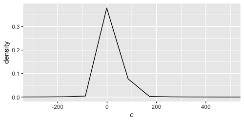
Certain probability distributions such as quotient distributions (aka ratio distributions), a specific case of which is the Cauchy distribution, seem to be difficult to visualise because of their heavy tails. Here is a MRE in ggplot2:

require(ggplot2)
a <- rnorm(1e4, 2, 0.5)
b <- rnorm(1e4, 0.2, 0.1)
c <- a/b
ggplot() + geom_density(aes(c)) + coord_cartesian(xlim = c(-300, 500))

enter image description here

Question

I have tried adjusting the kernel bandwidth following answers to this S/O post but that didn't seem to work. How do I get a smooth version of the above probability distribution? The same problem obviously arises when I try working with dependencies, such as ggridges::geom_density_ridges.

Hemphill answered 24/4, 2023 at 3:24 Comment(1)
As a small side note, you might want to be careful naming your variables c in R, as it is also the widely used function to combine things.Delija
D
4

The issue is that ggplot2 by default creates 512 points along the x-axis over which to evaluate the kernel density. Since your range is fraction of the data range, only a a few of those evaluated points will be shown. We can demonstrate this by adding a point layer:

library(ggplot2)
a <- rnorm(1e4, 2, 0.5)
b <- rnorm(1e4, 0.2, 0.1)
c <- a/b

ggplot() +
  geom_point(aes(c), stat = "density") +
  geom_density(aes(c)) +
  coord_cartesian(xlim = c(-300, 500))

Of note, density layer does not know about the coord's limits. One way to remedy the issue, is to increase the number of points with the n argument.

# Increase number of points over which to evaluate density
ggplot() + 
  geom_density(aes(c), n = 10000) + 
  coord_cartesian(xlim = c(-300, 500))

However, this can be inefficient as you're not using all these points. Instead, you can set the scale's limits, which the density layer will know about. This will make the range you're looking at more densely populated with points, giving a smoother KDE.

An important detail here is that we're using oob = scales::oob_keep as the out-of-bounds handler. This ensures that the KDE calculation considers all points, not just the ones in your range.

# Limit range to populate with points over which to evaluate density
ggplot() + 
  geom_density(aes(c)) + 
  scale_x_continuous(limits = c(-300, 500), 
                     oob = scales::oob_keep) # Do not censor data

Created on 2023-04-24 with reprex v2.0.2

Delija answered 24/4, 2023 at 6:46 Comment(5)
Thank you @teunbrand, this is a great solution for stat_density. However, it does not work for ggridges::stat_density_ridges (no change in KDE) and only partially works for ggdist::stat_slab (change in KDE but not smooth). Any thoughts?Hemphill
For ggridges::stat_density_ridges(), you can set the from/to arguments without setting any limits outside that function. For ggdist::stat_slab() I don't know. Intuitively, I'd have thought you could use the limits argument there, but it seems to be ignored.Delija
Sorry to return to my query at such a late stage @teunbrand, but I recently bumped into the above problem with geom_split_violin() using code from @Trang Q. Nguyen (https://mcmap.net/q/298722/-split-violin-plot-with-ggplot2). The oob = scales::oob_keep solution does not work and geom_violin() and its derivatives don't have an n argument. Perhaps you have an idea? I would really appreciate it!Hemphill
No I can't come up with a simple solution in this case, I'm afraid.Delija
Ok, thanks for the quick reply @teunbrand. In that case I am working on a solution with the answer provided by @Axeman (https://mcmap.net/q/298722/-split-violin-plot-with-ggplot2). Since it converts densities to polygons, the oob trick comes at too late a stage (the plotting stage). Would you recommend increasing the n or constraining the from/to arguments when the densities are estimated? Does it make a difference? Does constraining from/to still use the entire distribution?Hemphill

© 2022 - 2024 — McMap. All rights reserved.