How to use two-column layout with reveal.js?
Asked Answered
H

7

69

I use reveal.js and write my slides in Markdown code. Now I want to display my content (text, unordered list of bullet points or even an image) in a classical two-column text layout. I would prefer a solution which may be more complex in initial configuration as long as the actual writing of content in Markdown remains easy.

Since I prefer not to run a local server, I write my markdown within the main HTML file.

Update: As the first answer indicates this should be achieved with CSS. (I updated my question accordingly.) Still, I couldn't find any description how to do it with CSS.

Hautbois answered 16/6, 2015 at 7:56 Comment(3)
As for the practicalities of "how to do it with CSS" (where to store the file, how to call it), see stanford.edu/~vbauer/teaching/revealjs.htmlShute
@Shute link is deadRemarkable
@Remarkable I see - I haven't been able to find an alternative :(Shute
J
79

I am using CSS flex, it is working fine.

<style>
.container{
    display: flex;
}
.col{
    flex: 1;
}
</style>

<div class="container">

<div class="col">
Column 1 Content
</div>

<div class="col">
Column 2 Content
</div>

</div>

UPDATE:

Since pandoc supports fenced div,

::: {.container}
:::: {.col}
Column 1 Content
::::
:::: {.col}
Column 2 Content
::::
:::

For the style, we can either use flex or grid, both work fine.

Using flex

<style>
.container{
  display: flex;
}
.col {
  flex: 1;
}
</style>

Using grid

<style>
.container{
  display: grid;
  grid-auto-flow: column;
}
</style>
Jennette answered 6/6, 2017 at 14:1 Comment(10)
I think this is the best and easiest answer, why anyone would use display: table is beyond meCamp
A note on this method, to use it with markdown you need to use code like this <section class="hbox"> <div class="container"> <div class="flex-col" data-markdown> * Column 1 Content </div> <div class="flex-col" data-markdown> * Column 2 Content </div> </div> </section>Jacquelynejacquelynn
How does this work for Markdown? When I put a div around MD it stops parsing MD inside the div. So I get the raw output.Monstrosity
You need to have data-markdown in the div after the class name, e.g. <div class="col" data-markdown>Jacquelynejacquelynn
@Monstrosity You may have to have blank lines between the <div> tags so the MD parser works properly (it depends a lot on implementation).Cyndicyndia
I like this answer because you can do markdown inside the columns. Using markdown, I put the slide title and bullets in one column and an image in the other and it looks great.Cyndicyndia
Small addition: In Rmarkdown, the data-markdown statement or blank lines seem not necessary, however, the indentation is relevant: markdown inside the diff worked for me, if the content was not more than two tabs indented, but not otherwise.Cathicathie
I can't get this approach to work with markdown. I have set data-markdown on the divs and removed any indentation with no luck.Receivable
Could you explain why using the grid solution, the .col class is not needed ? In my case, it works whatever the name of the class of the inner div. But I have to give it a name.Winepress
@Winepress a name is needed for the inner fenced div, this is per spec: "Fenced divs can be nested. Opening fences are distinguished because they must have attributes.".Caliper
T
22

I created two ID's in an external css file, custom.css, which I attached to my reveal.js file with the field css: custom.css in the YAML header.

#left {
  left:-8.33%;
  text-align: left;
  float: left;
  width:50%;
  z-index:-10;
}

#right {
  left:31.25%;
  top: 75px;
  float: right;
  text-align: right;
  z-index:-10;
  width:50%;
}

I placed div elements with the right and left ID's in my markdown document to produce a two column layout.

<div id="right">

- You can place two graphs on a slide
- Or two columns of text
- These are all created with div elements

</div>
There answered 19/7, 2016 at 15:28 Comment(4)
This doesn't work for me perhaps because I write my markdown into the main HTML file and I don't use a separate markdown file.Hautbois
@Hautbois see the answer from @Gaucherie below. Also note that you can have the whole column of markdown in one <p> element.Hurl
My only suggestion is to use classes instead of IDs. You are only allowed to use an ID once, and I'd imagine you'd like to use the #left and #right elements several times.Beadroll
for me, this messes up the print/PDF output, probably because of the float. I prefer Frank's solution below.Pipistrelle
T
15

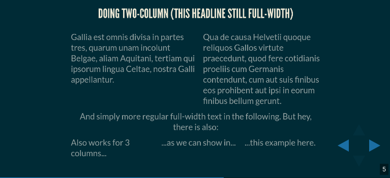
enter image description here

.multiCol {
    display: table;
    table-layout: fixed; // don't fudge depending on content
    width: 100%;
    text-align: left; // matter of taste, makes imho sense
    .col {
        display: table-cell;
        vertical-align: top;
        width: 50%;
        padding: 2% 0 2% 3%; // some vertical, and between columns
        &:first-of-type { padding-left: 0; } // there's nothing before col1
    }
}

Put this into your custom theme, i.e. right before

// Theme template ------------------------------
@import "../template/theme";
// ---------------------------------------------

How to use? – easy! And not limited to 2 columns:

<section>
    <h3>Doing two-column (this headline still full-width)</h3>

    <div class='multiCol'>
        <div class='col'>
            Gallia est omnis divisa in partes tres, quarum unam incolunt Belgae, aliam Aquitani, tertiam qui ipsorum lingua Celtae, nostra Galli appellantur.
        </div>
        <div class='col'>
            Qua de causa Helvetii quoque reliquos Gallos virtute praecedunt, quod fere cotidianis proeliis cum Germanis contendunt, cum aut suis finibus eos prohibent aut ipsi in eorum finibus bellum gerunt.
        </div>
    </div>
    And simply more regular full-width text in the following. But hey, there is also:
    <div class='multiCol'>
        <div class='col'>Also works for 3 columns...</div>
        <div class='col'>...as we can show in...</div>
        <div class='col'>...this example here.</div>
    </div>
</section>
  • No float needed
  • no clearfix needed
  • size independent (→ only percentages used)
  • 2 columns, 3 columns, 4 columns ...

<table> ist often considered “outdated” (since it got so badly abused for layout purposes in early html days, and still today for html in emails...) but to the contrary at least as a property layout:table it has many legit uses, is often the most simple solution and widely compatible.

Territus answered 6/11, 2017 at 14:24 Comment(1)
Does not render properly if the text in a column is too short.Schelling
S
11

The CSS Grid Layout allows very flexible layouts, two-column formats and more complex layouts.

For two columns, the following CSS snippet may be used. It defines two column templates with equal size, each 1 fraction (1fr) of the available width, and a gutter space of 10px between the columns.

.twocolumn {
   display: grid;
   grid-template-columns: 1fr 1fr;
   grid-gap: 10px;
   text-align: left;
}

It can be used as follows

<section>
  <h2>Slide Title</h2>
  <div class="twocolumn">
    <div>
      Column One
    </div>
    <div>
      Column Two        
    </div>
  </div>
</section>
Seeseebeck answered 19/11, 2017 at 13:55 Comment(3)
While I like CSS grids super much, it doesn't work properly in CSS gridsMu
@MartinThoma For me, the CSS grids approach worked in reveal.js. Perhaps you would share the issues you encountered?Seeseebeck
Works for me 👍Jae
G
9

I solved the problem with two floating <div>-Elements:

<section>
  <div style="text-align: left; float: left;">
    <p data-markdown>- This is my first left element</p>
    <p data-markdown>- This is my second left element</p>
    <!-- more Elements -->
  </div>

  <div style="text-align: right; float: right;">
    <p data-markdown>- This is my first right element</p>
    <p data-markdown>- This is my second rightelement</p>
    <!-- more Elements -->
  </div>
</section>

I found out, if you want to use markdowns inside the div-container, you have to wrap the elements in p-tags. If you write data-markdown into the parent section-Tag, it will be ignored inside the div

I hope I could help!

Gaucherie answered 8/6, 2016 at 11:21 Comment(0)
T
5

I have found the following way to show one element in such a way it seems to be in a column layout

Text going to the right <!-- .element: style="float: right; width: 40%" -->

Text going on the left column <!-- .element: style="width: 40%" -->

But actually it doesn't work with more than one element on the right

Typeset answered 2/5, 2016 at 21:50 Comment(0)
M
3

I could not understand you completely but I guess you may found the answer in ramnathv post.

---
layout: slide
---
{{{ content }}}
<div class='left' style='float:left;width:{{left.width}}'>
 {{{ left.html }}}
</div>
<div class='right' style='float:right;width:{{right.width}}'>
 {{{ right.html }}}
</div>

it worked for me

Misha answered 8/2, 2016 at 7:59 Comment(0)

© 2022 - 2024 — McMap. All rights reserved.