How to stretch a fixed number of horizontal navigation items evenly and fully across a specified container
Asked Answered
B

12

70

I'd like to stretch 6 nav items evenly across a 900px container, with an even amount of white space between. For instance...

---| 900px Container |---

---| HOME    ABOUT    BASIC SERVICES    SPECIALTY SERVICES    OUR STAFF    CONTACT US |---

Currently, the best method I can find to do this is the following:

nav ul {
  width: 900px; 
  margin: 0 auto;
}

nav li {
  line-height: 87px;
  float: left;
  text-align: center;
  width: 150px;
}

The PROBLEM with this is two fold. First of all, it doesn't truly justify it, but rather spreads the li tags evenly throughout the ul tag.. creating uneven white-space between smaller menu items like "HOME" or "ABOUT" and larger ones like "BASIC SERVICES".

The second problem is that the layout breaks if a nav item is larger than 150px, which SPECIALTY SERVICES is - even though there is more than enough space for the whole nav.

Can anyone solve this for me? I've been scouring the web for solutions, and they all seem to come up short. CSS / HTML only if possible...

Thanks!

UPDATE (7/29/13): Using table-cell is the best modern way to implement this layout. See felix's answer below. The table cell property works on 94% of browsers currently. You'll have to do something about IE7 and below, but otherwise should be ok.

UPDATE (7/30/13): Unfortunately, there is a webkit bug that impacts this if you're combining this layout with Media Queries. For now you'll have to avoid changing the 'display' property. See Webkit Bug.

UPDATE (7/25/14): There is a better solution to this below now involving text-align: justify. Using this is simpler and you'll avoid the Webkit bug.

Bracteate answered 20/2, 2011 at 23:40 Comment(0)
H
98

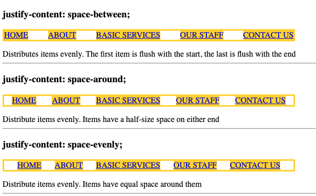
The modern way to distribute items evenly is to set the following two declarations on the container element:

.container {
  display: flex; /* (1) */
  justify-content: space-between; /* (2) or space-around or space-evenly */ 
} 

The value to use for justify-content depends on which kind of even distribution is needed.

enter image description here

See MDN

ul {
  list-style: none;
  padding: 0;
  width: 90vw;
  border: 3px solid gold;
  display: flex;
}
a {
  background: gold;
}
ul {
  justify-content: space-between;
}
ul ~ ul {
  justify-content: space-around;
}
ul ~ ul ~ ul {
  justify-content: space-evenly;
}
<h3>justify-content: space-between; </h3>

<ul id="nav">
  <li><a href="#">HOME</a></li>
  <li><a href="#">ABOUT</a></li>
  <li><a href="#">BASIC SERVICES</a></li>
  <li><a href="#">OUR STAFF</a></li>
  <li><a href="#">CONTACT US</a></li>
</ul>
<div>Distributes items evenly. The first item is flush with the start, the last is flush with the end </div>
<hr>
<h3>justify-content: space-around;</h3>
<ul id="nav">
  <li><a href="#">HOME</a></li>
  <li><a href="#">ABOUT</a></li>
  <li><a href="#">BASIC SERVICES</a></li>
  <li><a href="#">OUR STAFF</a></li>
  <li><a href="#">CONTACT US</a></li>
</ul>
<div>Distribute items evenly. Items have a half-size space on either end</div>
<hr>
<h3>justify-content: space-evenly;</h3>
<ul id="nav">
  <li><a href="#">HOME</a></li>
  <li><a href="#">ABOUT</a></li>
  <li><a href="#">BASIC SERVICES</a></li>
  <li><a href="#">OUR STAFF</a></li>
  <li><a href="#">CONTACT US</a></li>
</ul>
<div>Distribute items evenly. Items have equal space around them</div>
<hr>

Here's my original answer - if for some reason using a flex container isn't viable

Use text-align:justify on the container, this way it will work no matter how many elements you have in your list (you don't have to work out % widths for each list item

    #nav {
        text-align: justify;
        min-width: 500px;
    }
    #nav:after {
        content: '';
        display: inline-block;
        width: 100%;
    }
    #nav li {
        display: inline-block;
    }
<ul id="nav">
    <li><a href="#">HOME</a></li>
    <li><a href="#">ABOUT</a></li>
    <li><a href="#">BASIC SERVICES</a></li>
    <li><a href="#">OUR STAFF</a></li>
    <li><a href="#">CONTACT US</a></li>
</ul>

FIDDLE

Hyrax answered 30/7, 2013 at 15:29 Comment(15)
The :after-style is key :)Stravinsky
The after is used to stretch the content to take up 100% widthHyrax
This works because text-align: justify ensures that all lines are the same length. The :after style being set to display: inline-block with width: 100% creates a full-width child element within the nav for justify to match the length of.Gargan
Is there any way to minimize the impact of the :after pseudoelement? Adding these styles has introduced a blank line that I can't seem to shrink using margin, padding nor height. Is this just an unavoidable effect of using display-inline?Gargan
Try making a fiddle which shows this problem and then post it as a questionHyrax
New question regarding extra unwanted vertical space, along with fiddle, here: #20134651Raby
I don't think this method allows overflow if the menu is dynamic.Odontology
This is really great - anyone know the browser compatibility spectrum on this? Can I change the answer I marked since this is a better solution at this point?Bracteate
@Bracteate compatibility is very good. The current code will work in IE8+ and if you substitute the after pseudo element with a span it will work in even earlier version of IE. Regarding changing the answer - I think that's fine :D - but maybe check this up on metaHyrax
@AnthonyDiSanti hey there, you will need to neutralise the inline whitespace then reinstate if for the elements: codepen.io/anon/pen/MYWjgjPepillo
@Hyrax If you can address Anthony Disanti's white-space question in the answer above, I'll change this to the correct answer. It's a much more elegant solution, but I think incomplete without that note.Bracteate
@Bracteate I've solved the trailing whitespace issue in a cross-browser compatible way. I've submitted a new answer with the final solution and an explanation of why it works.Gargan
one problem here is that the click area is just over the text, not over the entire segment. I tried to use this but decided to go flex. its cleaner and only IE<9 sees uneven.Subauricular
Nice solution :) Thx.Value
What would be the best way to center the links within their areas? Go from "|HOME |ABOUT |" to "| HOME | ABOUT |"Camenae
S
39

This one really works. Also has the benefit that you can use media queries to easily turn off the horizontal style — for instance if you want to stack them vertically when on mobile phone.

HTML

<ul id="nav">
    <li><a href="#">Link</a></li>
    <li><a href="#">Link</a></li>
    <li><a href="#">Link</a></li>
    <li><a href="#">Link</a></li>
    <li><a href="#">Link</a></li>
    <li><a href="#">Link</a></li>
</ul>

CSS

​
#nav {
    display: table;
    height: 87px;
    width: 100%;
}

#nav li {
    display: table-cell;
    height: 87px;
    width: 16.666666667%;  /* (100 / numItems)% */
    line-height: 87px;
    text-align: center;
    background: #ddd;
    border-right: 1px solid #fff;
    white-space: nowrap;
}​

@media (max-width: 767px) {
    #nav li {
        display: block;
        width: 100%;
    }
}

http://jsfiddle.net/timshutes/eCPSh/416/

Subauricular answered 31/12, 2012 at 16:14 Comment(3)
This solution doesn't solve the problem, putting in a longer title in the li makes the white space bigger again instead of using the same whitespace as between the other itemsRundown
if the number of items is fixed then in the CSS you can set a percentage width of (1.0/numItems * 100)%. this will give exact evenly spaced cols.Subauricular
This solution is the best modern solution. It doesn't work on ie7 but that can be dealt with. There is one piece of code missing though for the layout described: width: 16.666666667%; or as Felix said above "(1.0/numItems * 100)%. I added this into your answer via an edit since you had it here in the comments.Bracteate
T
15

if you can, use flexbox:

<ul>
    <li>HOME</li>
    <li>ABOUT US</li>
    <li>SERVICES</li>
    <li>PREVIOUS PROJECTS</li>
    <li>TESTIMONIALS</li>
    <li>NEWS</li>
    <li>RESEARCH &amp; DEV</li>
    <li>CONTACT</li>
</ul>

ul {
  display: flex;
  justify-content:space-between;
  list-style-type: none;
}

jsfiddle: http://jsfiddle.net/RAaJ8/

Browser support is actually quite good (with prefixes an other nasty stuff): http://caniuse.com/flexbox

Tryptophan answered 20/5, 2014 at 11:34 Comment(1)
Yes, definitely flex. Thank you. I added: ul { padding-left: 0; } ul > li { text-align: center; }Wield
G
7

An ideal solution will:

  1. Automatically scale to the width of the navigation container
  2. Support a dynamic number of menu items.

Using a simple ul menu inside of an nav container, we can build a solution that meets the above requirements.

HTML

<nav>
  <ul>
    <li>Home</li>
    <li>About</li>
    <li>Basic Services</li>
    <li>Specialty Services</li>
    <li>Our Staff</li>
    <li>Contact Us</li>
  </ul>
</nav>

First, we need to force the ul to have the full width of its nav container. To accomplish this, we will use the :after psuedo-element with width: 100%.

This achieves our goal perfectly, but adds trailing whitespace from the psuedo-element. We can remove this whitespace across all browsers through IE8 by setting the line-height of the ul to 0 and setting it back to 100% on its li children. See the example CodePen and solution below:

CSS

nav {
  width: 900px;
}

nav ul {
  text-align: justify;
  line-height: 0;
  margin: 0;
  padding: 0;
}

nav ul:after {
  content: '';
  display: inline-block;
  width: 100%;
}

nav ul li {
  display: inline-block;
  line-height: 100%;
}
Gargan answered 26/11, 2014 at 20:8 Comment(3)
If you want really nice thing, you would set nav ul width to something like 90%, and set margin-left, margin-right to auto to have those nice paddings from left and right, check CodePenNeology
Good answer. I haven't tested it yet outside codepen, but it seems to do what i want. I do not like putting width in my list items for navigation.Betel
@Samia Ruponti Thanks, yeah I agree. Static widths are problematic especially in dynamic setups, like the menu on a wordpress blog, which will differ between sites using the theme. If you run into any trouble, let me know.Gargan
C
3

I tried all the above and found them wanting. This is the simplest most flexible solution I could figure out (thanks to all of the above for inspiration).

HTML

<div id="container">
<ul>
    <li>HOME</li>
    <li>ABOUT US</li>
    <li>SERVICES</li>
    <li>PREVIOUS PROJECTS</li>
    <li>TESTIMONIALS</li>
    <li>NEWS</li>
    <li>RESEARCH &amp; DEV</li>
    <li>CONTACT</li>
</ul>
</div>

CSS

div#container{
  width:900px;
  background-color:#eee;
    padding:20px;
}
ul {
    display:table;
    width: 100%;
    margin:0 0;
    -webkit-padding-start:0px; /* reset chrome default */
}
ul li {
    display:table-cell;
    height:30px;
    line-height:30px;
    font-size:12px;    
    padding:20px 10px;
    text-align: center;
    background-color:#999;
    border-right:2px solid #fff;
}
ul li:first-child {
    border-radius:10px 0 0 10px;
}
ul li:last-child {
    border-radius:0 10px 10px 0;
    border-right:0 none;
}

You can drop the first/last child-rounded ends, obviously, but I think they're real purdy (and so does your client ;)

The container width limits the horizontal list, but you can ditch this and just apply an absolute value to the UL if you like.

Fiddle with it, if you like..

http://jsfiddle.net/tobyworth/esehY/1/

Cirilo answered 15/10, 2013 at 17:41 Comment(0)
S
2

This should do it for you.

<div id="nav-wrap">
    <ul id="nav">
        <li><a href="#">Link</a></li>
        <li><a href="#">Link</a></li>
        <li><a href="#">Link</a></li>
        <li><a href="#">Link</a></li>
        <li><a href="#">Link</a></li>
        <li><a href="#">Link</a></li>
    </ul>
</div>

#nav-wrap {
    float: left;
    height: 87px;
    width: 900px;
}

#nav {
    display: inline;
    height: 87px;
    width: 100%;
}

.nav-item {
    float: left;
    height: 87px;
    line-height: 87px;
    text-align: center;
    text-decoration: none;
    width: 150px;

}
Shikari answered 21/2, 2011 at 1:58 Comment(0)
A
1

Have you tried setting the li width to, say, 16% with a margin of 0.5%?

nav li {
  line-height: 87px;
  float: left;
  text-align: center;
  width: 16%;
  margin-right: 0.5%;
}

edit: I would set the UL to 100% width:

nav ul { width: 100%; margin: 0 auto; }

Agriculturist answered 20/2, 2011 at 23:47 Comment(0)
P
1

This is the sort of thing that the CSS flexbox model will fix, because it will let you specify that each li will receive an equal proportion of the remaining width.

Pompadour answered 21/2, 2011 at 0:31 Comment(1)
From your lips to God's ears. Sadly, the only recent improvement I have seen in browsers so far is that our major customer recently moved from IE6 to 7. Woohoo! I suspect I will be able to take advantage of flexbox sometime around 2020. ;-)Agriculturist
C
1

I tried so many different things and finally found what worked best for me was simply adding in padding-right: 28px;

I played around with the padding to get the right amount to evenly space the items.

Cupbearer answered 17/8, 2011 at 20:13 Comment(0)
D
0

Instead of defining the width, you could just put a margin-left on your li, so that the spacing is consistent, and just make sure the margin(s)+li fit within 900px.

nav li {
  line-height: 87px;
  float: left;
  text-align: center;
  margin-left: 35px;
}

Hope this helps.

Decasyllabic answered 20/2, 2011 at 23:49 Comment(0)
C
0
<!DOCTYPE html>
<html lang="en">
<head>
<style>
#container { width: 100%; border: 1px solid black; display: block; text-align: justify; }
object, span { display: inline-block; }
span { width: 100%; }
</style>
</head>

  <div id="container">
    <object>
      <div>
      alpha
      </div>
    </object>
    <object>
      <div>
      beta
      </div>
    </object>
    <object>
      <div>
      charlie
      </div>
    </object>
    <object>
      <div>
      delta
      </div>
    </object>
    <object>
      <div>
      epsilon
      </div>
    </object>
    <object>
      <div>
      foxtrot
      </div>
    </object>
    <span></span>
  </div>
</html>
Currier answered 6/1, 2013 at 23:16 Comment(0)
Z
-1

I'm hesitant to offer this as it misuses ye olde html. It's not a GOOD solution but it is a solution: use a table.

CSS:

table.navigation {
    width: 990px;
}
table.navigation td {
    text-align: center;
}

HTML:

<table cellpadding="0" cellspacing="0" border="0" class="navigation">
    <tr>
        <td>HOME</td>
        <td>ABOUT</td>
        <td>BASIC SERVICES</td>
        <td>SPECIALTY SERVICES</td>
        <td>OUR STAFF</td>
        <td>CONTACT US</td>
    </tr>
</table>

This is not what tables were created to do but until we can reliably perform the same action in a better way I guess it is just about permissable.

Zimmer answered 5/9, 2012 at 9:17 Comment(0)

© 2022 - 2024 — McMap. All rights reserved.