'position: sticky' not working when 'height' is defined
Asked Answered
F

3

27

I am building a landing page where the user first sees a main area with a footer underneath it. Scrolling further down reveals that the footer is a sticky header, and I aim to use pure CSS to achieve this. To obtain the fullscreen appearance of the main content and the footer I set the height property to two different values: 92% and 8% (using vh also doesn't work). No matter the height I specify in my CSS (different units and all), my footer div is not sticking. As soon as I remove the height property it works as intended.

Here is a screenshot of my page before removing the height properties:

With %, landing

As you can see, it does not stick:

With %, scrolled

After removing the height property values, it does stick:

Without %, scrolled

Below the relevant code:

html,
body {
  height: 100%;
  margin: 0;
}

#main {
  height: 92%;
}

#landing {
  display: flex;
  align-items: center;
  justify-content: center;
  height: 100%;
  text-align: center;
}

#landingContent {
  width: 20vw;
}

#footerNav {
  height: 8%;
  display: flex;
  align-items: center;
  position: -webkit-sticky;
  position: sticky;
  top: 0px;
}
<div id="main">
  <div id="landing">
    <div id="landingContent">
      <h1 class="logo">Logo</h1>
      <p id="landingParagraph">Lorem ipsum, paragraph content, etc etc.</p>
      <button>Button</button>
    </div>
  </div>
</div>
<div id="footerNav">
  <div id="footerNavContent">
    <h1 class="logo">Logo</h1>
  </div>
</div>
<p>Hello</p>
<p>Hello</p>
<p>Hello</p>
<p>Hello</p>
<p>Hello</p>
<p>Hello</p>
<p>Hello</p>
<p>Hello</p>
<p>Hello</p>
<p>Hello</p>
<p>Hello</p>
<p>Hello</p>
<p>Hello</p>
<p>Hello</p>
<p>Hello</p>
<p>Hello</p>
<p>Hello</p>
<p>Hello</p>
<p>Hello</p>
<p>Hello</p>
<p>Hello</p>
<p>Hello</p>
<p>Hello</p>
<p>Hello</p>
<p>Hello</p>
<p>Hello</p>
<p>Hello</p>

I have read that using the overflow property can be problematic, though it is is not present nor have I heard anything about height being an issue for others. I might be wrong, of course.

I have tested on:

  • Firefox 61 (Nightly)
  • Safari 53 (Tech Preview)
  • Chrome 65

Note - removing the height property from #main keeps #footerNav sticky.

Fellowship answered 16/4, 2018 at 0:41 Comment(7)
There's not much difference in height of footer in your first (loading page with set height) screenshot and third (working without height) screenshot. So, what specific purpose do you want to set the height of the footer for? Also, have you tried removing height only for the footer?Mercurous
@Mercurous I appreciate having the set height for uniformity and to assure the page is 100% filled with the footer and main content, if that makes sense. Removing the height from the footer produced an interesting result: the footer stays sticky for a little but, but then 'unsticks' once I've scrolled past a certain point. Tested in Firefox.Fellowship
any reason you can't use javascript?Gladysglagolitic
@Gladysglagolitic No particular reason, I'd just rather keep it clean, I suppose.Fellowship
it's probably possible with some css trick but honestly it's going to be easier just using jsGladysglagolitic
Completely disagree, CSS3's 'sticky position property' is made for the problem he is trying to solve. Temani hit the nail on the head.Redskin
It's not just height, but also just adding a width CSS rule to sticky-top, loses the 'stickyness' and does the same thing, so it's not down to height.Albrecht
S
51

The issue here is with height, but not the height you thought about. Let's first start by the definition of the sticky position:

A stickily positioned element is an element whose computed position value is sticky. It's treated as relatively positioned until its containing block crosses a specified threshold (such as setting top to value other than auto) within its flow root (or the container it scrolls within), at which point it is treated as "stuck" until meeting the opposite edge of its containing block.

The important part here is the last sentence which explain that the position sticky will end when the element reach the edge of its containing block and in your case the containing block of the sticky element is the body and you set the body to be height:100% and you are having an overflow of content.

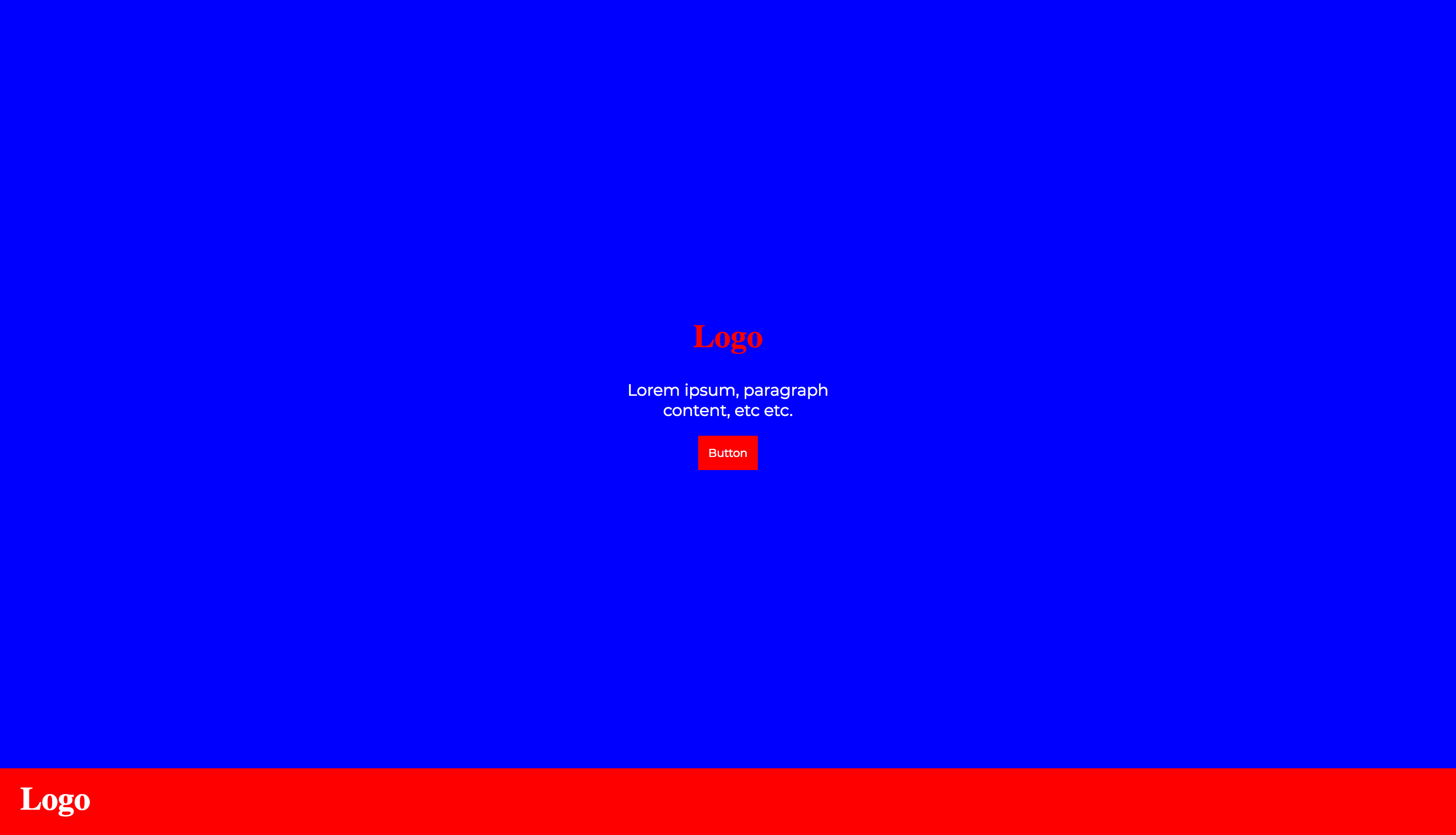
So when setting the height of main to be 92% and the footer to be 8%, you already made the footer at the oppsite edge of its containing block. Here is an illustration where I added a background color to the body so you can clearly see this:

html,
body {
  height: 100%;
  margin: 0;
}
html {
  background:white;
}
body {
  background:blue;
}

#main {
  height: 92%;
}
#landing {
  display: flex;
  align-items: center;
  justify-content: center;
  height: 100%;
  text-align: center;
}
#landingContent {
  width: 20vw;
}
#footerNav {
  height: 8%;
  display: flex;
  align-items: center;
  position: sticky;
  top: 0px;
  background:red;
  color:#fff;
}
<div id="main">
    <div id="landing">
        <div id="landingContent">
            <h1 class="logo">Logo</h1>
            <p id="landingParagraph">Lorem ipsum, paragraph content, etc etc.</p>
            <button>Button</button>
        </div>
    </div>
</div>
<div id="footerNav">
    <div id="footerNavContent">
        <h1 class="logo">Logo</h1>
    </div>
</div>
<p>Hello</p>
<p>Hello</p>
<p>Hello</p>
<p>Hello</p>
<p>Hello</p>
<p>Hello</p>
<p>Hello</p>
<p>Hello</p>
<p>Hello</p>
<p>Hello</p>
<p>Hello</p>
<p>Hello</p>
<p>Hello</p>
<p>Hello</p>
<p>Hello</p>
<p>Hello</p>
<p>Hello</p>
<p>Hello</p>
<p>Hello</p>
<p>Hello</p>
<p>Hello</p>
<p>Hello</p>

As you can see the logo is already at the bottom of the body so there is no way to make it move as sticky. Also your content is overflowing.

Now if you decrease the height of the main content a bit, you can see a small sticky behavior that will end when the footer will reach the bottom of the blue part (the body).

html,
body {
  height: 100%;
  margin: 0;
}
html {
  background:white;
}
body {
  background:blue;
}

#main {
  height: 82%;
}
#landing {
  display: flex;
  align-items: center;
  justify-content: center;
  height: 100%;
  text-align: center;
}
#landingContent {
  width: 20vw;
}
#footerNav {
  height: 8%;
  display: flex;
  align-items: center;
  position: sticky;
  top: 0px;
  background:red;
  color:#fff;
}
<div id="main">
    <div id="landing">
        <div id="landingContent">
            <h1 class="logo">Logo</h1>
            <p id="landingParagraph">Lorem ipsum, paragraph content, etc etc.</p>
            <button>Button</button>
        </div>
    </div>
</div>
<div id="footerNav">
    <div id="footerNavContent">
        <h1 class="logo">Logo</h1>
    </div>
</div>
<p>Hello</p>
<p>Hello</p>
<p>Hello</p>
<p>Hello</p>
<p>Hello</p>
<p>Hello</p>
<p>Hello</p>
<p>Hello</p>
<p>Hello</p>
<p>Hello</p>
<p>Hello</p>
<p>Hello</p>
<p>Hello</p>
<p>Hello</p>
<p>Hello</p>
<p>Hello</p>
<p>Hello</p>
<p>Hello</p>
<p>Hello</p>
<p>Hello</p>
<p>Hello</p>
<p>Hello</p>

In order to fix the issue you simply need to avoid setting height:100% to the body. You can use min-height instead or keep its height auto. You may also consider vh unit for main and footer:

html,
body {
  /*height: 100%;
    no needed
  */ 
  margin: 0;
}
html {
  background:white;
}
body {
  background:blue;
}

#main {
  height: 92vh;
}
#landing {
  display: flex;
  align-items: center;
  justify-content: center;
  height: 100%;
  text-align: center;
}
#landingContent {
  width: 20vw;
}
#footerNav {
  height: 8vh;
  display: flex;
  align-items: center;
  position: sticky;
  top: 0px;
  background:red;
  color:#fff;
}
<div id="main">
    <div id="landing">
        <div id="landingContent">
            <h1 class="logo">Logo</h1>
            <p id="landingParagraph">Lorem ipsum, paragraph content, etc etc.</p>
            <button>Button</button>
        </div>
    </div>
</div>
<div id="footerNav">
    <div id="footerNavContent">
        <h1 class="logo">Logo</h1>
    </div>
</div>
<p>Hello</p>
<p>Hello</p>
<p>Hello</p>
<p>Hello</p>
<p>Hello</p>
<p>Hello</p>
<p>Hello</p>
<p>Hello</p>
<p>Hello</p>
<p>Hello</p>
<p>Hello</p>
<p>Hello</p>
<p>Hello</p>
<p>Hello</p>
<p>Hello</p>
<p>Hello</p>
<p>Hello</p>
<p>Hello</p>
<p>Hello</p>
<p>Hello</p>
<p>Hello</p>
<p>Hello</p>

Related questions for more details/examples:

Why element with position:sticky doesn't stick to the bottom of parent?

What are `scrolling boxes`?

If you specify `bottom: 0` for position: sticky, why is it doing something different from the specs?

Severally answered 16/4, 2018 at 8:23 Comment(0)
C
5

I had the same issue, but I needed the height: 100%; on the parent container. In my case I have a sticky navigation, the content needs to grow to its full length and the footer should always be visible at the end of the page (but with no position attribute).

I fixed it by setting overflow: auto; to that parent container. Now the parent is still 100% tall but the sticky container inside it, doesn't matter the height limitations.

Cosmetician answered 19/1, 2021 at 12:27 Comment(0)
S
-2

The support for the use of position: sticky seems to be sort of weak. You can check that in this page:

https://caniuse.com/#search=position%3A%20sticky

If you want a sticky footer, you may use position: absolute, which is supported by every browser. I took your code and created like a mini version of it to illustrate my point regarding position: absolute.

<!doctype html>
    <html>
        <head>
    <style>
        * {
            margin: 0;
            padding: 0;
        }

        .footerNav {
            background-color: red;
            position: absolute;
            bottom: 0;
            width: 100%;
            height: 100px;
        }
    </style>
</head>
<body>
    <div id="main">
        <div id="landing">
            <div id="landingContent">
                <h1 class="logo">Logo</h1>
                <p id="landingParagraph">Lorem ipsum, paragraph content, etc etc.</p>
                <button>Button</button>
            </div>
        </div>
    </div>
    <div class="footerNav">
        <div id="footerNavContent">
            <h1 class="logo">Logo</h1>
        </div>
    </div>
</body>

Please, notice that I changed id="footerNav" for class="footerNav". I personally favor classes for applying styles. But you can use ids if you still prefer to.

If you want the login page to appear, and then the user to scroll a little bit to see your footer, then you can use the height: 100vh and remove the position absolute from the footer since it will be pushed down below by the main content div. For instance:

<!doctype html>
    <html>
<head>
    <style>
        * {
            margin: 0;
            padding: 0;
        }

        #main {
            height: 100vh;
        }

        #footerNav {
            background-color: red;
            position: relative;
            bottom: 0;
            width: 100%;
            height: 100px;
        }
    </style>
</head>
<body>
    <div id="main">
        <div id="landing">
            <div id="landingContent">
                <h1 class="logo">Logo</h1>
                <p id="landingParagraph">Lorem ipsum, paragraph content, etc etc.</p>
                <button>Button</button>
            </div>
        </div>
    </div>
    <div id="footerNav">
        <div id="footerNavContent">
            <h1 class="logo">Logo</h1>
        </div>
    </div>
</body>

I hope my answer could help you in some way.

Shanika answered 16/4, 2018 at 4:4 Comment(1)
Thanks for the response, but I don't think you've really answered my question: the 'sticky' behaviour works but when the height properties for the two divs is applied it breaks.Fellowship

© 2022 - 2024 — McMap. All rights reserved.