I have been trying to plot a time series graph from a CSV file. I have managed to read the file and converted the data from string to date using strptime and stored in a list. When I tried plotting a test plot in matplotlib with the list containing the date information it plotted the date as a series of dots; that is, for a date 2012-may-31 19:00, I got a plot with a dot at 2012, 05, 19, 31, 00 on y-axis for the value of x=1 and so on. I understand that this is not the correct way of passing date information for plotting. Can someone tell me how to pass this information correctly.
Convert your x-axis data from text to datetime.datetime, use datetime.strptime:
>>> from datetime import datetime
>>> datetime.strptime("2012-may-31 19:00", "%Y-%b-%d %H:%M")
 datetime.datetime(2012, 5, 31, 19, 0)
This is an example of how to plot data once you have an array of datetimes:
import matplotlib.pyplot as plt
import datetime
import numpy as np

x = np.array([datetime.datetime(2013, 9, 28, i, 0) for i in range(24)])
y = np.random.randint(100, size=x.shape)

plt.plot(x,y)
plt.show()

1. Make sure the data is datetime (or datetime64)
A common problem with plotting time-series data is that it's very common for the data to not be of type datetime but rather a string that looks like datetime such as "2023-03-23 07:13:13", which is especially common if the data was read from a file.
from datetime import datetime

x = ['2023-03-25 04:11:37', '2020-03-23 08:11:37', '2019-11-23 01:07:17', '2024-03-25 23:17:37', '2021-03-22 16:27:37']
y = [8.55, 6.55, 4.63, 10.46, 7.35]
z = [9.86, 4.95, 0.5, 6.35, 8.43]
x = [datetime.strptime(d, '%Y-%m-%d %H:%M:%S') for d in x]  # convert to datetime
If the csv file is read into a pandas dataframe, use pd.to_datetime() to convert to datetime. For example,
df = pd.DataFrame({'date': x, 'value': y, 'value2': z})
df['date'] = pd.to_datetime(df['date'])                     # convert to datetime
2. Sort by dates
To make a readable plot, it's important that the data is sorted (by the dates). For example, x and y as given in the example in #1 plots the graph on the left, while the same data sorted by x in ascending order plots the graph on the right.
xs, ys = zip(*sorted(zip(x, y)))                 # sort by date
plt.plot(xs, ys);
3. Plot multiple time series
To plot multiple time series on the same graph, simply call plt.plot twice.
xs, ys, zs = zip(*sorted(zip(x, y, z)))
plt.plot(xs, ys, label='y over time', color='blue')
plt.plot(xs, zs, label='z over time', color='red')
plt.legend();
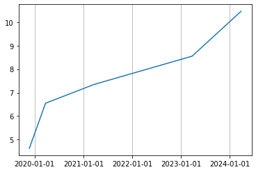
4. Draw vertical lines at even intervals
Matplotlib has dates module that has convenience functions that converts numbers to datetimes, vice versa, formats dates as specific strings etc.
One way is to detect major tick locations (could also include minor ticks as well depending on how granular the tick labels should be) using the matplotlib.dates module and then draw gridlines at the major tick positions.
from datetime import datetime
import matplotlib.dates as mdates

plt.plot(xs, ys)

pos = mdates.YearLocator()                    # detect tick locations by year
fmt = mdates.DateFormatter('%Y-%m-%d')        # format the datetime with '%Y-%m-%d
plt.gca().xaxis.set(major_locator=pos, major_formatter=fmt)
plt.grid(axis='x')
Another way is to draw vertical lines on top of the time-series plot. Since x-tick positions are numbers in matplotlib plots, we could use matplotlib.dates.num2date() method to convert them into dates and use these dates to plot vertical lines for specific datetimes. For example, to draw a vertical line for January 1, 00:00:00 of every year, use x-limits to get the years and create new datetimes of Jan 1s.
# plot time-series
plt.plot(xs, ys)

# draw vertical lines
xmin, xmax = map(mdates.num2date, plt.xlim())               # get dates on x-limits as dates
for yr in range(xmin.year, xmax.year):
    # vertical line on Jan 1 midnight
    plt.axvline(datetime(yr + 1, 1, 1), color='#b0b0b0', linewidth=0.8)

# show datetimes in a specific format
pos = mdates.YearLocator()                   # detect tick locations automatically
fmt = mdates.DateFormatter('%Y-%m-%d')       # format the datetime with '%Y-%m-%d
plt.gca().xaxis.set(major_locator=pos, major_formatter=fmt)
© 2022 - 2024 — McMap. All rights reserved.


