How to make radial gradients work in Safari?
Asked Answered
B

1

2

I'm using radial-gradients on a new site that i'm building, but the colours are rendering differently (much darker) in Safari on desktop. Is there a better cross-browser syntax to use?

I've tried different prefixes, but this hasn't fixed the issue. The code i'm using is as follows.

.item1 {
  background: -webkit-radial-gradient( bottom left, farthest-side, rgba(218, 218, 216, 0.5), transparent), -webkit-radial-gradient( bottom right, farthest-corner, rgba(253, 253, 253, 0.5), transparent 300px);
  background: -o-radial-gradient( bottom left, farthest-side, rgba(218, 218, 216, 0.5), transparent), -o-radial-gradient( bottom right, farthest-corner, rgba(253, 253, 253, 0.5), transparent 300px);
  background: radial-gradient( farthest-side at bottom left, rgba(218, 218, 216, 0.5), transparent), radial-gradient( farthest-corner at bottom right, rgba(253, 253, 253, 0.5), transparent 300px);
  background-size: 100% 100%;
  background-repeat: no-repeat;
}

The correct output as currently seen in Chrome and Firefox: https://i.sstatic.net/ej9pO.jpg

The output within Safari: https://i.sstatic.net/KYa13.jpg

As you can see it's much darker in Safari.

Does anybody have any ideas on how to fix that?

Barrel answered 16/1, 2019 at 10:43 Comment(6)
I think you can start by simplifying your code like this: jsfiddle.net/7rL0d5f4 .. you don't need all thisDipsomania
I think it's the same problem try this: https://mcmap.net/q/271449/-why-is-webkit-radial-gradient-not-working-in-safariPless
thanks @TemaniAfif yes the code does seem overly complicated. I ran it through an autoprefixer and it added the additional lines. Thanks for the fiddle, but if you check it in both Safari and Chrome it still have the same issue.Barrel
@JanilsonDuarte the question is 7 years old ...Dipsomania
@Barrel Actually I cannot test with safarit but probably the farthest-side/ farthest-corner aren't handled well. what about this:jsfiddle.net/7rL0d5f4/1 ? not exactly the same, but if it works on Safari, you can adjust the percentage to obtain what you wantDipsomania
@TemaniAfif unfortunately that doesn't seem to have solved the Safari issue either. You do still get a gradient effect it's just that the colours are much darkerBarrel
D
6

To start with, your gradient can be simplified like below.

.box{
 background: 
  radial-gradient( farthest-side at bottom left, rgba(218, 218, 216, 0.5), transparent), 
  radial-gradient( farthest-corner at bottom right, rgba(253, 253, 253, 0.5), transparent 300px);
 height:200px;
}

body {
 background:blue;
}
<div class="box">

</div>

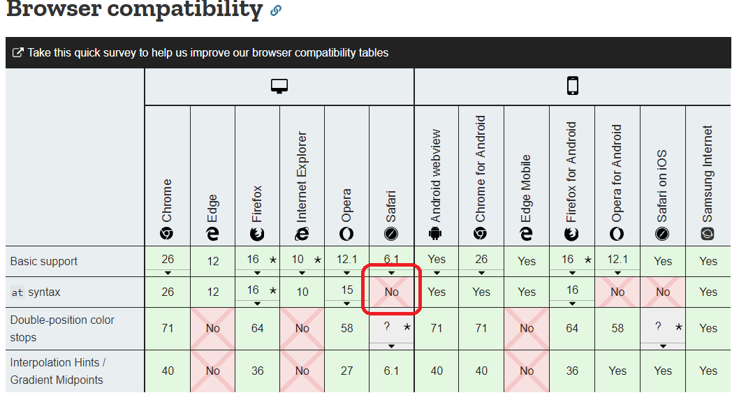
Now the issue is that safari don't support the syntax used with at as you can see in the MDN page:

enter image description here

You can change your syntax like below. I will split the gradient to better see the result, then you can easily combine them.

The first gradient:

.box{
 background: 
  radial-gradient( farthest-side at bottom left, rgba(218, 218, 216, 0.5), red);
 height:200px;
}

.box2{
 background: 
  radial-gradient( farthest-side, rgba(218, 218, 216, 0.5), red) top right/200% 200%;
 height:200px;
}
<div class="box">

</div>
<div class="box2">

</div>

The second gradient

.box{
 background:  
  radial-gradient( farthest-corner at bottom right, rgba(253, 253, 253, 0.5), red 300px);
 height:200px;
}

.box2{
 background:  
  radial-gradient( farthest-corner, rgba(253, 253, 253, 0.5), red 300px) top left/200% 200%;
 height:200px;
}
<div class="box">

</div>
<div class="box2">

</div>

The trick is that if you remove the at, the gradient will by default start from the center and when starting from the center we need an X distance to reach either the corner or the sides unlike when we start from a corner when we will need twice the X distance. That's why I made the gradient to have a size of 200% 200% and the I simply adjust the background position to have the same visual.

Here is the final background:

.box{
 background: 
  radial-gradient( farthest-side, rgba(218, 218, 216, 0.5) , transparent) top right/200% 200%, 
  radial-gradient( farthest-corner, rgba(253, 253, 253, 0.5), transparent 300px) top left/200% 200%;
 height:200px;
}

body {
 background:blue;
}
<div class="box">

</div>

Related question: How to animate a radial-gradient using CSS?

Dipsomania answered 21/1, 2019 at 23:26 Comment(0)

© 2022 - 2024 — McMap. All rights reserved.