Change color of the drop down arrow of Spinner in XML
Asked Answered
C

8

81

As I wrote in my question, I want to change the color of the drop down arrow (the default arrow, not a custom arrow or something like that) of a Spinner in XML, but the problem is that I couldn't find anything to make reference to it from the XML.

Is it possible? If yes, how can I change the color?

Culver answered 23/8, 2015 at 11:51 Comment(3)
take a look at the answer hereEndplay
@Rayes But it is for a custom dropdown, not the default dropdown.Culver
@Error404 3 months later and am faced with the same problem. your accepted answer has helped me solve the problem. 1 vote for you 1 for Hussein :)Fetish
P
182

There are three ways to achieve that.

1. Through code:

In your xml, make sure your spinner has an id. Let's say we have a spinner with id "spinner".

In your code, add the following in your onCreate():

Spinner spinner = (Spinner) findViewById(R.id.spinner);
spinner.getBackground().setColorFilter(getResources().getColor(R.color.red), PorterDuff.Mode.SRC_ATOP);

where red is your defined color in colors.xml in the values folder.

2. Through xml:

For API 21+:

<Spinner
    android:layout_width="wrap_content"
    android:layout_height="wrap_content"
    android:backgroundTint="@color/red" />

or if you use the support library, you can use:

<android.support.v7.widget.AppCompatSpinner
    android:layout_width="wrap_content"
    android:layout_height="wrap_content"
    app:backgroundTint="@color/red" />

3. Through drawables:

You can use this online tool: http://android-holo-colors.com

This will generate custom drawables for any view you want with your preferred color. Make sure you select spinner, then download the resources.

Pagoda answered 23/8, 2015 at 14:30 Comment(5)
I don't have colors.xml file. Or I have to create it? Also I want to point that in my question, when I say by XML, I mean if there is some option like android:colorDropDownArrow or something like that to set the value of the arrrow directly in the XML. Thanks!Culver
Unfortunately, there is no way you can do this from your xml except by using android:background="@drawable/spinnerBackground", but this will change your spinner background completely. So you have to create a new xml in your values folder called colors.xml and add a color there called red. Also check my updated answer, I have put another way instead of creating colors.xml if you want that.Pagoda
Thank you for the update! But I still have a doubt. The arrow it's only displayed with the color if I don't have any background for the Spinner, but if I make a background the arrow dissapears. Do you know why it is?Culver
If you make a background for the spinner, this means you will remove its default background which is an arrow. So if you want to use the background attribute in your xml, then you should go for the second way I posted in my answer. The site will generate a zip file with the files you will put in your project. The site will explain that to you. If you need more help, tell me.Pagoda
I mark it as accepted because you had been very helpful and if I have some doubt I put a new coment ;)Culver
C
16

I'm surprised noone had pointed it out, but you can just subclass Widget.AppCompat.Spinner and change backgroundTint

<style name="Spinner" parent="Widget.AppCompat.Spinner">
        <item name="backgroundTint">@color/spinnerTint</item>
</style>

and apply it to the Spinner

<Spinner
    style="@style/Spinner"
    android:layout_width="wrap_content"
    android:layout_height="wrap_content"
    android:spinnerMode="dropdown" />
Clow answered 7/5, 2016 at 0:30 Comment(5)
Isn't the backgroundTint property applicable only to API level 21?Meridithmeriel
@Meridithmeriel android:backgroundTint is. This is the AppCompat version (notice no android prefix here and style extends an AppCompat derived style)Clow
Weird behavior: when I added the attribute android:background, no matter what value i set the background, the color of the background is taken from backgroundTint and thus one can not see the arrow.Taproot
@Taproot When you change android:background you're no longer using Android's background drawable, but instead you are defining a new color drawable, that's why you don't see the arrowClow
Yes, I realized it when reading other posts. I also found a post that solved my problem as follows: to change the background color without destroying the drawable, I have put the spinner in a Relative layout and defined its background color. This, combined with your solution to use backgroundTint to change the arrow color, gives full control on both colors.Taproot
S
13

use backgroundTint attribute

<Spinner
        android:layout_width="wrap_content"
        android:layout_height="wrap_content"
        android:backgroundTint="@color/white"
        />

if min_SDK < 21(Lollipop) you should use AppCompatSpinner

<android.support.v7.widget.AppCompatSpinner
        android:layout_width="wrap_content"
        android:layout_height="wrap_content"
        app:backgroundTint="@color/white"
        /> 
Spinifex answered 29/9, 2016 at 15:36 Comment(0)
C
8

If (API 21+) {

you can use directly android:backgroundTint="@color/color", inside your Spinner:

<Spinner
   android:id="@+id/spinner"
   android:layout_width="match_parent"
   android:layout_height="match_parent"
   android:backgroundTint="@color/color" />

} else {

create your own style:

<style name="spinner_style" parent="Widget.AppCompat.Spinner">
        <item name="backgroundTint">@color/color</item>
</style>

then into Spinner:

<Spinner
   android:id="@+id/spinner"
   android:layout_width="match_parent"
   android:layout_height="match_parent"
   style="@style/spinner_style"/> 

}

Note: you can use the style method in all API's.

Cling answered 23/4, 2018 at 13:26 Comment(0)
C
5
<Spinner
            android:id="@+id/spinner"
            android:layout_width="match_parent"
            android:layout_height="wrap_content"
            android:backgroundTint="#00000" />

Only works above API Level 21

Calvados answered 28/7, 2016 at 8:22 Comment(1)
This is by far the best answer. I'd say we're all using 21+ by now anyway. Also note you can make it dark-mode friendly by using "?attr/color" or similar. (Be aware you've only got 5 zeros in your colour there.)Shakitashako
H
3

try this:

spinner_age.getBackground().setColorFilter(ContextCompat.getColor(this,
                R.color.spinner_icon), PorterDuff.Mode.SRC_ATOP);
Hypanthium answered 28/6, 2016 at 6:42 Comment(1)
it changed the background color and not the color of the arrowTaproot
G
2

Use this dependency for create a very nice and easy spinner and use "app:arrowTint="@color/green" to change the arrow color

Guitarfish answered 11/1, 2019 at 10:49 Comment(1)
Tried to use it, not showing the list at all.Millan
H
0

Step 1. Design your own drop-down arrow using:

https://icons8.com/icons/set/drop-down

Step 2. Add a white box with black border by the side of the down arrow using Paint and save as .PNG file.

It should look something like this:

enter image description here

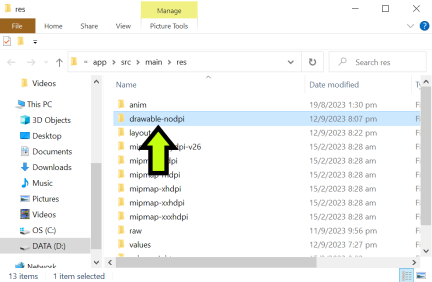
Step 3. Copy and paste the .PNG image into the app's drawable folder

enter image description here

Step 4. At activity_main.xml, copy and paste the following codes:

         <TextView
            android:id="@+id/spinnersearchtext"
            android:layout_width="80dp"
            android:layout_height="40dp"
            android:layout_marginEnd="5dp"
            android:gravity="center|end"
            android:text="Search:"
            android:textColor="#FFFFFF"
            android:textSize="20dp"
            android:textStyle="bold"
            android:visibility="visible"
            app:layout_constraintEnd_toStartOf="@+id/spinner1"
            app:layout_constraintHorizontal_bias="1"
            app:layout_constraintStart_toStartOf="parent"
            app:layout_constraintTop_toTopOf="@+id/spinner1" /> 


         <Spinner
            android:id="@+id/spinner1"
            android:layout_width="100dp"
            android:layout_height="40dp"
            android:layout_marginLeft="50dp"
            android:background="@drawable/dropdownarrow"
            app:layout_constraintBottom_toBottomOf="parent"
            app:layout_constraintHorizontal_bias="0.5"
            app:layout_constraintLeft_toLeftOf="parent"
            app:layout_constraintRight_toRightOf="parent"
            app:layout_constraintTop_toTopOf="parent" />

End Result:

enter image description here

Hahnert answered 12/9, 2023 at 12:42 Comment(0)

© 2022 - 2024 — McMap. All rights reserved.