Is there a way to style more than just the width of the grid gaps within the CSS grid layout module? I can't find anything about it in the documentation, however one would tend to think that it would be possible as grid gaps tend to be colored in many designs. If it is not possible, is there a workaround?
Sadly, there is currently no way in the CSS Grid spec to style grid-gap. I came up with a solution that works well though that involves just html and css: show border grid lines only between elements
Instead to use the solution above I recommend to use border with pseudo-classes because if you have an irregular amount of "table cells" you will end up with an ugly color filled cell at the end of the "table".
If you want to use borders between the "table cells" and you have not always the same amount of cells you can do something like this (this example would also work with flexbox):
.wrapper {
  display: grid;
  grid-template-columns: repeat(2, auto);
  /* with flexbox:
  display: flex;
  flex-wrap: wrap;
  */
}

/* Add border bottom to all items */
.item {
  padding: 10px;
  border-bottom: 1px solid black;
  /* with flexbox:
  width: calc(50% - 21px);
  */
}

/* Remove border bottom from last item & from second last if its odd */
.item:last-child, .item:nth-last-child(2):nth-child(odd) {
  border-bottom: none;
}

/* Add right border to every second item */
.item:nth-child(odd) {
  border-right: 1px solid black;
}
<div class="wrapper">
<div class="item">BOX 1</div>
<div class="item">BOX 2</div>
<div class="item">BOX 3</div>
<div class="item">BOX 4</div>
<div class="item">BOX 5</div>
</div><div class="item" style="width: 50%">BOX 4</div> (though I'm not sure if it's valid according to specific to have grid elements with a defined width). –
Langsyne I added the border color as a background-color to the grid and added a background color to all grid-items.
.grid {
  width: 1000px;
  display: grid;
  background: #D7D7D7;
  grid-template-columns: repeat(5, 1fr);
  grid-auto-rows: 200px;
  grid-gap: 1px;
}

.grid-item {
  background: white;
}
<!DOCTYPE html>
<html lang="en">
<head>
<meta charset="UTF-8">
<title>Document</title>
</head>
<body>
<div class="grid">
<div class="grid-item"></div>
<div class="grid-item"></div>
<div class="grid-item"></div>
<div class="grid-item"></div>
<div class="grid-item"></div>
<div class="grid-item"></div>
<div class="grid-item"></div>
<div class="grid-item"></div>
<div class="grid-item"></div>
<div class="grid-item"></div>
<div class="grid-item"></div>
<div class="grid-item"></div>
<div class="grid-item"></div>
<div class="grid-item"></div>
<div class="grid-item"></div>
</div>
</body>
</html>This works for me.
For instance: if one has a 5x5 grid of squares, is the only way to get colored grid lines to fill the grid with 25 elements and apply borders to those same elements?
You could do that, but grid borders do not collapse the same way that table borders can with the border-collapse property, and unlike grid gaps they'll be applied to the perimeter of your grid along with the inner borders, which may not be desired. Plus, if you have a grid-gap declaration, the gaps will separate your grid item borders much like border-collapse: separate does with table borders.
grid-gap is the idiomatic approach for spacing grid items, but it's not ideal since grid gaps are just that: empty space, not physical boxes. To that end, the only way to color these gaps is to apply a background color to the grid container.
It's not possible, but simply by setting a border in cascade: this affects text and divs positions.
.grids {
  display: grid;
  grid-template-columns: repeat(4, 1fr);
  grid-template-rows: repeat(3, 1fr);
  background: #222;
  height: 326px;
  width: 455px;
  color: white
}

.grids > div {
  border: 4px red solid
}
<div class="grids">
<div>f</div>
<div>f</div>
<div>f</div>
<div>f</div>
<div>f</div>
<div>f</div>
<div>f</div>
<div>f</div>
<div>f</div>
<div>f</div>
<div>f</div>
<div>f</div>
</div>By using outline, the positions is unchanged:
.grids {
  display: grid;
  grid-template-columns: repeat(4, 1fr);
  grid-template-rows: repeat(3, 1fr);
  background: #222;
  height: 326px;
  width: 455px;
  color: white
}

.grids > div {
  outline: 4px red solid;
}
<div class="grids">
<div>f</div>
<div>f</div>
<div>f</div>
<div>f</div>
<div>f</div>
<div>f</div>
<div>f</div>
<div>f</div>
<div>f</div>
<div>f</div>
<div>f</div>
<div>f</div>
</div>There is a workaround way: use pseudo :after or :before in each column to apply background color to grid gap.
.grid-column::after {
          position: absolute;
          right: -20px; // grid-gap
          top: 0;
          height: 102px; // grid row height
          width: 20px; // grid-gap
          display: block;
          content: '';
          background-color: black !important;
}
If you don't know in advance how many columns will fit in your container, this is how I would do it (works for any number of columns and of any size. Also, this method do not style empty items):
.grid {
  display: grid;
  grid-template-columns: repeat(auto-fit, minmax(80px, auto));
  grid-auto-rows: minmax(80px, auto);
  border-top: 1px solid #000;
  border-left: 1px solid #000;
}

.grid-item {
  border-bottom: 1px solid #000;
  border-right: 1px solid #000;
}

 /* not required */
.grid-item {
  display: flex;
  align-items: center;
  justify-content: center;
  background:#f5f5f5;
}
<div class="grid">
<div class="grid-item">Item 1</div>
<div class="grid-item">Item 2</div>
<div class="grid-item">Item 3</div>
<div class="grid-item">Item 4</div>
<div class="grid-item">Item 5</div>
<div class="grid-item">Item 6</div>
<div class="grid-item">Item 7</div>
<div class="grid-item">Item 8</div>
<div class="grid-item">Item 9</div>
<div class="grid-item">Item 10</div>
<div class="grid-item">Item 11</div>
<div>There is a way:
.container{
    background: white;
}
.wrapper {
    gap: 1px;
    background: red;
}
.wrapper .child {
    background: white;
}
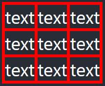
You can also choose to leave out the grid gaps and use the border on the underlying div like so:
CSS:
.grid {
  display: inline-grid;
  border: red solid;
  width: 200px;
  height: 100%;
  grid-template-columns: 1fr 1fr 1fr;
  grid-template-rows: 1fr 1fr 1fr;
}
.grid div {
  border: red solid;
}
and the HTML:
<div className="grid">
  <div>text</div>
  <div>text</div>
  <div>text</div>
  <div>text</div>
  <div>text</div>
  <div>text</div>
  <div>text</div>
  <div>text</div>
</div>
I believe this achieves what you wanted to achieve:
Setting background-color on grid will color your gaps. For example:
    section {
            display: grid;
            grid-gap: 15px;
            grid-template-columns: 1fr 1fr 1fr;
            grid-template-rows: 1fr 1fr 1fr;
            background-color: red;
        }
© 2022 - 2024 — McMap. All rights reserved.


background-colorof the elements inside the grid and space them using those elements'padding-bottomorpadding-right– Johnniejohnny