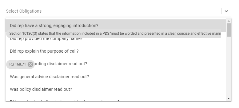
I am using the react-select library to create autocomplete drop-down.
I have used 2 drop-down parallel if 2nd has some data & I open first one then the zIndex problem comes. see the image
Add these lines in your all Select tag:
<Select
    // other props
    menuPortalTarget={document.body}
    styles={{ menuPortal: base => ({ ...base, zIndex: 9999 }) }}
/>
overflow: hidden, just setting menu z-index to 9999 cannot prevent the popup cropped by the parent container. –
Kingfish menuPortalTarget={document.body} did the trick –
Dig menu instead of menuPortal does not do this. –
Jeer Try this hacky way of setting zIndex, and let me know if it worked :)
<Select
  styles={{
    // Fixes the overlapping problem of the component
    menu: provided => ({ ...provided, zIndex: 9999 })
  }}
  value={selectedOption}
  onChange={evt => onSelectChange(evt, index)}
  options={options}
/>
menuPortal: provided => ({ ...provided, zIndex: 9999 }) –
Infralapsarian After seeing the half dozen related issues, yet not finding a resolution, I have finally found one.
<Select
    menuPortalTarget={document.body}
    menuPosition='fixed'
/>
Add these two options to your Select component.
It appears to make us of the new React Portal feature.
EDIT: If you do the above, you then run into this problem with the menu anchoring to the page due to position: fixed. Removing it may help. https://github.com/JedWatson/react-select/issues/4088
For me the solution was kind of the total of all the answers (thanks!);
 const customStyles = {
    ///.....
    menuPortal: provided => ({ ...provided, zIndex: 9999 }),
    menu: provided => ({ ...provided, zIndex: 9999 })
    ///.....
  }


 <Select
  //.....
  menuPortalTarget={document.body}
  menuPosition={'fixed'}
  styles={customStyles}
  //.....
  />
Just simply add the below two lines of code.
 const customStyles = {
    ///.....
    menuPortal: provided => ({ ...provided, zIndex: 5 }),

    ///.....
  }

 <Select
  //.....
  menuPosition={'fixed'}
  styles={customStyles}
  //.....
  />
Another way is We can config the classNamePrefix and control it through the outer class.
import Select from "react-select";

<Select
   classNamePrefix={"my-custom-react-select"}
/>
.my-custom-react-select__menu {
  z-index: 2;
}
Bonus, We can re-style everything
.my-custom-react-select__control {
  border-width: 1px !important;
  border-color: #cbd5e0 !important;
  padding-top: 0.16rem;
  padding-bottom: 0.16rem;
}

.my-custom-react-select__control--is-focused {
  border-color: #746df7 !important;
  box-shadow: none !important;
}

.my-custom-react-select__indicator-separator {
   display: none;
}
Only combination of those answers made the working solution for me on Next.js. menuPortalTarget={document.body} broke the application with the error ReferenceError: document is not defined, which makes sense on SSG/SSR :)
menuPosition={"fixed"} as suggested by @I Stand With Israel with combination of answer from @hemant rao: menuPortal: (base) => ({ ...base, zIndex: 4 }),.
TLDR:
In your (S)CSS, add this:
div[class*="-MenuPortal"] {
    z-index: 9999 !important;
}
It is so sad to see react developers raping CSS by putting styling into javascript. For any and all developers that think this is in any way a good idea - PLEASE STOP! CSS is there to do this stuff, not javascript. JS doesn't know where it's going to be in the DOM, so its support for the 'C' in CSS is at best a lucky guess.
Others have mentioned the term 'hacky' - there are few things hackier than auto-gen'ing css class names with JS.
Some of the answers above will work...sometimes...but they all rely on JS playing ball, which JS is simply not in a position to do.
So...here is a hacky solution for react-select dropdowns (this technique will work with any horrid auto-gen-css JS library) to work all the time - whether deep in the DOM or in a Modal/top-level and so on.
In your (S)CSS, add this:
div[class*="-MenuPortal"] {
    z-index: 9999 !important;
}
This will set the z-index for any div that has a class that contains -MenuPortal. Since you won't know the class name due to the infinite wisdom of react-select styling in JS, at least until they decide to change the autogen naming of classes (yuk!) to not include -MenuPortal this will work.
There is of course a possibility there is another div in your DOM that has this string - let's just hope it's another dropdown menu!
Apologies retrospectively for my soapbox rant on CSS-in-JS. With luck, one day there will be World Peace and JS will be a distant memory. In the meantime, keeping CSS well away from javascript and vide-versa is always a prudent move!
Happiness and smiles to you all! :-)
The code below worked for me. zIndex does not need to be 9999 (as suggested in other answers); just make sure the menu dropdown has a higher zIndex value than the other HTML elements.
<Select
  styles={{
    // Fixes the overlapping problem of the component
    menu: (base) => ({ ...base, zIndex: 2 })
  }}
  value={selectedOption}
  onChange={(evt) => onSelectChange(evt, index)}
  options={options}
/>
This is my solution when using "react-select" (version 4.3.1)
import ReactSelect from 'react-select';
...
...
<ReactSelect
  className="custom_zindex"
  ...
  ...
/>
In the css file:
.custom_zindex {
   z-index: 100;  /* or 999 */
}
"className" is one of the props in react-select (https://react-select.com/props).
I was having a problem where I was trying to apply a z-index to both the select and the options menu. But it was only being applied to the select and not the menu.
I was able to fix it using this:
&:focus-within {
    z-index: 5;
}
For some reason when I tried
z-index: 5;
The options menu still had a lower z-index
Change the zIndex of the parent component of this select
<div style={{zIndex:1000}}>
  <React-Select-Component/>
</div>
© 2022 - 2024 — McMap. All rights reserved.
