How is the screen size measured for media queries?
Asked Answered
B

4

2

I'm building a responsive website. There's a separate set of CSS to apply for smartphones. To do this, I use the following code

@media all and (min-width: 760px) {

 .wrap {
    /*css for large screens goes here*/
 }

}

@media not all and (min-width: 760px) {

 .wrap {
    /*css for small screens goes here*/
 }

}

My smartphone has a "Screen Resolution: 1080 x 1920." but it still displays the CSS for small screens. I'm surprised this is happening because 1080 > 760 so shouldn't the first block apply? Is screen resolution not actually measured in pixels? If not, then how does one find how many pixels in a screen?

I just found 760px from an example, is there a better way to decide when to switch from full size web page to compact for small screens?

Bromberg answered 4/1, 2018 at 12:51 Comment(0)
F
2

There are two different concepts: the physical pixels of the screen, and the CSS pixels.

Initially, they were in most cases the same, but with so-called “retina” or “hidpi” screens, they are no longer the same. The idea is that a CSS pixel should retain about the same size, and be independent from the actual number of pixels on the screen: you don’t want to have text with CSS font-size 12px to have different sizes on screens with the same dimensions because their pixel density changes.

So the 1080 pixel width of your phone is probably mapped to 360 CSS pixels (x3 pixel ratio).

Formally answered 4/1, 2018 at 13:9 Comment(2)
So how do I find out how many CSS pixels are in a given screen?Bromberg
screen.width / screen.height will give you that information in JS. You can also check ryanve.com/lab/dimensions for variants (including or excluding scrollbars, menus, etc.). devicePixelRatio will give give you the ratio between the CSS screen size and the actual screen size. Usually varies between 1 and 3, note that it is not always an integer, values like 1.33 or 1.5 are commonly found.Formally
S
1

Instead of this

@media not all and (min-width: 760px) {

use this

@media all and (max-width: 759px) {

to address all viewports below 760 width.


ADDITION, answering the question in the comment "I'm asking what does px mean since it doesn't seem to be the physical pixel count on the screen":

It used to be the pixel count on the screen before retina and similar displays were introduced, which had a multiple amount of device pixels (AKA device pixel ratio, between 1.5 to 3 time as much).

Still, when those came up, the size reference for one "CSS pixel" remained the same (i.e. one CSS pixel would be 2 device pixels on a device with a device pixel ratio of 2), otherwise all websites would be displayed at half the size on these devices. So the pixel unit used in CSS refers to "CSS pixels" not to "device pixels" unless otherwise stated (which is only possible in media queries).

Studhorse answered 4/1, 2018 at 15:28 Comment(2)
Thanks however that's not what I intend to ask; I'm asking what does px mean since it doesn't seem to be the physical pixel count on the screen?Bromberg
please note the addition to my answerStudhorse
T
1

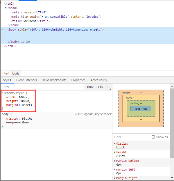
Go to development tools of your browser and select body tag and after that, you will find width and height by this: enter image description here

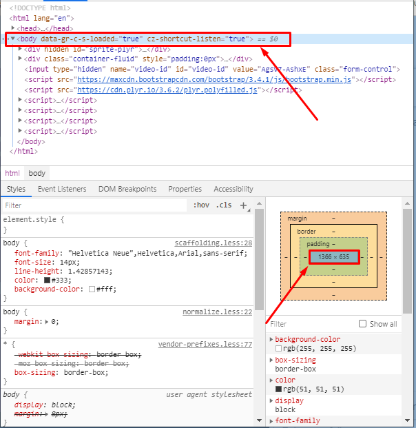
due to some CSS issue this may not work properly will be great if you create a simple HTML with the following data to get width and height: enter image description here

Thermosetting answered 10/7, 2020 at 16:45 Comment(0)
D
0

Change your media query with this.

@media only screen and (min-width: 760px) {
     // for screens above 760px
    .wrap {
        color: blue;
    }
}

@media only screen and (max-width: 760px) {
     // for screens below 760px
    .wrap {
        color: lightblue;
    }
}

If you want to change designing based on screen size then apply only screen with your media query.

Ask for more queries.

Thanks.

Donofrio answered 4/1, 2018 at 13:2 Comment(0)

© 2022 - 2024 — McMap. All rights reserved.