Boxplot with pandas
Asked Answered
B

2

5

this is how looks like my dataframe:

      PART  METHOD  J    P         AVG         STD
0       1   meth1   3   50      0.914482    0.007398
1       1   meth2   3   50      0.925134    0.005738
...    ...  ...     ... ...        ...         ...
190     4   meth4   7   150     0.913014    0.006144
191     4   meth4   7   200     0.914199    0.002962

And I would like to show a Boxplot with Pandas using the AVG and the STD columns (average and standard deviation), and I don't know how can start.

For instance, I would like to compare the four methods for PART = 1, J = 3 and P = 50 through a boxplot to see if these values are compatibles (similar) or not.

I'm very lost, any guidance?

EDIT: the following image shows what I would like. Where A, B, C and D are the methods and each box is created by the value of AVG in combination with de STD for PART = 1, J = 3 and P = 50.

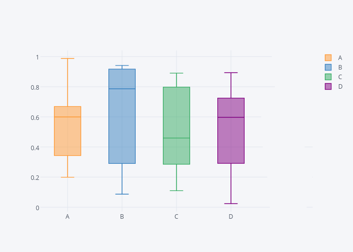
enter image description here

Bonaventura answered 13/12, 2018 at 17:56 Comment(2)
Perhaps I don't understand the question, but I don't think you can create a Box plot alone from the mean and standard deviation. The box and whiskers are based on quartiles, which depends upon the underlying distribution of points, not simply the first two moments. Given your blue box, I can tell you the data are not normally distributed, so not sure how you're going to get what you want.Groyne
With your latest update are you implying that for PART = 1, J = 3 and P = 50 there's only one row per method that you want to build a box plot for solely out of single values of AVG and STD?Flagellant
C
5

You can filter the dataframe and create boxplot with parameter by.

filtered_df = df[(df['PART'] == 1) & (df['J'] == 3) & (df['P'] == 50)]
filtered_df.boxplot(column = 'AVG', by = 'METHOD', patch_artist = True)

For the following sample df

df = pd.DataFrame({'PART':np.random.randint(1,4,10000), 'METHOD':np.random.choice(list('ABCD'), 10000), 'J':np.random.randint(3,7, 10000), 'P':np.random.randint(50,100, 10000),'AVG':np.random.randn(10000),'STD':np.random.randn(10000)})

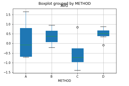
You get

enter image description here

Cote answered 13/12, 2018 at 18:25 Comment(2)
The sample df is right, but I get this error: ValueError: not enough values to unpack (expected 2, got 0). Any clue?Bonaventura
That means, in one of the groups you do not have enough number of rows corresponding to each method. One bracket is missing in the filtered_df code, I just corrected it. Anyway, the result will vary as the sample dataframe is using random number generator.Cote
F
1

Have you tried

(df.groupby(['PART', 'J', 'P'])
 .get_group((1, 3, 50))
 .groupby('METHOD')
 .boxplot(column=['AVG', 'STD']));

which on the following sample data

      PART  METHOD  J    P         AVG         STD
0       1   meth1   3   50      0.914482    0.6398
1       1   meth1   3   50      0.583014    0.5144
2       1   meth2   3   50      0.425134    0.5738
3       1   meth2   3   50      0.914199    0.2962
4       4   meth4   7   150     0.913014    0.6144
5       4   meth4   7   200     0.914199    0.2962

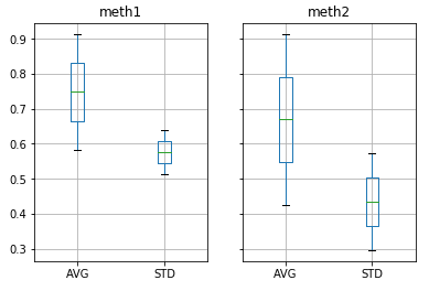
produces

enter image description here


UPDATE

Given the latest update to the post, please consider doing

(df.groupby(['PART', 'J', 'P'])
 .get_group((1, 3, 50))
 .boxplot(column=['AVG', 'STD'], by='METHOD'));

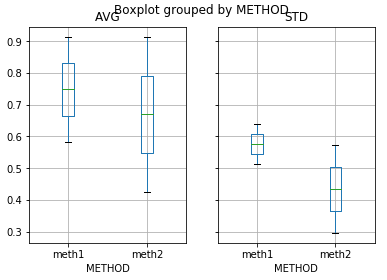
resulting in

enter image description here

Flagellant answered 13/12, 2018 at 17:58 Comment(3)
yes, but " I would like to compare the four methods for PART = 1, J = 3 and P = 50 through a boxplot"Bonaventura
Doesn't work. I would like a plot with 4 boxes, each of them showing the AVG and STD for each method when PART, J and P are 1, 3 and 50Bonaventura
It doesn't the same. I've updated the question with a imageBonaventura

© 2022 - 2024 — McMap. All rights reserved.