Question on how to draw back-to-back plot using R and ggplot2
Asked Answered
U

2

5

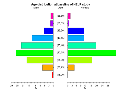
I aiming to draw a pyramid plot, like the one attached.

enter image description here

I found several example using ggplot, but I am still struggling with the adoption of my example to my data (or the data that I want to plot).

structure(list(serial = c(40051004, 16160610, 16090310), DMSex = structure(c(2, 
2, 2), label = "Gender from household grid", labels = c(`No answer/refused` = -9, 
`Don't know` = -8, `Interview not achieved` = -7, `Schedule not applicable` = -2, 
`Item not applicable` = -1, Male = 1, Female = 2), class = "haven_labelled"), 
    dtotac = structure(c(-9, -9, -8), label = "DV: Total actual hours in all jobs and businesses", labels = c(`No answer/refused` = -9, 
    `Don't know` = -8, `Interview not achieved` = -7, `Item not applicable` = -1
    ), class = "haven_labelled")), row.names = c(NA, -3L), class = c("tbl_df", 
"tbl", "data.frame"))

How can I convert my data and to draw the back-to-back plot? Or how to define the Gender and dtotac variables without subseting?

The code that I am using

library(ggplot2)
library(plyr)
library(gridExtra)

SerialGenderWorkN <- data.frame(Type = sample(c('Male', 'Female', 'Female'), 
                                              11421, replace=TRUE),
                                dtotac = sample (0:60, 11421, replace=TRUE))

WrkFactor <- ordered(cut(SerialGenderWork$dtotac, 
                         breaks = c(0, seq(20, 60, 10)), 
                         include.lowest = TRUE))

SerialGenderWorkN$dtotac <- WrkFactor 

ggplotWrk <- ggplot(data =SerialGenderWorkN, aes(x=dtotac))

ggplotWrk.female <- ggplotWrk + 
  geom_bar(data=subset(SerialGenderWorkN, Type == 'Female'), 
           aes( y = ..count../sum(..count..), fill = dtotac)) +
  scale_y_continuous('', labels = scales::percent) +
  theme(legend.position = 'none', 
        axis.title.y = element_blank(),
        plot.title = element_text(size = 11.5),
        plot.margin=unit(c(0.1,0.2,0.1,-.1),"cm"), 
        axis.ticks.y = element_blank(), 
        axis.text.y = theme_bw()$axis.text.y) + 
  ggtitle("Female") + 
  theme(plot.title = element_text(hjust = 0.5)) + 
  coord_flip()

ggplotWrk.male <- ggplotWrk + 
  geom_bar(data=subset(SerialGenderWorkN,Type == 'Male'), 
           aes( y = ..count../sum(..count..), fill = dtotac)) +
  scale_y_continuous('', labels = scales::percent, 
                     trans = 'reverse') + 
  theme(legend.position = 'none',
        axis.text.y = element_blank(),
        axis.ticks.y = element_blank(), 
        plot.title = element_text(size = 11.5),
        plot.margin=unit(c(0.1,0.2,0.1,-.1),"cm")) + 
  ggtitle("Male") + 
  theme(plot.title = element_text(hjust = 0.5)) + 
  coord_flip() + 
  xlab("Work Hours")

## Plutting it together
grid.arrange(ggplotWrk.male, ggplotWrk.female,
             widths=c(0.4, 0.4), ncol=2)

And this is the output

enter image description here

How can I move the "Work hours" to show between the "Male" and "Female" plots?

Urbanity answered 29/5, 2019 at 9:45 Comment(0)
L
3

I find this problem very interesting and I think there's no perfect solution. Personally I want everything to look neat and aligned, so gridExtra::grid.arrange's top (or bottom for axis label) argument doesn't really please my eye.

Another solution is to use facets and edit the plot with packages gtable and grid. This is not perfect either, because there's no solution that I have found to adjust facets' scales separately. The only option is set the scales free by adding scales = "free_x" to the facet. If the max percentages on both sides are close to each other, this works very well. If not, maybe not so.

First I've written a function for deleting a column in the grob. We'll use it to move the axis labels to the center.

library(tidyverse)
library(grid)
library(gtable)

delete_col <- function(x, pattern) {
  t <- x$layout %>% 
    filter(str_detect(name, pattern)) %>% 
    pull(l)

  x <- gtable_filter(x, pattern, invert = TRUE)

  x$widths[t] <- unit(0, "cm")

  x
}

We'll then create the data and the base plot. The two theme options are needed to set the axis texts right in the middle of the facets.

test_data <- rnorm(500, 50, 15) %>% 
  crossing(sex = c("M", "F")) %>% 
  transmute(sex, value = cut(., c(min(.), 20, 40, 60, max(.)), include.lowest = TRUE))

test_data <- test_data %>% 
  count(sex, value) %>% 
  group_by(sex) %>% 
  mutate(p = n/sum(n)) %>% 
  ungroup() %>% 
  mutate(p = if_else(sex == "F", -p, p)) # negative values for the left-hand side.

p1 <- test_data %>% 
  ggplot(aes(value, p)) + 
  facet_wrap(~ sex, scales = "free_x") + 
  geom_col() +
  coord_flip() +
  theme(axis.text.y = element_text(hjust = 0.5, margin = margin(0, 0, 0, 0)),
        axis.ticks.length = unit(0, "pt")) +
  scale_y_continuous(labels = function(x) paste0(abs(x) * 100, "%")) +
  labs(x = NULL)

Now it gets a bit more complex. First we'll create a grob object from the ggplot object.

p1_g <- ggplotGrob(p1)

Then we'll widen the space between the facets by taking the existing space taken by the axis texts and add some whitespace. I've taken a look of the grob object to see which columns are which by using gtable_show_layout(p1_g).

p1_g$widths[7] <- p1_g$widths[4] + unit(0.5, "cm")

Next we'll detach the axis texts to it's own object for later use.

p1g_axis <- gtable_filter(p1_g, "axis-l-1-1") 

And finally we'll add it all together. I now know from looking at the layout where to put everything. l is for the left extent and t is for the top extent.

p1_g %>% 
  gtable_add_grob(p1g_axis, l = 7, t = 8, name = "middle_axis") %>% # add the axis to the middle
  delete_col("axis-l-1-1") %>% # delete the original axis
  gtable_add_grob(textGrob("Label", gp = gpar(fontsize = 11)), l = 7, t = 7) %>% # add the top label
  grid.draw() # draw the result

enter image description here

Lag answered 5/6, 2019 at 7:34 Comment(0)
D
3

You can use the top argument and bring it down using vjust.

grid.arrange(ggplotWrk.male, ggplotWrk.female,
             widths=c(0.4, 0.4), ncol=2,
             top = textGrob("Work Hours",gp=gpar(fontsize=11,font=1), vjust=2))

Drogue answered 29/5, 2019 at 15:27 Comment(1)
@user10974052 read this thread to make your example dataset representing your actual data #5963769Drogue
L
3

I find this problem very interesting and I think there's no perfect solution. Personally I want everything to look neat and aligned, so gridExtra::grid.arrange's top (or bottom for axis label) argument doesn't really please my eye.

Another solution is to use facets and edit the plot with packages gtable and grid. This is not perfect either, because there's no solution that I have found to adjust facets' scales separately. The only option is set the scales free by adding scales = "free_x" to the facet. If the max percentages on both sides are close to each other, this works very well. If not, maybe not so.

First I've written a function for deleting a column in the grob. We'll use it to move the axis labels to the center.

library(tidyverse)
library(grid)
library(gtable)

delete_col <- function(x, pattern) {
  t <- x$layout %>% 
    filter(str_detect(name, pattern)) %>% 
    pull(l)

  x <- gtable_filter(x, pattern, invert = TRUE)

  x$widths[t] <- unit(0, "cm")

  x
}

We'll then create the data and the base plot. The two theme options are needed to set the axis texts right in the middle of the facets.

test_data <- rnorm(500, 50, 15) %>% 
  crossing(sex = c("M", "F")) %>% 
  transmute(sex, value = cut(., c(min(.), 20, 40, 60, max(.)), include.lowest = TRUE))

test_data <- test_data %>% 
  count(sex, value) %>% 
  group_by(sex) %>% 
  mutate(p = n/sum(n)) %>% 
  ungroup() %>% 
  mutate(p = if_else(sex == "F", -p, p)) # negative values for the left-hand side.

p1 <- test_data %>% 
  ggplot(aes(value, p)) + 
  facet_wrap(~ sex, scales = "free_x") + 
  geom_col() +
  coord_flip() +
  theme(axis.text.y = element_text(hjust = 0.5, margin = margin(0, 0, 0, 0)),
        axis.ticks.length = unit(0, "pt")) +
  scale_y_continuous(labels = function(x) paste0(abs(x) * 100, "%")) +
  labs(x = NULL)

Now it gets a bit more complex. First we'll create a grob object from the ggplot object.

p1_g <- ggplotGrob(p1)

Then we'll widen the space between the facets by taking the existing space taken by the axis texts and add some whitespace. I've taken a look of the grob object to see which columns are which by using gtable_show_layout(p1_g).

p1_g$widths[7] <- p1_g$widths[4] + unit(0.5, "cm")

Next we'll detach the axis texts to it's own object for later use.

p1g_axis <- gtable_filter(p1_g, "axis-l-1-1") 

And finally we'll add it all together. I now know from looking at the layout where to put everything. l is for the left extent and t is for the top extent.

p1_g %>% 
  gtable_add_grob(p1g_axis, l = 7, t = 8, name = "middle_axis") %>% # add the axis to the middle
  delete_col("axis-l-1-1") %>% # delete the original axis
  gtable_add_grob(textGrob("Label", gp = gpar(fontsize = 11)), l = 7, t = 7) %>% # add the top label
  grid.draw() # draw the result

enter image description here

Lag answered 5/6, 2019 at 7:34 Comment(0)

© 2022 - 2024 — McMap. All rights reserved.