Make monospaced text as big as possible without causing overflow or wrapping
Asked Answered
W

3

5

I'm looking for a way to make a monospaced text as wide as possible in its container witohut overflowing or breaking. I've already looked at CSS3 Make Text As Big As Possible To FIll Element Without Overflowing and tried to implement the suggested solution, but it doesn't appear to work in my case. If I set the font size to 3vw instead of 7vw as suggested in the answer to the linked question, it seems to be close, but when I change the length of the lines or width of the page, it's off again.

Here is my code:

https://jsfiddle.net/de7qbu19/ (the code in the fiddle is the same)

#song-container {
    text-align: center;
    margin: 20px;
}
#song {
    color: #000;
    font: normal 3vw Courier New,monospace,Courier;
    white-space: pre;
    word-break: break-all;
    text-align: left;
    display: inline-block;
}

#song > span { /* Chords*/
    color: #007fbf;
    cursor: pointer;
}
<link rel="stylesheet" href="https://maxcdn.bootstrapcdn.com/bootstrap/3.3.7/css/bootstrap.min.css" integrity="sha384-BVYiiSIFeK1dGmJRAkycuHAHRg32OmUcww7on3RYdg4Va+PmSTsz/K68vbdEjh4u" crossorigin="anonymous">
<script src="https://code.jquery.com/jquery-3.4.1.slim.min.js" integrity="sha384-J6qa4849blE2+poT4WnyKhv5vZF5SrPo0iEjwBvKU7imGFAV0wwj1yYfoRSJoZ+n" crossorigin="anonymous"></script>
<link rel="stylesheet" href="https://maxcdn.bootstrapcdn.com/bootstrap/3.3.7/css/bootstrap-theme.min.css" integrity="sha384-rHyoN1iRsVXV4nD0JutlnGaslCJuC7uwjduW9SVrLvRYooPp2bWYgmgJQIXwl/Sp" crossorigin="anonymous">
<script src="https://maxcdn.bootstrapcdn.com/bootstrap/3.3.7/js/bootstrap.min.js" integrity="sha384-Tc5IQib027qvyjSMfHjOMaLkfuWVxZxUPnCJA7l2mCWNIpG9mGCD8wGNIcPD7Txa" crossorigin="anonymous"></script>
            
<div class="container-fluid">
    <div id="song-container">
        <div class="panel panel-default">
            <div class="panel-body">
                <span id="song">
[Placeholder]

<span>Em</span>         <span>G</span>
Placeholder Placeholder Placeholder Placeholder
<span>D</span>          <span>C</span>
Placeholder Placeholder Placeholder Placeholder
                </span>
            </div>
        </div>
    </div>
</div>

When I run the snippet it seems like it almost takes the entire width: small But when I then click the Full page option, it becomes clear that it doesn't and that it's not reliable, especially when I reduce the window size: full screen small win
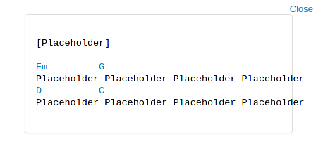
So setting the font size using the vw units doesn't appear to do the trick for me.

Any ideas how I could achieve this properly?

Wearisome answered 26/4, 2020 at 16:22 Comment(9)
Sounds like you need another class? Like .text.full-page or .text.small-page and throw your styles under those. So you would define two separate font-sizes based on the current setting. Maybe also look at media queries if your screen size is actually shrinking?Searchlight
Are you suggesting to create hundreds of media query entries and find out via trial and error which screen width requires which font size to cover every resolution/zoom state? Sounds like a lot of work and not very maintainable. Just changing the font type would break everything wouldn't it?Wearisome
No I wouldn't advocate that, it sounded like you only had 2 or so views that were breaking which would be ok for that. Have you taken a look at this css-tricks.com/fitting-text-to-a-container Some options to achieve what you're looking forSearchlight
None of those worked for me. Either they only work with one line of text or you have to change some value whenever the length of the text lines changes or it just doesn't work with all window sizes.Wearisome
It is margin: 20px; causing the trouble. Change the value to margin: 20px auto; may resolve your issue.Artamas
@Artamas I just tried that and it didn't fix the issue.Wearisome
@Wearisome plz try at fiddle.jshell.net/de7qbu19/show or local html file, not in iframe here. But if you plan to use the page in iframe, then add #song-container { width: min-content }Artamas
@Artamas Doesn't work for me. When I reduce the windows width and zoom in it breaks just like in the screenshot of my question.Wearisome
@Wearisome I can reproduce that only when the developer tool is opening or by increasing padding of .panel-body screenshots (I mean I cannot reduce the windows width that much without effort). BTW, please keep in mind that css-based (and some js-based) answers work only when characters have the same width. Normally CJK characters/emoji have different width, though you may not use them for chords.Artamas
P
3

If you're fine width a javascript solution, here's a simple one.

It consist in retrieving the width of div and font size, it calculates the width of a single character, and finally calculates the new maximum font size according to these informations.

You must also specify in the script the maximum number of characters you can have on the longest line of text:

Placeholder Placeholder Placeholder Placeholder

In this example above, there are 47 characters on the longest line of text;

var container = document.getElementById("container"),
  cs = getComputedStyle(container),
  containerPB = parseFloat(cs.paddingLeft) + parseFloat(cs.paddingRight) + parseFloat(cs.borderLeftWidth) + parseFloat(cs.borderRightWidth), //containerPadding + containerBorderWidth
  containerWidth = container.offsetWidth - containerPB,
  containerFontSize = parseFloat(cs.fontSize),
  containerFontFamily = cs.fontFamily,
  span = document.createElement("SPAN"),
  char = document.createTextNode("a"),
  charMax = 47, //max characters per line
  alpha = 1.00; //represent font scaling based on width
span.style.fontFamily = containerFontFamily;
span.appendChild(char);
span.style.visibility = "hidden";
document.body.appendChild(span);
//GETTING THE WIDTH OF A SINGLE CHAR
var charWidth = span.getBoundingClientRect().width;
document.body.removeChild(span);
container.style.fontSize =
  (containerWidth * containerFontSize * alpha) / (charWidth * charMax) + "px";
window.addEventListener("resize", function(e) {
  //update the width of container
  containerWidth = container.offsetWidth - containerPB;
  //update the font-size
  container.style.fontSize =
    (containerWidth * containerFontSize * alpha) / (charWidth * charMax) + "px";
});
* {
  padding: 0;
  margin: 0;
  box-sizing: border-box;
}

#container {
  border: 1px solid #ddd;
  color: #000;
  font-family: Courier New, monospace, Courier;
  margin: 0 auto;
  padding: 0.375rem;
  width: 90%;
}

#container>span {
  /* Chords*/
  color: #007fbf;
  cursor: pointer;
}
<pre id="container">[Placeholder]

<span>Em</span>         <span>G</span>
Placeholder Placeholder Placeholder Placeholder
<span>D</span>          <span>C</span>
Placeholder Placeholder Placeholder Placeholder</pre>
Plaintiff answered 28/4, 2020 at 22:27 Comment(0)
T
3

Let's first have a look at why the size of the text is the way it currently is. 3vw means 3% of the viewport width. Important to note is that this value is used for the height of the characters. We can calculate the width of the full text in a percentage of the viewport width. This only works for a mono font.

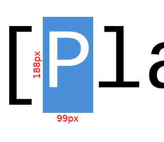
To start of we need the width/height ration of the font. The width of a mono-spaced character depends on the font. I will be working with Courier New for this example. I'm not sure where exactly to find this so I will be using a approximate of 99/188.

image of character measurement

If the maximum amount of characters is:

11 * 4 (Placeholder) + 3 (spaces) = 47

Then the width of 47 characters is:

47 * 3vw * (99/188) = 74.25vw

So about 75% of the viewport width. This means when paddings, margins and borders take up more then 25% of the width (due to resizing the window) the contents of the text will no longer fit in its container.

So how do we make the content fit? We can use the CSS calc() function to subtract some a static value from a dynamic value. To do this we first have to know the width of the static values. In your example these are the static widths:

  • 20px margin for #song-container
  • 15px padding for .container-fluid
  • 1px border for .panel
  • 15px padding for .panel-body

Don't forget that all of these values are present on both sides, so they take up:

(20px + 15px + 1px + 15px) * 2 = 102px

We can't subtract this from the 3vw, because the 3vw is the height of one character whereas the 102px is the width of the static elements. So we now need to convert the 102px to the height of one character. This is done by spreading the width over all characters, then applying the ratio to convert from character width to height.

102px / 47 / (99/188) ≈ 4.121212121

Now we are comparing apples with apples and we can use calc(3vw - 102px / 47 / (99/188)) for the font size. You can now freely play around with the 3vw value. In the example I upped this value to 3.5vw.

Note that this isn't 100% accurate, I didn't account for character spacing and the font width/height ratio is based on a measurement, not a given.

#song-container {
    text-align: center;
    margin: 20px;
}
#song {
    color: #000;
    font-size: calc(3.5vw - 102px / 47 / (99/188));
    font-family: "Courier New",monospace,Courier;
    white-space: pre;
    word-break: break-all;
    text-align: left;
    display: inline-block;
}

#song > span { /* Chords*/
    color: #007fbf;
    cursor: pointer;
}
<link rel="stylesheet" href="https://maxcdn.bootstrapcdn.com/bootstrap/3.3.7/css/bootstrap.min.css" integrity="sha384-BVYiiSIFeK1dGmJRAkycuHAHRg32OmUcww7on3RYdg4Va+PmSTsz/K68vbdEjh4u" crossorigin="anonymous">
<script src="https://code.jquery.com/jquery-3.4.1.slim.min.js" integrity="sha384-J6qa4849blE2+poT4WnyKhv5vZF5SrPo0iEjwBvKU7imGFAV0wwj1yYfoRSJoZ+n" crossorigin="anonymous"></script>
<link rel="stylesheet" href="https://maxcdn.bootstrapcdn.com/bootstrap/3.3.7/css/bootstrap-theme.min.css" integrity="sha384-rHyoN1iRsVXV4nD0JutlnGaslCJuC7uwjduW9SVrLvRYooPp2bWYgmgJQIXwl/Sp" crossorigin="anonymous">
<script src="https://maxcdn.bootstrapcdn.com/bootstrap/3.3.7/js/bootstrap.min.js" integrity="sha384-Tc5IQib027qvyjSMfHjOMaLkfuWVxZxUPnCJA7l2mCWNIpG9mGCD8wGNIcPD7Txa" crossorigin="anonymous"></script>
            
<div class="container-fluid">
    <div id="song-container">
        <div class="panel panel-default">
            <div class="panel-body">
                <span id="song">
[Placeholder]

<span>Em</span>         <span>G</span>
Placeholder Placeholder Placeholder Placeholder
<span>D</span>          <span>C</span>
Placeholder Placeholder Placeholder Placeholder
                </span>
            </div>
        </div>
    </div>
</div>

This works, but when the static widths, the maximum amount of characters or the font width/height ratio changes you have to recalculate the compensation value. For this reason a JavaScript library might be better suited. You can find a few of them described in the CSS-Trics post Fitting Text to a Container.

I would also suggest taking a look at the Font scaling based on width of container question, which has some other suggestions.

Thorvald answered 4/5, 2020 at 18:0 Comment(0)
U
0

I few things that will improve the responsiveness is this:

#song-container{
 text-align: center;
 margin:0;
overflow: hidden;
}

.panel-body{
 margin: 0;
}

If you would like the overflow to be scrollable you can just add overflow-x: scroll; Also if you use media queries that would make it more responsive as well because even with my approach there it comes to a point that if the screen is only 220px it will cut some of the words due to the fonts not scalling fast enough, which you could alter your media query to scale the font faster after reaching this point to keep it within your container. Hope this helps!

EDIT:

  #song-container {
    text-align: center;
    /*margin: 20px;*/
    padding: 1%;
}
#song {
    color: #000;
    font: normal 3vw Courier New,monospace,Courier;
    white-space: pre;
    word-break: break-all;
    text-align: left;
    display: inline-block;
}

#song > span { /* Chords*/
    color: #007fbf;
    cursor: pointer;
}
.panel-body{
  padding:0;
}

This should do it, I edit it in the fiddle.

Usk answered 4/5, 2020 at 21:27 Comment(2)
JSFiddle forks the project when you are not the owner, generating a new URL. So you either have to link to the new URL from your answer, or press the large "Copy snippet to answer" button under the snippet and make the edits here on Stack Overflow.Thorvald
Gotcha, I did not know that Thanks! However when I mean I edit the fiddle I meant that I tested it there and just copied the code, my apologies if that was misleading.Usk

© 2022 - 2024 — McMap. All rights reserved.