How to change displot color saturation
Asked Answered
A

1

5

I have installed the latest version of seaborn (0.11.1). When I plot a hist with custom color, it show different color than I expected (see the color by sns.palplot). For some api, it has a saturation parameter, but not for the displot.

dat_plots_mod = dat_plots.copy(deep=True)
dat_plots_mod.loc[dat_plots_mod.LDS == "FC", "LDS"] = "F"
palette = ["#9b59b6", "#ff0000", "#00f0f0", "#00ff00", "#000000", "#320ff0"]
sns.set_theme(style="ticks", font_scale=1.3)
g = sns.displot(
    x="AgeRS", 
    hue="LDS", 
    data=dat_plots_mod, 
    palette=palette, 
    aspect=1.5,
)
g.set(ylabel="Number of samples", ylim=(0, 30))

Screenshot of script and plot result

Ardennes answered 8/5, 2021 at 2:55 Comment(0)
M
6

Here, the graying of the colors isn't due to "saturation", but to "alpha". You can set sns.displot(...., alpha=1).

import seaborn as sns

tips = sns.load_dataset('tips')
sns.displot(data=tips, x='total_bill', hue='day', palette=["#9b59b6", "#ff0000", "#00f0f0", "#00ff00"], alpha=1)

displot with alpha=1

Note that the default to show multiple bars for the same x-value is multiple='layer'. Using alpha=0.4 the different layers can be easily distinguished, while with alpha=1 the viewer can be confused in thinking the bars are stacked.

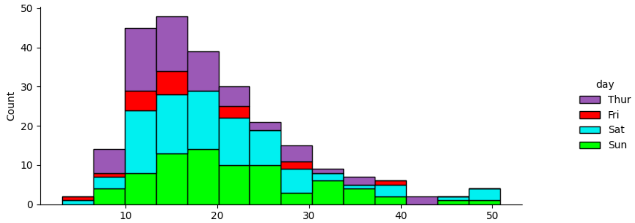
Here is how multiple='stack' looks like (note the larger y-values):

sns.displot with multiple='stack'

And here with multiple='dodge':

multiple='dodge'

Murial answered 8/5, 2021 at 11:51 Comment(1)
Ok, I will show code directly next time. Thank you for your explain and example, JohanC. It's great.Ardennes

© 2022 - 2024 — McMap. All rights reserved.