I have data of a pre and a posttest in two groups: control and treatment. I computed the score and now want to illustrate the differences between groups and tests. As a basis I have a data frame in R containing for each student a row with the results of the pre as well as the posttest:
student_id  group       test_id  Score
145         Treatment   pre      0.12
145         Treatment   post     0.78
109         Control     pre      0.45
109         Control     post     0.99
I have written the following code
s2$test_id <- as.factor(s2$test_id)
s2$group <- as.factor(s2$group)

p <- ggplot(s2, aes(x = test_id, y=score, fill = group)) + geom_violinhalf(trim=FALSE, fill="gray")+
  labs(title="Half Violin",x="Test", y = "Score")+
  geom_boxplot(width=0.1)+
  theme_classic() + scale_x_discrete(limits = rev)
p
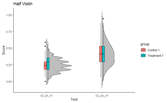
producing
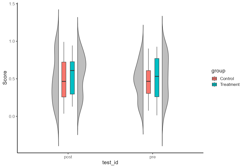
Is it possible, that the grey violin can be changed into the distribution of the treatment group (blue) and that I can add a second half violin shape on the left of the pre and posttest depicting the control distribution (red)?


