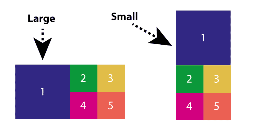
Flexbox Layout Pattern: 5 Square (1 Large, 4 small)
Asked Answered
T

2

5

I'm trying to put together a flexbox layout - for the purposes of this question I'll call it a 'square five block' layout (see image) - but I'm running into trouble, as all the experiments I have tried do not wrap correctly.

I've seen the same layout done using floats, but I was hoping to future-proof it a little and use a more up-to-date method - hence flexbox. I've tried searching for this pattern but there doesn't appear to be a consistent name for it, so finding similar examples is proving tough.

I'm using viewport units too to ensure that the blocks remain perfectly square, all based on viewport widths (vw) units.

div { width: 25vw; height: 25vw; }
div:first-of-type { width: 50vw; height: 50vw; }

The key features is that all the blocks should be square, the first block however should be the size of the remaining four combined. Has anyone seen or worked on such a layout before?

5-block grid of perfect squars using flexbox; first block should be exact size of the remaining four blocks

Thanks!!

Thermotaxis answered 12/4, 2016 at 12:12 Comment(1)
Good question. Flexbox is amazing.Eratosthenes
R
5

Nested flexboxes would work here in combination with media queries.

Codepen Demo with media query

Basically:

* {
  box-sizing: border-box;
  margin: 0;
  padding: 0;
}
.parent {
  width: 100vw;
  display: flex;
}
.col {
  flex: 0 0 50vw;
  height: 50vw;
  background: blue;
}
.wrap {
  display: flex;
  flex-wrap: wrap
}
.box {
  flex: 0 0 25vw;
  height: 25vw;
}
.red {
  background: red;
}
.pink {
  background: pink;
}
.orange {
  background: orange;
}
.grey {
  background: grey;
}
<div class="parent">
  <div class="col"></div>
  <div class="col wrap">
    <div class="box red"></div>
    <div class="box pink"></div>
    <div class="box orange"></div>
    <div class="box grey"></div>
  </div>
</div>
Ref answered 12/4, 2016 at 12:26 Comment(4)
Wow. Paulie, that was fast! Thanks very much indeed. You've won my patented 'Favourite Person of the Day' award! Would there be a way to do this in an even simpler way, such as 5 divs all on the same [siblings] level?Thermotaxis
No. Flexbox doesn't wrap like that.Ref
Okay. No problem then. I still have a bit to learn about flexbox - right before CSS native grids come along and force me to learn a new layout technique for the tenth time! Thanks.Thermotaxis
I'm kinds dreading CSS Grids too...they have a lot in common with flexbox but look very confusing still.Ref
E
2

See the code below and expand the result. I have used flexbox

body {
  margin: 0;
  height: 100vh;
  width: 100vw;
}

.wrapper {
  height: 100%;
}

.layout.horizontal,
.layout.vertical {
  display: -ms-flexbox;
  display: -webkit-flex;
  display: flex;
}

.layout.horizontal {
  -ms-flex-direction: row;
  -webkit-flex-direction: row;
  flex-direction: row;
}

.layout.vertical {
  -ms-flex-direction: column;
  -webkit-flex-direction: column;
  flex-direction: column;
}

.flex {
  -ms-flex: 1 1 0.000000001px;
  -webkit-flex: 1;
  flex: 1;
  -webkit-flex-basis: 0.000000001px;
  flex-basis: 0.000000001px;
}

.box {
  color: #fff;
  text-align: center;
}

.box.blue {
  background: #312783;
}

.box.green {
  background: #0B983A;
}

.box.yellow {
  background: #E1BD48;
}

.box.pink {
  background: #D2007F;
}

.box.orange {
  background: #EB6053;
}

@media all and (max-width: 768px) {
  .change-in-responsive.layout.horizontal {
    -ms-flex-direction: column;
    -webkit-flex-direction: column;
    flex-direction: column;
  }
}
<div class="layout horizontal wrapper change-in-responsive">
  <div class="box large flex blue">1</div>
  <div class="flex layout vertical">
    <div class="flex layout horizontal">
      <div class="box green flex">2</div>
      <div class="box yellow flex">3</div>
    </div>
    <div class="flex layout horizontal">
      <div class="box pink flex">4</div>
      <div class="box orange flex">5</div>
    </div>
  </div>
</div>
Eratosthenes answered 12/4, 2016 at 12:53 Comment(0)

© 2022 - 2024 — McMap. All rights reserved.