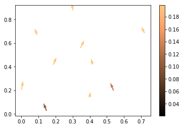
I am plotting a map with arrows on top of it. These arrows represent winddirections, average windspeed (per direction) and the occurence (per direction).
The direction is indicated by the direction of the arrow. The length of the arrow indicated the average windspeed in that direction. The color of the arrow indicates the occurence of winds in such a direction.
This all works fine with the script below:
windData = pd.read_csv(src+'.txt'), sep='\t', names=['lat', 'lon', 'wind_dir_start', 'wind_dir_end', 'total_num_data_points','num_data_points', 'avg_windspeed']).dropna()

# plot map
m = Basemap(llcrnrlon=minLon, llcrnrlat=minLat, urcrnrlon=maxLon, urcrnrlat=maxLat, resolution='i')
Left, Bottom = m(minLon, minLat)
Right, Top = m(maxLon, maxLat)

# get x y
x, y = m(windData['lon'], windData['lat'])

# angles
angleStart = -windData['wind_start']+90
angleStart[angleStart<0] = np.radians(angleStart[angleStart<0]+360.)

angleEnd = -windData['wind_end']+90
angleEnd[angleEnd<0] = np.radians(angleEnd[angleEnd<0]+360.)

angle = angleStart + math.radians(binSize/2.)

xux = np.cos(angle) * windData['avg_windspeed']
yuy = np.sin(angle) * windData['avg_windspeed']

# occurence
occurence = (windData['num_data_points']/windData['total_num_data_points'])

xi = np.linspace(minLon, maxLon, 300)
yi = np.linspace(minLat, maxLat, 300)

# plotting
## xux and yuy are used negatively because they are measured as "coming from" and displayed as "going to"
# To make things more readable I left a threshold for the occurence out
# I usually plot x, y, xux, yuy and the colors as var[occurence>threshold]
Q = m.quiver(x, y, -xux, -yuy, scale=75, zorder=6, color=cm.jet, width=0.0003*Width, cmap=cm.jet)
qk = plt.quiverkey(Q, 0.5, 0.92, 3, r'$3 \frac{m}{s}$', labelpos='S', fontproperties={'weight': 'bold'})
m.scatter(x, y, c='k', s=20*np.ones(len(x)), zorder=10, vmin=4.5, vmax=39.)
This plot shows the arrows well, but now I want to add a colormap that indicates the percentage of occurence next to the plot. How would I do this?


color=cm.jet. Does this define the color of the arrow? If so, how does it relate to "occurence of winds"? In order to define a colorbar you would need a quantity according to which the colorbar is defined, but I don't see this quantity here in the code. Also mind that it would tremendously help to have a minimal reproducible example of the issue. – Marrymars