css-grid: place element "outside" of grid
Asked Answered
P

3

5

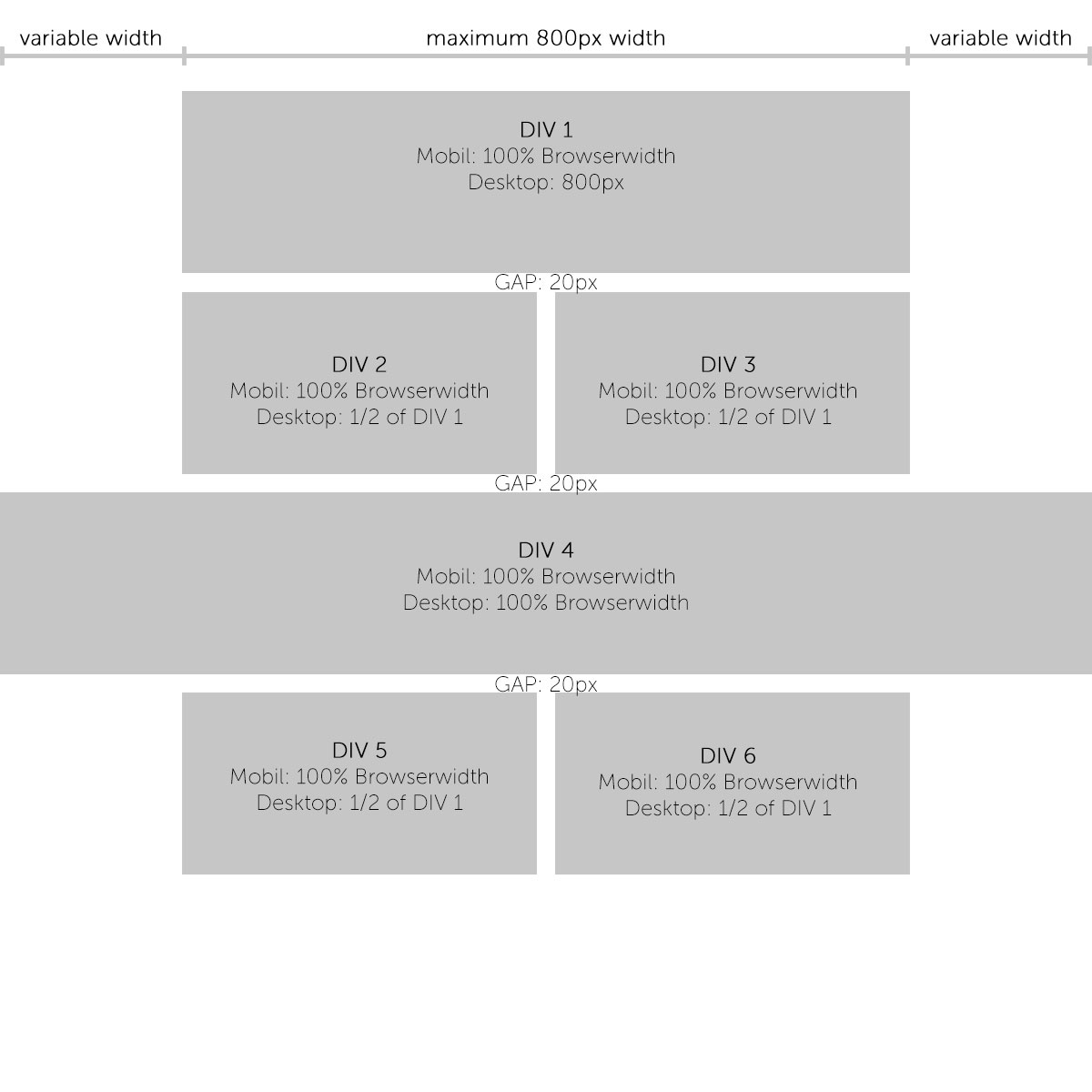
I am new to css grid I try to achieve the layout from the image attached where ONE element DIV 4 is wider than the grid layout. I try to avoid to close the grid-div before DIV 4 and then reopen the grid after DIV 4 again so I can controll the appearance of each grid element and how it is displayed through ONE css-class only and it won't need a different div-structure.

https://codepen.io/anon/pen/RBdjbd

 .grid-2er {
     grid: auto-flow dense / 1fr 1fr;
     display: grid;
     grid-gap: 20px;
     grid-auto-rows: auto;
}

.grid-2er .halfwidth {
     grid-column: 1 / -1;
}

.grid-2er .fullwidth {
     grid-column: 1 / -1;
}

enter image description here

Pollypollyanna answered 13/8, 2018 at 9:21 Comment(0)
C
4

Might I suggest a four column grid

  grid-template-columns: 1fr minmax(0, 400px) minmax(0, 400px) 1fr;

Codepen Demo

* {
  margin: 0;
  padding: 0;
  text-decoration: none;
  outline: none;
  font-weight: 300;
  border: none;
  font-family: "Source Sans Pro", sans-serif;
  text-align: center;
}

*,
*::after,
*::before {
  box-sizing: border-box;
}

.grid-2er {
  grid-template-columns: 1fr minmax(0, 400px) minmax(0, 400px) 1fr;
  display: grid;
  grid-gap: 20px;
  grid-auto-rows: auto;
}

.grid-2er * {
  background: blue;
  color: white
}

.grid-2er .mainwidth {
  grid-column: 2 / 4;
}

.grid-2er .halfwidth {
  grid-column: 2;
}

.halfwidth+.halfwidth {
  grid-column: 3;
}

.grid-2er .fullwidth {
  grid-column: 1 / -1;
}
<div class="grid-2er">
  <div class="mainwidth">DIV 1</div>
  <div class="halfwidth">DIV 2</div>
  <div class="halfwidth">DIV 3</div>
  <div class="fullwidth">DIV 4</div>
  <div class="halfwidth">DIV 5</div>
  <div class="halfwidth">DIV 6</div>
</div>
Cloister answered 13/8, 2018 at 10:29 Comment(4)
Seems perfect. Thanks.Pollypollyanna
How could I achieve to get rid of the OUTSIDE GAPs (the ones bordering to the browser-sides) on a screenwidth of less than 480px?Pollypollyanna
Remove the 10px padding you have on everything including the body - codepen.io/Paulie-D/pen/oMVqGVCloister
Only I think you need to change min-width to max-width in your pen.Pollypollyanna
N
3

You can use negative margin. If the width of the whole grid is maximized to 800px then you can have a negative margin of (800px - 100vw)/2 on each side. Then when the size of the window is less than 800px you reset margin to 0:

Here is an example (I used 600px in this case)

* {
  margin: 0;
  padding: 0;
  font-weight: 300;
  border: none;
  font-family: "Source Sans Pro", sans-serif;
  text-align: center;
  padding: 10px;
}

*,
*::after,
*::before {
  box-sizing: border-box;
}

.grid-2er {
  grid: auto-flow dense / 1fr 1fr;
  display: grid;
  grid-gap: 20px;
  grid-auto-rows: auto;
  max-width: 600px;
  margin: auto;
}

.grid-2er .halfwidth {
  grid-column: 1 / -1;
  background: blue;
  color: white
}

.grid-2er .fullwidth {
  grid-column: 1 / -1;
  background: blue;
  color: white
}

.outside {
  margin: 0 calc((600px - 100vw)/2);
}

@media only screen and (max-width: 600px) {
  .outside {
    margin: 0;
  }
}

@media only screen and (min-width: 480px) {
  .grid-2er .halfwidth {
    grid-column: auto;
  }
  .grid-2er .fullwidth .tile {
    width: 50%;
  }
}
<div class="grid-2er">

  <div class="fullwidth ">
    DIV 1
  </div>

  <div class="halfwidth">
    DIV 2
  </div>

  <div class="halfwidth">
    DIV 3
  </div>

  <div class="fullwidth outside">
    DIV 4
  </div>

  <div class="halfwidth">
    DIV 5
  </div>

  <div class="halfwidth">
    DIV 6
  </div>

</div>
Numbing answered 13/8, 2018 at 9:29 Comment(3)
Thank you for this solution. But isn't using negative margins considered a less ideal practice? (Just trying to find the most "professional" way there is.)Pollypollyanna
@TomSenner and what is the definition of professional way ? :) .. how you will judge a solution is more professional than another? ... negative margin is one working solution among another and there is no bad things with it since we are allowed to use negative margin but at the end it's up to you to choose the solution that you like ;)Numbing
All divs look the same width when I run the code snippet. Firefox.Silas
M
0

Use calc to get the value of your gutter. The width of the gutter is half the width of it's container minus half the width of the content container. In your case the math is calc(50% - 400px). I like to add a minmax to keep the gutter from collapsing completely but you can ignore that if you don't need it. This frees you up to use 1fr for your interior columns so they are responsive and you can change the number of columns without having to recalculate their widths.

.content {
  display: grid;
  grid-template-columns: calc(50% - 400px) repeat(2, 1fr) calc(50% - 400px);
  gap: 1rem;
 }
 
 .column {
  text-align: center;
  background-color: #ddd;

 }
 
 .--column1 {
  grid-column: 2 / 3;
 }
 
 .--column2 {
  grid-column: 3 / 4;
 }

 .--columnfull {
      grid-column: 1 / 5;
 }
<div class="container">
  <div class="content">
    <div class="column --column1">column</div>
    <div class="column --column2">column</div>
    <div class="column --columnfull">column</div>
  </div>
</div>
Malony answered 15/2, 2022 at 15:29 Comment(0)

© 2022 - 2024 — McMap. All rights reserved.