CSS: How to fade text from top and bottom?
Asked Answered
O

2

5

I need to fade paragraph from both top and bottom. But am able to fade from only either of the side.

HTML:

<p className="bottom-overflow-fade">
  {content}
</p>

CSS:

.bottom-overflow-fade {
  mask-image: linear-gradient(to bottom, black 80%, transparent 100%);
  -webkit-mask-image: linear-gradient(to bottom, black 80%, transparent 100%);
}

.top-overflow-fade {
  mask-image: linear-gradient(to top, black 80%, transparent 100%);
  -webkit-mask-image: linear-gradient(to top, black 80%, transparent 100%);
}

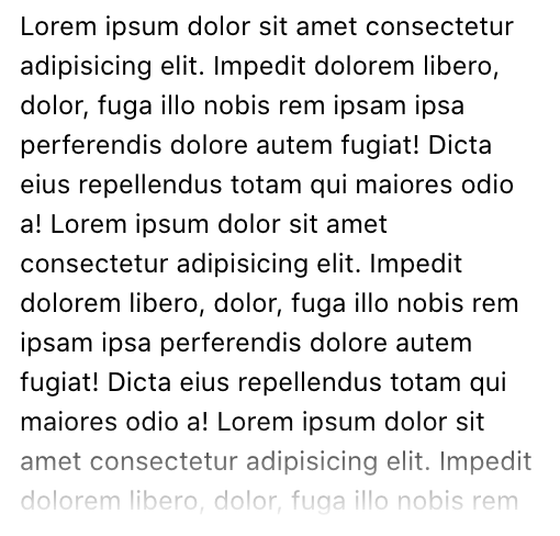
Current Result:

enter image description here

Issue:

If I add both these classnames to the paragraph, the fade won’t work. If I use either one of them, then the fade works perfectly either for top and bottom. Is it possible to combine both these CSS properties in one, so that both the top and bottom fade works?

Note: I am not talking about any animation.

Oversell answered 1/7, 2020 at 13:41 Comment(5)
How do you want to fade in a single paragraph from 2 sides at once. That doesn't make sense.Thanos
That does make in my use case when user is scrolling I want to fade from both sides.Oversell
Can you show what it looks like when it works perfectly so we can have a reference?Aye
My bad. I always thought you ment a fade-in animation, not a color gradient. Wow shoulda read that more carefully - sorryThanos
@Aye I have added an image for the reference.Oversell
T
6

This is because of the nature of CSS. If you apply two declarations for the same property only one will preside! You can create a single class with a different linear gradient that starts transparent goes to black then ends transparent such as:

.top-bottom-overflow-fade {
  mask-image: linear-gradient(transparent, black 20%, black 80%, transparent 100%);
  -webkit-mask-image: linear-gradient(transparent, black 20%, black 80%, transparent 100%);
}

EDIT

The question posed in the comments asks what the values are that are passed to the linear-gradient function:

  1. The first argument is an optional value that controls the direction of the gradient. This can be described using some keywords (such as to left top or to right) or with an angle of rotation. In CSS the units used to express angles can be in the form of deg (degrees), turn, rad (radians), or grad (gradians). The default direction is from top to bottom if none is supplied. Note that I didn't include this so the default direction is used.
  2. The remaining arguments are a list of colors and optional values for where the color should start and stop called color stops. You may use as many color stops as you wish. The more color stops you have the narrower each 'band' of color will become. A color stop list without any 'hints', or start and stop points, will have a smooth transition from one color to the next because it will apply the color start and stop points uniformly. If you want an abrupt transition from one color to the next, you would set the stopping percentage of the first color to the same value as the starting percentage of the next color. Some clever and artistic people produce amazing patterns with CSS gradients by taking advantage of the background-image property's ability to stack multiple images (gradients are treated as background-images not background-colors)!
Trichosis answered 1/7, 2020 at 14:13 Comment(3)
Hey @Trichosis this worked like charm. Can you please explain the syntax for this or share some relevant resource? Like if I keep on adding more properties what they would mean? linear-gradient(a, b, c, d, e, ...); and so on? Thanks! :)Oversell
@VinaySharma If you want to get a handle on the power of CSS gradients (linear and radial) definitely take a look at the CSS Gradients post on CSS Tricks. css-tricks.com/css3-gradientsTrichosis
I couldn’t figure out your answer if I want to fade out only left and right edges. I did go through your EDIT twice but I still fail to understand that how the args passed to linear-gradient are able to specify to fade the container only from top and bottom, and leave the rest as it is. In short, you have not specified any directions something like to-top and to-bottom so how's this working actually? 😅Oversell
A
1

Here is a generic solution in case you want to have top, bottom and the combination of both.

The trick is to create a mask using 3 gradient where by default everything is white color (no transparency) then with a CSS variable you change the white to transparent to create the fading effect.

.fade {
  -webkit-mask:
    linear-gradient(to top   ,#fff,var(--t,#fff)) top    / 100% 30%,
    linear-gradient(#fff,#fff)                    center / 100% 40%,
    linear-gradient(to bottom,#fff,var(--b,#fff)) bottom / 100% 30%;
  -webkit-mask-repeat:no-repeat;
  mask:
    linear-gradient(to top   ,#fff,var(--t,#fff)) top    / 100% 30%,
    linear-gradient(#fff,#fff)                    center / 100% 40%,
    linear-gradient(to bottom,#fff,var(--b,#fff)) bottom / 100% 30%;
  mask-repeat:no-repeat;
}

.top {
  --t:transparent;
}

.bottom {
  --b:transparent;
}

p {
 font-size:25px;
 max-width:180px;
 display:inline-block;
}
<p class="fade top">
  Lorem ipsum dolor sit amet, consectetur adipiscing elit. Cras euismod est quis nibh porta, ut vehicula magna imperdiet. Etiam euismod urna id venenatis pulvinar
</p>

<p class="fade bottom">
  Lorem ipsum dolor sit amet, consectetur adipiscing elit. Cras euismod est quis nibh porta, ut vehicula magna imperdiet. Etiam euismod urna id venenatis pulvinar
</p>

<p class="fade top bottom">
  Lorem ipsum dolor sit amet, consectetur adipiscing elit. Cras euismod est quis nibh porta, ut vehicula magna imperdiet. Etiam euismod urna id venenatis pulvinar
</p>

To understand the puzzle here is the same code used a backoground:

.fade {
  background:
    linear-gradient(to top   ,red,var(--t,green))   top    / 100% 30%,
    linear-gradient(pink,pink)                      center / 100% 40%,
    linear-gradient(to bottom,blue,var(--b,purple)) bottom / 100% 30%;
  background-repeat:no-repeat;
}

.top {
  --t:transparent;
}

.bottom {
  --b:transparent;
}

p {
 font-size:25px;
 max-width:180px;
 display:inline-block;
}
<p class="fade top">
  Lorem ipsum dolor sit amet, consectetur adipiscing elit. Cras euismod est quis nibh porta, ut vehicula magna imperdiet. Etiam euismod urna id venenatis pulvinar
</p>

<p class="fade bottom">
  Lorem ipsum dolor sit amet, consectetur adipiscing elit. Cras euismod est quis nibh porta, ut vehicula magna imperdiet. Etiam euismod urna id venenatis pulvinar
</p>

<p class="fade top bottom">
  Lorem ipsum dolor sit amet, consectetur adipiscing elit. Cras euismod est quis nibh porta, ut vehicula magna imperdiet. Etiam euismod urna id venenatis pulvinar
</p>
Annunciator answered 1/7, 2020 at 20:10 Comment(0)

© 2022 - 2024 — McMap. All rights reserved.