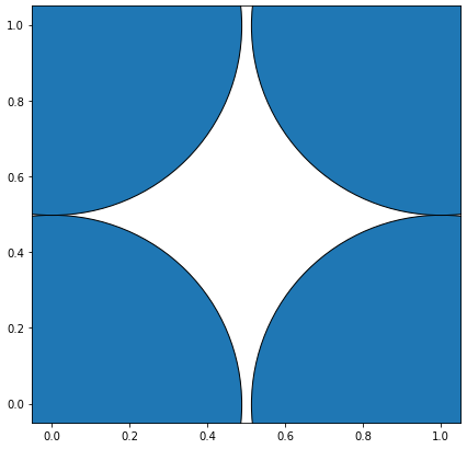
The code looks perfectly fine. You can see this if you plot just 4 points (n=2):
![4 cricles]()
The radius is (almost) exactly the r=0.5 coordinate-units that you wanted to have. wait, almost?!
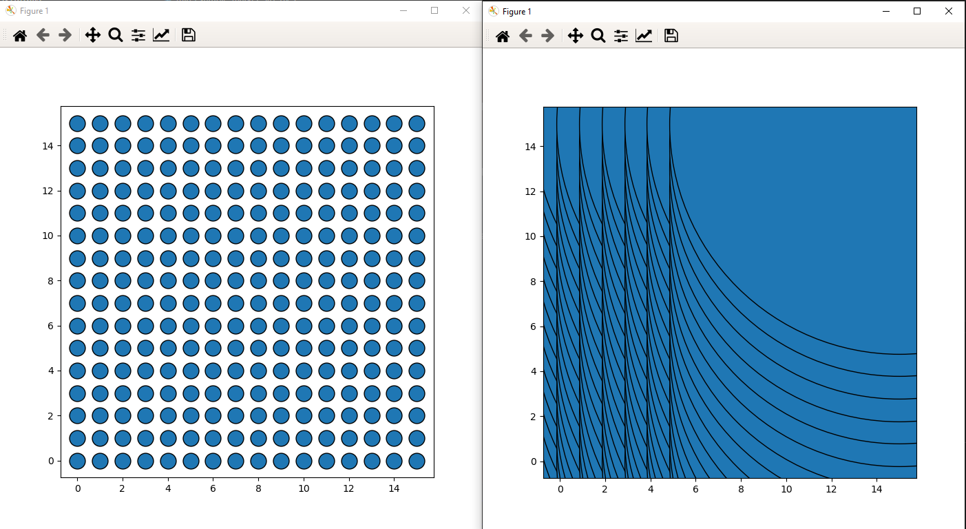
Yes, the problem is that you determine the coordinate-units-to-figure-points size before plotting, so before setting the limits, which influence the coordinate-units but not the overall figure size...
Sounded strange? Perhaps. The bottom line is that you determine the coordinate transformation with the default axis-limits ((0,1) x (0,1)) and enlarges them afterwards to (-0.75, 15.75)x(-0.75, 15.75)... but you are not reducing the marker-size.
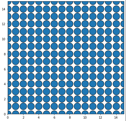
So either set the limits to the known size before plotting:
ax.set_xlim((0,n-1))
ax.set_ylim((0,n-1))
The complete code is:
import matplotlib.pyplot as plt
from numpy import pi

n = 16
# create a n x n square with a marker at each point as dummy data
x_data = []
y_data = []
for x in range(n):
    for y in range(n):
        x_data.append(x)
        y_data.append(y)

# open figure
fig,ax = plt.subplots(figsize=[7,7])
# set limits BEFORE plotting
ax.set_xlim((0,n-1))
ax.set_ylim((0,n-1))
# radius in data coordinates:
r = 0.5 # units
# radius in display coordinates:
r_ = ax.transData.transform([r,0])[0] - ax.transData.transform([0,0])[0] # points
# marker size as the area of a circle
marker_size = pi * r_**2
# plot
ax.scatter(x_data, y_data, s=marker_size, edgecolors='black')

plt.show()
![output set limits]()
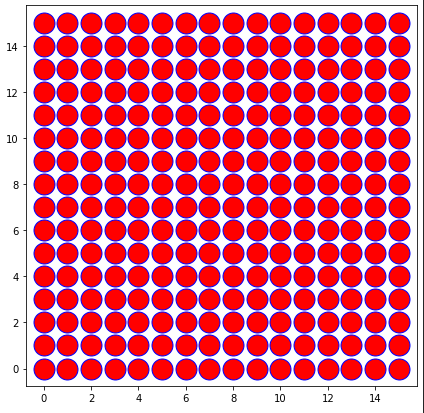
... or scale the markers's size according to the new limits (you will need to know them or do the plotting again)
# plot with invisible color
ax.scatter(x_data, y_data, s=marker_size, color=(0,0,0,0))
# calculate scaling
scl = ax.get_xlim()[1] - ax.get_xlim()[0]
# plot correctly (with color)
ax.scatter(x_data, y_data, s=marker_size/scl**2, edgecolors='blue',color='red')
This is a rather tedious idea, because you need to plot the data twice but you keep the autosizing of the axes...
![output with double plotting]()
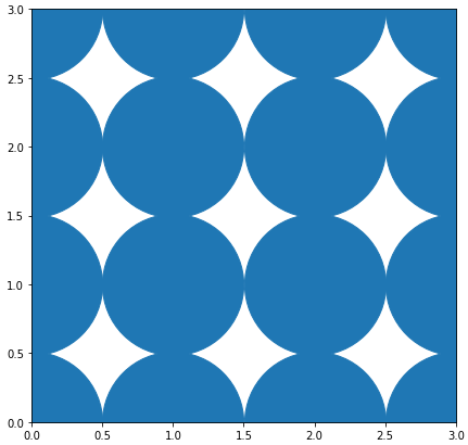
There obviously remains some spacing. This is due a misunderstanding of the area of the markers. We are not talking about the area of the symbol (in this case a circle) but of a bounding box of the marker (imagine, you want to control the size of a star or an asterix as marker... one would never calculate the actual area of the symbol).
So calculating the area is not pi * r_**2 but rather a square: (2*r_)**2
# open figure
fig,ax = plt.subplots(figsize=[7,7])
# setting the limits
ax.set_xlim((0,n-1))
ax.set_ylim((0,n-1))
# radius in data coordinates:
r = 0.5 # units
# radius in display coordinates:
r_ = ax.transData.transform([r,0])[0] - ax.transData.transform([0,0])[0] # points
# marker size as the area of a circle
marker_size = (2*r_)**2
# plot
ax.scatter(x_data, y_data, s=marker_size,linewidths=1)
#ax.plot(x_data, y_data, "o",markersize=2*r_)
plt.show()
![output (2*r)**2]() As soon as you add an edge (so a non-zero border around the markers), they will overlap:
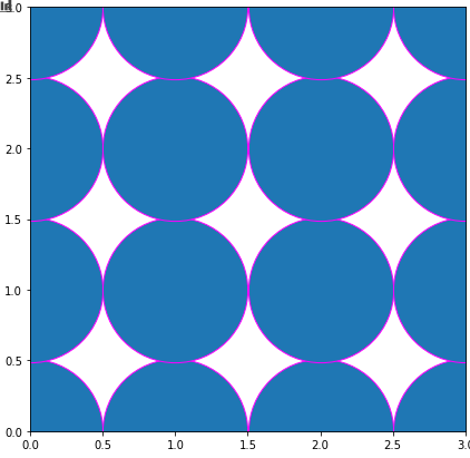
As soon as you add an edge (so a non-zero border around the markers), they will overlap:
![overlap]()
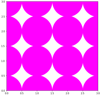
If even gets more confusing if you use plot (which is faster if all markers should have the same size as the docs state as "Notes"). The markersize is only the width (not the area) of the marker:
ax.plot(x_data, y_data, "o",markersize=2*r_,color='magenta')
![plot command]()
