`white-space: nowrap` inside flex container only grows to width of text as if it were wrapped
Asked Answered
T

3

5

I am trying to implement a flexbox layout that works as follows:

  • A flexbox container with flex-direction: row contains two children.

  • The parent should only be as big as it needs to to accommodate the children (achieved via display: inline-flex).

  • The children contain text of different lengths, which does not wrap (i.e. all on one line).

  • The children should be exactly the same width, which is the width of the widest of the two texts. This is very important, and precludes the usage of flex-basis: auto, because that will cause the length of the two texts to vary rather than being exactly the same.

In order to make the children the exact same width, determined by the largest of the two, I am using flex: 1 0 0px.

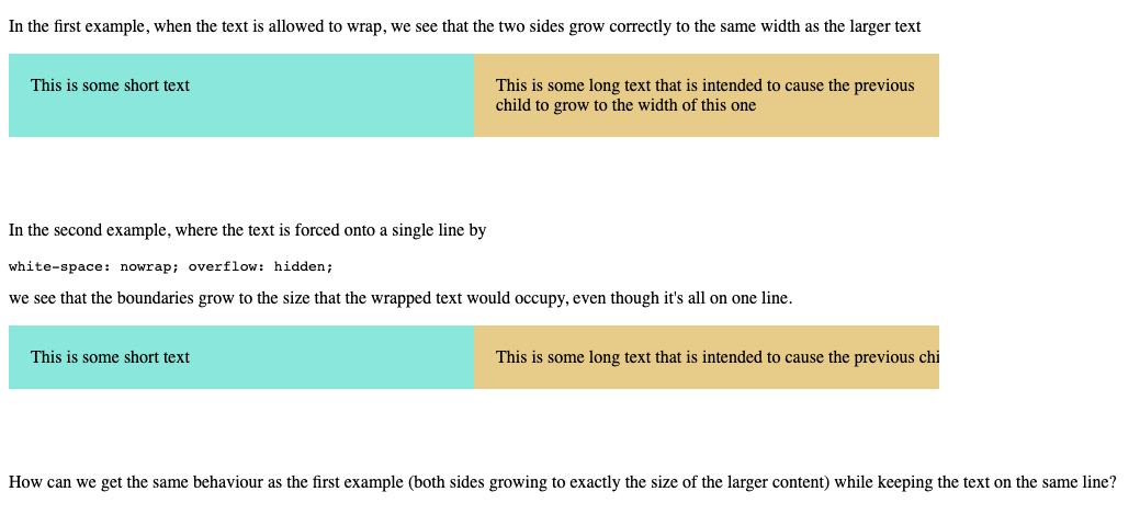
The layout works exactly as expected, except that the text only seems to grow to the width as if it didn't have white-space: nowrap! The following screenshot from this codepen that I've created illustrates the problem:

Showing what happens with and without white-space: nowrap

Is there any way to implement this exact behaviour without line wrapping? I know that I can do something like add a fixed width, but I want to know if this is possible to implement dynamically (always growing to exactly the correct width of arbitrary text) using flexbox.

Thanks

.parent {
  display: inline-flex;
  margin-bottom: 60px;
}

.child {
  flex: 1 0 0px;
  padding: 20px;
}

.nowrap {
  white-space: nowrap;
  overflow: hidden;
}

.left {
  background-color: #89e7dc;
}

.right {
  background-color: #e7cc89;
}
<p>In the first example, when the text is allowed to wrap, we see that the two sides grow correctly to the same width as the larger text</p>
<div class="parent">
  <div class="child left">This is some short text</div>
  <div class="child right">This is some long text that is intended to cause the previous child to grow to the width of this one</div>
</div>

<p>In the second example, where the text is forced onto a single line by
  <pre>white-space: nowrap; overflow: hidden;</pre> we see that the boundaries grow to the size that the wrapped text would occupy, even though it's all on one line.</p>
<div class="parent">
  <div class="child left nowrap">This is some short text</div>
  <div class="child right nowrap">This is some long text that is intended to cause the previous child to grow to the width of this one</div>
</div>

<p>
  How can we get the same behaviour as the first example (both sides growing to exactly the size of the larger content) while keeping the text on the same line?
</p>
Tania answered 28/5, 2021 at 15:24 Comment(7)
we see that the boundaries grow to the size that the wrapped text would occupy, This is wrong, it's growing because of flex:1 0 0, if you want the text to define the width then flex: 0 0 auto should do it. What is the end result here ?Blocky
@ZohirSalak flex: 0 0 auto will result in the sides having different widths. As stated in the post, the desired behaviour is for both sides to have the same width, which should be the exact width of the larger of the two texts.Tania
which should be exact width of the larger of the two texts This screams flex-basis:auto otherwise how could it be possible for the content to define the width if you ignore it ?Blocky
Please look at the codepen that I included. If you use flex-basis: auto, the width of each child will be determined by its own text, rather than the maximum text width of the two of them. flex-basis: 0px means that the growth along the flex axis will not be proportional to individual content, causing them to grow to the exact same size.Tania
You want the longest text to define the width of the two elements, That bit is clear. Yet you're ignore it with flex-basis: 0 what it does is Ignore all content, split free space evenly then lay content, in this case there's no free space thanks to inline-flex The free space then becomes the sum of the widths of both elements as if no styles were appliedBlocky
You can apply this known trick if you know before hand which is longest jsfiddle.net/pLw4dm9sBlocky
The behaviour for flex-basis: 0 is precisely what I'm trying to achieve. What still confuses me is that it works perfectly except when white-space: nowrap is applied. It still insists on basing the max width on the text as if it were wrapped, and I have no idea why. That trick from your JSFiddle could actually be useful in a practical sense though, thanks for that.Tania
C
6

I tried within the codepen you provided and ended up preppending the following, not sure if it's what you meant/wanted:

HTML

<div class="grid">
  <div class="child left">This is some short text</div>
  <div class="child right">This is some long text that is intended to cause the previous child to grow to the width of this one</div>
</div>

CSS

.grid {
  /* choose one of these below depending whether you want it (the parent) take the full width */
  display: inline-grid;
  display: grid;
  grid-template-columns: 1fr 1fr;
  /* choose one of these below depending whether you want it overflowing horizontally */
  width: fit-content;
  width: max-content;
}

The full demo:

.grid {
  display: grid;
  grid-template-columns: 1fr 1fr;
  width: max-content;
}

.parent {
  display: inline-flex;
  margin-bottom: 60px;
  width: max-content;
}

.child {
  flex: 1 0 0px;
  padding: 20px;
}

.nowrap {
  white-space: nowrap;
  overflow: hidden;
}

.left {
  background-color: #89e7dc;
}

.right {
  background-color: #e7cc89;
}
<h2>Answer</h2>

<div class="grid">
  <div class="child left">This is some short text</div>
  <div class="child right">This is some long text that is intended to cause the previous child to grow to the width of this one</div>
</div>

<h2>Question</h2>

<p>In the first example, when the text is allowed to wrap, we see that the two sides grow correctly to the same width as the larger text</p>
<div class="parent">
  <div class="child left">This is some short text</div>
  <div class="child right">This is some long text that is intended to cause the previous child to grow to the width of this one</div>
</div>

<p>In the second example, where the text is forced onto a single line by
  <pre>white-space: nowrap; overflow: hidden;</pre> we see that the boundaries grow to the size that the wrapped text would occupy, even though it's all on one line.</p>
<div class="parent">
  <div class="child left nowrap">This is some short text</div>
  <div class="child right nowrap">This is some long text that is intended to cause the previous child to grow to the width of this one</div>
</div>

<p>
  How can we get the same behaviour as the first example (both sides growing to exactly the size of the larger content) while keeping the text on the same line?
</p>

It's always tricky for a child to control the parent or its siblings with CSS, and I think we got either hacky or lucky with this one... (if it at all is what you meant)

Carp answered 28/5, 2021 at 16:23 Comment(4)
This looks pretty good with max-content (on Chrome). Doesn't even need nowrap.Fidler
Wow this actually seems to work! For one-dimensional layouts I figured that grid wouldn't provide any extra capability. I'll have to look into this to understand a little better. Thanks a lot!Tania
You're very welcome! (Make sure you thank Alex too haha) I actually wrote an article about the less-known subtle difference between flexbox and grid, which is somewhat related to your commnet: dev.to/li/…Carp
@Neo, good article. For your follow up... https://mcmap.net/q/823939/-areas-covered-by-flexbox-which-are-difficult-or-impossible-to-achieve-with-grid/3597276Fidler
F
1

Won't work with flex-grow because this function distributes free space on the line.

This means that the longer text item will first consume the free space in the shorter item before the container can expand. This kills the equal width layout you're seeking.

Put another way, flex-grow: 1, applied to both items, will distribute free space evenly between them. However, the longer the content, the less the free space, and flex-grow can't work as you expect. It can only create equal width items with flex-basis: 0 and enough free space.

Same problem with grid: the use of free space.

I don't think this layout can be achieved with flex-grow or fr. You would need another CSS method or JS.

Fidler answered 28/5, 2021 at 15:51 Comment(3)
I think I agree with you (although I'd be delighted to be proven wrong) that this is not possible without JS. Out of curiosity, do you know why it works perfectly if the text is allowed to wrap? Also, do you know why it gets cut off at the exact width of the wrapped text when white-space: nowrap is applied?:Tania
"Do you know why it works perfectly if the text is allowed to wrap?" Because flex-grow: 1 and flex-basis: 0 can work as intended, as the longer text expands vertically, not consuming additional space on the horizontal axis.Fidler
"Do you know why it gets cut off at the exact width of the wrapped text when white-space: nowrap is applied?" Because the inline-flex algorithm sets the same width for the container regardless of the white-space value.Fidler
S
0

Does this work? https://codepen.io/cheapsteak/pen/qBrPVda

<div class="parent">
  <div class="left child" style="">This is some short text</div><div class="right child" style="">This is some long text that is intended to cause the previous child to grow to the width of this one</div>
</div>

<style>
.parent {
  margin-bottom: 60px;
}

.child {
  padding: 20px;
  box-sizing: border-box;
  display: inline-block;
  width: 50%;
  min-width: max-content;
}

.nowrap {
  white-space: nowrap;
  overflow: hidden;
}

.left {
  background-color: #89e7dc;
}

.right {
  background-color: #e7cc89;
}
</style>
Settler answered 28/5, 2021 at 15:53 Comment(1)
Thanks for taking a crack at it. Unfortunately this codepen does not produce the desired behaviour, as the two sides are of different length.Tania

© 2022 - 2024 — McMap. All rights reserved.