You could do this by using the libraries grid and gtable.
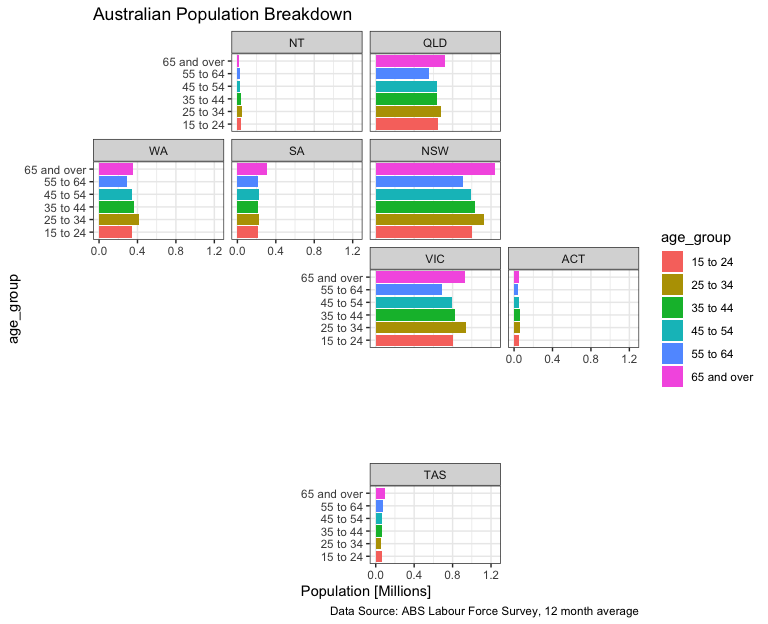
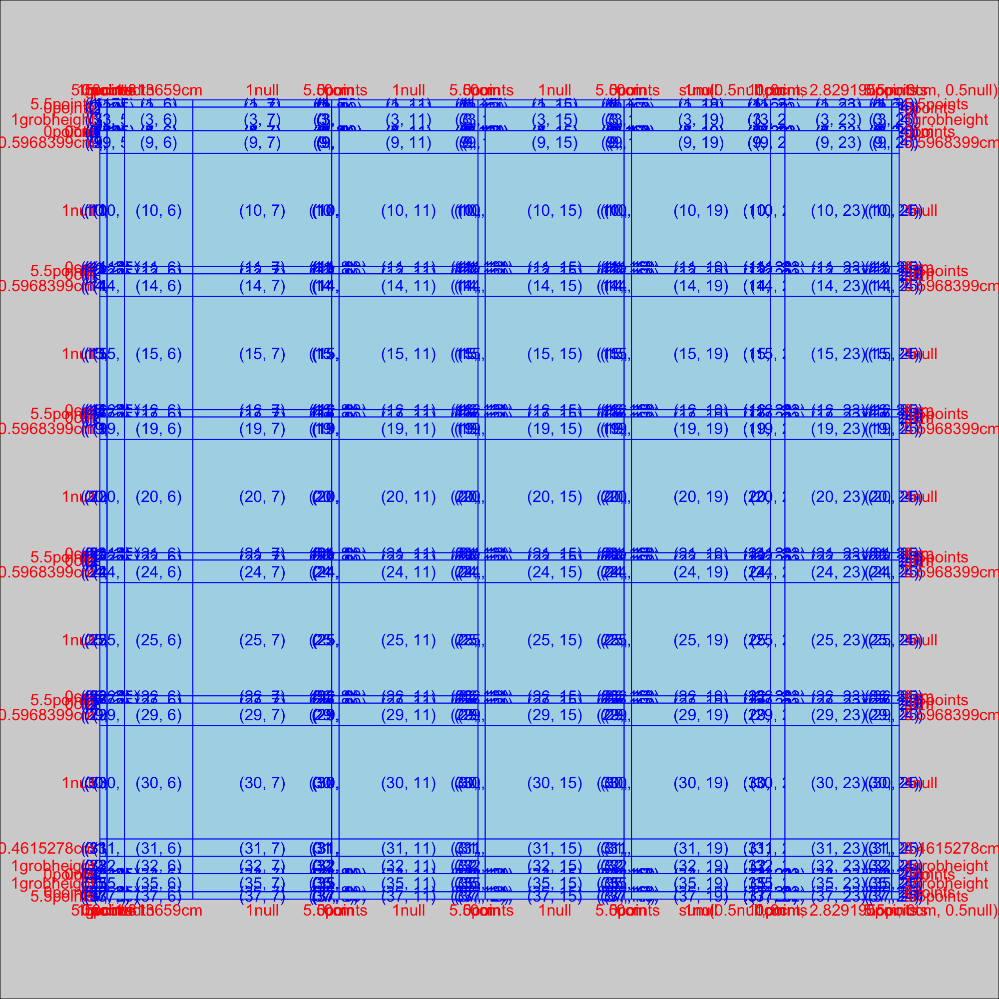
First, make the plot and convert it to a gtable. Then use gtable_show_layout() to display the grid visually and get row/column numbers:
library("ggplot2")
library("geofacet")
library("gtable")
library("grid")

# Make the plot
plt <- ggplot(aus_pop, aes(age_group, pop / 1e6, fill = age_group)) +
  geom_col() +
  facet_geo(~ code, grid = "aus_grid1") +
  coord_flip() +
  labs(
    title = "Australian Population Breakdown",
    caption = "Data Source: ABS Labour Force Survey, 12 month average",
    y = "Population [Millions]") +
  theme_bw()

# Turn it into a gtable
gtab <- get_geofacet_grob(plt) # Normally you'd use ggplotGrob(plt), but geofacet is different

# See the gtable layout visually
gtable_show_layout(gtab)
![]()
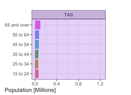
Next, make the purple rectangle for TAS:
purplerect <- polygonGrob(x=c(0,0,1,1), y=c(0,1,1,0),name='purplerect',gp=gpar(fill='purple',alpha=0.25))
grid.draw(gtable_add_grob(gtab,purplerect,t=28,l=15,b=30,r=16))
![]()
But you probably want it to go a bit beyond the plot area for a background or a border, so you can take the coordinates out of the (0,1) range and use clip='off' with gtable_add_grob():
purplerect <- polygonGrob(x=c(-0.02,-0.02,1.02,1.02), y=c(-0.02,1.02,1.02,-0.02),name='purplerect',gp=gpar(fill='purple',alpha=0.25))
grid.draw(gtable_add_grob(gtab,purplerect,t=28,l=15,b=30,r=16,clip='off'))
![]()
Still using TAS to demonstrate, you could also make it an outline rather than a shaded area. I've still kept the alpha (opacity) at 0.5, so when it overlaps something like a plot axis tick you can still see what's underneath it:
purplerect <- polygonGrob(x=c(-0.02,-0.02,1.02,1.02), y=c(-0.02,1.02,1.02,-0.02),name='purplerect',gp=gpar(fill=NA,col='purple',alpha=0.5,lwd=3))
grid.draw(gtable_add_grob(gtab,purplerect,t=28,l=15,b=30,r=16,clip='off'))
![]()
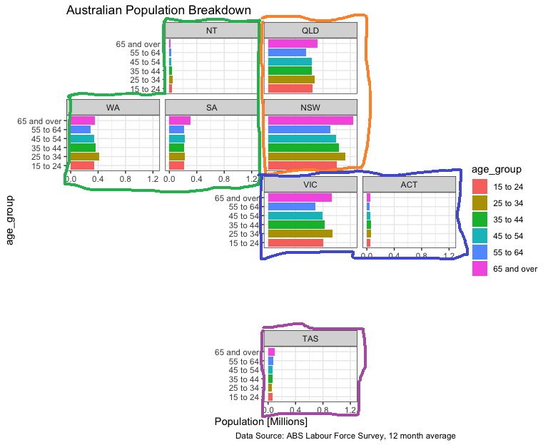
And here's the whole plot done that way:
purplerect <- polygonGrob(x=c(-0.02,-0.02,1.02,1.02), y=c(-0.02,1.02,1.02,-0.02),name='purplerect',gp=gpar(fill=NA,col='purple',alpha=0.5,lwd=5))
bluerect <- polygonGrob(x=c(-0.01,-0.01,1.01,1.01), y=c(-0.02,1.02,1.02,-0.02),name='bluerect',gp=gpar(fill=NA,col='blue',alpha=0.5,lwd=5))
orangerect <- polygonGrob(x=c(-0.02,-0.02,1.02,1.02), y=c(-0.01,1.01,1.01,-0.01),name='orangerect',gp=gpar(fill=NA,col='orange',alpha=0.5,lwd=5))
greenshape <- polygonGrob(x=c(0.5,0.5,1.01,1.01,-0.01,-0.01,0.5),y=c(0.5,1.01,1.01,-0.01,-0.01,0.5,0.5),name='greenshape',gp=gpar(fill=NA,col='green3',alpha=0.5,lwd=5))

step1 <- gtable_add_grob(gtab,purplerect,t=28,l=15,b=30,r=16,clip='off')
step2 <- gtable_add_grob(step1,bluerect,t=18,b=21,l=14,r=21,clip='off')
step3 <- gtable_add_grob(step2,orangerect,t=6,b=15,l=14,r=15,clip='off')
step4 <- gtable_add_grob(step3,greenshape,t=6,b=15,l=7,r=11,clip='off')
grid.draw(step4)
![]()
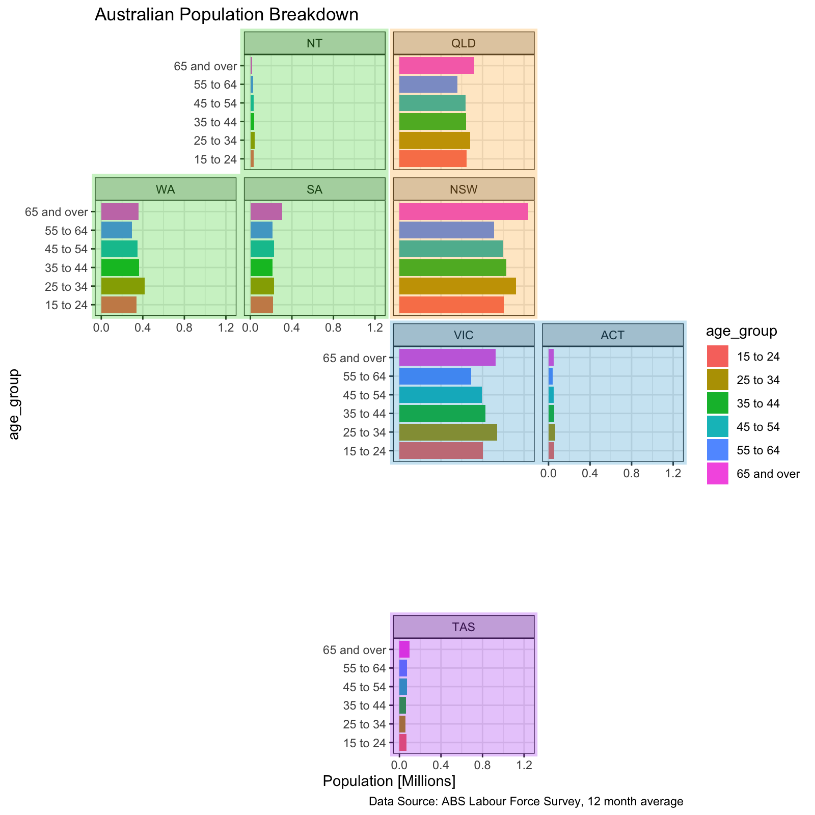
You can also set alpha to 0.25 for more transparency and fill in the shapes (I also changed the shade of blue in this one to stop it from looking purple when translucent):
purplerect <- polygonGrob(x=c(-0.02,-0.02,1.02,1.02), y=c(-0.02,1.02,1.02,-0.02),name='purplerect',gp=gpar(fill=NA,col='purple',alpha=0.5,lwd=5))
bluerect <- polygonGrob(x=c(-0.01,-0.01,1.01,1.01), y=c(-0.02,1.02,1.02,-0.02),name='bluerect',gp=gpar(fill=NA,col='blue',alpha=0.5,lwd=5))
orangerect <- polygonGrob(x=c(-0.02,-0.02,1.02,1.02), y=c(-0.01,1.01,1.01,-0.01),name='orangerect',gp=gpar(fill=NA,col='orange',alpha=0.5,lwd=5))
greenshape <- polygonGrob(x=c(0.5,0.5,1.01,1.01,-0.01,-0.01,0.5),y=c(0.5,1.01,1.01,-0.01,-0.01,0.5,0.5),name='greenshape',gp=gpar(fill=NA,col='green3',alpha=0.5,lwd=5))

step1 <- gtable_add_grob(gtab,purplerect,t=28,l=15,b=30,r=16,clip='off')
step2 <- gtable_add_grob(step1,bluerect,t=18,b=21,l=14,r=21,clip='off')
step3 <- gtable_add_grob(step2,orangerect,t=6,b=15,l=14,r=15,clip='off')
step4 <- gtable_add_grob(step3,greenshape,t=6,b=15,l=7,r=11,clip='off')
grid.draw(step4)
![]()
Finally, you can also use the parameter z of gtable_add_grob() to control the order things are drawn in. Here's output of head(gtab$layout) showing that the background has z=0 and the panels have z=1:
     t  l  b  r z clip       name
133  1  1 37 25 0   on background
2   15  7 15  7 1   on  panel-2-1
6   10 11 10 11 1   on  panel-2-2
7   15 11 15 11 1   on  panel-3-2
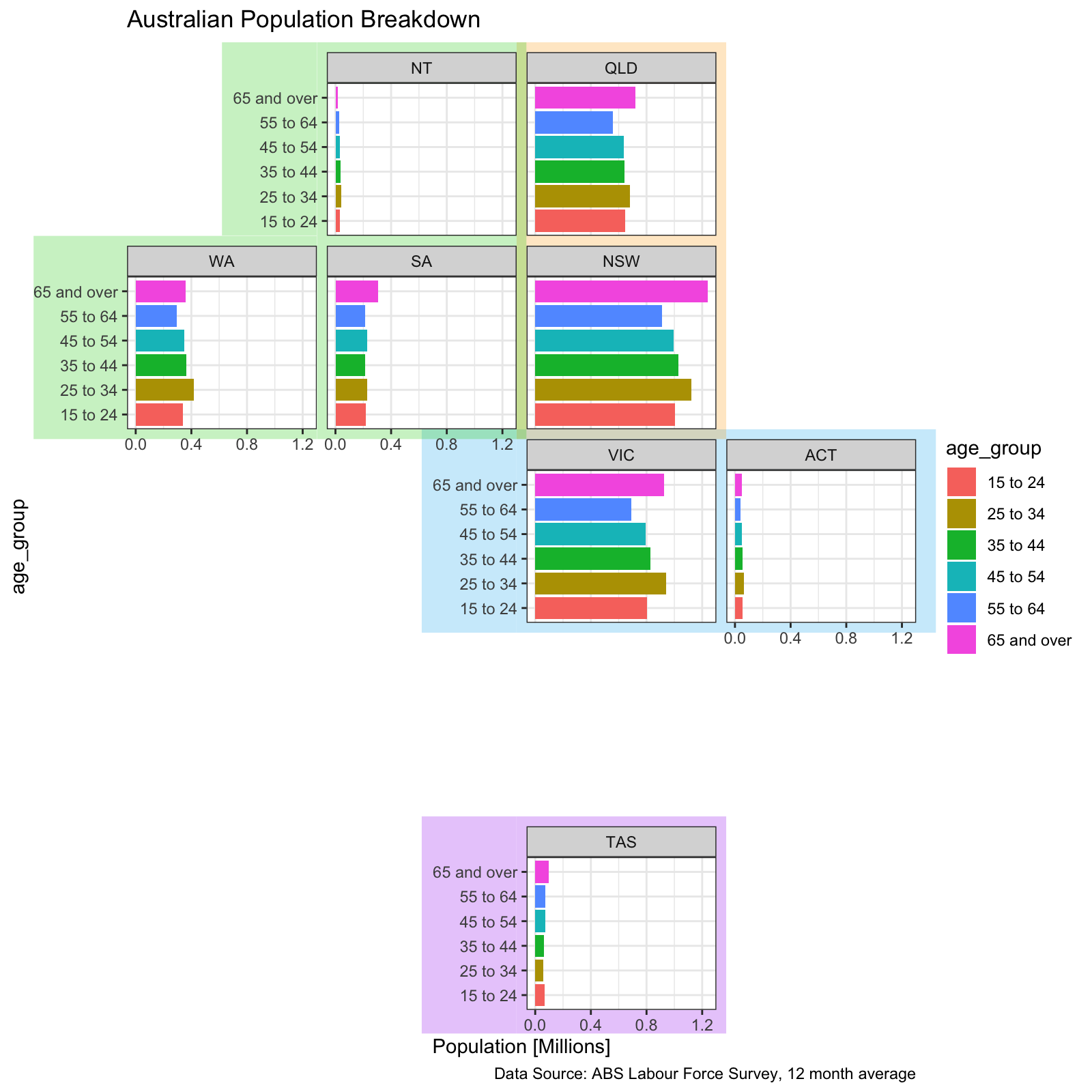
So if we draw the shapes with z=0.5, they will be drawn after the background and before the panels, and the panels will end up on top of them. This means we can shade areas of the plot besides the panel (because they are transparent/have no background besides the overall plot background) by just filling in those grid squares:
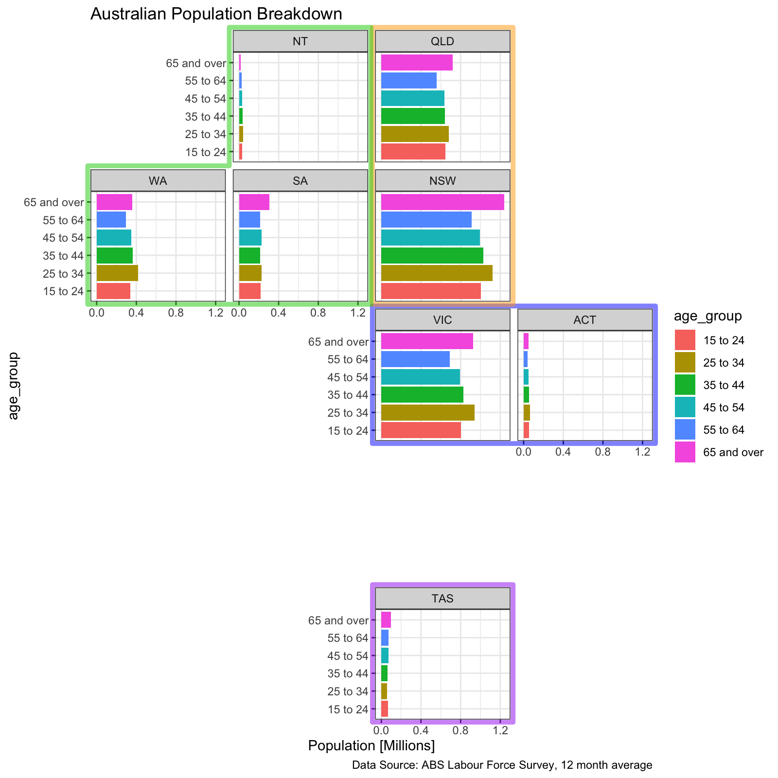
purplerect <- polygonGrob(x=c(0,0,1,1), y=c(0,1,1,0),name='purplerect',gp=gpar(fill='purple',col=NA,alpha=0.25))
bluerect <- polygonGrob(x=c(0,0,1,1), y=c(0,1,1,0),name='bluerect',gp=gpar(fill='deepskyblue2',col=NA,alpha=0.25))
halfblue <- polygonGrob(x=c(0.5,0.5,1,1), y=c(0,1,1,0),name='halfblue',gp=gpar(fill='deepskyblue2',col=NA,alpha=0.25))
orangerect <- polygonGrob(x=c(0,0,1,1), y=c(0,1,1,0),name='orangerect',gp=gpar(fill='orange',col=NA,alpha=0.25))
greenrect <- polygonGrob(x=c(0,0,1,1), y=c(0,1,1,0),name='greenrect',gp=gpar(fill='green3',col=NA,alpha=0.25))

# For ones with y-axes, make additional rectangles that will only fill the right half of those squares
halfpurple <- polygonGrob(x=c(0.5,0.5,1,1), y=c(0,1,1,0),name='halfpurple',gp=gpar(fill='purple',col=NA,alpha=0.25))
halfblue <- polygonGrob(x=c(0.5,0.5,1,1), y=c(0,1,1,0),name='halfblue',gp=gpar(fill='deepskyblue2',col=NA,alpha=0.25))
halfgreen <- polygonGrob(x=c(0.5,0.5,1,1), y=c(0,1,1,0),name='halfgreen',gp=gpar(fill='green3',col=NA,alpha=0.25))


# Add a row between the title and the top of the plots, since the title has a white background that would cover the top of the green/orange rectangles
step0 <- gtable_add_rows(gtab,unit(5.5,'pt'),pos=3)

# Shade different squares of the grid
step1 <- gtable_add_grob(step0,purplerect,t=28,b=32,l=12,r=17,z=0.5)
step2 <- gtable_add_grob(step1,halfpurple,t=28,b=32,l=11,r=11,z=0.5)
step3 <- gtable_add_grob(step2,bluerect,t=17,b=24,l=12,r=22,z=0.5)
step4 <- gtable_add_grob(step3,halfblue,t=17,b=24,l=10,r=11,z=0.5)
step5 <- gtable_add_grob(step4,orangerect,t=4,b=19,l=12,r=17,z=0.5)
step6 <- gtable_add_grob(step5,greenrect,t=4,b=18,l=8,r=13,z=0.5)
step7 <- gtable_add_grob(step6,halfgreen,t=4,b=12,l=7,r=7,z=0.5)
step8 <- gtable_add_grob(step7,greenrect,t=13,b=18,l=6,r=7,z=0.5)
grid.draw(step8)
![]()
As a final note, make sure you're using dev.off() before you start each new plot. Otherwise it will just keep drawing the plots on top of each-other. You might not see it because the background is opaque, but drawing plots will get slower and slower if you're troubleshooting and making lots of test versions.



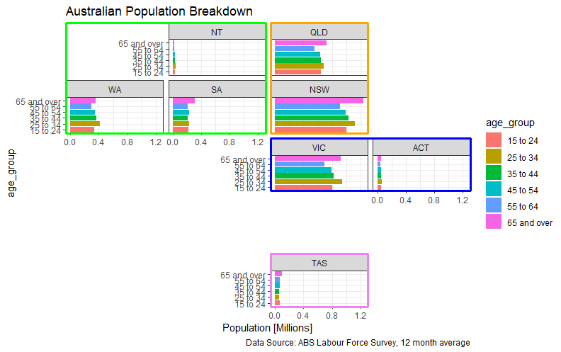
age_groups (already discernible by position) and clashes with the intended colour coding of state groups, why not paint the panel strips individually, or the panel background (by adding ageom_rect(aes(xmin = -Inf, xmax = Inf, ymin = -Inf, ymax=Inf, fill = state_group))underneath thegeom_col? – Aquinas