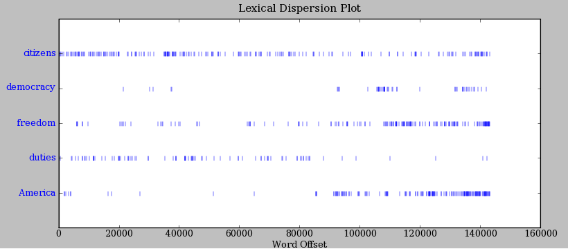
I'm looking to create a chart much like nltk's lexical dispersion plot, but am drawing a blank how to construct this. I was thinking that scatter would be my best geom, using '|' as markers, and setting the alpha, but I am running into all sorts of issues setting the parameters. An example of this is below:
I have the dataframe arranged with a datetime index, freq='D', over a 5 year period, and each column represents the count of a particular word used that date. For example:
tst = pd.DataFrame(index=pd.date_range(datetime.datetime(2010, 1, 1), end=datetime.datetime(2010, 2, 1), freq='D'), data=[[randint(0, 5), randint(0, 1), randint(0, 2)] for x in range(32)])
Currently I'm trying something akin to the following:
plt.figure()
tst.plot(kind='scatter', x=tst.index, y=tst.columns, marker='|', color=sns.xkcd_rgb['dodger blue'], alpha=.05, legend=False)
yticks = plt.yticks()[0]
plt.yticks(yticks, top_words)
the above code yields a KeyError:
KeyError: "['2009-12-31T19:00:00.000000000-0500' '2010-01-01T19:00:00.000000000-0500'\n '2010-01-02T19:00:00.000000000-0500' '2010-01-03T19:00:00.000000000-0500'\n '2010-01-04T19:00:00.000000000-0500' '2010-01-05T19:00:00.000000000-0500'\n '2010-01-06T19:00:00.000000000-0500' '2010-01-07T19:00:00.000000000-0500'\n '2010-01-08T19:00:00.000000000-0500' '2010-01-09T19:00:00.000000000-0500'\n '2010-01-10T19:00:00.000000000-0500' '2010-01-11T19:00:00.000000000-0500'\n '2010-01-12T19:00:00.000000000-0500' '2010-01-13T19:00:00.000000000-0500'\n '2010-01-14T19:00:00.000000000-0500' '2010-01-15T19:00:00.000000000-0500'\n '2010-01-16T19:00:00.000000000-0500' '2010-01-17T19:00:00.000000000-0500'\n '2010-01-18T19:00:00.000000000-0500' '2010-01-19T19:00:00.000000000-0500'\n '2010-01-20T19:00:00.000000000-0500' '2010-01-21T19:00:00.000000000-0500'\n '2010-01-22T19:00:00.000000000-0500' '2010-01-23T19:00:00.000000000-0500'\n '2010-01-24T19:00:00.000000000-0500' '2010-01-25T19:00:00.000000000-0500'\n '2010-01-26T19:00:00.000000000-0500' '2010-01-27T19:00:00.000000000-0500'\n '2010-01-28T19:00:00.000000000-0500' '2010-01-29T19:00:00.000000000-0500'\n '2010-01-30T19:00:00.000000000-0500' '2010-01-31T19:00:00.000000000-0500'] not in index"
Any help would be appreciated.
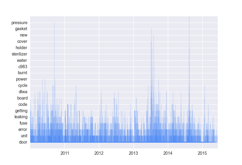
With help, I was able to produce the following:
plt.plot(tst.index, tst, marker='|', color=sns.xkcd_rgb['dodger blue'], alpha=.25, ms=.5, lw=.5)
plt.ylim([-1, 20])
plt.yticks(range(20), top_words)
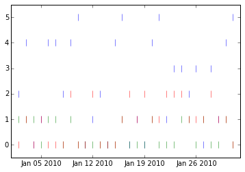
Unfortunately, it only appears that the upper bars will show up when there is a corresponding bar to be built on top of. That's not how my data looks.


