Center the focused item in horizontal scroll
Asked Answered
A

1

5

I have created a horizontal scroll container with <HTML/> and CSS:

body {
background-color: #212121;
}

.scroll_container {
	height: 100px;
	width: 400px;
	display: flex;
	align-items: center;
	overflow-y: hidden;
	width: 100%;
	height: 20%;
}

.scroll_container_sub {
	height: 100px;
	min-width: 230px;
	float: none;
	display: inline-block;
	zoom: 1;
	margin: 10px;
	border: solid 1px transparent;
	border-radius: 15px;
	background-color: #fff;
}
<div class="scroll_container">
        <div class="scroll_container_sub"></div>
        <div class="scroll_container_sub"></div>
        <div class="scroll_container_sub"></div>
</div>

What I try:
Is it possible that every time one item (scroll_container_sub) is centered in the scroll_container? Especially for mobile use, this is very good.
EXAMPLE:
After the scroll the middle item gets centered horizontally:
ee
(image: mobile view)
That means that things like this should not exist:
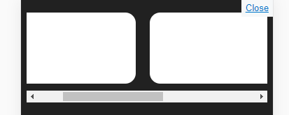
tt
Because none of the containers are centered. When I look at a scroll position like this the scroll view should center one of the containers.
For hopefully more detail: :)
In the following link, you see what I try to achieve. Look only at the few seconds in the beginning.
The cards are centered every time after the user swiped. Exactly what I try to achieve:
https://www.youtube.com/watch?v=UsXv6VRqZKs Do you need a live example? No Problem. In the Google Play Store, you find them. For example this swiper:
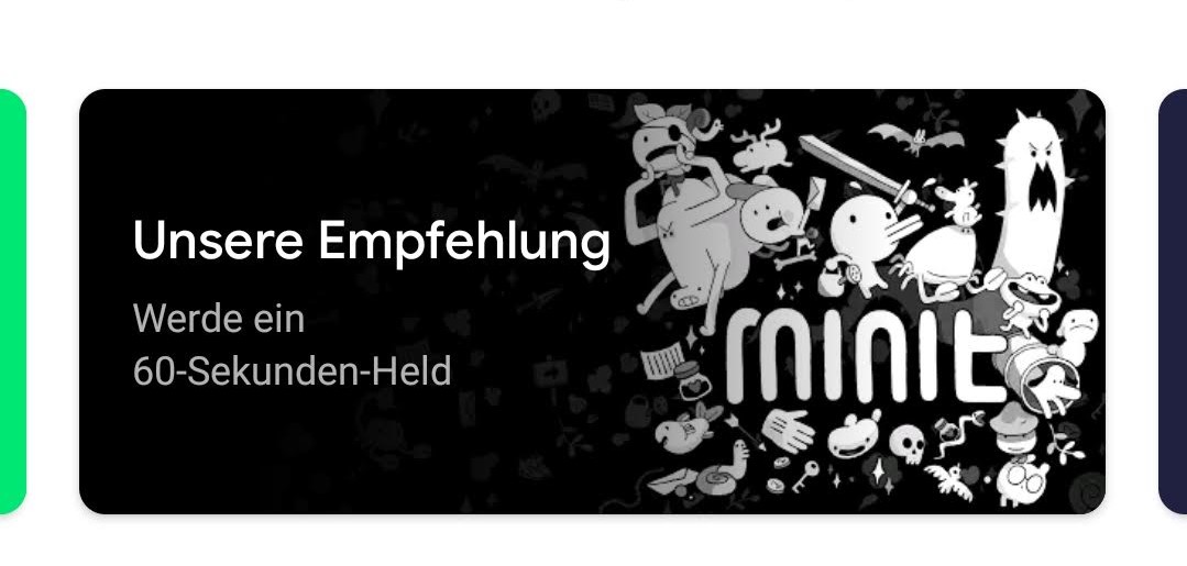
play store

~filip

Abrasion answered 25/8, 2019 at 20:55 Comment(2)
Do you mean so that elements appear initially centered (thus the middle item would be horizontally at the center of the screen), or so that they fill up the screen width, or something else?Skiing
@Skiing I provided an example. Can you please have a look at my edit?Abrasion
S
8

2022 edit: unless you need to support old browsers, scroll-margin is now the way to go.

JS implementation and theory follows:


The general formula is as following - you find your element of interest, find its middle point (x + width / 2), then subtract half of container's width from that:

window.addEventListener("load", function(e) {
  var container = document.querySelector(".scroll_container");
  var middle = container.children[Math.floor((container.children.length - 1) / 2)];
  container.scrollLeft = middle.offsetLeft +
    middle.offsetWidth / 2 - container.offsetWidth / 2;
});
body {
background-color: #212121;
}

.scroll_container {
    height: 100px;
    width: 400px;
    display: flex;
    align-items: center;
    overflow-y: hidden;
    position: relative;
    width: 100%;
    height: 20%;
}

.scroll_container_sub {
    height: 100px;
    min-width: 230px;
    float: none;
    display: inline-block;
    zoom: 1;
    margin: 10px;
    border: solid 1px transparent;
    border-radius: 15px;
    background-color: #fff;
}
<div class="scroll_container">
        <div class="scroll_container_sub"></div>
        <div class="scroll_container_sub"></div>
        <div class="scroll_container_sub"></div>
</div>

If you want to dynamically apply this effect, you would want to wait until the user is done scrolling, calculate the new scroll destination, and ease towards that over time.

Skiing answered 25/8, 2019 at 21:17 Comment(0)

© 2022 - 2024 — McMap. All rights reserved.