Flutter DrawerHeader // How to get rid of divider
Asked Answered
H

8

5

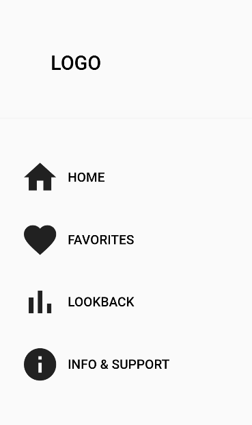
I'm designing a drawer for the first time and the DrawerHeader apparently comes with a grey line as divider I want to get rid of, but I don't know how.

Code here (edited for readability), screenshot below:

return SizedBox(
  width: 316.w,
  child: Drawer(
    child: Column(
      crossAxisAlignment: CrossAxisAlignment.start,
      children: [
        SizedBox(
          height: 152.5,
          child: DrawerHeader(
            padding: EdgeInsets.fromLTRB(0, 74.h, 0, 0),
            child: Column(
              children: [
                Center(
                  child: Row(
                    mainAxisAlignment: MainAxisAlignment.start,
                    children: [
                      SizedBox(
                        width: 67.w,
                      ),
                      GestureDetector(
                        onTap: () {
                          toggleDevMode();
                        }, //selectPage(4),
                        child: Text(
                          'LOGO',
                          style: Provider.of<CustomTextStyle>(context)
                              .customTextStyle('Headline 3'),
                        ),
                      ),
                    ],
                  ),
                ),
              ],
            ),
          ),
        ),
        //
        SizedBox(height: 42.5.h),
        //
        navIcon(
            labelText: 'HOME',
            icon: Icon(Icons.home, size: 50.r),
            index: 0),
        //
        SizedBox(height: 30.h),
        //favorites
        navIcon(
            labelText: 'FAVORITES',
            icon: Icon(Icons.favorite, size: 50.r),
            index: 1),
        //
        SizedBox(height: 30.h),
        //lookback
        navIcon(
            labelText: 'LOOKBACK',
            icon: Icon(Icons.bar_chart, size: 50.r),
            index: 2),
        //
        SizedBox(height: 30.h),
        //info & support
        navIcon(
            labelText: 'INFO & SUPPORT',
            icon: Icon(Icons.info, size: 50.r),
            index: 3),
      ],
    ),
  ),
);

enter image description here

I couldn't find the solution by google; maybe one of you knows more? Also, there really isn't that much more to say. There is a grey line. How to get rid of it? But the algorythm won't let me post until I write more to have more text in relation to code. Sorry to make you read it.

Helmick answered 18/3, 2022 at 17:56 Comment(0)
P
-1

You can easily modify it using the decoration. See the example:

DrawerHeader(
        decoration: BoxDecoration(
          border: Border(
            bottom: Divider.createBorderSide(context,
                color: Colors.red, width: 2.0),
          ),
        ),
        child: Text('Hello World'),
      )
Porphyritic answered 18/3, 2022 at 18:36 Comment(0)
B
6

after trying all solutions i decided to use Container with height: 200 instead of DrawerHeader and it worked :))

        Container(
          height: 200,
          padding: const EdgeInsets.only(top: 25),
          child: Center(
            child: Column(
              children: [
                // content of header
              ],
            ),
          ),
        ),
Bozeman answered 27/2, 2023 at 20:33 Comment(0)
O
2

I strongly disagree with the accepted answer. To actually get rid of the Divider, you have two options.

  1. Just do away with the DrawerHeader widget and build yours.
  2. This also aligns with option one. If you look at the code for DrawerHeader it's not complicated.
// This is the build method of the `DrawerHeader` widget.
...
 return Container(
      height: statusBarHeight + _kDrawerHeaderHeight,
      margin: margin,
      decoration: BoxDecoration(
        border: Border(
          bottom: Divider.createBorderSide(context),
        ),
      ),
      child: AnimatedContainer(
        padding: padding.add(EdgeInsets.only(top: statusBarHeight)),
        decoration: decoration,
        duration: duration,
        curve: curve,
        child: child == null ? null : DefaultTextStyle(
          style: theme.textTheme.bodyLarge!,
          child: MediaQuery.removePadding(
            context: context,
            removeTop: true,
            child: child!,
          ),
        ),
      ),
    );

The reason for the divider is the Container decoration. You can literally copy the whole code, create your own widget, call it whatever you want and remove the border.

This part of the code is responsible for the Divider

border: Border(
// This is what you don't want
  bottom: Divider.createBorderSide(context),
),
Octogenarian answered 7/7, 2023 at 17:12 Comment(0)
H
1

I suggest you remove the widget altogether. After all, there is no point in having it if you don't want the divider. Use a Padding widget instead (if you want to keep that padding there)

Heaves answered 18/3, 2022 at 18:23 Comment(2)
Hey, I do want to use a divider in the end, jut not the one provided by the header. I hink I'dknow how to achieve the result by not using the header at all, but this is more a learning object than everything else. Is there a way to style the divider the header comes with?Helmick
No I don't think there is a way to do that. If you want, you can take a look at the documentation for it: api.flutter.dev/flutter/material/DrawerHeader-class.htmlHeaves
T
1

There is a Theme property wit the name dividerColor, assing it to the Drawer (example in code below) and then change it in the Material theme data.

DrawerHeader(
        padding: const EdgeInsets.fromLTRB(0, 74, 0, 0),
        decoration: BoxDecoration(
          color: const Color(0xFF303030),
          border: Border(bottom: BorderSide(color: Theme.of(context).dividerColor)) // <--- use the global theme to change the dividerColor property 
        ),
        child: Column(
          children: [
            Center(
              child: Row(
                mainAxisAlignment: MainAxisAlignment.start,
                children: [
                  const SizedBox(
                    width: 67,
                  ),
                  GestureDetector(
                    onTap: () {
//                       toggleDevMode();
                    }, //selectPage(4),
                    child: const Text(
                      'LOGO',
                      style: TextStyle( color: Colors.green )
                    ),
                  ),
                ],
              ),
            ),
          ],
        ),
      ),

Here how to change the dividerColor property value:

MaterialApp(
        theme: ThemeData(
          dividerColor: Color(0xFF303030) // change it with the background color
        ),
      ),
Tsui answered 18/3, 2022 at 18:39 Comment(0)
W
0

hopefully work this code

 child: DrawerHeader(
          decoration: BoxDecoration(
            color: Colors.white,
            border: Border(
              bottom: Divider.createBorderSide(context,
                  color: Colors.white, width: 0.0),
            ),
          ))
Williemaewillies answered 9/11, 2023 at 10:53 Comment(0)
S
0

just go the code of The DrawerHeader by pressing ctrl and click on the DrawerHeader widget in vscode and change the decoration of the container from

decoration: BoxDecoration(
        border: Border(
          bottom: Divider.createBorderSide(context),
        ),

to

decoration:null,
Synonymous answered 8/7 at 21:37 Comment(0)
H
0

Just go to ThemeData

ThemeData(dividerTheme: const DividerThemeData(color: Colors.black),)

Hoseahoseia answered 16/8 at 20:2 Comment(0)
P
-1

You can easily modify it using the decoration. See the example:

DrawerHeader(
        decoration: BoxDecoration(
          border: Border(
            bottom: Divider.createBorderSide(context,
                color: Colors.red, width: 2.0),
          ),
        ),
        child: Text('Hello World'),
      )
Porphyritic answered 18/3, 2022 at 18:36 Comment(0)

© 2022 - 2024 — McMap. All rights reserved.