I am currently following along with Forecasting: Principles and Practice, 3rd Edition, which is graciously available online. To replicate my issue, you will need to install and then load the package fpp3. You will then need to carry out the following in R (or RStudio):
PBS %>%
  filter(ATC2 == "A10") %>%
  select(Month, Concession, Type, Cost) %>%
  summarise(TotalC = sum(Cost)) %>%
  mutate(Cost = TotalC / 1e6) -> a10
After defining a10, it will then be necessary to plot the tsibble, like so:
autoplot(a10, Cost) +
  labs(y = "$ (millions)",
       title = "Australian antidiabetic drug sales")
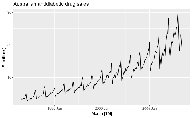
You should then get a plot like this:
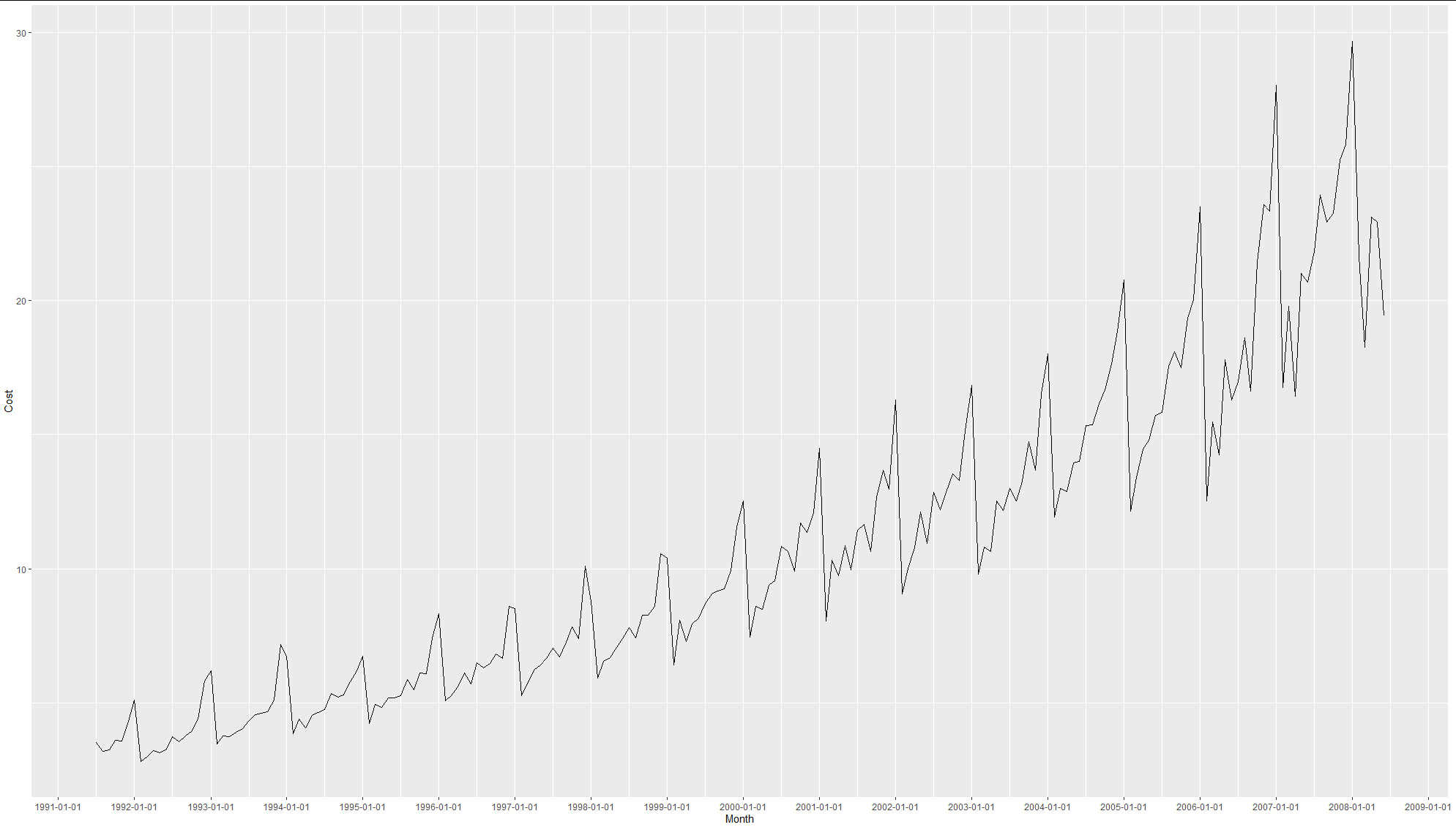
It's fine for the most part, but I would like to have at least twice as many ticks on the x-axis, possibly more if they can be rotated by 45° or so. I tried something that seemed promising which was adding scale_x_date(date_labels = "%m-%Y") to the plot object but that only works with objects of class Date and here we are dealing with yearmonths. How can I get a more detailed x-axis under these circumstances?


